
When I first explored the community view in Palladio, I found it quite confusing and visually overwhelming. The clustering of nodes and edges felt chaotic. It was difficult to interpret what was being represented or how the information connected. I found that when I adjusted the dimensions to look at the curator or track only, it became much clearer. I began to see meaningful patterns and relationships. These individual dimensions provided a view that was more accessible and allowed me to build the patterns and relationships slowly. It was easier for me to see the connections in this way. I also played around with the table view and this was much easier for me to work with. I was able to sort the data in a structured way which made the relationships easier to interpret.
This visualization did not capture the reasons behind the choices. I can assume that the other participants used the same reasons as me for their choices but in reality there are many reasons that a person could use to make their choices. These choices could be cultural familiarity, emotional response, symbolic meaning, and/or curiosity. The data can also not show why people didn’t chose tracks.
The political implications that stood out for me were the groupings. When people are grouped only on data you begin to understand that visualizations are not neutral. Groupings based on musical choices can lead to the emergence of power dynamics. Normalization reinforces musical types and marginalizes less represented music and cultures. Erasure means that null choices are made invisible. The silence of these null choices are not coded but may carry meaning like disinterest or critique. Choosing from a predetermined list of songs can lead to misinterpretations by overlooking cultures and creating a narrow selection of what is available for music.
While working on this assignment I did find the one space that I kept going back to was the course that I took during the summer term on Culture and Communication (ETEC 542). I was able to use ideas around these topics to help me decipher and analyze the information in the graph.
Below are the visualizations that helped build my understanding:

Fig. 1: Initial view that I found overwhelming

Fig 2: Using layers to build understanding.
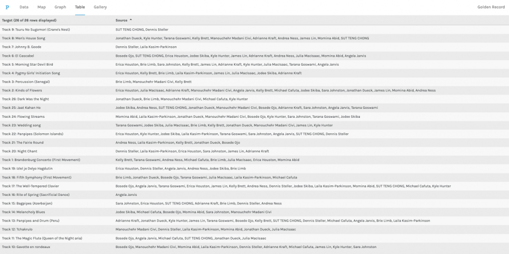
Fig 3: Table view of data