July 2022

Task 11 – Algorithms of Predictive Text

The English Version of Predictive Text using Twitter:


The Mandarin Chinese Version of Predictive Text using Microblog:


Reflection: 

I personally don’t rely on predictive texting too much so I decided to try it in both English and Mandarin. I would have read those kinds of statements in people’s blogs or microblogs, such as some of the motivational quotes. They both don’t sound like how I would normally text using my phone, especially the English post. To be honest, I rarely post anything except updating my moments with friends I actually know in person. Both statements here sounded a bit more formal than I would normally post. This reminds me that I actually use smart compose a lot more while writing formal emails. I often would use the prompts popped up while I was composing the emails for booking an appointment, writing the closing sentence, etc.

I also noticed the difference between using predictive texting in English and Mandarin. English keyboard only provided me with three options, mostly just words. The limitation of choices and also English not being my first language might have resulted in extra thinking time while I used predictive texting in English. I found myself struggling to make a grammatically correct sentence. On the other hand, the Mandarin keyboard gave me way more options of words and phrases to choose from. I was able to scroll left and right for a better way to express myself.

Also, the reason why I tried two different platforms is to try to see if that affects what the predictive texting give me. It turns out that it’s just Apple’s keyboard and I came up with relatively same choices using both platforms. Nowadays, even upper intermediate school teachers encourage their students to type their good copy of writing and proof read using Word. It is very useful for its autocorrect feature to help the ELL students with misspelled words. However, sometimes the suggested changes and the red underlines can be very distractive and may not be better.

In my own experience, my students don’t even rely on laptop that much for writing anymore, more on their phones instead, especially the younger ones. When I was teaching in a BC offshore school in Asia, 70% of my students writing time in English was on their phones, messaging each other, and the rest 30% would be at school using pen and paper. As a result, the autocorrect and predictive text features have a massive impact on their ability and style to write. I often find them very stuck when they were asked to hand write a piece of writing, even as a draft. I’m not sure if the technology is helping or slowing them down from practicing the correct spelling and sentence structures for writing. And if they are able to learn how to write in English using the autocorrect and predictive text features? If yes, are they able to transfer those skills to academic writing eventually?

Weekly Task 10 – Attention Economy

I might be one of the slowest to complete this game while frantically clicking everywhere on the page. I haven’t played a game which is this frustrating for a while. To be honest, I do like to play these kinds of games, not about an interface necessarily, but like solving mystery games which requires a slight brain twist. However, it almost feel like every single design of User Inyerface is meant to trick or frustrates me. It makes me think all the different ways we got trained about things like how to create a profile, where and what to click, what each button is usually used for, etc.

First of all, I had a lot of trouble getting into the game. Refreshed the page a couple times, and clicked everywhere on the page, including the green button “no” (which draws my immediate attention), the grey and tiny letters of “click here” and “go” (which is harder to see if the webpage designer put hidden messages there in this kind of colour). I still have no clue how I got in.

Later, I was stuck on the creating profile page for a while. It was annoying that I had to delete the letters in the text boxes before I was able to type my own information. The instructions for password were not given at the first place and I didn’t seem them until later as they were hidden on the bottom. The ticking clock and the 1,2,3,4 were very distractive as the main focus on the page. I feel pressured to try to fill it quickly, instead of carefully create a safe password. The clock also constantly locked the page and it took me a few tries to figure out how to unlock it. During the process, I even tried the unhelpful help feature and just ended up sending it to the bottom.

I went through the rest of the game pretty smoothly. I laughed when I saw the “unselect all” box near the end of the list when I was un-clicking every single box to delete the random items. Also, choosing the right image to verify that I was an actual human part was funny too. I sometimes struggle with this type of verification questions when I’m using other websites. My instruction was to choose the images with glasses, and I was given pictures of reading glasses, sunglasses, buildings made of glasses, glasses of wine, glasses of water, and empty glasses. The instruction was not precise and was misleading.

Although, I do like one feature of this game. Instead of scrolling right down to the bottom of the terms and conditions to click the “I agree” button, it forced me to slowly go down the information and I actually found myself reading more than half of it. Maybe this is how web page designers need to do for the other webpages.

This game showed how we got trained by filling out hundreds of these forms on the other websites and I got frustrated when none of that worked. It also makes me reflect that I need to be more cautious in the future when I use any sites. It indicates that why it is necessary and ethical for web designers to have clear instructions and information for web consumers to understand as it is so easy to be misleading.

Task 9: Network Assignment Using Golden Record Curation Quiz Data

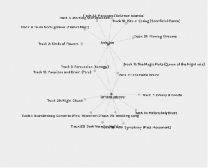
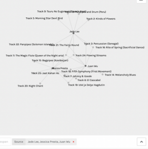
Visual representation of data:

  • At first, it seems very messy and unorganized with whole bunch of unweighted nodes and edges. 

Filter by source:

  • Music selection of each source
  • It allows you to see how many and who else chose the same piece of music if you click into the specific target (piece). However, it is an unweighted network of all the undirected nodes and edges and do not allow visual differentiation directly from looking at the graph. Also, it’s a bit frustrating that you can’t click on the nodes and edges on the graph directly to trace the hyperlinks.
  • If two sources chosen, it is able to show a connection between these two sources. For example, Track 3, 11, 13, and 21 are the common choices between Jade Lee and Tamara Jabbour. However, when more than 2 sources were chosen, it was a bit hard to spot the common choice among them. Again, I wish it could use weighed edges and also highlight or enlarge the size of the common nodes for the visual representation.
  • When you choose a specific track, it shows who in the class has made the same choice.

Communities:

  • I’m not quite sure how the communities were created. My guess is that is a group of sources with most similar music choices. From the graph, it is hard to predict the reasons behind the common choices.

Task 8 – Golden Record Curation

After listening to the Voyager’s Golden Record, researching about the background information, and reading people’s comments about each piece, I chose the following 10 tracks for my playlist:

  1. Azerbaijan S.S.R., bagpipes, recorded by Radio Moscow. 2:30
  2. Bach, “Gavotte en rondeaux” from the Partita No. 3 in E major for Violin, performed by Arthur Grumiaux. 2:55
  3. Georgian S.S.R., chorus, “Tchakrulo,” collected by Radio Moscow. 2:18
  4. Australia, Aborigine songs, “Morning Star” and “Devil Bird,” recorded by Sandra LeBrun Holmes. 1:26
  5. Peru, panpipes and drum, collected by Casa de la Cultura, Lima. 0:52
  6. “Melancholy Blues,” performed by Louis Armstrong and his Hot Seven. 3:05
  7. Mexico, “El Cascabel,” performed by Lorenzo Barcelata and the Mariachi México. 3:14
  8. China, ch’in, “Flowing Streams,” performed by Kuan P’ing-hu. 7:37
  9. Senegal, percussion, recorded by Charles Duvelle. 2:08
  10. Beethoven, Fifth Symphony, First Movement, the Philharmonia Orchestra, Otto Klemperer, conductor. 7:20

While I was listening to it, I was curious to know why and how they picked these particular 27 tracks to be sent to the space. It reminded me of this week’s reading about selecting content based on power and authority (Apple, 1992). It seems like the Golden Record project initiated in Western society and was lead by middle-upper class, causation scientists, such as Carl Sagan. Does their selection of music truly a representation of Earth’s sound from all culture? When they have decided these tracks to on go the record, what are we not including? “Why can we afford to lose” if those end up being the only proof of music left from the Earth after humanity disappears? (Brown University, 2017)

I’m trying to pick and choose a variety of music based on my listening preferences as an East Asian living in the western society for the past decade. I’m also trying to choose pieces that are more likely to represent the cultural diversity of humans. In addition, just like what the 20kHz Podcast Channel mentioned, the aliens might only be able to hear high/low pitch sound, or no sound at all but only the rhythms.

References:

Apple, M. W. (1992). The text and cultural politics. Educational Researcher, 21(7), 4-19.

Brown University. (2017). Abby Smith Rumsey: “Digital Memory: What Can We Afford to Lose?”