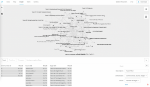
Visual representation of data:
- At first, it seems very messy and unorganized with whole bunch of unweighted nodes and edges.
Filter by source:

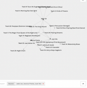
- Music selection of each source
- It allows you to see how many and who else chose the same piece of music if you click into the specific target (piece). However, it is an unweighted network of all the undirected nodes and edges and do not allow visual differentiation directly from looking at the graph. Also, it’s a bit frustrating that you can’t click on the nodes and edges on the graph directly to trace the hyperlinks.
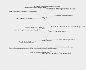
- If two sources chosen, it is able to show a connection between these two sources. For example, Track 3, 11, 13, and 21 are the common choices between Jade Lee and Tamara Jabbour. However, when more than 2 sources were chosen, it was a bit hard to spot the common choice among them. Again, I wish it could use weighed edges and also highlight or enlarge the size of the common nodes for the visual representation.
- When you choose a specific track, it shows who in the class has made the same choice.

Communities:
- I’m not quite sure how the communities were created. My guess is that is a group of sources with most similar music choices. From the graph, it is hard to predict the reasons behind the common choices.
