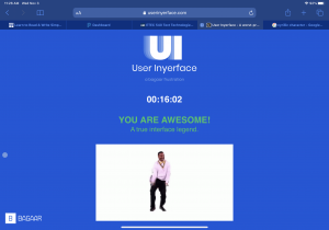
When trying to complete this task, the biggest thing I noticed is how difficult they make it for you to move onto the next page. I spent way more time than I expected to fill out questions and provide simple information (especially the “I am not a robot” part). The overall format of the site was counterintuitive. The next button is on the left (instead of the right), they asked reverse questions, made it difficult to close any pop ups or tabs, and made pop ups reappear frequently. All the functions (eg. Speed of pop up disappearing, how frequent pop up reappears, bad design, hard to find buttons) forced me to spend more time on the site. Based on this weeks module, a platform will likely do this to ensure that you stay on the site as long as possible so that they can gather more data on your actions (which can later be used by others or sold off). This makes me think about the design of a platform. For me personally, if a site has too many pop ups and is difficult to deal with, I will not use the site and will quickly close it. However, in this case, I needed to use this site, which is why I tolerated the pop ups and design of it. This made me realize that much of the data collection has to be done behind the scenes so that consumers do not need to deal with the constant disruptions in using the platform. This realization is what makes it concerning. If I enjoy the site, I will spend more time on it. If the site/platform has algorithms that work behind the scenes to capture my data, the better the design of the site, the more data they can collect. Just like the TedTalks mentioned, there is some good in it, but there can be consequences that are detrimental (eg. Government invading citizens privacy, addictions, marketing etc).
For the first part, the thing I struggled with was creating a password that met all the criteria’s that it listed. I even had to search up what Cyrillic character was because I never heard of it before. Also, the help tab kept getting in the way (I like my screen to be free of any pop ups) so I kept clicking on it to go down. But it went down slowly throughout the whole time. Furthermore, I noticed that the “cookie” pop up wouldn’t allow me to click “Yes.” I had to click “not really no” for it to dissappear. It never gave me an option. Additionally, the “I do not accept the terms” were counterintuitive to what I am use to. I had to unclick it to “accept” the terms.
On the second page, I had to create a profile. They made this difficult to fill out since the age scroll tab had to match your birthday. It was hard to locate the correct placement of the age and led to frustrations (and more time spent trying to find the correct number). Also, when picking the country, they used flags instead in black and white and closely spaced together, which means that it would take a longer time for me to find the correct country. I also struggled with the gender tab. Usually, when something is highlighted (in this case blue), that is the choice you picked. In this case, it was the white colour that indicated your chosen gender.
For the third page, I initially started to deselect all the ones to start from scratch in order to pick 3 choices. However, I noticed in the last column, there was the option to select or unselect all. Because of this formatting, I spent more time on this page than necessary. Since English speakers/learners read from left to right, or up/down a column, they used this knowledge to ensure that I would not see select/unselect all option until much later.
The last page was what fustrurated me the most. For the words, they picked words (eg. Glasses, circles, light, bow) that had multiple meanings depending on context and what they want. The pictures they showed for each word essentially fit the critieria that they laid out. However, I did not know if I was picking the right now. I had to keep repeating the same things over and over again for what seemed like 5-7 minutes before I was able to complete it. Going back and forth between the same words made me question my interpretation and I would switch my selections for the pictures every so often. This made me spend a lot more time on the site.

One response to “Task 10: Attention Economy”