Link #6 – Dana C – Task 6 – An Emoji Story

Dana’s post is here.

Hi Dana,

I was so intrigued by your write-up that I just had to cheat and find out what the movie was via a Google search. Honestly, without the synopsis, I would have never figured it out. I loved how you approached this task – the simplicity of your emoji interpretation juxtaposed with the depth of your ideas and connections with other readings, as well as your personal work experiences, really bring the idea of changing media literacies home.

Like your approach, I tried to keep things straightforward, especially with the title, but I attempted to depict a summarized plot with the same process. Your final comment struck me: “It is a peek into my lifeworld while also allowing an understanding of my fellow classmates’ lifeworld.” I think this idea resonates with my reflection (in my post) that emojis are not as ‘universal’ as people think but rather “steeped in the culture and history of its speakers” (Leonardi, 2022). 

For example, my first experience of online ‘chat’ or texting was via mIRC in the 90s, an early instant messaging chat that used emotes – text indicating an action is taking place and a precursor to emojis. So, the first part of my post to you would read as follows:  

I was so intrigued by your write-up that I just had to cheat and find out what the movie was via a Google search *blushes with shame.* Honestly, without the synopsis, I would have never figured it out *breathes a sigh of relief.* I love how you approached this task *makes a star-struck smiling face* – the simplicity of your emoji interpretation juxtaposed with the depth of your ideas and connections with other readings, as well as your personal work experiences, really brings the idea of changing media literacies home *gives you a big thumb’s up.*

Of course, because of my now-frequent use of emojis, I can’t help but unconsciously emote with them; however, it is interesting to think about Kress’s ‘gains and losses’ when comparing emoting to emojis. Emojis are definitely the faster draw, but as we experienced in this task, they have a limited vocabulary for abstract and complex concepts.

Thank you, I really enjoyed your post! 

*smiles*


References:

Leonardi, V. (2022, October 18). Are Emojis Really a Lingua Franca? – De Gruyter Conversations. De Gruyter Conversations. https://blog.degruyter.com/are-emojis-really-a-lingua-franca/ 

Wikipedia contributors. (2023a, January 11). Emote. Wikipedia. https://en.wikipedia.org/wiki/Emote

Wikipedia contributors. (2023b, April 7). Internet Relay Chat. Wikipedia. https://en.wikipedia.org/wiki/Internet_Relay_Chat

Link #5 – Phiviet Vo – Task 11 – Text-to-Image

Phiviet’s post is here.

Hi Phiviet,

The linking assignment requires or implies that we should connect to tasks we have completed ourselves (to link, compare and critically reflect on); however, I just had to respond to your post after seeing your quick experiment with Craiyon AI for Task 11, even though (like you) I completed the Detain/Release simulation for this task.

To experience it firsthand, I tried the same prompts (rich people, poor people) in DALL-E and had similar results to you (below are the images) – rich people are all white and dressed similarly, except for one black man who needed wads of cash in his hands to signal his ‘richness.’ Poor people are all South Asian women and children! 

Despite everything we have read and heard about human bias being integrated and amplified in AI, it still shocks me in its immediate context. 

Yes, South Asia has a high level of poverty, especially compared to North America and certain parts of Europe. However, what stood out was the homogeneity and the implication of dress, culture, gender, age and race in this depiction of poverty. 

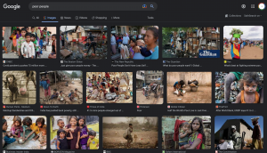
DALL-E creates the link between textual semantics and their visual representations by training on 650 million images and text captions (Johnson, 2022). These images (I assume) come primarily from the (uncurated) Internet, i.e. most online pictures captioned ‘poor’ must be of South Asian women and children. So I did a quick Google Image search of poor people, and the results matched. Below is a screenshot.

The difference that stood out for me between the two sets of images was that of context. Because the Google images are from the real world, they have an integrated backdrop that may provide more information relevant to reaching the judgement of ‘poor.’ On the other hand, DALL-E only extracts some salient features (race, gender, clothing style) from the data and then generates new images based on these, minus the context, thus reinforcing existing stereotypes.

This also leads us back to Dr. Shannon Vallor’s idea that “the kind of AI we have today and the kind we’re going to keep seeing is always a reflection of human-generated data and design principles. Every AI is a mirror of society, although often with strange distortions and magnifications that can surprise and disturb us” (Santa Clara University, 2018, 11:51).

Thank you for triggering an intriguing app exploration.

References:

Johnson, K. (2022, May 5). DALL-E 2 Creates Incredible Images—and Biased Ones You Don’t See. WIRED. https://www.wired.com/story/dall-e-2-ai-text-image-bias-social-media/

Santa Clara University. (2018, November 6). Lessons from the AI Mirror Shannon Vallor [Video]. YouTube.


Link #4 – Jamie Husereau – Task 9 – Network Assignment

Jamie’s post is here.

Hi Jamie,

I enjoyed reading your post on this task for several reasons. First, because it was so different from my approach, and second, I learnt a lot from your interpretation of the quiz data. I found the Palladio program confusing when first assigned this task and couldn’t get as far deciphering it, so it was helpful to see how you understood it. After reading your post, I played with it again, and it made much more sense! From the perspective you set up, it seems my choices were not as ‘mainstream’ as others.

Though I got a better handle on reading the data thanks to you, my original reflection on understanding the human reasoning behind them remains the same: hard to gauge from the data alone. I can see from your post’s ‘Political Implications‘ section that you are of a similar mind. 

Does the fact that my selection is not as mainstream as the rest of the group’s imply that I have little in common with the group? Not at all. Does it indicate I have a vastly different musical taste from the rest of the group? Not necessarily. You have stated aptly that “misinterpreting data can lead to misrepresenting people.”

Your final comments on the original record tracks and how and why they were selected take me back to my original post on this task. As well as the map from Module 8.1 that visualizes documents available through the Internet Archive demonstrates an uneven and limited representation of certain parts of the world over others, in almost every mainstream realm, digital or otherwise.

Link #3 – Amy Stiff – Task 8 – Golden Record Curation

Amy’s post is here.

Hi Amy,

Like you, I chose to use geography and cultural diversity as curating factors for the Golden Record, so I thought it would be interesting to compare our final choices. Here’s a quick visual I sketched to understand the selections:

70% of our choices were the same; however, we diverged on three track selections. The secondary criteria for curation we both had were entirely dissimilar, which could presumably explain the differences. You cited the range of human emotions expressed in music as a decisive factor, and I claimed a preference for tribal sounds over classical ones. 

Of course, the Venn diagram I sketched is a ‘logic diagram’ used to explain the logical relationships between sets of things. In retrospect, I speak for myself when I say, I picked the tracks I liked, first, and then applied my stated criteria to them. So a Venn diagram is perhaps not the most useful tool to understanding why I like certain music over others.

The entire exercise also takes me back to the first statement made at the start of this Module (8.1 Why digitize? Digitize what?): “Texts are promoted through time for many reasons that may have little to do with any inherent quality.” So often I think I am ‘neutral,’ but in reality, far from it.

Link #2 – Chris Rugo – Task 4 – Manual Printing

Chris’s post is here.

Hi Chris,
When it came to this task, I didn’t think twice and instinctively opted for handwriting, a communication medium I have loved since childhood. However, your post on the manual process of producing text via potato stamping was eye-opening.

As you walked us through your robust process of creating the simple text of your name, it reinforced Bolter’s idea that the value of electronic writing systems lies in making “structure a permanent feature of the text. The writer can think globally about the text,” (pg. 30, 2001) a trait not afforded by this stamping process (but still possible in a limited way via handwritten text).

Writing is a way of thinking for me, but even with a complete set of 26 potato letters ready on hand, I would not be able to express nor organize my thoughts adequately via this technology, except perhaps as a final (tedious) representation medium. As Bolter mentions, “the writer is thinking and writing in terms of verbal units or topics, whose meaning transcends their constituent words” (pg. 29, 2001), let alone individual letters, as is the case here.

Like you, I have always considered block printing more of an artistic or textile printing endeavour, so seeing its role and fit in the jigsaw puzzle of developing text technologies was interesting. In addition, your comparative analysis of manual versus mechanized printing processes was informative, and I agree with you on the far-reaching consequences of the latter.

Most of all, I appreciate the parallel you drew between your process and that of students in maker spaces, reinforcing Bolter’s (and somewhat McLuhan’s) idea of remediation: “a process of cultural competition between or among technologies” (pg. 23, 2001). Clearly, 3D printers win over hand-carved potato text blocks any day, but it was an interesting reminder to think of our maker tools as communication technologies as well.

Reference:

Bolter, J. D. (2001). Writing space: Computers, hypertext, and the remediation of print (2nd ed). Lawrence Erlbaum Associates.

Link #1 – Jessie Young – Task 7 – Mode-Bending

Jessie’s post is here.

Hi Jessie, 

I enjoyed your rendition of this task tremendously! Reinventing this task as an ‘unboxing’ vlog is pure genius, and your execution of the video makes you look like a pro 😉

I have to admit, I think of videos as more visual mediums, which is why I shied away from them for this task, but the conversational style of your vlog made me realize the visual was secondary and the orality of your piece was fundamental to it, (reminiscent of Ong’s claim of a return to a second orality). 

I found your ‘unboxing’ performance authentic, fun, engaging and informative, as well as checking off many other boxes (entertaining, thoughtful). There was a point when I forgot this was graduate work/study, and consumer-me took over and started clicking on product links, all off on tangents. For me, that marks the integrity of your work, its ability to elicit a variety of spontaneous responses different from those perhaps intended. It also embodies the New London Group’s idea of multiliteracies, calling attention to the dynamic nature of “language and other modes of meaning,” which are “constantly being remade by their users as they work to achieve their various cultural purposes” (Dobson & Willinsky, 2009).

A final note; I also greatly appreciate your explanation/breakdown of how you executed the task because it motivates me to experiment with the media/interfaces you have used.

References:

Dobson, T., & Willinsky, J. (2009). Digital literacy. In D. R. Olson & N. Torrance (Eds.), The Cambridge handbook of literacy (pp. 286-312). Cambridge University Press. 

Spam prevention powered by Akismet