Linking Assignment

Linking Assignment 1: “What’s in my bag?” by Judy Tai

In her entry, Judy talks about the items in her office bag, and has aptly renamed the task to “What’s in my office bag?” One of the things that struck me the most about her post was how neat and uncluttered her bag looks as compared to mine. Instead of examining all the items (like I did!), Judy chose to examine a few specific items in her bag and connect it to her work experiences. Judy mentions that listing all items “would be quite boring” and has taken a different approach to presenting the information. This brings me to one of the prompts for this assignment

  • How has your colleague’s experience differed from yours? And how do you know?

The items in Judy’s bag are reflective of her life as an online teacher. When comparing and contrasting my post to Judy’s I realize that all my items are of a personal nature—ranging from a book to candies to random receipts. My narrative, too, is reflective of the myriad items in my bag, and while these tell a lot about me as a person, one cannot link the items explicitly to how they relate to me as a professional, which is something that Judy focuses on in her post. What appealed to me in Judy’s post were two things: the first was her idea to showcase only selected items, and not all the contents of her bag which is a different approach than mine. The second is how wonderfully, Judy was able to connect the items to her job of online teaching grades 1-2 students. While I simply listed the items in my task, Judy explains how these items serve as tools of teaching and motivation. The cute pink llama notebook for jotting on-the-spur-of-the -moment inspirations, to her laptop—all the items are indicative of how they serve a specific purpose.

The items also provide me a glimpse into Judy’ busy life as a teacher when she mentions about responding to emails and troubleshooting for parents late at night. I do see some similarities between our thoughts—for instance both of us do mention that our bags would have been much bulkier 20 years ago!

This linking assignment made me appreciate how two tasks with the exact same instructions can be presented completely differently. While I chose to list every tiny item in my bag, Judy’s interpretation of focusing on a few things was novel. While I chose to focus more on how text and technology is ubiquitous, Judy further built upon this and connected her items to her work experiences.

Linking Assignment 2 Emoji Story by Marwa Kotb

The Emoji Story was one of my personal favourites. I enjoyed not only creating my emoji story, but I also enjoyed guessing the stories/title of my peers.

For the second linking assignment, I have selected Marwa Kotb’s Emoji Story (Modern Family). Marwa begins her post with a snapshot of emoji messages to her daughter asking her to guess some movies. In this activity, Marwa makes an interesting point that “while using emojis, composing and deciphering would primarily depend on the author and the viewer’s knowledge, culture, and experience.” This point resonated with me because while I was able to guess the movies, I grew up watching and are some of my personal favourites, someone younger or belonging to a different generation might not be able to guess the names. Writing tells and visuals depict or show (Kress, 2005, pg. 12). However, what they show is subjective, “so it is the viewer’s action that orders the simultaneously present elements in relation to her or his interest” (Kress, 2005, pg. 13). For example, the folded hands emoji can mean to pray or as Marwa says it could mean a yoga pose or it could also be a symbol of gratitude!

Except in some cases wherein Marwa decided to break the words into syllables, our approach was similar in the sense we both decided to depict broad ideas and certain words through emojis.

I could connect Marwa’s different presentation style with one of the prompts in the linking assignment:

  • How does their tool differ from yours in the ways in which it allows content-authouring and end-user interface?

Both Marwa and I have used the UBC blog space for our posts. My template lists the main tabs on top with the “recent” comments to the right, while Marwa’s has the tabs to the left. However, over and above the superficial differences, what struck me were the different visual elements and tools in her post. While I used https://emojikeyboard.io to generate all my standard emojis, I observed that Marwa, in the initial example, has used WhatsApp emojis, that in my opinion offer more variety that the tool I used. I also see that while I had simply grabbed a screenshot of my emojis and pasted it as an image in my post, I see that Marwa has created her emoji story using Scribd, which has been embedded into her post. What I like about the Scribd format is the ability for the user to view it in full screen mode, which makes the emojis quite legible and spaces it out. While grabbing my screenshot, I realized I had to zoom out the images and grab multiple screenshots and then paste it all together so that the emoji were big and clear enough. Embedding it in the Scribd format takes care of this issue and makes the emojis clear and legible.

Reference:

Kress (2005), Gains and losses: New forms of texts, knowledge, and learning. Computers and Composition, Vol. 2(1), 5-22

Linking Assignment 3 Mode-Bending Exercise by Olga Kanapelka

During this exercise, I explored the posts o several of my peers. It was fascinating to see how everyone chose different methodologies to showcase the exact same things they had done in Task 1, and the creativity was very inspiring! Melissa D’s take through a sci-fi podcast; Ian’s take on using audio cues as hint and Meipsy’s “Day in the Life” theme—all of these were so creative and I learnt so much more about the individuals through these activities than I did by simply reading the description and looking at the pictures in Task 1.

I particularly chose to examine Olga’s Mode Bending task as I could see many similarities and differences between our posts. Olga says that she created the presentation to account for “increasing multiplicity and integration of significant modes of meaning-making, where the textual is also related to the visual, the audio, the spatial, the behavioral” (Cazden et al., 1996, p. 64). She further elaborates on how multiliteracies come into play especially in her role as an ESL teacher. One of the things that I could really identify myself with was Olga’s emphasis on how important it is to maintain one’s one voice in the ever-changing narrative. To that effect, she decided to include both audio and visual modes, and to let her “accent be heard, first, because it is a part of who I am, and second, because it adds to the diversity of our learning community.” Being a first-generation immigrant myself, I could really find echoes of my own dilemmas and challenges in her voice. I have always been a bit conscious of my accent, and generally avoid designing activities that include my voiceover and decide to go with more visual or textual modes. For the Mode Bending exercise, I decided to step out of my insecurities and to record an audio poem. In Olga’s words, my voice—accent and all–it is a part of who I am and contributes to the mosaic of learning diversity we see in our communities.

In this task, while I decided to use a mix of aural and text modes, Olga chose audio, visual and text. The diverse media made me realize that design “recognizes the iterative nature of meaning-making, drawing on Available Designs to create patterns of meaning that are more or less predictable in their contexts” (NLG, 1996). While the media is important, it is also necessary to provide learners with the necessary tools for meaning making and constructing their own knowledge.

Reference:

Cazden, C., Cope, B., Fairclough, N., Gee, J., Kalantzis, M., Kress, G., Luke, A., Luke, C., Michaels, S. and Nakata, M. (1996). A pedagogy of multiliteracies: Designing social futures. Harvard educational review66(1), pp.60-92.

The New London Group. (1996). A pedagogy of multiliteracies: Designing social futures. Harvard Educational Review 66(1), 60-92

Linking Assignment 4 Twine by Anne Emberline

I simply loved Anne’s take on the Twine exercise! It was designed so professionally (Anne is a graphic designer, artist and educator) and everything was so clean, and it was so much fun to watch as she debated the different fonts for designing a business card for a professional organizer.

I decided to explore the following prompts for this reflection:

  • What web authoring tool have they chosen to manifest their work?
  • How does their tool differ from yours in the ways in which it allows content-authouring and end-user interface?
  • How do the constraints of the course design manifest in your architectural choices? How have you responded to the pedagogical underpinnings of this course design in your own web space?

In terms of the web authoring tool, Anne has used her own domain to host her Twine activity. I do believe that this offers more choice and flexibility in terms of presenting information. For example, in the Twine activity, Anne has creatively used screen capture videos to show the different branching scenarios. I tried to create videos and embed it in Twine, but I guess I would have had to play around with it a bit more to figure it out. I was able to embed videos from the web into my Twine, but I was unable to embed ones that I had created and saved onto my computer.  I also like the way Anne’s post provides an option to either download the Twine or to play it live. I do believe that my own learning curve with Twine affected my design choices. For example, in terms of architectural choices, I have used a very, simple and straightforward branching scenario. I used existing templates and most of my energy was focused on learning and then applying the tool correctly.

In the activity, Anne takes us through the different steps in designing a business card—and the screen capture video shows us her perusing through a variety of applications—OneNote, Instagram, Google Search, Adobe Illustrator, etc. as she searches for the apt font. I am not a designer or a graphic artist, but I learnt so much about clean design and font selection for this exercise. For example, Anne used TypeWolf to search for font-pairings—I was not aware something like this existed (font pairing—how amazing is that?), and I can see it being so useful to me in my work as an instructional designer.

What I particularly found interesting was how Twine as a tool provided opportunities to organically divide the content into “verbal units or topics” (Bolter, 2001, pg. 29) in both tasks.

Reference:

Bolter, Jay David. (2001). Writing space: computers, hypertext, and the remediation of print. New York, NY: Routledge.

Linking Assignment 5 Attention Economy by Olivia Marin

The first thing that struck me was the time difference. Olivia took a total of 3 minutes 48 seconds to complete the exercise and I took a whopping 14 minutes 20 seconds to do the same. It really got me wondering where I went wrong, especially as I looked at the posts of some of my other peers and realized that they had taken far too less time to complete it compared to me. Perhaps I overthought or over complicated the whole exercise and tried to read too much between the lines!

After reading Olivia’s post I realize that we have adopted a different approach towards the analysis. While our posts do share similarities in terms of the click baits, and the overall frustration with the exercise, there are marked differences as well. For example, in my post I have provided a screenshot-by-screenshot analysis of the exercise. Olivia’s approach is more holistic in the sense that the first part of her post is about the interface. The second part focuses more on how she has drawn connections between this exercise and between the videos of Mr. Harris and Dr. Tufecki that were suggested for that week. For example, she mentions Tristan Harris’s need for a design renaissance to get our technology under control and to steer it towards more humanistic goals. Olivia also talks about Dr. Tufecki’s thoughts on algorithms and their impact on democracy and our political system.

With reference to Mr. Harris and Dr. Tufecki’s videos, Olivia mentions that, “I hate to think of myself as someone who can be easily manipulated through targeted ads, but I can understand that we are at a place with algorithms and AI that the kinds of calculations they are making are beyond human understanding.” I agree with Olivia’s views, but I do wonder at the same time that while it is possible for the more aware and discerning individuals to not get swayed by the advertisements, it does pose a challenge for those who are most vulnerable—children, teenagers, seniors, people who are suffering from mental and physical health issues and who are not in the best position to judge what is in their best interests. Dr. Tufecki highlights that the dark side of UX is not merely relegated to annoying ads. She further gives an example of how it can predict the onset of manic behaviour in those who are suffering from a bipolar disorder and take advantage of their condition. For example, people in such a manic state are known to behave riskily—for instance gamble. By showing ads for cheap airline tickets to Las Vegas, the algorithm does much more then simply induce consumers to buy. It preys on their mental and physical vulnerabilities without them knowing about it, which is indeed scary.

References:

Tristan Harris (2017, July 28). How a handful of tech companies control billions of minds every day. [Video]. YouTube. https://www.youtube.com/watch?v=C74amJRp730

Zeynep Tufekci. (2017, November 17). We’re building a dystopia just to make people click on ads. [Video]. YouTube. https://www.youtube.com/watch?v=iFTWM7HV2UI

Linking Assignment 6 Speculative Futures by Adriana Silvestre

I loved listening to Adriana’s piece on how Lara, a 13-year old girl uses an AI planner to navigate through her daily tasks and chores—both at home and at school. In my opinion, the AI app was a perfect combination of Siri, Alexa, and meditation apps such as Calm and Headspace.

Both Adriana and I have used AI as an example in our posts. While Adriana’s AI app focuses more on planning of day-to-day tasks as well as curriculum planning, my fictitious AI app called CC or ‘Calm-n-Collected’ is of an emotions management tool that helps Joe, a fictitious transit operator in Vancouver to manage the more emotionally challenging aspects of his job.

In this reflection entry, I have chosen to examine the authoring tools used by Adriana and myself. For my first scenario I chose to use Adobe Spark page that helps to create engaging web pages quickly. There is both a free and paid version available. Creating the post, including images and sharing it is a quick and easy process. I have used images of our beautiful city of Vancouver to show the different stops our fictitious transit operator makes along his way as he drives all over the city picking up and dropping off passengers.

Adriana has used a program called Murf.ai to record the voiceover. I was not aware of this app and after a bit of research I realized that it is cool program that allows us to create professional studio quality voiceovers at home. One can either use their own recorded script or record it directly using the suggested AI voiceovers. What I like about this program is its ability to record “hyper-real lifelike AI voices”. As an instructional designer, I have always struggled with recording voiceovers. While having a real human recording is the best option, it is not always easy. For in-house recordings there are always time and scheduling conflicts. Recording externally is always an expensive and a time-consuming affair. Also, in both scenarios making edits to existing Vos is difficult. At the other end of the spectrum we have the automatic, very android-like voiceovers that are not the most preferred due to their artificial tones. Murf.ai sound like a great in-between option. The tool also allows to time it perfectly with visuals and the voiceovers have been created based on the voices of professional artists. I cannot wait to try their free version!




Task 12: Speculative Features

To give a bit of context, I work as an Instructional Designer with TransLink’s Coast Mountain Bus Co.—Vancouver Lower Mainland’s public transit provider. As an ID I work in the Operator Training and Technical Department, wherein we train new transit bus operators. The training focuses on both the practical aspect of driving as well as the emotional or soft skills component. Most transit operators report that while the task of driving is stressful, dealing with the emotional highs and lows that accompany driving are more difficult to deal with. To provide trainees with the necessary skills to deal with these emotions, they are provided with a variety of training modules to prevent violent incidents and to avoid hazards.

In my first scenario, I am imagining a future reality wherein Joe, our fictitious transit operator is just about to begin his shift. Unlike the buses that we see today, these buses are specially equipped with emotion detectors. These AI detectors are not only able to gauge Joe’s emotions, but they are also equipped with a myriad feature that enable it to catch on to the moods and emotions of passengers as they enter. These detectors have the unique ability to provide Joe with a heads up—who is having a bad day? Who is about to get into an embarrassing situation because they don’t have the money to pay the fares? Which customers are in a mood for confrontation? The AI device quietly observes and provides Joe with information on how to deal with different problematic situations before these get escalated and result into an untoward incident.

Click on the picture below to view the Adobe Spark page that I created for this scenario:

Joe’s Day Out – A day in the life of a transit operator in 2050

My second scenario was inspired from these powerful quotes:

It is hard to say what today’s dreams are; it seems they have been downgraded to hopeshope that we will not allow ourselves to become extinct, hope that we can feed the starving, hope that there will be room for us all on this tiny planet. There are no more visions. We dont know how to fix the planet and ensure our survival. We are just hopeful. (Dunne, Anthony & Raby, 2013)

I have imagined a scenario in the not so-near future wherein the carbon emissions have gone over the roof in the world. The government has banned all private vehicles, and everyone is now forced to take transit, walk or bike everywhere they go. This is the only hope if we are to save what is left of Beautiful BC. Reduce our carbon footprints no matter what it takes. The buses are electronically charged and emit zero emission.

However, as the number of buses has increased, the city does not have enough people to drive the buses. The company has now started creating robots that will manage these buses. Here comes in Joe 2.0 (our protagonist from Scenario 1), only in this case he is a humanoid. Joe 2.0 is devoid of emotions yet extremely efficient. He manages to reach all the bus stops on time and does not participate in road rage. He is a paragon of calm and courteous service, despite the many annoyances that he faces daily. On one occasion, an angry customer spat on the ground in anger, and Joe did not bat an eyelash. One another occasion, Mrs. Pat started chatting with Joe about her two new Labrador pups, and Joe provided all the right responses, while at the same time remaining focused on the road. Distracted driving is not something one can accuse Joe of after all. Joe 2.0 is well versed with the theory and principles of Defensive Driving and literally has the principles of Smith System built into him. He remembers to scan ahead, and to leave a space cushion around him when he drives. The roads are much safer, and the environment much cleaner thanks to Joe 2.0.

Reference:

Dunne, A. & Raby, F. (2013). Speculative Everything: Design, Fiction, and Social Dreaming. Cambridge: The MIT Press. Retrieved August 30, 2019, from Project MUSE database.

Task 11: Algorithms of Predictive Text

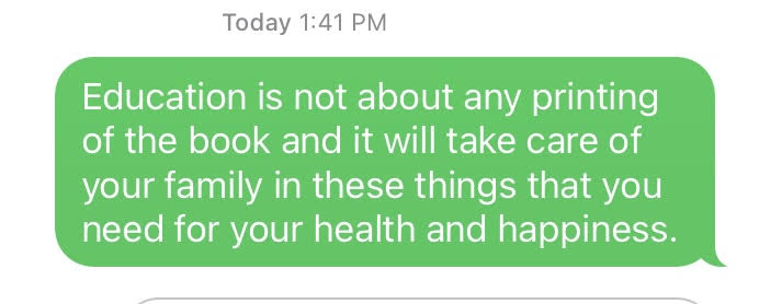
I decided to go with three prompts for this exercise and the results are as follows:

In both scenarios, even though the content sounds correct, the messaging is not what I had intended. For the first prompt “Education is not about…” I was hoping to write something based on the different learning theories, but the message I ended up with was more existential in nature. In the second message, ideally, I would have written something about the future of our society or humanity as a whole, but again due to the nature of the predictive text, I ended up with messaging that was too generic and limited to the personal context of my family.

I saw a lot of similarities in the predictive text suggestions that popped up no matter the prompt I used. For example, in the above scenarios, even though the prompts are different it is interesting to see how words like “happy or happiness” and “family” pop up despite the theme of the prompt. These are clearly based on the words and phrases that I have been using a lot in my general messages, and the predictive text algorithm clearly picks up and shows these words based on its probability.

Here’s another one that I tried!

Again, this is not something I would have consciously thought of or written if it had not been for the predictive text.

In all of the examples above, I feel the ‘voice’ sounds very stilted and not like my own. It either sounds too affected or overly prescriptive—and not reflective of what I really intended to communicate.

Regarding AI algorithms, I agree with Vallor (Santa Clara University, 2018) that these algorithms are good when it comes to automating routine, predictable tasks. But the minute we introduce real-world problems, or anything nuanced, these automations become an issue. This is evident in the predictive text microblogging exercise. I have used the automated predictive text feature in Gmail for writing every generic, standard responses and this feature has worked well. But the minute we try to talk about opinions, ideas or something complex and abstract, the predictive text feature falls severely short. Vallor further states that every AI is a mirror of our society. In such a scenario what is fed into the algorithm will determine its output. For example, words and phrases that I use frequently while messaging shows up in my predictive text while others do not. The output, therefore, is at times reflective and at other times distorted.

Another dark aspect of algorithms is the secrecy involved in sharing the data, something Dr. O’Neil addresses in her Google Talk (2016). During her talk, Dr. O’Neil mentions about personality tests that major companies deploy when hiring new staff. The scores and the result are never shared. I could connect to this example very well. In my personal experience, I once applied for a job in a Vancouver-based company. I completed five out of six rounds of interviews and tests. The sixth and final round was a personality test (similar to the Myers-Briggs but not quite). The options were vague, and I was not sure what was expected of me. After the sixth and final round I was rejected based on the outcome of the test. The analysis was not shared with me—the only thing I was told was that based on the results of the test I was not “a good fit”. Prior to the test, I had been interviewed by everyone from HR, to the reporting manager to the CEO and I passed all those interviews. But, when it came to a machine-based test, I failed. As Dr. O’Neil says, I was not even aware that I was being scored, and the unfairness of it all made me livid. It also made me wonder if the algorithm designed to provided ‘objective assessment’ in the test was fair and if it in fact superseded the subjective assessments of everyone who had interviewed me prior to the test.

Objective algorithms aren’t as objective or fair as one would like to believe. As Vallor says biases and prejudice are a part of our social data and one cannot separate the creators of these algorithms from the product. Plus, many of these algorithms have the potential for inflicting social harm. Dr. O’ Neil gives an example of algorithms that spread fake news that have the potential to affect a country’s democracy. The many examples provided by Dr. O’Neil validate the fact that the world of ungoverned algorithms has been going unmonitored for a very long time. It is time to take into account the political, ethical and social consequences of algorithms used for dubious, nefarious and at times downright illegal purposes.

References:

O’Neil, C. (2016). Weapons of math destruction: How big data increases inequality and threatens democracy (First edition). New York: Crown.

O’Neil, C. (2017, July 16). How can we stop algorithms telling lies? The Observer. Retrieved from https://www.theguardian.com/technology/2017/jul/16/how-can-we-stop-algorithms-telling-lies (Links to an external site.)

Santa Clara University. (2018). Lessons from the AI Mirror Shannon Vallor.

The Age of the Algorithm. (n.d.). In 99 Percent Invisible. Retrieved from https://99percentinvisible.org/episode/the-age-of-the-algorithm/


Task 10: Attention Economy

The User Inyerface exercise has a byline that says “a baggar frustration”. I agree with it wholeheartedly—it was an an exercise in frustration and deception and by the end of it I simply wanted it to be over. User web interfaces can be very deceitful, and these deceits come across in various ways (Brignull, 2010). One only has to take into account the number of steps it takes to discontinue a free channel subscription on Amazon Prime to understand the dark side of UX design and forced continuity.

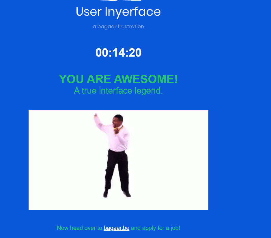
According to the timer in the online game it took me 14 minutes and 20 seconds to complete the entire exercise. During the game, I grabbed a few screenshots as well:

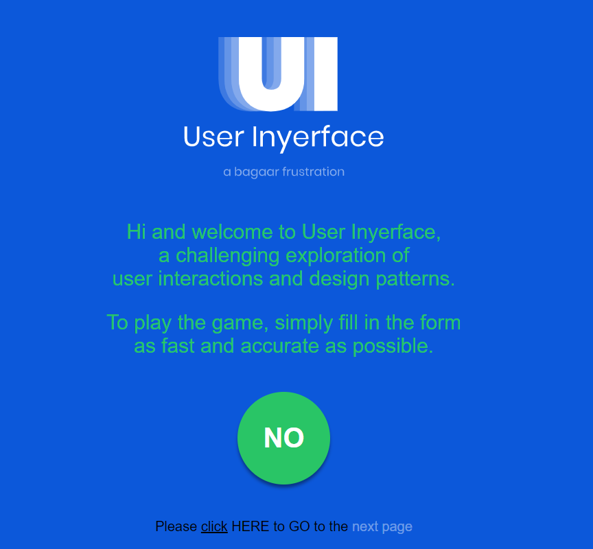
Screenshot#1:

  • The first thing that struck me were the instructions in the beginning to complete the form as “fast and accurate as possible”. This made me suspect the intent of the exercise, as being quick and accurate don’t always go hand in hand.
  • The timer that threatened to ‘lock’ the screen made me a bit jumpy even though I knew it was just a game. It made me realize the tactics that a lot of web portals use—i.e. they force you to complete a transaction quickly within a given period of time, which does not give buyers the time to reflect before making a purchase. Popular online retailers often have a ticker “Hurry sale ends in 1 hour 55 minutes and 27 seconds” and the ticker is like a timebomb waiting to explode unless one checks out and completes the transaction soon enough.
  • The first screen had dubious instructions—for example the green button saying “No” drew attention and almost begged to be clicked. While my first instinct was to click on the green circle, I forced myself to look at the fine print. I initially thought the underlined “click” was hyperlinked, but I was mistaken. I finally clicked “HERE” to begin the game. I really had to read the fine print to proceed, something that can be very easily overlooked.
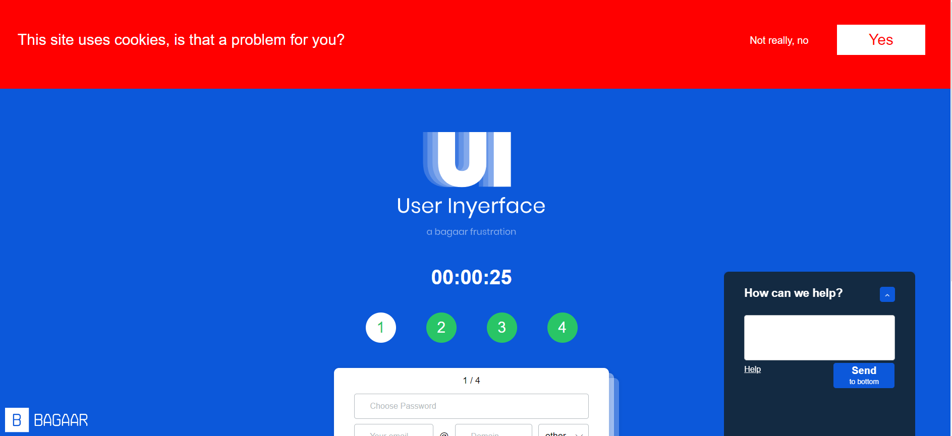
Screenshot#2

  • “This site uses cookies. Is that a problem for you?” Yes, it was a problem. Unfortunately, I clicked yes multiple times, but the message did not disappear. All the while I played the game, the cookies banner stayed on top and blocked my screen. In a real world situation, this banner is very distracting, and I have experienced it in multiple websites, wherein it blocks half your screen and one does not have an option but to simply click “yes” just to get rid of the banner that covers half your page. Perhaps this is another strategy to make something so frustrating that users simply want to get rid of it and will probably click on the “Agree” button without thinking twice.
  • The chatbot help box was not hidden and very distracting. Sometimes I found myself clicking on the blue upward arrow, and that covered a good portion of my screen. The “Send to bottom” button was deceptive. The “Send” was in bigger letters and “to bottom” in smaller letters, it made me instinctively think that the button was to type and send the message but in reality, it only removed the chat box from the screen by sending it to the bottom. Also, when I clicked “help” it showed me 455 users waiting. The chat box is a classic example of misdirection— both in text and design.
  • While setting the password I noticed the instruction that “your password is now not unsafe”. The use of double negatives is confusing and misleading.
Screenshot#3

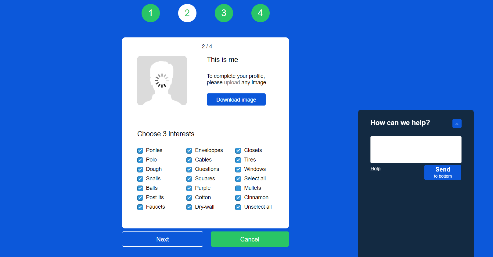
  • It took me a while to figure out the “upload”, “download” process. Initially, I clicked on “download image” button which rightfully downloaded the image. There is something about a bright blue button on a design interface that prompts users to click it! It is an example of a bait in the sense that it leads you to do something you don’t want to do.
  • The “choosing three interest areas” is a classic example of dark UX that leads users to unknowingly “select all” options, a phrase which is buried under so many other options it is easy to miss. Moreover, it provides users with the illusion of making a choice, when in reality the user has to manually uncheck each box (all checkboxes are checked by default), because the “unselect all” option is buried at the end as well. Just like the A/B test, the design was quite devious as it misdirected users and made them opt in for options they would not have otherwise (Brignull, 2010).
Screenshot #4:

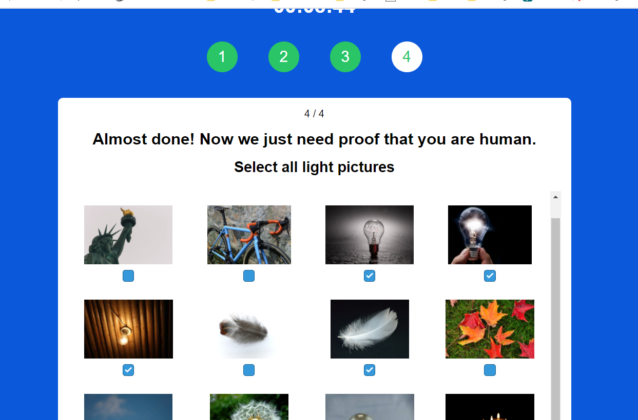
  • The last screen was the most frustrating of all! It gave users various options to choose “checks”, “lights”, “bows” and “glasses”—the images provided were misleading because a checkbox could count as a check, and even a bank check could be a check. Same with glasses and spectacles, or bowties and bowing. The instructions including the placement of the checkboxes was unclear. Also, I had to click on the “Validate” button several times to complete the exercise. I clicked repeatedly to exit the screen. In a real world situation, it is a perfect set up to click or accept something unknowingly out of sheer frustration.

Th online game helped me to better understand the dark side of UX design. In her Ted Talk Zeynip Tufekci (2017) talks about how our dystopian reality is not simply limited to annoying ads based on our search history. The fact that it can predict onset of manic behaviour in people with bipolar disorders and take advantage of their condition, or writing algorithms that affect emotions and the way we think—that is indeed dark and scary.

Task 9: Network Assignment Using Golden Record Curation Quiz Data

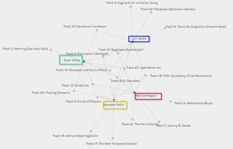
The above graph showcases some of the commonalities I shared with other group members in terms of music selection, namely Jasmeet, Ryan and Lori. In some cases, it is interesting to see how I have more than a few songs in common and in other cases there were some songs selected by my peers which do not feature in my top ten list. This makes me realize that while Palladio is a good tool for tracking data in terms of simple input and output and tracking similarities and grouping individuals based on tracked similarities, I don’t believe it captures the information between the lines. For example, does the graph really tell me that I share a similar musical interest as my peers based on the grouping? Absolutely not, because in all honesty, musical choices are far too wide and varied a subject area to be captured in a single graph. If I were to be completely honest, I had never heard a single one of the 27 tracks listed in the Voyager records, and none of these will ever feature in my iTunes playlist. 🙂 I don’t doubt that the music is excellent, and in some cases other-worldly (pun not intended!), it would just not fall under the kind of music I would normally listen to. In that sense the graph, though accurate can be misinterpreted.

This brings me to a very important point that was covered in Week 8, “As we focus on information bubbles and how algorithms increasingly decide what we consume online, we all-too-often forget that these bubbles and algorithmic decisions are themselves constrained to just that information which is available in the digital realm” (Leetaru, 2017). The music record curation exercise is a classic example of this fact. To begin with, the exercise asked us to select 10 tracks for a given set of 27 tracks, with the emphasis on the fact that these tracks were pre-selected for us. As a result, we had to choose a top 10 from the given set of music. It would be interesting to see how the algorithms run by Palldio would present the data if everyone in the class had an option to present their own personal favourite top 10 tracks and to not be relegated to a confined set. Would we still share similarities? Therefore, the algorithms and subsequent results are constrained in terms of the data input. The information that is captured and digitized is merely a snapshot in the passage of time and does not really account for how data (and people’s taste in music!) evolves over a period. Also, while the tool does a great job of reporting quantitative numbers, there is no way for us to understand the qualitative aspects. For example, are all jazz lovers included in one category? Why did some of us choose a particular track and not the other?

Connecting to personal experiences

Recently, our department decided to move over some of our daily tracking reports to PowerBI, a Microsoft Business Analytics tool. While working with the Data Analyst, I realized that the Excel sheet that I had provided to her contained some very marginal errors, but in the grand scheme of things affected the data quality and output in the final Power BI format. That’s when I learnt an important lesson in data integrity. What you input, affects the output, and very often something as simple as human error can affect the results in terms of data quality. It would be interesting to see how Palldio as a tool tracks the outliers, data overload and failed calculations.

Reference:

Leetaru, K. (2017). In A Digital World, Are We Losing Sight Of Our Undigitized Past? Retrieved June 15, 2019, from Forbes website: https://www.forbes.com/sites/kalevleetaru/2017/09/29/in-a-digital-world-are-we-losing-sight-of-our-undigitized-past/#4ddf07accd0


Task 8: Golden Record Curation Assignment

Image courtesy: pch.vector Freepik.com

Here are my top 10 tracks:

  1. Holborne, Paueans, Galliards, Almains and Other Short Aeirs, “The Fairie Round,” performed by David Munrow and the Early Music Consort of London. 1:17
  2. Mexico, “El Cascabel,” performed by Lorenzo Barcelata and the Mariachi México. 3:14
  3. “Johnny B. Goode,” written and performed by Chuck Berry. 2:38
  4. Java, court gamelan, “Kinds of Flowers,” recorded by Robert Brown. 4:43
  5. “Melancholy Blues,” performed by Louis Armstrong and his Hot Seven. 3:05
  6. Peru, panpipes and drum, collected by Casa de la Cultura, Lima. 0:52
  7. Georgian S.S.R., chorus, “Tchakrulo,” collected by Radio Moscow. 2:18
  8. Azerbaijan S.S.R., bagpipes, recorded by Radio Moscow. 2:30
  9. India, raga, “Jaat Kahan Ho,” sung by Surshri Kesar Bai Kerkar. 3:30
  10. Beethoven, Fifth Symphony, First Movement, the Philharmonia Orchestra, Otto Klemperer, conductor. 7:20

This was a fascinating exercise! I was not aware of the Voyager Golden Record project, so I was very intrigued by the idea of a space probe hurtling through the universe at the rate of 30,000 mph, in search of extraterrestrials, who might possibly listen to the record one day! It also made me think of humanity’s need to tell a story and to leave a mark.

While there is not one single reason why I chose the top ten, in my opinion my selection was determined by the tempo of the music. The fairly upbeat and happy-sounding ones (in my humble opinion) automatically made it to my list. The “Peru, panpipes and drums” by Casa de la Cultura oddly reminded me of Simon and Garfunkel’s El Condor Pasa, one of my favorites, so that made it to the list as well.  Perhaps, music that sounds familiar or that I can subconsciously draw connections to appealed to me intrinsically. Some songs such as Jaat Kahan Ho, which means “where do you go, you lonely traveler?” (a song very apt for this project!) and the Indonesian track “Kinds of Flowers” which describes the spiritual and philosophical states a person evolves or goes through appealed to me at an esoteric level, and I included them in my list.

I could connect this project with the week’s reading that highlighted how minority culture struggles to be included among the mainstream, and the internet’s web pages are a classic example. For instance, “a survey published by Unesco in 2008 found that 98% of the internet’s web pages are published in just 12 languages, and more than half of them are in English” (Treviño, 2020). The voyager Golden Records project was put together in the 1970s, and it did a fantastic job of representing the minority culture, whether it be the Peruvian Wedding Song, the Senegal beats or the Azerbaijan flutes. It crossed boundaries and barriers to send a collective message as one humanity to whoever or whatever is out there. What will it take to make the internet and all the information that is available within it, more inclusive and more accessible so that it transforms the way we learn, communicate, and think (Rumsey, 1999)? And does digitization of text play a crucial role in this case? If it does, and as all text is technology, then what happens to 43% of the world’s languages and dialects that are unwritten (Treviño, 2020)? These are some of my key takeaways from this exercise.

Reference:

Trancozo Treviño, M. (2020, April 14). The many languages missing from the internet. Retrieved from https://www.bbc.com/future/article/20200414-the-many-lanuages-still-missing-from-the-internet

Smith Rumsey, A. (1999, February). Why Digitize? Retrieved June 15, 2019, from Council on Library and Information Resources website: https://www.clir.org/pubs/reports/pub80-smith/pub80-2/


Task 7: Mode-Bending

For this task, I decided to write and narrate a short poem: “What’s in my bag, you ask?”

Original image from Task 1:

What’s in my bag, you ask?

What’s in my bag, you ask?
A few knicks, a few knacks,
And yes, the quintessential mask.

A written word,
A fading receipt.
A little bit of me,
in every item I see.
An earring with a broken clasp,
A tome of a novel I just cant grasp.
The drama, intrigue and baggage I carry around,
Oh! And did I mention that absolutely random piece of wire I found?

A little bit of me,
in every item I see.
Some candies, chocolates, credit cards to pay.
A pair of sunglasses in case Vancouver sees a sunny day?

What’s in my bag you ask?
A ton of memories in which I bask.
A pen grabbed at a hotel’s front desk,
a reminder of a family vacation, a good time;
A dollop of sanitizer and a coffee gift card,
Well, now doesn’t this finally rhyme?

For you see, a little bit of me,
In every item I see.
A rouge, a lipstick,
Things of vanity.

A several hundred years down the line;
Perhaps an archaeologist will find this bag of mine;
And unravel its secrets,
like threads of twine;
And find in it contents,
Clues to a simpler time.

Reflection:

For this task, the semiotic mode I decided to go with was auditory—something I have never done before. I decided to redesign the first task from a visual mode to an aural exercise by conveying the information I originally included in Task 1 in the form of a poem. I am not a writer, but I enjoyed writing this simple yet heartfelt poem. I was surprised to see how a visual and text-heavy task can be transformed by a simple poem coupled with background music. It also made me realize that indeed all text is multimodal (Kress, 2005) and that from a multiliteracies point of view, one can adopt a more holistic approach that includes both the formal and the informal in the process of meaning-making (NLG, 1996).

“Any successful theory of pedagogy must be based on views about how the human mind works in society and classrooms as well as about the nature of teaching and learning” (NLG, 1996, pg. 82). I could relate this statement to the learning theory of Constructivism, wherein meaning making happens in bits and pieces through cognitive and social developments. This meaning can also be constructed by presenting text, which is multimodal, through digital means (NLG, 1996) because knowledge creation is a product of social and cultural constructions.

This exercise was challenging, because it was difficult for me to grasp initially what was required exactly. However, as I progressed through the task, I was able to connect this to the example of “Transformed Practice” (NLG, 1996, pg. 83), in the sense that I was able to recreate the meaning or redesign this task of meaning in a different context. At the heart of learning is motivation. While doing this task, I realized that I was able to express myself better through a poem as opposed to taking a picture and writing about the items. Because I had the freedom to choose the way I wanted to learn, I was more motivated to learn. As an educator, I was able to connect this to the concept of “Situated Practice” (NLG, 1996, pg. 85), as it further reaffirmed my belief that a learner’s affective and sociocultural need must be accounted for and guided learning experiences must be created to enable the same.

While this task is mainly auditory, there are elements of gestural design as I tried to use background music to create a certain feeling or affect. The task compelled me to take the information from Task 1–an Available Design, design it in a different mode, and to create something which transformed me as a learner by enhancing my meaning-making process and redesigning it in a completely different and unique way (Cope & Kalantzis, 2009, pg. 175).

*I created this short audio clip using Camtasia and the royalty-free music “Inspiring Piano” is courtesy Purple Planet.

References:

Cope, B. & Kalantzis, M. (2009). Multiliteracies: New literacies, new learning. Pedagogies: An International Journal, 4:3, 164-195, DOI:10.1080/15544800903076044

Kress (2005), Gains and losses: New forms of texts, knowledge, and learning. Computers and Composition, Vol. 2(1), 5-22.

The New London Group. (1996). A pedagogy of multiliteracies: Designing social futures. Harvard Educational Review 66(1), 60-92


Task 6: Emoji Story

Guess the famous sitcom?


Reflections:

I began with the title of my favourite sitcom in mind, because just like prose, the idea in my mind was to progress in a linear fashion as “sequencing has effects on authorship and reading” (Kress, 2005, pg. 13). Just as a prose narrative begins with a title, provides a brief description of various key characters that enables the reader to visualize the different elements, I too followed a similar narrative arc and began with the title, followed by emojis describing the characters’ qualities—both explicit and implicit, which in turn was followed by the unveiling of the plot. While print provides ownership and a sense of control to the author, with readers being mere dependants, visual imagery works differently in the sense that all elements are present, “so it is the viewer’s action that orders the simultaneously present elements in relation to her or his interest” (Kress, 2005, pg. 13). It made me realize that even though I tried to follow a liner narrative in my emoji story, the reader need not follow the same logic or linearity of thoughts for it is as easy to not begin at the beginning and to not end at the end.

Graphics are used in replacement of text and the two are constantly working upon one another (Bolter, 2001, pg.47) Similarly, emojis are being increasingly used to replace common textual phrases and are also used to express emotions. For example, the heart emoji alone has various meanings ranging from romantic love to friendship to a close bond to admiration, all depending upon the colour of the heart. A “bye” or a “see you later” is replaced by the hand wave emoji.
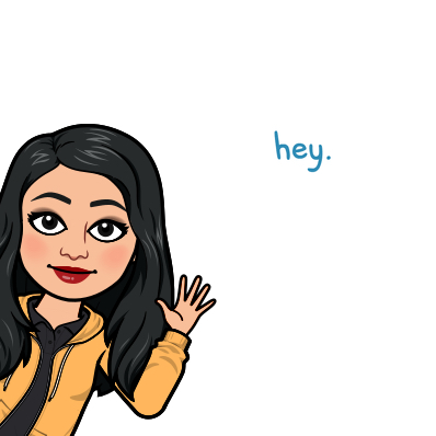
 

In fact, emojis are now being customized according to the user, to create a personal emoji or a Bitmoji—or what I refer to as an emoji with a personality!

While putting together my emoji story, I relied heavily sometimes on the metaphorical aspect of emojis to convey my message. Sometimes, the symbolic emojis can be misinterpreted due to their subjectivity or “as so it is the viewer’s action that orders the simultaneously present elements in relation to her or his interest” (Kress, 2005, pg. 13). Like all art forms, the ideas expressed in my emoji story can be interpreted based on the viewer’s personal experiences, bias and worldview.

For example, the following emojis can mean that the character is nerdy; loves maths/science and perhaps loves candies. What I was aiming for is the fact that the character is very smart in a geeky way (think Sheldon from the Big Bang Theory) but is also very sweet-natured. Because I could not find an emoji for ‘sweet-natured’ I decided to go for the wrapped candy instead!

If I were to be completely honest, I wanted to create an emoji story for the last book that I read “Just Mercy: A Story of Justice and Redemption” by Bryan Stevenson. I decided not to go ahead with it as it would be very difficult for me to express the main theme of racial discrimination, police brutality and bias which is faced by black Americans  in an emoji format. I can connect this to this week’s reading that the mode and media is critically important in terms of how we think of acts of production and consumption of meaning. In my opinion, emojis would not do justice to the book with its serious themes. Thus, the medium of communication should be based on what needs to be communicated and what meaning we want the viewers or learners to discern least it be misinterpreted. Instead, I decided to go with something that would be more suitable to an emoji format—a regular sitcom.

When we reflect on the tension between visual and print modes (Bolter, 2001, pg. 54), it is interesting to see how paper-based media is created using digital tools. In my professional experience as an instructional designer, I have been involved in using tools such as Adobe InDesign to create books in a digital format. This includes our instructor and student manuals, brochures, etc. with hyperlinked table of contents and a standard template. While the main use of the manuals is digital, these can also be printed if required. My next goal is to create interactive eBooks, complete with multimodal elements that include videos, sound effects, 360-degree images, etc. The eLearning modules that I develop rely largely on visuals. Based on feedback from the learners, I try to minimize the text on screen, and choose templates that are not too text heavy. The modules are often accompanied by voiceovers for those who prefer a more auditory style of learning. This is, as Bolter (2001) says, an evidence of the fact that we are living in a more visual culture.

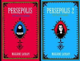
“The breakout of the visual, the ekphrastic impulse, is at its most vigorous in the electronic writing space, where new media designers and authors are also redefining the balance between word and image” (Bolter, 2001, pg. 57). When it comes to redefining word and image, perhaps one of the best examples that comes to my mind is that of the graphic novel, of which “Maus” and “Persepolis” happen to be my favourites. Graphic novels, in my opinion, are the perfect examples of where writing tells and visuals depict or show (Kress, 2005, pg. 12). Both graphic novels deal with very serious themes such as the Holocaust, exile, fundamentalism and the journey of an immigrant being a few dominant themes, but do an amazing job of striking the right balance between visuals and text, where one truly builds upon the other.

References:

Bolter, J. D. (2001). Writing space: Computers, hypertext, and the remediation of print (2nd ed.). Mahwah, N.J: Lawrence Erlbaum Associates. doi:10.4324/9781410600110

Kress (2005), Gains and losses: New forms of texts, knowledge, and learning. Computers and Composition, Vol. 2(1), 5-22.

Task 5: Twine Activity

Image: Rawpixel at Freepik.com

Quest for Cookies!

Steps to download and view:

  1. Right click the above folder and click “Open in New Tab”
  2. The folder will be automatically downloaded.
  3. Open the html link using either Chrome or Firefox for best user experience.

Reflection

I am not a gamer and I have never used Twine before, so I learnt a lot in this exercise. My strategy was simple—I decided to choose a topic that I was familiar with, namely baking cookies. I thought about how this could be converted to an interactive exercise, and I decided the best way would be by including some Frequently Asked Questions as hypertext, which lead to separates passages. Learners had a choice to either continue with the linear path or to deviate a bit, check out the FAQs and then come back to the main recipe.

While creating the passages and links, something interesting happened. I realized that the linked phrases lead to other pages, and that this process “continues indefinitely as the reader progresses through a textual space” (Bolter, 2001, pg. 27). I realized that the possibilities were infinite as I created more passages. By adding links at critical junctures, I was able to create a separate yet distinct path. I also felt that the exercise compelled me, rather organically, to think in terms of “verbal units or topics” (Bolter, 2001, pg. 29). I separated my exercise, therefore, into different topics such as, the ingredients, the process, the variations and a bit of trivia. In that sense, I could relate it personally to my career as an Instructional Designer, where storyboarding of content plays an integral role. A typical storyboarding exercise from an instructional design perspective will include a step-by-step or rather a screen-by-screen layout and instructions in terms of content, animation, graphics, etc. This storyboard is followed when developing the content matter into an eLearning course. The Twine activity was like a storyboarding exercise—each screen or passage was connected to another screen, and the interconnectedness formed a web of sorts, in which each process or action was made up of further sub-processes (Engelbart, 1963). Writing the text was merely a sub-process but thinking conceptually and designing the process hierarchies within the Twine activity was most challenging.

While developing eLearning courses I use programs such as StoryLine and Adobe Captivate. Many features such as number variables and triggers that are available in these programs were also available in Twine. Despite my familiarity with these tools, I did find myself struggling a bit with Twine due to the newness of it. Also, it took me longer than I had expected to create a simple activity.  My overall learning from this activity is perhaps best summarized as “the human mind neither learns nor acts by large leaps but by steps organized or structured so that each one depends upon previous steps” (Engelbart, 1963, pg. 10).

References

Bolter, Jay David. (2001). Writing space: computers, hypertext, and the remediation of print. New York, NY: Routledge.

Englebart, Douglas. (1963). A conceptual framework for the augmentation of man’s intellect. In Hawerton, P.W. and Weeks, D.C. (Eds.), Vistas in information handling, Volume I: The augmentation of man’s intellect by machine. Washington, DC: Spartan Books

Spam prevention powered by Akismet