Task 11: Algorithms of Predictive Text

I decided to go with three prompts for this exercise and the results are as follows:

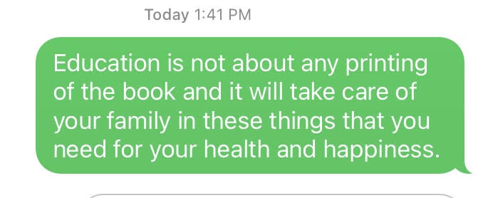
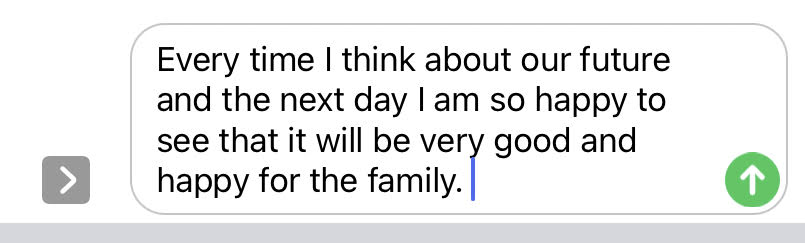
In both scenarios, even though the content sounds correct, the messaging is not what I had intended. For the first prompt “Education is not about…” I was hoping to write something based on the different learning theories, but the message I ended up with was more existential in nature. In the second message, ideally, I would have written something about the future of our society or humanity as a whole, but again due to the nature of the predictive text, I ended up with messaging that was too generic and limited to the personal context of my family.

I saw a lot of similarities in the predictive text suggestions that popped up no matter the prompt I used. For example, in the above scenarios, even though the prompts are different it is interesting to see how words like “happy or happiness” and “family” pop up despite the theme of the prompt. These are clearly based on the words and phrases that I have been using a lot in my general messages, and the predictive text algorithm clearly picks up and shows these words based on its probability.

Here’s another one that I tried!

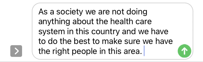
Again, this is not something I would have consciously thought of or written if it had not been for the predictive text.

In all of the examples above, I feel the ‘voice’ sounds very stilted and not like my own. It either sounds too affected or overly prescriptive—and not reflective of what I really intended to communicate.

Regarding AI algorithms, I agree with Vallor (Santa Clara University, 2018) that these algorithms are good when it comes to automating routine, predictable tasks. But the minute we introduce real-world problems, or anything nuanced, these automations become an issue. This is evident in the predictive text microblogging exercise. I have used the automated predictive text feature in Gmail for writing every generic, standard responses and this feature has worked well. But the minute we try to talk about opinions, ideas or something complex and abstract, the predictive text feature falls severely short. Vallor further states that every AI is a mirror of our society. In such a scenario what is fed into the algorithm will determine its output. For example, words and phrases that I use frequently while messaging shows up in my predictive text while others do not. The output, therefore, is at times reflective and at other times distorted.

Another dark aspect of algorithms is the secrecy involved in sharing the data, something Dr. O’Neil addresses in her Google Talk (2016). During her talk, Dr. O’Neil mentions about personality tests that major companies deploy when hiring new staff. The scores and the result are never shared. I could connect to this example very well. In my personal experience, I once applied for a job in a Vancouver-based company. I completed five out of six rounds of interviews and tests. The sixth and final round was a personality test (similar to the Myers-Briggs but not quite). The options were vague, and I was not sure what was expected of me. After the sixth and final round I was rejected based on the outcome of the test. The analysis was not shared with me—the only thing I was told was that based on the results of the test I was not “a good fit”. Prior to the test, I had been interviewed by everyone from HR, to the reporting manager to the CEO and I passed all those interviews. But, when it came to a machine-based test, I failed. As Dr. O’Neil says, I was not even aware that I was being scored, and the unfairness of it all made me livid. It also made me wonder if the algorithm designed to provided ‘objective assessment’ in the test was fair and if it in fact superseded the subjective assessments of everyone who had interviewed me prior to the test.

Objective algorithms aren’t as objective or fair as one would like to believe. As Vallor says biases and prejudice are a part of our social data and one cannot separate the creators of these algorithms from the product. Plus, many of these algorithms have the potential for inflicting social harm. Dr. O’ Neil gives an example of algorithms that spread fake news that have the potential to affect a country’s democracy. The many examples provided by Dr. O’Neil validate the fact that the world of ungoverned algorithms has been going unmonitored for a very long time. It is time to take into account the political, ethical and social consequences of algorithms used for dubious, nefarious and at times downright illegal purposes.

References:

O’Neil, C. (2016). Weapons of math destruction: How big data increases inequality and threatens democracy (First edition). New York: Crown.

O’Neil, C. (2017, July 16). How can we stop algorithms telling lies? The Observer. Retrieved from https://www.theguardian.com/technology/2017/jul/16/how-can-we-stop-algorithms-telling-lies (Links to an external site.)

Santa Clara University. (2018). Lessons from the AI Mirror Shannon Vallor.

The Age of the Algorithm. (n.d.). In 99 Percent Invisible. Retrieved from https://99percentinvisible.org/episode/the-age-of-the-algorithm/


Task 10: Attention Economy

The User Inyerface exercise has a byline that says “a baggar frustration”. I agree with it wholeheartedly—it was an an exercise in frustration and deception and by the end of it I simply wanted it to be over. User web interfaces can be very deceitful, and these deceits come across in various ways (Brignull, 2010). One only has to take into account the number of steps it takes to discontinue a free channel subscription on Amazon Prime to understand the dark side of UX design and forced continuity.

According to the timer in the online game it took me 14 minutes and 20 seconds to complete the entire exercise. During the game, I grabbed a few screenshots as well:

Screenshot#1:

  • The first thing that struck me were the instructions in the beginning to complete the form as “fast and accurate as possible”. This made me suspect the intent of the exercise, as being quick and accurate don’t always go hand in hand.
  • The timer that threatened to ‘lock’ the screen made me a bit jumpy even though I knew it was just a game. It made me realize the tactics that a lot of web portals use—i.e. they force you to complete a transaction quickly within a given period of time, which does not give buyers the time to reflect before making a purchase. Popular online retailers often have a ticker “Hurry sale ends in 1 hour 55 minutes and 27 seconds” and the ticker is like a timebomb waiting to explode unless one checks out and completes the transaction soon enough.
  • The first screen had dubious instructions—for example the green button saying “No” drew attention and almost begged to be clicked. While my first instinct was to click on the green circle, I forced myself to look at the fine print. I initially thought the underlined “click” was hyperlinked, but I was mistaken. I finally clicked “HERE” to begin the game. I really had to read the fine print to proceed, something that can be very easily overlooked.
Screenshot#2

  • “This site uses cookies. Is that a problem for you?” Yes, it was a problem. Unfortunately, I clicked yes multiple times, but the message did not disappear. All the while I played the game, the cookies banner stayed on top and blocked my screen. In a real world situation, this banner is very distracting, and I have experienced it in multiple websites, wherein it blocks half your screen and one does not have an option but to simply click “yes” just to get rid of the banner that covers half your page. Perhaps this is another strategy to make something so frustrating that users simply want to get rid of it and will probably click on the “Agree” button without thinking twice.
  • The chatbot help box was not hidden and very distracting. Sometimes I found myself clicking on the blue upward arrow, and that covered a good portion of my screen. The “Send to bottom” button was deceptive. The “Send” was in bigger letters and “to bottom” in smaller letters, it made me instinctively think that the button was to type and send the message but in reality, it only removed the chat box from the screen by sending it to the bottom. Also, when I clicked “help” it showed me 455 users waiting. The chat box is a classic example of misdirection— both in text and design.
  • While setting the password I noticed the instruction that “your password is now not unsafe”. The use of double negatives is confusing and misleading.
Screenshot#3

  • It took me a while to figure out the “upload”, “download” process. Initially, I clicked on “download image” button which rightfully downloaded the image. There is something about a bright blue button on a design interface that prompts users to click it! It is an example of a bait in the sense that it leads you to do something you don’t want to do.
  • The “choosing three interest areas” is a classic example of dark UX that leads users to unknowingly “select all” options, a phrase which is buried under so many other options it is easy to miss. Moreover, it provides users with the illusion of making a choice, when in reality the user has to manually uncheck each box (all checkboxes are checked by default), because the “unselect all” option is buried at the end as well. Just like the A/B test, the design was quite devious as it misdirected users and made them opt in for options they would not have otherwise (Brignull, 2010).
Screenshot #4:

  • The last screen was the most frustrating of all! It gave users various options to choose “checks”, “lights”, “bows” and “glasses”—the images provided were misleading because a checkbox could count as a check, and even a bank check could be a check. Same with glasses and spectacles, or bowties and bowing. The instructions including the placement of the checkboxes was unclear. Also, I had to click on the “Validate” button several times to complete the exercise. I clicked repeatedly to exit the screen. In a real world situation, it is a perfect set up to click or accept something unknowingly out of sheer frustration.

Th online game helped me to better understand the dark side of UX design. In her Ted Talk Zeynip Tufekci (2017) talks about how our dystopian reality is not simply limited to annoying ads based on our search history. The fact that it can predict onset of manic behaviour in people with bipolar disorders and take advantage of their condition, or writing algorithms that affect emotions and the way we think—that is indeed dark and scary.

Task 9: Network Assignment Using Golden Record Curation Quiz Data

The above graph showcases some of the commonalities I shared with other group members in terms of music selection, namely Jasmeet, Ryan and Lori. In some cases, it is interesting to see how I have more than a few songs in common and in other cases there were some songs selected by my peers which do not feature in my top ten list. This makes me realize that while Palladio is a good tool for tracking data in terms of simple input and output and tracking similarities and grouping individuals based on tracked similarities, I don’t believe it captures the information between the lines. For example, does the graph really tell me that I share a similar musical interest as my peers based on the grouping? Absolutely not, because in all honesty, musical choices are far too wide and varied a subject area to be captured in a single graph. If I were to be completely honest, I had never heard a single one of the 27 tracks listed in the Voyager records, and none of these will ever feature in my iTunes playlist. 🙂 I don’t doubt that the music is excellent, and in some cases other-worldly (pun not intended!), it would just not fall under the kind of music I would normally listen to. In that sense the graph, though accurate can be misinterpreted.

This brings me to a very important point that was covered in Week 8, “As we focus on information bubbles and how algorithms increasingly decide what we consume online, we all-too-often forget that these bubbles and algorithmic decisions are themselves constrained to just that information which is available in the digital realm” (Leetaru, 2017). The music record curation exercise is a classic example of this fact. To begin with, the exercise asked us to select 10 tracks for a given set of 27 tracks, with the emphasis on the fact that these tracks were pre-selected for us. As a result, we had to choose a top 10 from the given set of music. It would be interesting to see how the algorithms run by Palldio would present the data if everyone in the class had an option to present their own personal favourite top 10 tracks and to not be relegated to a confined set. Would we still share similarities? Therefore, the algorithms and subsequent results are constrained in terms of the data input. The information that is captured and digitized is merely a snapshot in the passage of time and does not really account for how data (and people’s taste in music!) evolves over a period. Also, while the tool does a great job of reporting quantitative numbers, there is no way for us to understand the qualitative aspects. For example, are all jazz lovers included in one category? Why did some of us choose a particular track and not the other?

Connecting to personal experiences

Recently, our department decided to move over some of our daily tracking reports to PowerBI, a Microsoft Business Analytics tool. While working with the Data Analyst, I realized that the Excel sheet that I had provided to her contained some very marginal errors, but in the grand scheme of things affected the data quality and output in the final Power BI format. That’s when I learnt an important lesson in data integrity. What you input, affects the output, and very often something as simple as human error can affect the results in terms of data quality. It would be interesting to see how Palldio as a tool tracks the outliers, data overload and failed calculations.

Reference:

Leetaru, K. (2017). In A Digital World, Are We Losing Sight Of Our Undigitized Past? Retrieved June 15, 2019, from Forbes website: https://www.forbes.com/sites/kalevleetaru/2017/09/29/in-a-digital-world-are-we-losing-sight-of-our-undigitized-past/#4ddf07accd0


Task 8: Golden Record Curation Assignment

Image courtesy: pch.vector Freepik.com

Here are my top 10 tracks:

  1. Holborne, Paueans, Galliards, Almains and Other Short Aeirs, “The Fairie Round,” performed by David Munrow and the Early Music Consort of London. 1:17
  2. Mexico, “El Cascabel,” performed by Lorenzo Barcelata and the Mariachi México. 3:14
  3. “Johnny B. Goode,” written and performed by Chuck Berry. 2:38
  4. Java, court gamelan, “Kinds of Flowers,” recorded by Robert Brown. 4:43
  5. “Melancholy Blues,” performed by Louis Armstrong and his Hot Seven. 3:05
  6. Peru, panpipes and drum, collected by Casa de la Cultura, Lima. 0:52
  7. Georgian S.S.R., chorus, “Tchakrulo,” collected by Radio Moscow. 2:18
  8. Azerbaijan S.S.R., bagpipes, recorded by Radio Moscow. 2:30
  9. India, raga, “Jaat Kahan Ho,” sung by Surshri Kesar Bai Kerkar. 3:30
  10. Beethoven, Fifth Symphony, First Movement, the Philharmonia Orchestra, Otto Klemperer, conductor. 7:20

This was a fascinating exercise! I was not aware of the Voyager Golden Record project, so I was very intrigued by the idea of a space probe hurtling through the universe at the rate of 30,000 mph, in search of extraterrestrials, who might possibly listen to the record one day! It also made me think of humanity’s need to tell a story and to leave a mark.

While there is not one single reason why I chose the top ten, in my opinion my selection was determined by the tempo of the music. The fairly upbeat and happy-sounding ones (in my humble opinion) automatically made it to my list. The “Peru, panpipes and drums” by Casa de la Cultura oddly reminded me of Simon and Garfunkel’s El Condor Pasa, one of my favorites, so that made it to the list as well.  Perhaps, music that sounds familiar or that I can subconsciously draw connections to appealed to me intrinsically. Some songs such as Jaat Kahan Ho, which means “where do you go, you lonely traveler?” (a song very apt for this project!) and the Indonesian track “Kinds of Flowers” which describes the spiritual and philosophical states a person evolves or goes through appealed to me at an esoteric level, and I included them in my list.

I could connect this project with the week’s reading that highlighted how minority culture struggles to be included among the mainstream, and the internet’s web pages are a classic example. For instance, “a survey published by Unesco in 2008 found that 98% of the internet’s web pages are published in just 12 languages, and more than half of them are in English” (Treviño, 2020). The voyager Golden Records project was put together in the 1970s, and it did a fantastic job of representing the minority culture, whether it be the Peruvian Wedding Song, the Senegal beats or the Azerbaijan flutes. It crossed boundaries and barriers to send a collective message as one humanity to whoever or whatever is out there. What will it take to make the internet and all the information that is available within it, more inclusive and more accessible so that it transforms the way we learn, communicate, and think (Rumsey, 1999)? And does digitization of text play a crucial role in this case? If it does, and as all text is technology, then what happens to 43% of the world’s languages and dialects that are unwritten (Treviño, 2020)? These are some of my key takeaways from this exercise.

Reference:

Trancozo Treviño, M. (2020, April 14). The many languages missing from the internet. Retrieved from https://www.bbc.com/future/article/20200414-the-many-lanuages-still-missing-from-the-internet

Smith Rumsey, A. (1999, February). Why Digitize? Retrieved June 15, 2019, from Council on Library and Information Resources website: https://www.clir.org/pubs/reports/pub80-smith/pub80-2/


Spam prevention powered by Akismet