
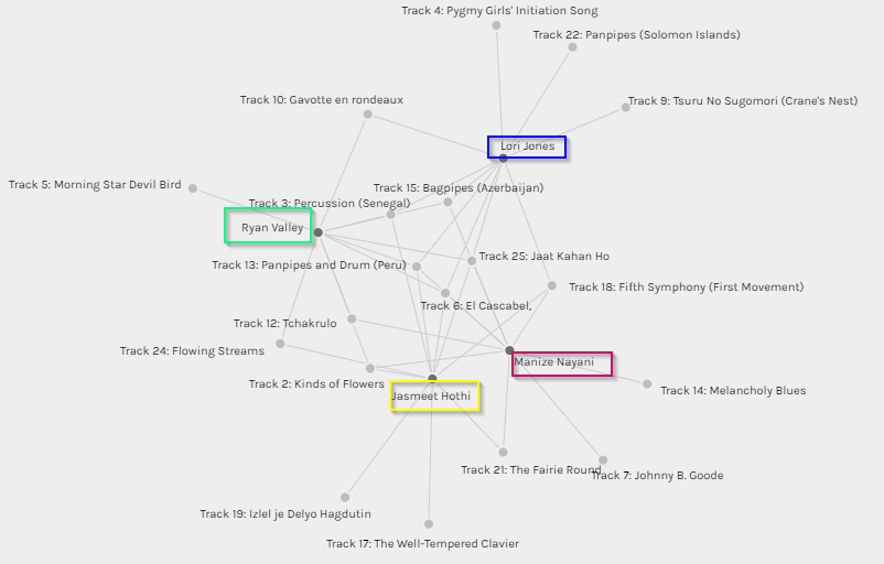
The above graph showcases some of the commonalities I shared with other group members in terms of music selection, namely Jasmeet, Ryan and Lori. In some cases, it is interesting to see how I have more than a few songs in common and in other cases there were some songs selected by my peers which do not feature in my top ten list. This makes me realize that while Palladio is a good tool for tracking data in terms of simple input and output and tracking similarities and grouping individuals based on tracked similarities, I don’t believe it captures the information between the lines. For example, does the graph really tell me that I share a similar musical interest as my peers based on the grouping? Absolutely not, because in all honesty, musical choices are far too wide and varied a subject area to be captured in a single graph. If I were to be completely honest, I had never heard a single one of the 27 tracks listed in the Voyager records, and none of these will ever feature in my iTunes playlist. 🙂 I don’t doubt that the music is excellent, and in some cases other-worldly (pun not intended!), it would just not fall under the kind of music I would normally listen to. In that sense the graph, though accurate can be misinterpreted.
This brings me to a very important point that was covered in Week 8, “As we focus on information bubbles and how algorithms increasingly decide what we consume online, we all-too-often forget that these bubbles and algorithmic decisions are themselves constrained to just that information which is available in the digital realm” (Leetaru, 2017). The music record curation exercise is a classic example of this fact. To begin with, the exercise asked us to select 10 tracks for a given set of 27 tracks, with the emphasis on the fact that these tracks were pre-selected for us. As a result, we had to choose a top 10 from the given set of music. It would be interesting to see how the algorithms run by Palldio would present the data if everyone in the class had an option to present their own personal favourite top 10 tracks and to not be relegated to a confined set. Would we still share similarities? Therefore, the algorithms and subsequent results are constrained in terms of the data input. The information that is captured and digitized is merely a snapshot in the passage of time and does not really account for how data (and people’s taste in music!) evolves over a period. Also, while the tool does a great job of reporting quantitative numbers, there is no way for us to understand the qualitative aspects. For example, are all jazz lovers included in one category? Why did some of us choose a particular track and not the other?
Connecting to personal experiences
Recently, our department decided to move over some of our daily tracking reports to PowerBI, a Microsoft Business Analytics tool. While working with the Data Analyst, I realized that the Excel sheet that I had provided to her contained some very marginal errors, but in the grand scheme of things affected the data quality and output in the final Power BI format. That’s when I learnt an important lesson in data integrity. What you input, affects the output, and very often something as simple as human error can affect the results in terms of data quality. It would be interesting to see how Palldio as a tool tracks the outliers, data overload and failed calculations.
Reference:
Leetaru, K. (2017). In A Digital World, Are We Losing Sight Of Our Undigitized Past? Retrieved June 15, 2019, from Forbes website: https://www.forbes.com/sites/kalevleetaru/2017/09/29/in-a-digital-world-are-we-losing-sight-of-our-undigitized-past/#4ddf07accd0