The User Inyerface exercise has a byline that says “a baggar frustration”. I agree with it wholeheartedly—it was an an exercise in frustration and deception and by the end of it I simply wanted it to be over. User web interfaces can be very deceitful, and these deceits come across in various ways (Brignull, 2010). One only has to take into account the number of steps it takes to discontinue a free channel subscription on Amazon Prime to understand the dark side of UX design and forced continuity.
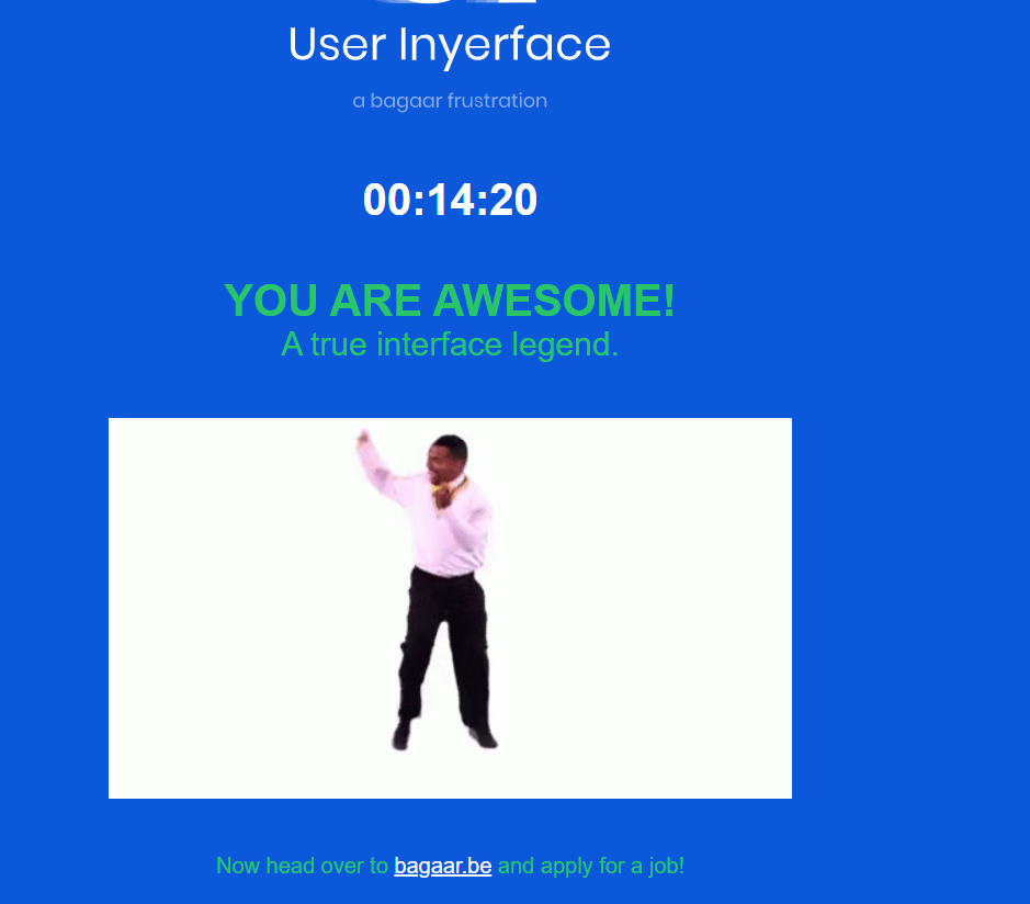
According to the timer in the online game it took me 14 minutes and 20 seconds to complete the entire exercise. During the game, I grabbed a few screenshots as well:
Screenshot#1:
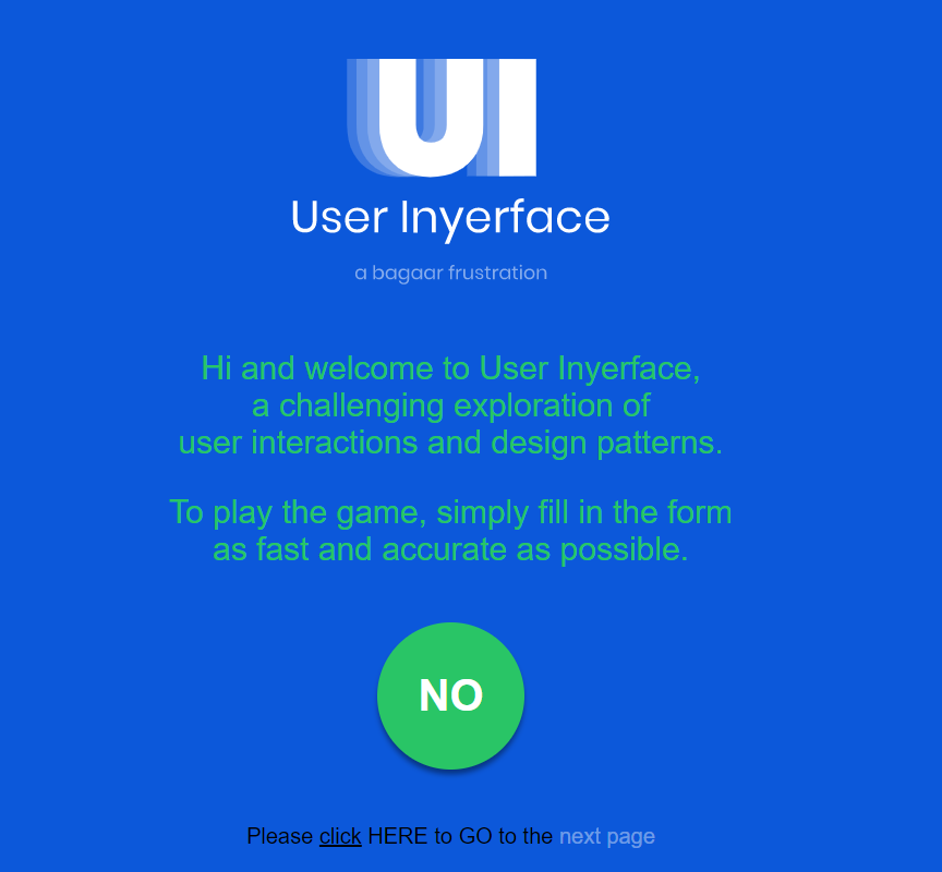
- The first thing that struck me were the instructions in the beginning to complete the form as “fast and accurate as possible”. This made me suspect the intent of the exercise, as being quick and accurate don’t always go hand in hand.
- The timer that threatened to ‘lock’ the screen made me a bit jumpy even though I knew it was just a game. It made me realize the tactics that a lot of web portals use—i.e. they force you to complete a transaction quickly within a given period of time, which does not give buyers the time to reflect before making a purchase. Popular online retailers often have a ticker “Hurry sale ends in 1 hour 55 minutes and 27 seconds” and the ticker is like a timebomb waiting to explode unless one checks out and completes the transaction soon enough.
- The first screen had dubious instructions—for example the green button saying “No” drew attention and almost begged to be clicked. While my first instinct was to click on the green circle, I forced myself to look at the fine print. I initially thought the underlined “click” was hyperlinked, but I was mistaken. I finally clicked “HERE” to begin the game. I really had to read the fine print to proceed, something that can be very easily overlooked.
Screenshot#2
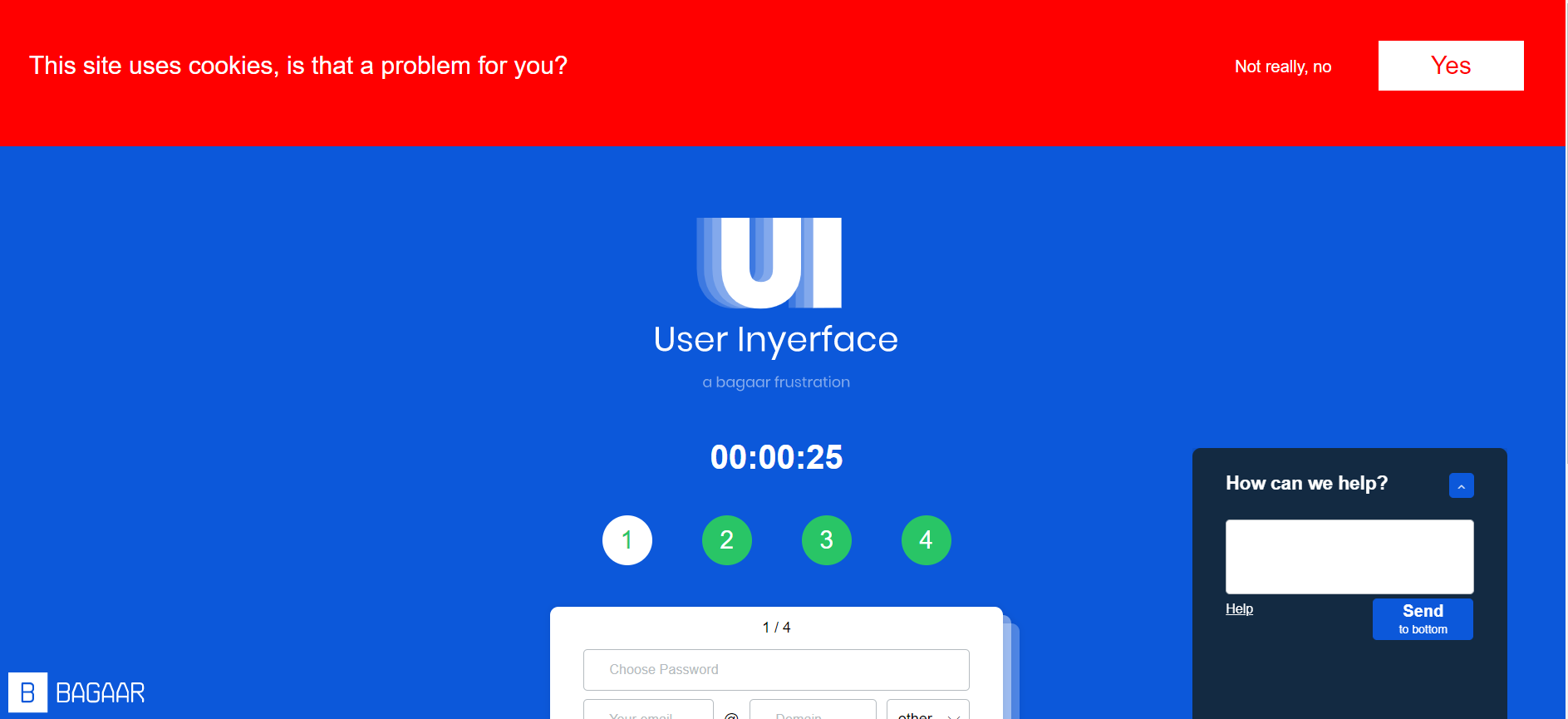
- “This site uses cookies. Is that a problem for you?” Yes, it was a problem. Unfortunately, I clicked yes multiple times, but the message did not disappear. All the while I played the game, the cookies banner stayed on top and blocked my screen. In a real world situation, this banner is very distracting, and I have experienced it in multiple websites, wherein it blocks half your screen and one does not have an option but to simply click “yes” just to get rid of the banner that covers half your page. Perhaps this is another strategy to make something so frustrating that users simply want to get rid of it and will probably click on the “Agree” button without thinking twice.
- The chatbot help box was not hidden and very distracting. Sometimes I found myself clicking on the blue upward arrow, and that covered a good portion of my screen. The “Send to bottom” button was deceptive. The “Send” was in bigger letters and “to bottom” in smaller letters, it made me instinctively think that the button was to type and send the message but in reality, it only removed the chat box from the screen by sending it to the bottom. Also, when I clicked “help” it showed me 455 users waiting. The chat box is a classic example of misdirection— both in text and design.
- While setting the password I noticed the instruction that “your password is now not unsafe”. The use of double negatives is confusing and misleading.
Screenshot#3
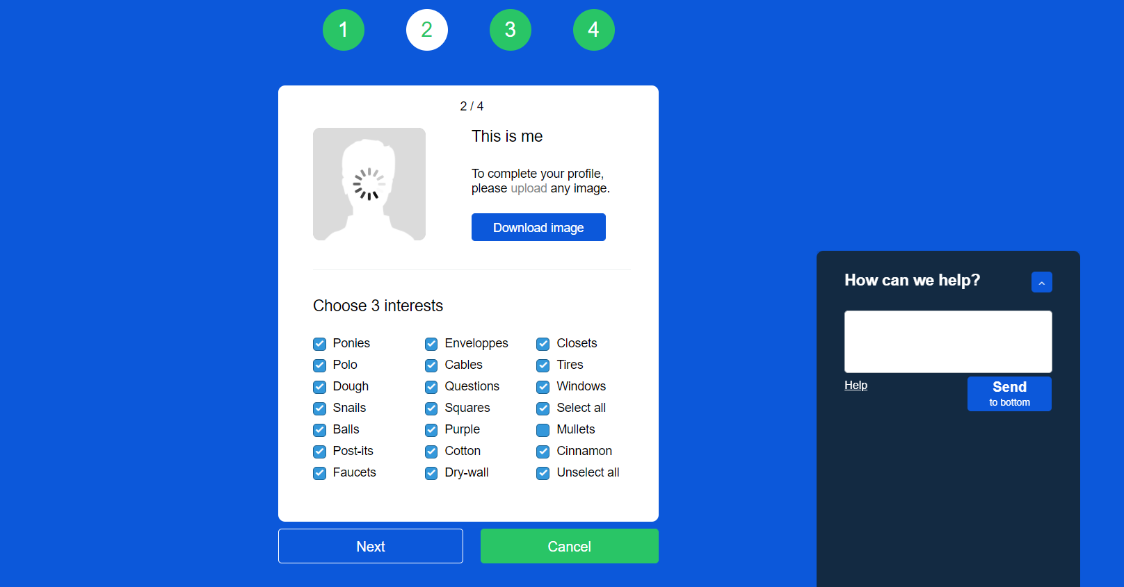
- It took me a while to figure out the “upload”, “download” process. Initially, I clicked on “download image” button which rightfully downloaded the image. There is something about a bright blue button on a design interface that prompts users to click it! It is an example of a bait in the sense that it leads you to do something you don’t want to do.
- The “choosing three interest areas” is a classic example of dark UX that leads users to unknowingly “select all” options, a phrase which is buried under so many other options it is easy to miss. Moreover, it provides users with the illusion of making a choice, when in reality the user has to manually uncheck each box (all checkboxes are checked by default), because the “unselect all” option is buried at the end as well. Just like the A/B test, the design was quite devious as it misdirected users and made them opt in for options they would not have otherwise (Brignull, 2010).
Screenshot #4:
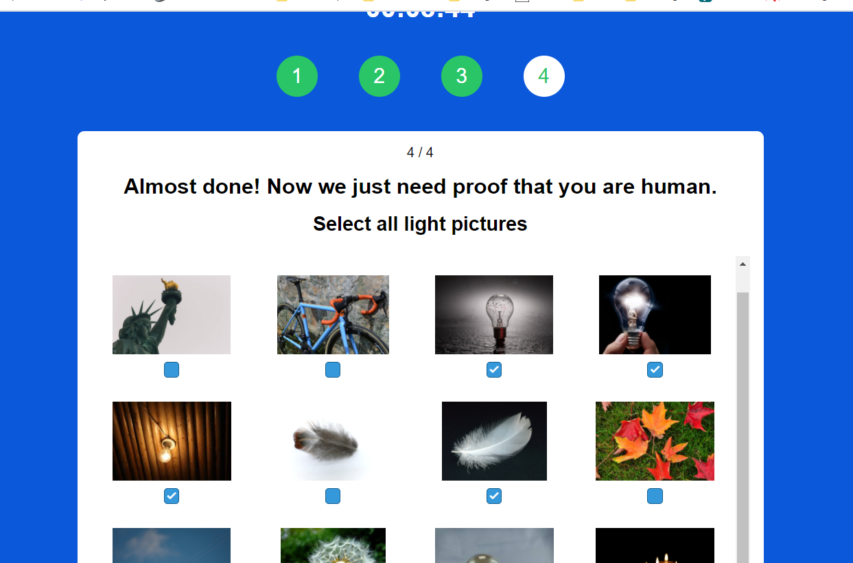
- The last screen was the most frustrating of all! It gave users various options to choose “checks”, “lights”, “bows” and “glasses”—the images provided were misleading because a checkbox could count as a check, and even a bank check could be a check. Same with glasses and spectacles, or bowties and bowing. The instructions including the placement of the checkboxes was unclear. Also, I had to click on the “Validate” button several times to complete the exercise. I clicked repeatedly to exit the screen. In a real world situation, it is a perfect set up to click or accept something unknowingly out of sheer frustration.
Th online game helped me to better understand the dark side of UX design. In her Ted Talk Zeynip Tufekci (2017) talks about how our dystopian reality is not simply limited to annoying ads based on our search history. The fact that it can predict onset of manic behaviour in people with bipolar disorders and take advantage of their condition, or writing algorithms that affect emotions and the way we think—that is indeed dark and scary.

