Final Project – Describing Communication Technologies

For my final project, I’ve created a video describing an ancient writing innovation – the PILCROW.  I chose this because it’s something that my students ask me about all the time.  I was surprised to find what a huge impact it’s had on our writing practices over the past few hundred years!  But I won’t spoil it for you!  Enjoy the video!

And here’s a copy of the script I created with the references that are also at the end of the video:  Final Project

Task 12: Speculative Future

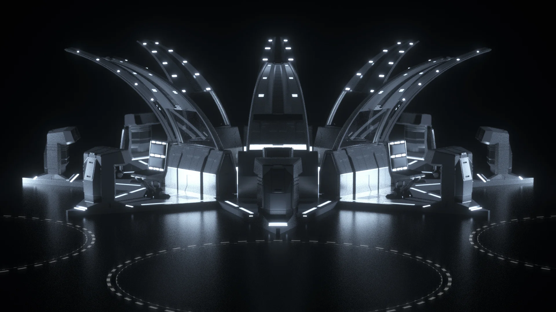
This week, we’re speculating about the future!  We’re entering a world where ‘schools’ as we know it no longer exist!  But instead, every home is equipped with a Personal Education Assistant Pod (PEA Pod).  I’m imagining it looking something like this:

Related image
A hypothetical “PEA Pod” setup. Image retrieved from awesomerocketship.com

The data that big-tech companies have been harvesting about each of us over the following 30 years is actually being put to good use as algorithms are now being created that personalize each student’s educational experience – not only WHAT students like/don’t like to learn….but especially HOW students can best go about learning the kinds of information that will be needed for the 21st century.  Biomechanical sensors could be implanted that send a myriad of information to the PEA Pod computer and it will then tailor the experience based on everything it knows about the student.  Give a listen to what a morning could be like for a fictional student, Nathaniel, as he enters the PEA Pod after breakfast:

As you can hear, this future looks at the collection of data by big-tech companies at a future benefit to human’s education systems.  The PEA Pod leveraged what it could discover about general human learning preferences, as well as Nathaniel’s emotions, past performance, motivation, and even social relationships (maybe he even has a crush on Maria!) to help him become educated in the most effective way that he can be….in this case, dealing with tricky chemistry concepts.

Task 10: Attention Economy

I dunno if this is the end…..but I’m giving up!!!  Totally frustrated!


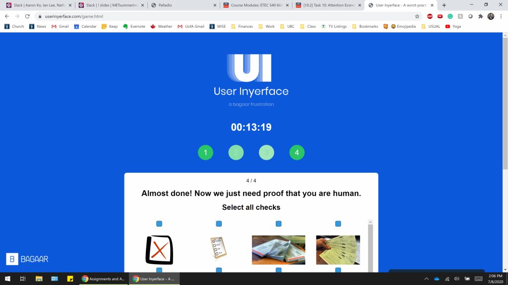
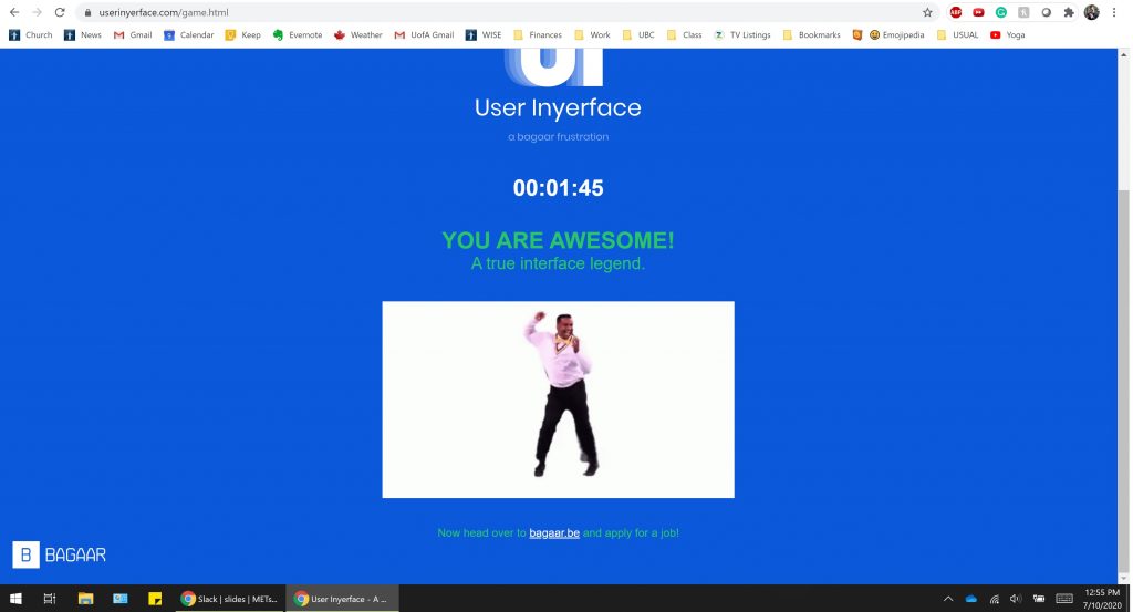
Haha, okay I gave myself a few days to cool down and come back to this.  I read a few classmates blogs – no hints.  Thanks a lot guys!  So I tried again, still trying to thing of all the possible combinations it would be asking for.  Finally….I Googled it.  Duh!  Here’s my screenshot.  As you can see, it didn’t take long.

Task 9: Network Reflections

This was a neat exercise and I found a couple interesting tidbits of data that caught my eye.

One of the first was how much of a “cloud” it created – meaning that there were no selections that were left out completely.  Each track had at least one person choose it.  In fact, 26 of the 27 tracks had more than one person choose it.  There were no tracks from the original record that created consensus about them *not* being on the record.  The closest one to this would be the ‘Men’s House Song’ that was only chosen by one of the curators (as you can see, off on its own on the left):

What is interesting about this, is that (from this data), we cannot tell WHY 26 of us chose to leave this track out.  Could it be because it’s from New Guinea and we didn’t feel that culture was pervasive enough to be included on a ‘worldwide’ record?  Could it be that we felt men’s voices were already very predominantly represented on the record and it was an obvious way to limit more of that because “mens” was in the title?  It’s impossible to know from the data we are given.

Another interesting combination I noticed comes from looking at Group 7….which ended up being a group of only two.  What was interesting about this group is that they chose 7 of the same songs for inclusion out of the 27 – the only differed on 3….closer than any other group.  When I saw this, I did some very basic research (ie. looked at their profile pages on the People page of Canvas….thought about trying FB, but didn’t want to get too creepy!) and made some very rudimentary judging (don’t be mad!) that the two curators may come from a similar demographic background in more than one way.  I wondered if these similar aspects would have contributed to picking such similar choices.   Here is their graph:

Unfortunately, this theory didn’t hold up to well, because another group I found very interesting was Group 4.  This group included three people and their choices were almost as congruous as Group 7.  Interestingly, they matched up on 6.6666 of their choices with each other – very high for a group of three, I thought.  So I did the same ‘research’ on their profile pages and found that my theory did not really hold up because their demographics did not appear to be as similar at first glance.  Their graph is also shown here:

One other thing of interest with this group was that I noticed that the picks they chose were some of the most ‘western’ tracks on the golden record – so I would infer that these are tracks that they related to on a more personal level based on past experience.

What I’m learning from this experience is that it is VERY difficult to capture the reasoning behind choices with this kind of data gathering.  I think in order to even come close to being able to make any statements about the ‘null’ choices that someone makes, there would need to be a LOT of other data collected about that person and their other previous choices.  But even doing that would not bring you to a 100% definitive answer.

This exercise is really showing me just how the information that large tech companies (ie. Google, Facebook, Microsoft, etc) is being used to create snapshots of who we are as people.  And it’s REALLY helping me to see WHY they are so driven to collect as much data as they possibly can –> because that is the only way they can start to make real inferences about who we are and what our choices/preferences would be in and situation.

Task 8: Golden Record Curation

Wow, so many varied and interesting pieces!  It was a challenge, but here are my top 10 (in no particular order):

  • China, ch’in, “Flowing Streams,” performed by Kuan P’ing-hu. 7:37
  • Peru, panpipes and drum, collected by Casa de la Cultura, Lima. 0:52
  • India, raga, “Jaat Kahan Ho,” sung by Surshri Kesar Bai Kerkar. 3:30
  • “Johnny B. Goode,” written and performed by Chuck Berry. 2:38
  • Georgian S.S.R., chorus, “Tchakrulo,” collected by Radio Moscow. 2:18 –
  • Mexico, “El Cascabel,” performed by Lorenzo Barcelata and the Mariachi México. 3:14
  • Bach, Brandenburg Concerto No. 2 in F. First Movement, Munich Bach Orchestra, Karl Richter, conductor. 4:40
  • Beethoven, Fifth Symphony, First Movement, the Philharmonia Orchestra, Otto Klemperer, conductor. 7:20
  • Navajo Indians, Night Chant, recorded by Willard Rhodes. 0:57
  • Japan, shakuhachi, “Tsuru No Sugomori” (“Crane’s Nest,”) performed by Goro Yamaguchi. 4:51

My main concern for inclusion was to create as representative of a sample of the population of earth as possible.  It seemed like that was only fair given that the intent behind the record is to introduce possible alien life to the entire planet as a whole.  China and India, as the two most populous nations, were shoo-ins for inclusion.  And as they each only had one track for consideration, those were my immediate first picks.  The rest of my choices were an attempt to ‘spread out’ the representation over as much of the population as possible, so I attempted to choose tracks that achieved this.  If some tracks represented similar cultures (ie. the two Peruvian tracks, or the Georgian/Azerbaijanina tracks), I opted for the track which had a more complex set of tones and sounds in an attempt to reach a broader alien audience.  I did opt to keep two of the Beethoven/Bach tracks which shows my own Western bias because they both to me are sort of ‘iconic’ of my own culture and have impacted it so greatly…..but the more I think about it, the more I think that would matter very little to any aliens who encounter it!  C’est la vie – I’ve already submitted my data via the Canvas quiz.  But if pressed now….I’d probably change out the Bach one for “Kinds of Flowers”.

Links to Course Colleagues

The following are some of the most interesting/relevant posts from some of my colleagues in the ETEC 540 course.  I’ve included a summary and reflection about each.  I hope you are as intrigued as I was!

“The Fishing Trip That Wasn’t” (by Andrew Shedden)

Summary

This is for the voice-dictation assignment where Andrew tells a story about a fishing trip that he went on – but with a plot twist in the end!  It’s worth the read for entertainment value alone!  He uses Google Docs’ Text-to-Speech function to create the story text and then includes some reflective thoughts on both the process and the results.

Reflection

I wanted to highlight and link to Andrew’s story because we both used the same authoring tool so I wanted to connect with a different attempt with the same technology.  It was interesting to me to note how the technology handled the differences in our speech.  My text has so many non-spaces when there should be every time I paused….yet Andrew has almost none.  This implies that he must think quicker than I do when telling an oral story….and that Google doesn’t have the patience to wait for slow thinkers.

Andrew’s also differed from mine in that he chose to speak the word “period” at the end of every sentence which I opted not to do – to get the full, oral, text-to-speech experience.  But I wanted to show this because his models how with just a small adaptation to the way we speak, the technology can make our story seem much more “normal” when compared with the way we are generally used to reading stories in print.

I also want to point out the similarity that happens in both of our stories with the ‘tone’ that using text-to-speech produces.  Both of our attempts produced very benign sounding stories – even though, in actual fact, there would have been a lot of high emotion involved.  But using the technology in this way stripped our stories of much of their emotion.

For comparison, you can access my similar task here.

Potato Printing” (by Tanya Weder)

Summary

In this link, Tanya has done a masterful job of printing the word TEACH using potato stamps.  She includes many pictures of her process, as well as some of her own thoughts and reflections that went into how and why she printed the word TEACH and why she chose to print it in the way she did.  Tanya also includes some descriptions of the challenges that she faced, how she overcame them, and her own reflections on the mechanization of printing that has happened over the centuries – well worth a look!

Reflection

I want to link to Tanya’s site for this task for two reasons:  1) to highlight her finished product as the best potato stamp work I’ve ever seen, and 2) to contrast her web architecture with my own.

  1. Tanya really went above and beyond in her potato stamp project and I think she (possibly more than any of us) really experienced what it would have been like for the early printers.  Her project was truly a labor of love and it shows in the final result.  I thought it very interesting to read about the thought she put into the font of her potato project.  It made me start to think about what the early printers may have been trying to convey in their own font choices.  As we learned earlier, there was a desire to make the printed word still look like the scribal script from earlier days.  So I wonder how much thought, time, and effort must have been put into the artistic creation of each letter.  Tanya’s project shows me just how must it must have been!
  2. I was also intrigued to see that Tanya has chosen a different web-authoring tool than the WordPress that most of us are using.  Her Weebly site does seem to offer a much more clean, modern look than many of our sites have.  Most of our sites (as amazing as they are – don’t be offended!) look like they were written around 2010.  Logging in and viewing Tanya’s site feels like a breath of fresh air bringing me back to the present.  This has caused me to reflect on just how fast this change has happened.  I’m actually considering a final project now based on researching how different font types have become *trendy* over the years (ie. forever, it was Times New Roman) and what has led to shifts in the trends in font type.  We’ll see!  But it’s food for thought for everyone.  It also helps that Tanya’s post is full of rich, color images which also helps cue up my eye’s interest.

If you haven’t seen it yet, I recommend checking out her project.  For comparison, you can compare my attempts at both completing and documenting my project here to see what I mean about her artistry and web-design.

Emoji Story” (by Tyler Senini)

Summary

Tyler writes out the plot for Little Fires Everywhere using only emojis as per the assignment instructions.  He then gives a brief description of his process for determining how to go about creating both the title and then the plot outline for the show. A few of our colleagues were able to guess the show by figuring out what the title was and were able to follow the plotline he created.

Reflection

I wanted to link to Tyler’s post because it was one that left me feeling utterly and completely lost.  I maybe would have guessed “Small Flames World” as the title, but that’s about as close as I would have come.  I had never heard of Little Fires Everywhere before.

I thought it was interesting to read the comments of those who did know the show and were familiar with the plot.  I was especially intrigued by those who commented that they liked how Tyler used “ideas” rather than actual words or syllables to represent the plot.  This made me realize something about the visual representation of text – the viewer MUST have some common background information in order for meaning-making to happen.  If not, the way they interpret the symbols or images could vary dramatically from what the author intended.  This can lead to drastic consequences (like in this recent news story from Australia where the text of emergency alerts was the same, but the symbols and colors were different …. and were thus interpreted by users in differing ways, causing confusion).  This just goes to show that even though we may be heading back to a resurgence of audio/visual storytelling….that sometimes having some form of explicit text that can only have one meaning is an advantage.


Golden Record Curation” (by Rebecca Hydamacka)

Summary

On this page, Rebecca overviews some of the thought processes that she was required to go through in order to narrow the selection of songs to be included on NASA’s Golden Record from 27 down to 10.  She ponders on what criteria she should be using for such selection as well as her personal motivations.  And she speculates on a few songs that didn’t even make the list of 27 that perhaps should have.  Her post concludes with her ten finalists and a small description of her rationale for choosing it.

Reflection

Of all the posts about this assignment that I read, I’m choosing to link Rebecca’s because of her gift in capturing the emotions that we all (I think) went through in trying to complete this assignment.  I think we all started with a little bit of shock – really…narrow all the earth’s music down into 10 songs!?  I felt the truth of her third sentence myself, “It seems impossible to implode all of humanity into 10 songs.”

I think we all then started to do what Rebecca does.  That is….wonder why other songs, that we know and think are important, weren’t on the record?  Many others mentioned the absence of the Beatles … which really have been a huge musical influence in the West.  But on a global scale for all time – I think I’m realizing that they might have a smaller influence than we tend to give them credit for.

Rebecca’s process was similar to mine (and many others) in that it was easier to start by excluding rather than including. And this worked fine at first…but then we all started to feel some angst about what we were now ‘leaving out’ – be it culture or location.  Her thoughts on this resonated with my own experience.  She made an interesting comment early on, on which Jamie also comments – that maybe it would just be fairer to make this selection by lottery.  And looking at the results from our class, I am beginning to think that we might have got similar results by following this method!  It made me start to think about collecting large amounts of data and how when the data you are collecting is based on subjective responses, I wonder how often it would just come back as if it had been collected through random assignment!

In the end, I was most impressed by Rebecca’s structure, professional and organized way she makes her case for each of the ten finalists.  Instead of just basing it on the representing of cultures and locations (which I think most of us did), she also had a very thorough mix of different types of tones and sounds – which is, in reality, probably what would make it most interesting to alien life someday.  They would care very little about what place of dirt each of the songs was recorded from.

Network Assignment” (by Sasha Passaglia)

Summary

This post is Sasha’s analysis of the Golden Record Curation assignment where we all chose the 10 songs we think were most appropriate to send into space.  Sasha first shows all the data and then was able to manipulate the data into different groups than the ones we received and found some very interesting results based on gender which she details.

Reflection

I found Sasha’s analysis of the data collected from our class to be most interesting…and she has included it on a very clean, inviting blog space that I found visually appealing.  The architecture of her blog space is quite basic – but it doesn’t seem boring/basic – it seems intentionally clean/basic.  It gives it a modern feel that seemed to really work for me.  I find that it really eliminates any distractions and helps me to focus on her writing.

But I REALLY want to talk about what Sasha found in her analysis of the data we collected!  She really seemed to go over and above in figuring out how the Palladio program could manipulate data and the results are fascinating!  She was able to use it to break the data down into two genders (male and female) and then compare and see how their choices differed.  It was so interesting that there were 3 songs that all 5 of the males chose, while there was not a single song that all 17 of the females chose.  Sasha gives some rationale for why the 5 males may have chosen so similarly – some of which seems logical given what we know about the male psyche.

Her ‘food for thought’ near the end of her posts does truly shine some light on an issue with the recordings that I had not even noticed!  That 23 of the 27 were either sung or recorded by males!  This really does speak to the time that the record was being created in…and to represent.  Male thought was truly dominating.

So I really thought that Sasha’s blog post had 2 things going for it – very original and thought-provoking ideas.  And a simple, clean structure that highlights the ideas and data, rather than distracts from it.


Algorithms of Predictive Text” (by Brian Leavitt)

Summary

Brian includes 4 different versions of algorithmic-generated text endings to the phrase, “As a society, we are….”.  He used Twitter on an iPhone to generate these sentences.  He then goes on to give a very thorough analysis of his thoughts on why the sentences were created in the way that they were.  He compared the sentences to his own ‘voice’ and situations in his own life to see if there is any correlation and then discusses a few questions about culture and algorithms that this brought up for him.

Reflection

As this was one of the ‘optional’ tasks that I chose to not complete for this course, I was interested to see what others discovered through their completion of the assignment.  Brian’s stood out to me initially due to his thoughts on what he thought the predictive text was saying about our society as a whole.

When I did the readings and thought about the idea of predictive text, for some reason, it didn’t really click that this is a ‘group’ exercise (the collection of typing data).  I think I’ve always viewed my Google keyboard as storing data about ME and what I tend to type and thus predicting what will be next (which I’m sure it does to some degree).  But I hadn’t thought much about it using aggregate data about what EVERYONE has been typing about lately.  Brian hypothesizes that much of the sentences that this assignment created for him are based on major world events that are happening currently (COVID-19, Black Lives Matter, Me Too, etc) – even though he said that he doesn’t really use Twitter or post much about such things.  This was an interesting thought for me.  And it made me think about the possible subtle ‘nudging’ that our phones may be doing as we are writing out our thoughts to others as it may be suggesting words that we might not have used if we weren’t prompted.  But it is subtly ‘nudging’ us to be using the more ‘preferred’ kinds of language without us even knowing.  Like it’s letting us *think* we have free speech, but really it’s subconsciously controlling the way we write our thoughts!  Wow!  These were new thoughts that I was having as I read over Brian’s post about the 4 sentences he created.

As far as Brian’s blog architecture goes, I read a lot of blogs and I’ve found his to be a little challenging to get through … especially this post at times.  It has a very clean, predictable setup….nothing super visually appealing.  The font was very small and I found myself squinting at my computer quite hard and started to feel some eye strain as I tried to follow along.  This tiny text was exacerbated by a few (one especially) very long paragraphs with multiple ideas in them.  I found myself feeling fatigued in this one paragraph and had to take a break and try to come back and read it again to make sure I was getting it all.  There were some good ideas and some really important questions that he poses, but it could have been structured in a way that made those ideas and questions really pop out – rather than buried in a giant mass of tiny text.

I could see that having a design like this might scare away more casual readers or those who have any sort of difficulty with vision or reading ability.
Task 7: Mode-Bending My Life

For this week’s task to “think about the original purpose of [task 1] and redesign it”, I first pondered what the original purpose of task really was.  I feel that it was meant to help our student colleagues get an ‘inside’ look at our lives.

Based on the NLG model, I decided to use music and sound effects to try and give my colleagues an inside look at what my life is really like.  Take a listen and catch a glimpse!


Task 6: An Emoji Story

Reflection:

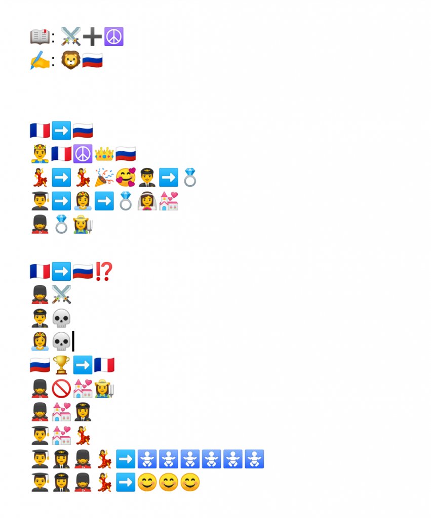
Wow, this (again) turned out to be more challenging than I anticipated that it would.  After completing the readings this week, I really felt like it would be easier than it was to complete this assignment using just images.  But I ran into a few complications.

The first issue came with the platform.  At first, I just started using the UBC blog editor as my platform and I was pulling all the emojis from emojipedia.org But I found that many of the emojis were not supported by the blog platform and they were all just ending up as “????”.  So I ended up switching to my phone and typed using my GBoard keyboard into Google Docs where I then took a screenshot to post above.

The second challenge I encountered was the massive scope of the work I recently finished.  Coming in at over 1200 pages (there’s a hint for you!), it was extremely difficult to decide what parts of the plot were most important to include and which to pare away.  Plus, the work includes so much other philosophical text that isn’t directly related to the plot that I ended up just having to cut that all out.  Most of the plot is simply describing the movements and lives of various people, but I found that the emojis available didn’t have specific enough ‘different’ people to really capture all the wide range of characters (especially those who would most likely be depicted very similarly) in the book.  So, in the end, I had to just choose one specific family and try to convey their experiences throughout the plot of the book.

My thought process was a very literal one….at least I wanted it to be.  I would just look for emojis that represented bascially each word that I wanted.  Syllables didn’t seem like an option that would work and I found that trying to capture very big ideas with an emoji was really tricky.  So I mostly stuck with trying to find an emoji for each word.  But then that became a challenge when the word I needed didn’t have a specific emoji.  I found that I ended up using an arrow emoji to try and represent all sorts of different movements and actions!

I think this activity has helped me to see that while *much* can be told with a single image, that it also can leave much out and leaves much to the interpretation of the reader/viewer.  So much of the interpretation of ‘image-based’ media will be dependent on what prior knowledge and background is and has been.

Task 4: A Potato Paragon

Cut some stamps out of potatoes and stamp the same word twice – try to make it look similar.  How hard could this be!?  Turns out….not easy at all.  And now I have a vastly increased amount of respect for Gutenberg and other founders of mechanized printing!

I actually scoffed a little when I saw this assignment.  “How silly for a Masters program, ” I thought.  But I’ve changed my tune!  Especially when I imagine that the early pioneers were doing this type of work in TINY increments in METAL.  I think this activity perfectly drove the point home.  This was NOT easy – it took time, effort, and I’m sure thousands of trial and error.  So much of what they did would have impacted how we write today.  More on that later.

I tried to make this activity as easy as possible on myself so I chose a word with as little ‘inner’ parts that I would need to carve out (like O, Q, A, P, R etc).  Turns out that it isn’t that easy to come up with 5-letter words like that!  Eventually, I chose “THING”.  This helped much of the carving process to be as basic as possible.  But even with this minimal effort, the G was rather tricky to hollow out without messing up.  That being said, the actual carving part took me less time than I expected it would after watching the sample video.  Probably 20-25 minutes of total carving time.  I was actually quite pleased with how well my carvings turned out – if you can over look the fact that none of them are the same height – which would be critical for efficient codex printing.  I guess I was mostly happy that they actually looked like the letters I was hoping for!

So the carving process was simple, albeit time consuming to just print 5 letters.  The actual printing of the letters and attempting to make them similar was much more of a challenge.  For efficiency’s sake, I decided to do each letter twice back-to-back and I learned as I went.  Here’s a photo of the results:

T – when I placed it down with paint, it immediately smudged sideways to the right.  It left a large gap in the lower portion, but I assumed that my stamp just wasn’t cut flat enough.  I over-corrected when placing the second T so it ended up smudging to the left.  This second T also had a large gap…..but I again chalked it up to a faulty stamp.

H – this is when I realized that user error was causing the gaps.  The first H also had large gaps and I realized that there is a reason for the device being called the printing PRESS – because you actually need to press!  I was just setting the stamp down gently in hopes that it wouldn’t make a mess.  So the second H is when I first pressed – and it made a much fuller letter!

I – the I is when I learned that you can’t put too much paint on the stamp.  I slathered it on and it ended up soggying the paper – hence the need for the special roller to apply the ink in the video shown in our module.  The I was also when I realized that I hadn’t paid much attention to the differing sizes of the letters.  I sort of just assumed that since I was using the same potato that the sizes would be similar…..not so!  One needs to pay close attention to the size when carving individual letters by hand.

N – and here’s when I realized that I have no future in potato stamp crafting.  Turns out that T, H, and I are all symmetrical letters…..so I thought I was doing great and hadn’t given a second thought to one important detail.  When you make movable type, the letters have to be backwards!  Seems like that should have been one of the first things I thought about….but it didn’t even cross my mind until I pressed that first N.  Oops!  On the bright side, the N is when I peaked with my consistency between the two versions of the letters. I had the paint amounts and pressing just right for once.

G – at this point, I knew my G was backward …. but it was the hardest letter to carve, so I went with it….in all its Glory. Here, I was back to too much paint though and it shows in the sogginess and blotting around the edge of the letter.

So how would this affected our writing today?  It must have….though I haven’t researched any specific examples.  But through the whole activity, I was asking myself, “How can I make this easier?”, “How can I make this more efficient?”, and “How can I produce similar, repeatable results?”  I am amazed that Gutenberg initially took the time to try and forge his letters so that they somewhat represented handwritten script!  But I can see someone else later asking the same questions I was.  And this I’m assuming led to the more ‘blocky’ printing that we have today where flourishes are eliminated and the letters are very basic and generally just occupy their own space alone.  As someone who still writes regularly in cursive writing, I find this ‘blocky’ printing to be very cumbersome when I am forced to hand-write a significant amount.  And even our modern computer typefaces often keep all the extraneous flourishes to a minimum – producing a very stoic, cool, economical look to much of our printed text.

I am in awe of the work that went into the mechanization of writing after this activity.  The figure given in this weeks podcast (that in the first 50 years of movable type 12,000,000 books were printed) is even more absolutely mind-boggling to me.  The HOURS and HOURS of laborious work behind the scenes that that number represents is staggering to my mind.

Just for fun, here’s a photo of my (non-reversed!) potato stamps:

Task 3: A (Crazy) Birth Story

Here is the direct text as recorded using voice-to-text software:

………………………………………………………………………………………………………………………………………………….

when my wife had our fourth child a few years ago it was one of the craziest experiences of Our Lives her water broke in the morning and we Call the Midwifeshe said that we should waitand just see how things progressed so we just kind of took it easy for the rest of the dayand didn’t do a whole lotwe mostly hung around homenothing really happened for the better part of the dayand so we kept going about our routines I went out with my kids to deliver the flyers for their flyer route that we usually doeventually Cheryl started to get agot feeling that something wasn’t rightso she called the Midwife again and the Midwife came over to check and see how things were goingturns out that there was of cord prolapse which means that the umbilical cord was coming out first and that is a very dangerous situation because the baby can start to come and push on the cord and cut off the blood supplyso this is a very emergency situationand the Midwife called nine-one-one immediatelyI was out with the kids stilland so my sister-in-law came and got meimmediatelywhen I got home the Midwife was there with my wife and they were waiting for the ambulance to arrivebut before the ambulance came a fire truck came and saw a bunch of firefighters came in andtrying to assess the situation but my Midwife just said we were waiting for the ambulance once the ambulance arrivedthey went down the stairsand had to jump in the ambulance in front of all of our neighbourswho were looking onthe ambulance took off and went to the hospital so I left our kids with my sister-in-law and took our vehicleand went after it we went flying down the roadand I even blew past a police officer who was waving me overto give me a ticket because I was speeding but he didn’t chase me because he must have known I was following the ambulance that had just gone byonce I got to the hospitalI had to go wait in a waiting room because they had rushed my wife in for an emergency C-sectionand it was all a very surreal feeling while I just sat there and waitedeventually they came out and told me that everything was okay and the baby was fine and my wife was fine we found out later thatit only took 28 seconds to get the baby out from the time that the anesthetic was administeredthe last thing that my wife remembers before falling asleep was hearing someone say are you ready with the knifeit was just a crazy situation but in the end it all turned out okay and everyone is fine and healthy

……………………………………………………………………………………………………………………………………………………

Analysis

I used Google Docs on my Chromebook to record this oral version of the story of my daughter’s birth.  I used the ‘dictation’ feature on the Chromebook to complete this exercise.   One of the main ways this text is deviant from written English is its lack of punctuation.  It is possible using the tech that I used to add punctuation orally – but this would not be how I would “tell” the story orally.  So there is a complete void when it comes to punctuation.  Along with this lack of punctuation, there is also a lack of proper capitalization when it comes to the first word in each sentence.  This lack of punctuation and capitalization leads to a totally incorrect sentence structure which makes it challenging for a literate reader to follow the flow of the story.

I was impressed with the dictation software to get most of the words I spoke down correctly.  There are a few incorrect words, but I would estimate that it got over 95% of the actual words correct.  At times while I was speaking it would initially insert one word, but then as I continued to speak it would realize that it had incorrectly ‘heard’ me based on the context of what else I said and it would make corrections on its own.  Very impressive!

The most prevalent mistake besides the punctuation and capitalization is the spacing of the words.  The dictation software had a very quick ‘timeout’ so if there were any pauses in my thought process while I was speaking – it would cut out and I would have to re-press the record button.  But it would not add any spaces in between the previous word and the new thought so the reader is left with a lot of words mashed together to decipher.  I consider this to be a ‘mistake’ because 1) the conventions of our written English say so, and 2) because it makes it more difficult (and thus more time-consuming) for our brain to process the information because often one must pause to ensure that they are dividing up the combined words properly.

The few other minor mistakes were made which I would group into two categories: 1) improper spelling of a few words or random capitalization of words, and 2) occasionally the wrong word was inserted (rarely) because the word that was used sounds very similar to the word that I actually spoke.  This second grouping would be considered a mistake for obvious reasons (it’s not the proper word!) but the first grouping could only really be considered ‘mistakes’ of convention, not in meaning.  Because it’s still very obvious in these cases what I was trying to get across in the story.

I think if I had scripted the story that it actually would have ended up much longer.  After I ‘told’ the story, I remembered many other small details that I could have included….which could have helped to create a more ‘complete’ picture in the minds of readers of how the events of the story actually transpired.  I think I also would have told a couple things in a different order in order to improve the flow of the story somewhat.  I also think that if I would have created a script that I would have ended up pausing much less and the dictation software would not have been able to kick out so many times and this would have reduced the number of missing spaces that occur in the story.

I think the biggest differences I’m noticing between oral and written storytelling is the emotion that is lost in the story when it’s written (especially in this manner).  If I was to tell this story orally, in person – I would use so many changes in tone and manner to convey the gravity of the situation, and the speed at which things were happening.  But all that is lost in a text version such as this.  As one reads this version of events, it almost sounds robotic and callous in the way it is presented at times.  This really helps me to see and understand the need for the invention of punctuation (and more modernly, emojis)!  It’s fascinating to me that we literate beings have crafted so many ways to try and capture emotion in the written form and now I really see how that would have come to be a thing as those 106 cultures (Ong, 2002, p.7) developing a written language eventually began to create literature.  So interesting!

References

Ong, Walter, J. Taylor & Francis eBooks – CRKN, & CRKN MiL Collection. (2002). Orality and literacy: The technologizing of the word. New York; London: Routledge.


Spam prevention powered by Akismet