Cut some stamps out of potatoes and stamp the same word twice – try to make it look similar. How hard could this be!? Turns out….not easy at all. And now I have a vastly increased amount of respect for Gutenberg and other founders of mechanized printing!
I actually scoffed a little when I saw this assignment. “How silly for a Masters program, ” I thought. But I’ve changed my tune! Especially when I imagine that the early pioneers were doing this type of work in TINY increments in METAL. I think this activity perfectly drove the point home. This was NOT easy – it took time, effort, and I’m sure thousands of trial and error. So much of what they did would have impacted how we write today. More on that later.
I tried to make this activity as easy as possible on myself so I chose a word with as little ‘inner’ parts that I would need to carve out (like O, Q, A, P, R etc). Turns out that it isn’t that easy to come up with 5-letter words like that! Eventually, I chose “THING”. This helped much of the carving process to be as basic as possible. But even with this minimal effort, the G was rather tricky to hollow out without messing up. That being said, the actual carving part took me less time than I expected it would after watching the sample video. Probably 20-25 minutes of total carving time. I was actually quite pleased with how well my carvings turned out – if you can over look the fact that none of them are the same height – which would be critical for efficient codex printing. I guess I was mostly happy that they actually looked like the letters I was hoping for!
So the carving process was simple, albeit time consuming to just print 5 letters. The actual printing of the letters and attempting to make them similar was much more of a challenge. For efficiency’s sake, I decided to do each letter twice back-to-back and I learned as I went. Here’s a photo of the results:

T – when I placed it down with paint, it immediately smudged sideways to the right. It left a large gap in the lower portion, but I assumed that my stamp just wasn’t cut flat enough. I over-corrected when placing the second T so it ended up smudging to the left. This second T also had a large gap…..but I again chalked it up to a faulty stamp.
H – this is when I realized that user error was causing the gaps. The first H also had large gaps and I realized that there is a reason for the device being called the printing PRESS – because you actually need to press! I was just setting the stamp down gently in hopes that it wouldn’t make a mess. So the second H is when I first pressed – and it made a much fuller letter!
I – the I is when I learned that you can’t put too much paint on the stamp. I slathered it on and it ended up soggying the paper – hence the need for the special roller to apply the ink in the video shown in our module. The I was also when I realized that I hadn’t paid much attention to the differing sizes of the letters. I sort of just assumed that since I was using the same potato that the sizes would be similar…..not so! One needs to pay close attention to the size when carving individual letters by hand.
N – and here’s when I realized that I have no future in potato stamp crafting. Turns out that T, H, and I are all symmetrical letters…..so I thought I was doing great and hadn’t given a second thought to one important detail. When you make movable type, the letters have to be backwards! Seems like that should have been one of the first things I thought about….but it didn’t even cross my mind until I pressed that first N. Oops! On the bright side, the N is when I peaked with my consistency between the two versions of the letters. I had the paint amounts and pressing just right for once.
G – at this point, I knew my G was backward …. but it was the hardest letter to carve, so I went with it….in all its Glory. Here, I was back to too much paint though and it shows in the sogginess and blotting around the edge of the letter.
So how would this affected our writing today? It must have….though I haven’t researched any specific examples. But through the whole activity, I was asking myself, “How can I make this easier?”, “How can I make this more efficient?”, and “How can I produce similar, repeatable results?” I am amazed that Gutenberg initially took the time to try and forge his letters so that they somewhat represented handwritten script! But I can see someone else later asking the same questions I was. And this I’m assuming led to the more ‘blocky’ printing that we have today where flourishes are eliminated and the letters are very basic and generally just occupy their own space alone. As someone who still writes regularly in cursive writing, I find this ‘blocky’ printing to be very cumbersome when I am forced to hand-write a significant amount. And even our modern computer typefaces often keep all the extraneous flourishes to a minimum – producing a very stoic, cool, economical look to much of our printed text.
I am in awe of the work that went into the mechanization of writing after this activity. The figure given in this weeks podcast (that in the first 50 years of movable type 12,000,000 books were printed) is even more absolutely mind-boggling to me. The HOURS and HOURS of laborious work behind the scenes that that number represents is staggering to my mind.
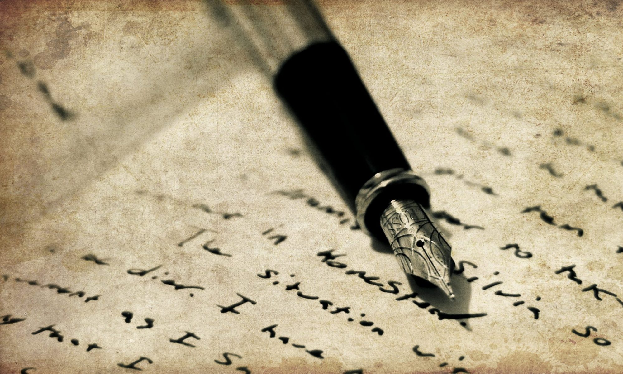
Just for fun, here’s a photo of my (non-reversed!) potato stamps:
