This task was so frustrating to do! The website pages were so poorly designed, buttons to click didn’t make sense and pop ups were driving me insane. It took me several attempts to get past the simple first page of filling out my information, encountering annoying functionalities such as having to erase the fields to type my email – where typically sites it auto erasing when you click your mouse on that field. I was trying to move quickly to avoid that “Lock/Unlock” pop up, that again took me several minutes to realize how to close it without re-starting the game over and over and trying to race the pop up. I thought to close it out was the “x” in the top right hand corner but that just made it larger, got increasingly frustrated till i realized bottom left hand corner it said “close 2021” that i assumed was a copy write symbol. While getting frustrated through these screens i found myself getting distracted easily by the help pop up in the bottom right corner that kept getting in the way and the blinking 1234 green circles at the top – this site was mayhem and a mess. This task SHOULD have taken me 60 seconds, instead took me several minutes and several attempts.
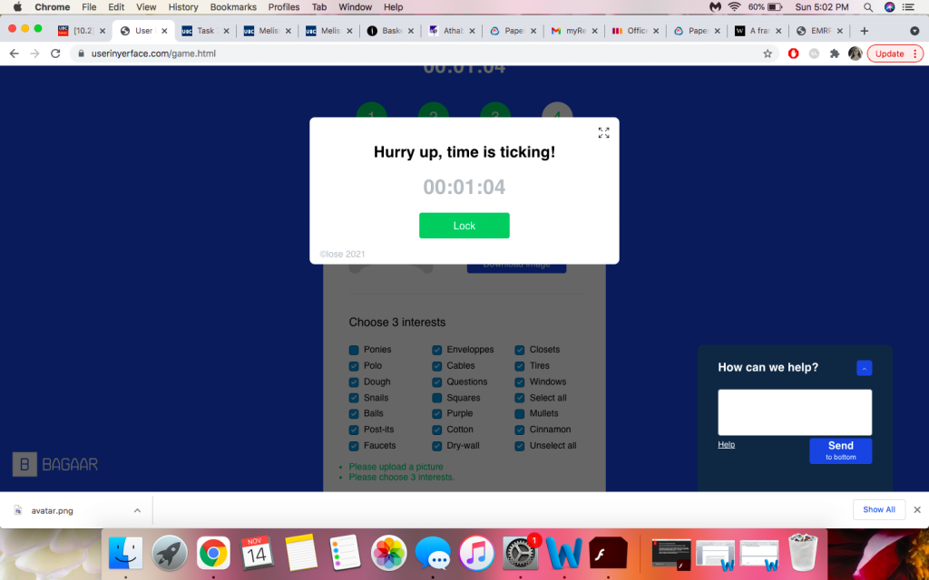
The addition of the timing clock pop up added an annoying layer of stress because i thought to myself “you’ve finally made it passed the first screen but now its going to time out and close out for sure and lose progress”, so i found myself rushing and not reading instructions properly just trying to race through as efficiently as i could.
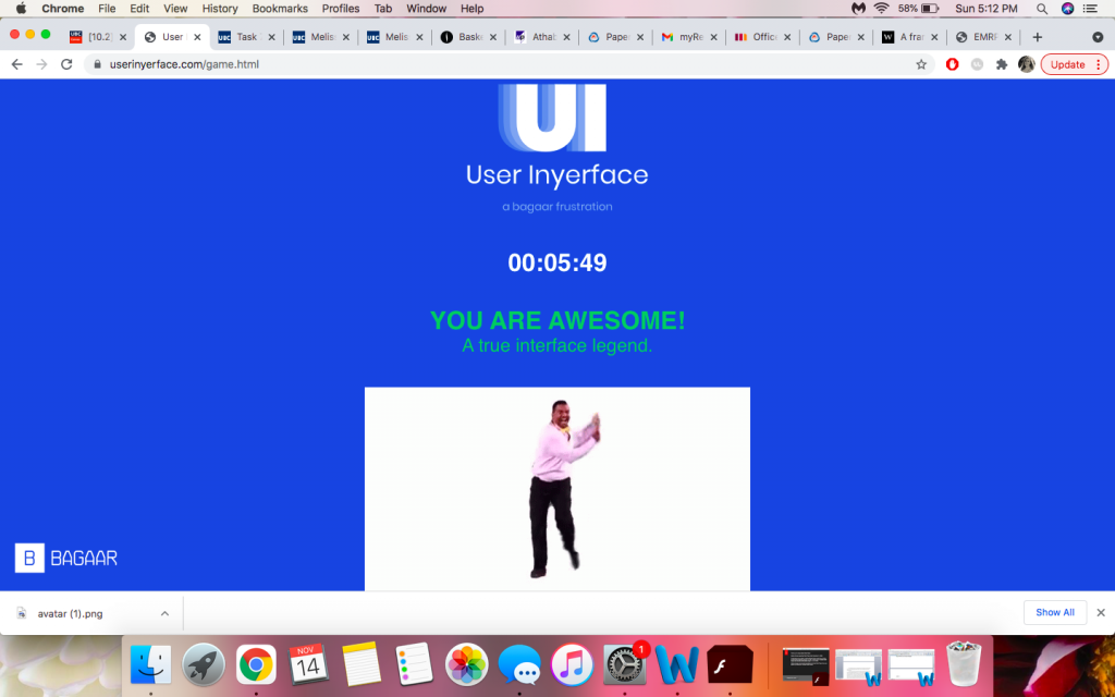
Finally! i made it to the end, but was not an easy task. This took several re attempts, reloading the game over and over, groans of frustration and overall pure annoyance – but ultimately got to the end. Truly can say i appreciate the websites out there that i use daily that are more user friendly in design, unlike this chaotic example of a webspace.