This week’s assignment is quite interesting. Along with my classmates, we were tasked with choosing 10 songs out of 27, and then analyzing the data to see if we can spot any trends / reasons behind why we chose the songs we did.
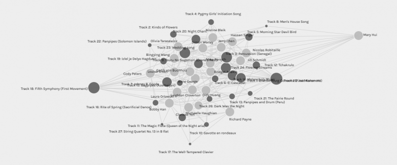
This is what was generated when I uploaded the data into Palladio.:

data
I pulled my name out to see if it’s the same size as my classmates, and it seems like it is similar. I guess it is because everyone in class chose 10 songs? Oh I found out 1 person only chose 9 songs… does that skew the data?
The smaller circles are songs that were not chosen as often as the bigger / darker circles. At this point, I have no idea why people chose the songs they did, but I know which songs are more popular than the other. To be fair, I went into some of the blogs to find out why people chose their songs. Some of them simply like the beat of the music / songs. Others chose the songs because they like the instrumental range it included. I did find some of my colleagues disliked some of the songs. However, even when I toggle the filter, it was difficult to determine the rationale of the decisions based on this visualization alone.
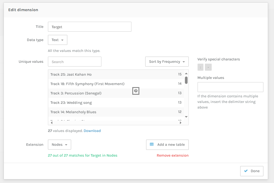
So I went to Edit dimensions to see and sort by frequency. Seems like Track 25 is the most frequently picked and track 17 and 27 was the least picked.

I went back to Youtube to play the songs again just to see if I can find a common trend. I still cannot find out why, so I then came back to Palladio. Then I found out who picked which song by playing around with the settings, and played with the calculator function inside Palladio.

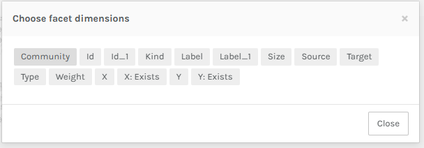
Yet, I was still confused as the labels were not descriptive. For example, I have no idea why I was filtering what I was filtering. I can choose the source and target. Depending on what I choose, the visualization changes. This is an interesting view, but what do the numbers mean? I don’t really understand what is being displayed here.

Another reason for the confusion is that I don’t understand what the dimensions are. The program asks me to choose a dimension, but what do they mean? It seems like Label_1 consist of all the tracks, and community consist of the number of students. Source is who picked what… X/Y related ones are how the the nodes are plotted, so it doesn’t really help me find out why people chose the songs they did. Perhaps if there was facet with categories for reason and students were able to select why they chose the songs, that may be more helpful.
i.e.: Reason: Genre, upbeat, liked the song, disliked the song, etc.
At this point, it seems like the data displays quantitative results rather than qualitative even though the plots are visualized, it does not provide any rationale to why people chose the songs they did without going to each blog to see task 8. This defeats the point having a centralized statistical data hub to depict the reason for why people chose the songs they did.