To be completely honest, It was a bit of a struggle to analyze this graph. There were just so many things on the screen, and it did not help that the connections were 3D, which made it hard to visualize. To make things worse, the interface was pretty complex and I spent a lot of time just tinkering around with options to see if it made things easier to see. From the required video watching in this module, this graph can be seen as an undirected graph.
I was able to get some discernible information from using these settings on the site. Sizing the nodes according to Sum of Weight or even the number of edges made it much easier to see which songs were most commonly chosen in this group.
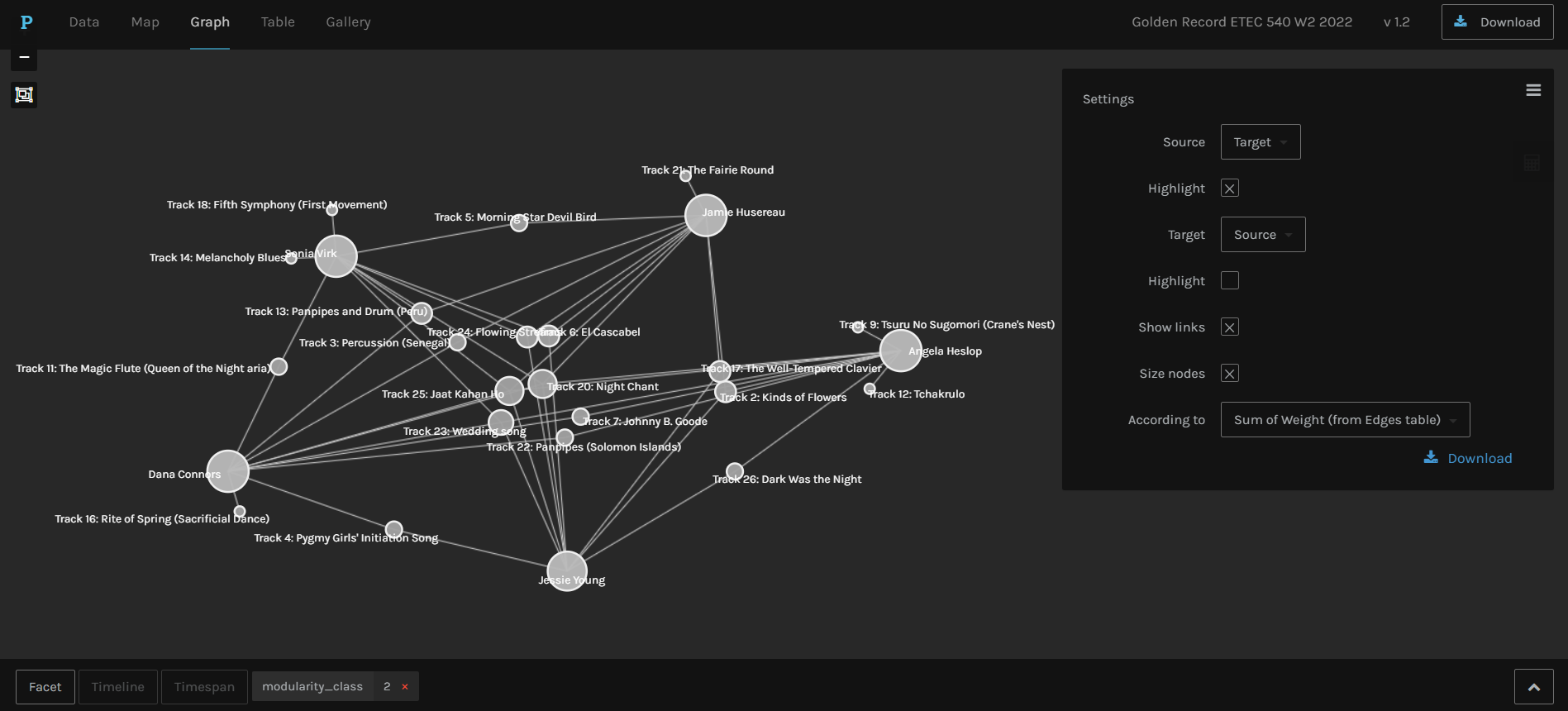
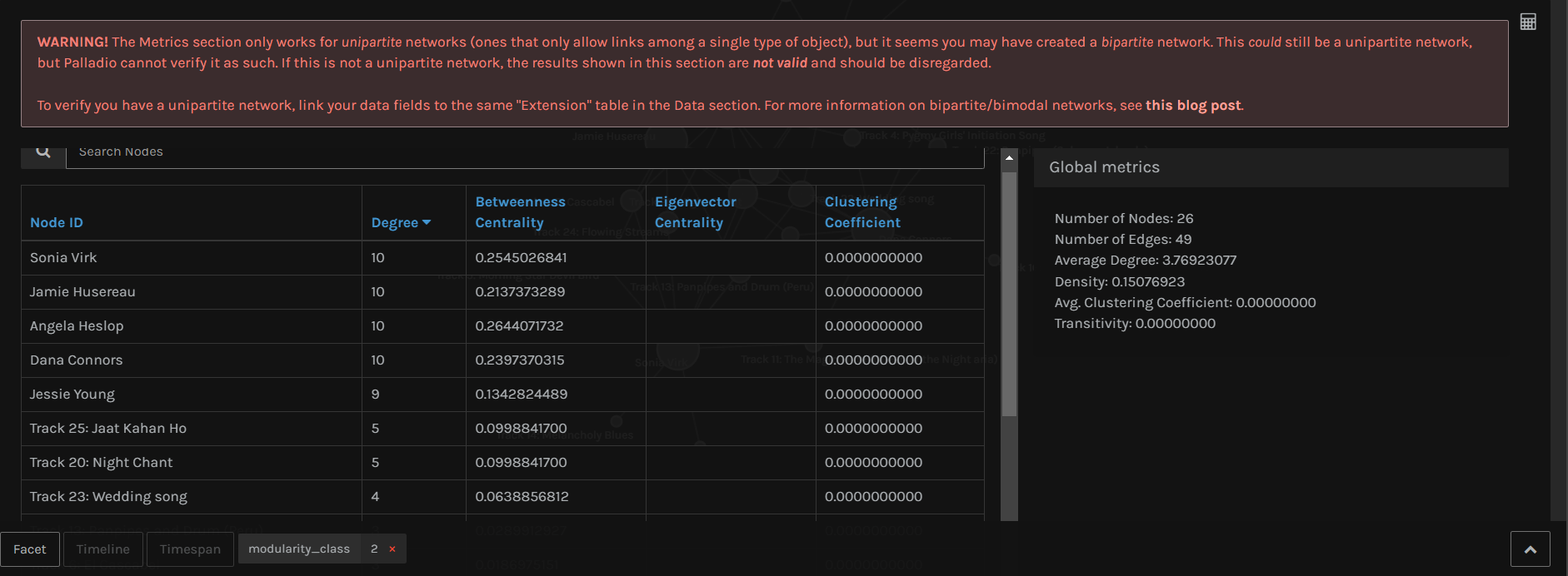
Upon clicking on the calculator icon, I was able to see some numbers and find that track 25 and 20 were the most commonly chosen songs in this group (modularity_class 2), each with a degree of 5 (meaning all five people in this group chose this song).
In modularity_class 1 (3 people), track 20 and 26 were the most common.
In modularity_class 3 (3 people), track 7, 13, 18, 6 were the most common.
In modularity_class 4 (3 people), track 14 and 21 were the most common.
In modularity_class 0 (3 people), track 15, 9, 24, 20, 18, were the most common.
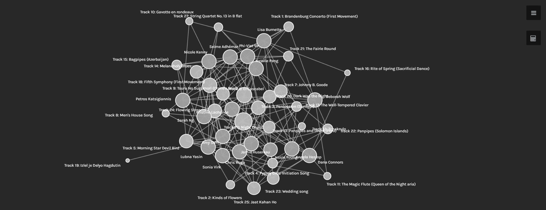
I could have also tracked multiple combinations of groups, but for the sake of simplicity I selected all groups to see which tracks were the most common amongst all participants.
The winner was track 20, with a total of 14 degrees or edges linked to the node for the highest degree of connectivity. The least common was track 19, with only 1 degree.
Notably, track 6, 7, 8, 9 were not chosen at all.
But why exactly are these responses similar?
- The site only shows connections between the participants and the tracks they chose, not the reason they chose those tracks. Similarly, one could ask why the participants were grouped the way they were. Was the grouping based on the similarity of songs chosen by each participant? In each group, there were still many songs that only one participant out of the whole group chose. To conclude, there was no clear reason as to why the responses were similar. Perhaps many of us are used to listening to similar types of music, or are from similar cultures. Then again, the most common song was a sacred Navajo Indian chant. So what really is the reason behind it?
Is the visualization able to capture the reasons behind the choices?
- From the reasons stated above, no. The visualization made it more difficult to understand, if anything.
A screenshot of what I see when viewing all data. Give me a data table over this any day…
Reflect on the political implications of such groupings considering what data is missing, assumed, or misinterpreted.
- I am not exactly sure how this would tie to politics, but viewing data in this way can be polarizing as it does not include any options that were available but not selected (like the tracks mentioned above.) If the tracks were not numbered, one could believe that the tracks chosen were the only tracks available. Sample size is not necessarily shown here either, and that can play a large part in how reliable the data is.
Can the reasons for these “null” choices ever be reflected/interpreted in the data?
- No. Perhaps the null choices could be shown as outlier points on the graph, but again, there is no reasoning or descriptions available on the graph to show why they were not chosen.
References
Systems Innovation. (2015, April 18). Graph theory overview [Video]. YouTube.
Systems Innovation. (2015, April 19). Network connections [Video]. YouTube.