Author Archives: Phiviet vo

Final Project – Describing Communication Technologies

Hello everyone!

Congratulations for making it to the end of the course! I enjoyed reading through your posts and reflecting on my understanding of technology, communication, and digital spaces.

For my project, I chose to explore the history and impact of Grammarly, a name now commonplace amongst education, businesses, and YouTube advertisements on like, every other video (anyone else, or just me?)

Thank you in advance for reading through, and any feedback or questions are appreciated!

Thank you to Ernesto for an amazing course and to all of you for being a part of my educational journey! Best of luck in the future!

PDF ver.


Chris’ Task 12 – Speculative Futures

Check out Chris’ Task 12 here.

Chris created a situation based off of the following prompt: Describe or narrate a scenario about a pill found a few years into a future in which society as we know it has come apart. Your description should address issues related to the government and elicit feelings of disgust.

He presented his story using the H5P slideshow tool and embedding it into his post, describing the situation with accompanying pictures. It is a short, but interesting read.

I chose to link Chris’s task because of how similar his approach was to mine in this assignment. Both of our descriptions could be considered to be further out in the realm of possibility, rather than the more likely probable or plausible futures according to The Cone coined by Joseph Voros in 2003: 

Speculative design cone of possibilities FINALThe Cone. From Speculative Design and a Cone of Possibilities | Delve

Chris attributed his collapse of society to climate change and government inaction, and I attributed my collapse of society to the COVID pandemic resurging and harmful government action- yet, my prompt had no mention of the government but environment (Describe or narrate a scenario about an advertisement found a few years into a future in which society as we know it has come apart. Your description should address issues related to environment and elicit feelings of cheer), and vice-versa for Chris (Describe or narrate a scenario about a pill found a few years into a future in which society as we know it has come apart. Your description should address issues related to the government and elicit feelings of disgust.)

As for our object, we created things that honestly don’t seem too far-fetched in terms of realism, and both could be seen as “band-aid” solutions to the issues stated in our situations (Chris explicitly mentions this in his post, and in case you didn’t read mine, or you read it and didn’t understand what the object did, it essentially killed the person who put the VR headset on- a device created by the government to secretly commit genocide). 

Overall, I think both speculative futures are well thought up, scary, and hopefully will never come to fruition. Here’s to pushing our trajectory towards the preferred futures!


Task 12 – Speculative Futures

Hi everyone! Here is my scenario for Task 12. There are quite a few references in there to various media, keep an eye out and see if you can spot them all. Any feedback or questions are appreciated!

Describe or narrate a scenario about an advertisement found a few years into a future in which society as we know it has come apart. Your description should address issues related to environment and elicit feelings of cheer.

The year is 2026. The COVID virus has resurged from China with a new, more powerful and dangerous strain, and the world experiences another global pandemic. Governments are shutting down shops and activities, leaving the streets empty and families struggling to survive. The war in Ukraine has now escalated to a point where multiple countries such as the US, China, and North Korea are now getting involved and threatening nuclear war. Governments bring back conscription for males ages 20-45 of age, and civil unrest grows significantly. Riots break out in the streets, looters and vandals litter the street with broken glass and graffiti on government buildings, saying “WE WANT OUR LIVES BACK”. The governments invoke martial law and the global economy shuts down due to lack of trade and the massive funding needed for militarization of countries. A curfew is introduced and anyone seen on the streets after 8 pm is shot with rubber bullets and arrested immediately.

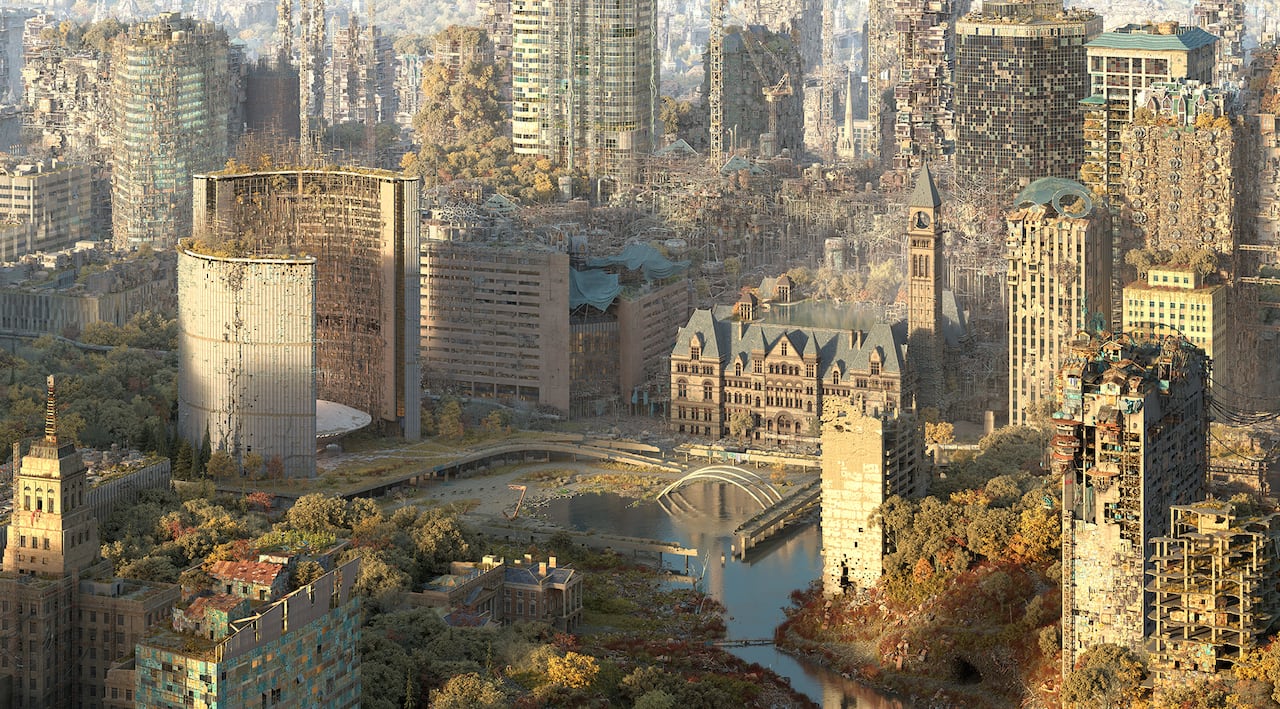
The deserted buildings of the city. From Alternate Toronto: Artist creates images of city in decaying, dream-like future | CBC News

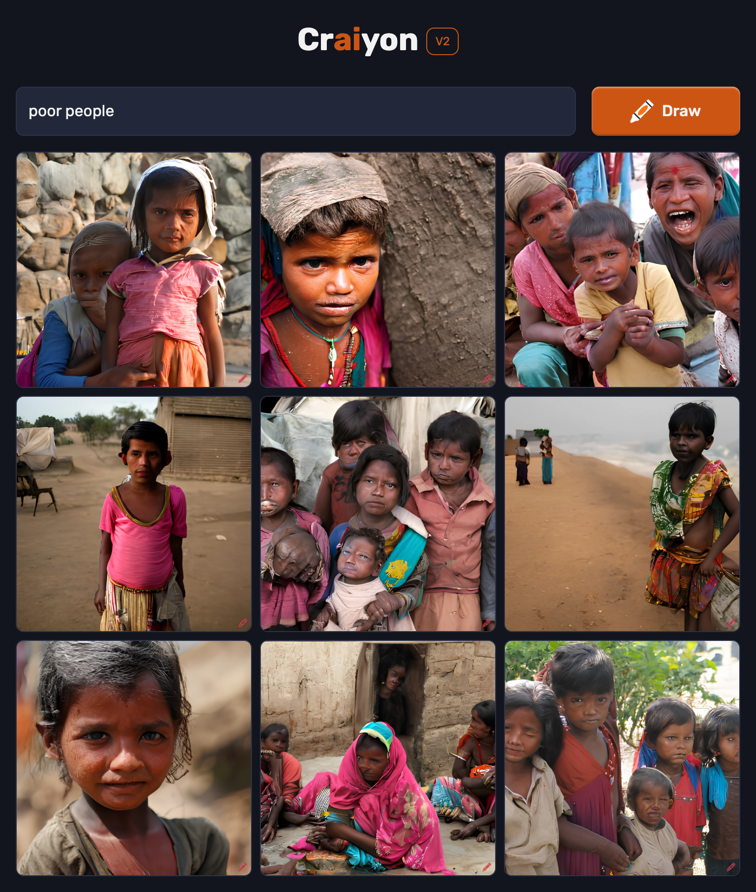
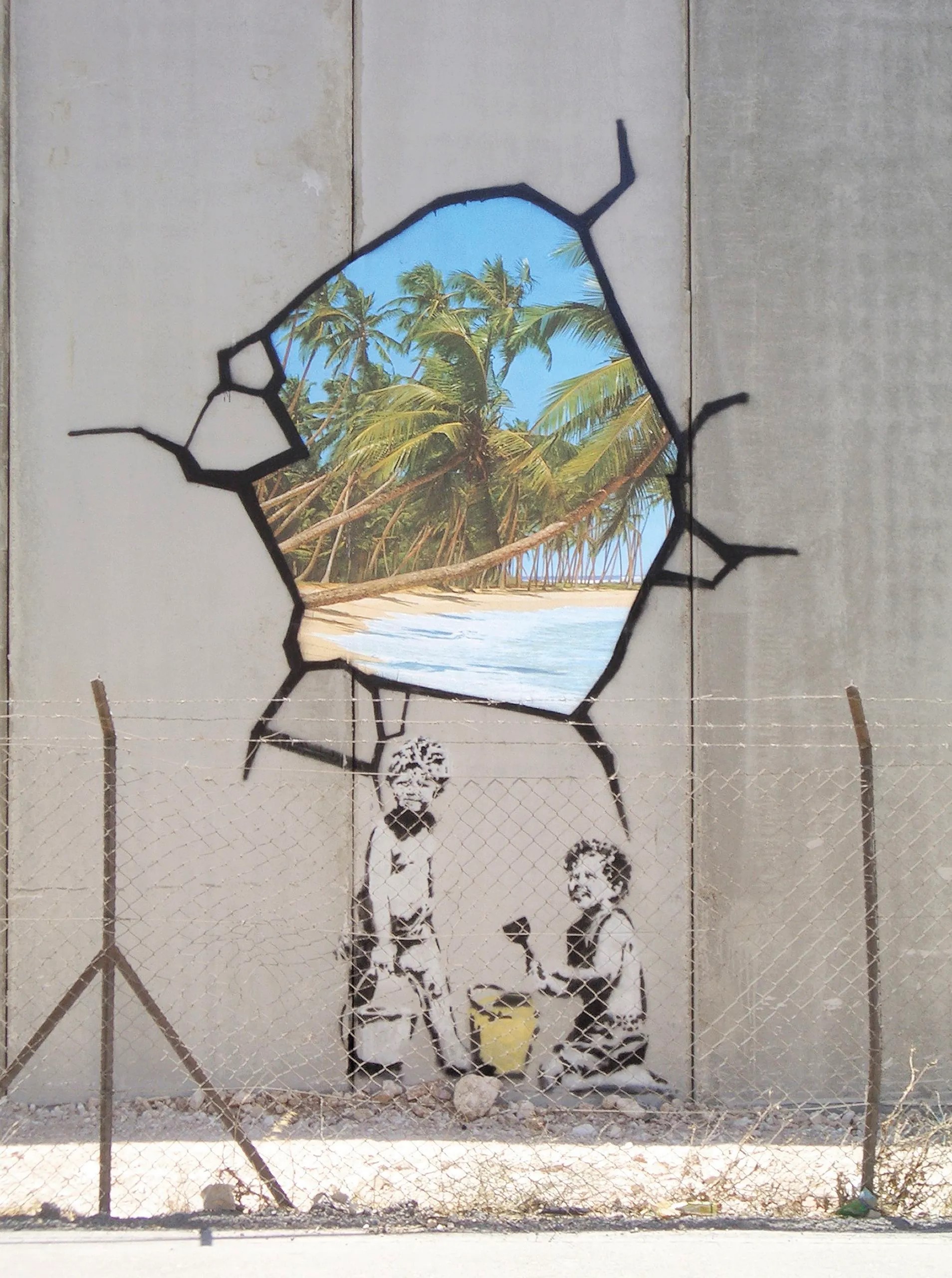
Graffiti on the streets. From Banksy Was Here | The New Yorker

Meanwhile, social media and general internet activity skyrockets. Everybody is trying to gain a following to make some money and get sponsored by companies. Everyone from the elderly to toddlers are on their screens, constantly trying to escape the bleakness of reality that lays before them. 

All of a sudden, the most popular and elite group of influencers on social media start to rave about a new VR machine that can influence all of your senses (touch, smell, sound, sight, and taste) and literally make you feel like you are in a different world. The machine is called “Paradies”, and the company behind it is called F.Y.R.E (For Your Reality Escape). The founder has no social media accounts, but has the alias Eddie$. 


F.Y.R.E. Company Logo. From The Official Trailer for the Fyre Festival Documentary Is Here – Fashionista

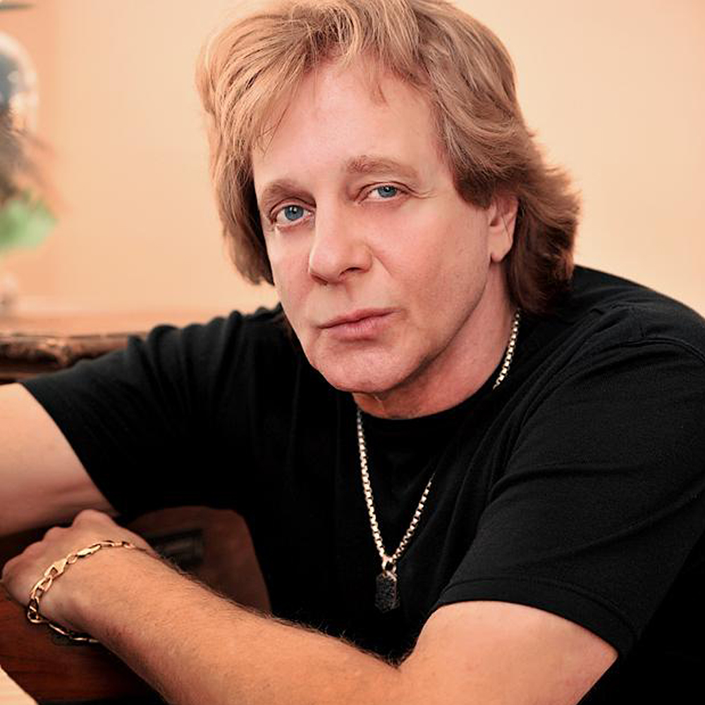
Eddie$’s rumored appearance. Eddie Money – The Palace Theatre

Over the past 20 years, Eddie$ has been buying your personal data sold by Meta, TikTok, and other social media companies to track your activity and essentially create an archive of your old life and how you used to live it. Eddie$ and his team used advancements in technology to code this into a device that can stimulate all human senses and allow you to live your life before all of the chaos. 

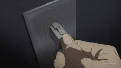
Concept of someone putting on a Paradies VR headset. From Kirito nerve gear grin 2 on Make a GIF

“I have speculated about this future for a long time, and I am sad to see it come to fruition. Deserted streets, broken window fronts, and even more broken homes and societies. However, I have been able to design something that will give you your life back, seeing as the government will not heed your words. Come one, come all, bring your family and friends, and let us travel to Paradies together. 

Of course, I know you must be experiencing financial hardship. For a limited time, entrants who are elderly, disabled, or identify on the LGBTQ2+ spectrum will receive a free set of Paradies VR machines for them and their families. Call 492-688-6343 now and get your tickets to Paradies today. The servers will open in one month. Signed, Eddie$.”

People were so desperate for any kind of hope at this point that they cheered and cried tears of joy. Hundreds of thousands of people were calling this line, and the sets were delivered in black unmarked trucks to their houses and shelters. 

On the day of the server launch, they all put their headsets on, eagerly awaiting paradise.


Concept of Paradies VR startup. From Sword Art Online – LINK START !!! on Make a GIF

They were never seen or heard from again.

Petro’s Task 7 – Mode-bending

Check out Petro’s Task 7 here.

As a redesign of his initial task, Petro decided to describe the contents of his bag using nouns only, in audio format, alongside a visual written list of the nouns. 

Petro’s redesign of his first task was quite concise in comparison to mine, yet I found both to be effective in their own ways. I chose to link Petro’s task because of the contrasting approaches we took to it, really emphasizing the variety and importance of interpretation when it comes to design. Recalling the first task, it asked us to show a picture of the contents of our daily bag (visual), and reflect on some questions to further describe the items in our bag (written/linguistic). To change the semiotic mode is to change the way in which it is presented, and Petro chose to use an audio and written/linguistic multi-modal approach in his redesign. In comparison, I used an audio/visual/gestural multi-modal approach by filming myself going through my bag. Although the two approaches are different, they both inform the reader what exists in our bag and offer many ways  to access the information.

Task 11 – Detain/Release or Text-to-Image

Findings from Readings

From O’Neil, C. (2017):

  • -People tend to see algorithms as purely mathematical and unbiased, but our inherent biases are programmed into them (poorer people/neighborhoods are more likely to be hotspots of crime, and blacks and hispanics are more likely to be poor and residing there compared to rich white people who are still also committing crimes)
  • Collected data that judges use to predict the chances of someone committing a crime again rates black people higher than white people

From  Vogt, P. (2018):

  • Random ticketing and needing to meet quota needed for COMPSTAT data
  • Police would downgrade crimes so that it would not show up on COMPSTAT, therefore making the crime rate go down artificially and they would survive the COMPSTAT meeting
  • Police would have to meet a quota to show that they were being more active by doing more summons and frisking people, not actually solving crimes
  • Impact zones where police officers would randomly summon innocent people and target young black and hispanic men
  • White men would not be targeted

Task reflection

After the readings and podcasts, I was quite wary of being biased in my decisions while going through the Detain/Release simulation. I honestly should have blocked the AI generated mosaic of the people that I was making decisions on so that race/skin color did not play a factor. Nonetheless I needed to experience the simulation in full so I observed everything. I based my decisions off of their stats such as likelihood to commit another crime, violence, and failure to appear, as well as the crime. Their age, picture, and name did not influence me much.

However, upon reading through Porcaro (2019) after completing the simulation, I realized that I had no idea how the system measured these chances of these people committing another crime, or their violence level, or their tendency to miss trial. I simply just believed what was shown to me, and based my decisions off of that data. Perhaps this is similar to how cops at the lower level felt when instructed by their superiors to meet quotas and specifically target men of color- blindly following instructions based off of supposedly “unbiased” data can certainly have some dangerous consequences. It would be interesting to see the results from the class data, as I was unable to see that after completing the simulation.

Although it was another option, I was curious as to how the Craiyon AI would draw these prompts (rich people and poor people)  after seeing the example in the module. Because they were so general, I did not know exactly what to expect for the prompts. However, I could almost guarantee that poor people would include some people of color in desolate neighborhoods, and rich people would be mostly white people. The results are below. How do you feel about what you see?


References

O’Neil, C. (2017, April 6). Justice in the age of big data. TED. Retrieved August 12, 2022.

Porcaro, K. (2019, January 8). Detain/Release: simulating algorithmic risk assessments at pretrial. Medium.

Vogt, P. (2018, October 12a). The Crime Machine, Part I (no. 127) [Audio podcast episode]. In Reply All. Gimlet Media.

Vogt, P. (2018, October 12b). The Crime Machine, Part II (no. 128) [Audio podcast episode]. In Reply All. Gimlet Media.


Task 10 – Attention Economy

Well, I finished it. I could have finished slightly faster but I noted down some observations during the playthrough that took time. Also, the annoying pop-up box kept coming up.

Here are the observations I made while playing the game:


  • Some of the font is hard to see due to having similar colours to the background, or just being a dark colour. 


  • The first page is confusing as it looks like there are many options to continue to the next page


  • If you have ADHD, you are going to struggle in this game because there is a lot going on at once on the screen


  • When filling out information, you have to manually delete the text prompts in the box. Strange and tedious


  • I actually read the terms and conditions this time (I usually skip them). Scrolling through the terms and conditions  was really slow until I read that I can hold ALT to scroll faster (although it said that that was cheating. Oh well).


  • The constant ticking time pop up box encouraging you to finish  was annoying


  • On some of the pages, the “cancel” box is highlighted and not the “next” box, tricking people to click on the wrong option.


  • Basically, everything is designed to be impractical and annoying to the user. Hence, User Inyerface.


  • I thought that it was an interesting but terribly impractical way to choose the country, difficult because there is no colour or names but pictures of flags that show colour when you hover over them.


  • I also felt weird putting in my personal information into a website that I do not trust, so I put in fake information.


  • When choosing a birthdate, the months are out of order,  and the slider to choose the age is a terribly designed slider because it is so sensitive.


  • the year starts from 1900… nobody born in 1900 is still alive…


  • You have to choose age AND input your birthdate? That is annoying.


  • Gender is the unhighlighted selection, not the highlighted section. If male was highlighted, then you were actually stating you were female.


  • Asking users to select the bow is ambiguous because all of them are technically bows.


  • The select boxes are above the pictures, not below as it would seem as shown.


Overall, an annoying, terrible, frustrating experience. 0/10 would not play again. However, it did help me appreciate the efficient, streamlined user interfaces that we use a lot more. Despite this obviously satirical approach to the game, I have experienced similar cases of dark patterns and general user manipulation on websites and games. 


One recent experience that came to mind was when using the Instagram search feature. It is quite subtle, but it has happened to me so many times that I feel that it is on purpose. When searching for an Instagram user, when you type in the username it starts to suggest users as you type. I would go to tap on the suggested user and then the autocomplete suggestions would come up and I would tap on the wrong thing. 


Mobile games also are nefarious for having scummy user interfaces, by making things purposefully complex to navigate through and also for having the “amazing deal” microtransactions constantly popping up on your screen and having them be the biggest and most colourful options when looking through their store.

Task 9 – Network Assignment Using Golden Record Curation Quiz Data

To be completely honest, It was a bit of a struggle to analyze this graph. There were just so many things on the screen, and it did not help that the connections were 3D, which made it hard to visualize. To make things worse, the interface was pretty complex and I spent a lot of time just tinkering around with options to see if it made things easier to see. From the required video watching in this module, this graph can be seen as an undirected graph. 

I was able to get some discernible information from using these settings on the site. Sizing the nodes according to Sum of Weight or even the number of edges made it much easier to see which songs were most commonly chosen in this group. 


Upon clicking on the calculator icon, I was able to see some numbers and find that track 25 and 20 were the most commonly chosen songs in this group (modularity_class 2), each with a degree of 5 (meaning all five people in this group chose this song).

In modularity_class 1 (3 people), track 20 and 26 were the most common.

In modularity_class 3 (3 people), track 7, 13, 18, 6 were the most common.

In modularity_class 4 (3 people), track 14 and 21 were the most common.

In modularity_class 0 (3 people), track 15, 9, 24, 20, 18, were the most common.

I could have also tracked multiple combinations of groups, but for the sake of simplicity I selected all groups to see which tracks were the most common amongst all participants.

The winner was track 20, with a total of 14 degrees or edges linked to the node for the highest degree of connectivity. The least common was track 19, with only 1 degree.

Notably, track 6, 7, 8, 9 were not chosen at all. 

But why exactly are these responses similar?

  • The site only shows connections between the participants and the tracks they chose, not the reason they chose those tracks. Similarly, one could ask why the participants were grouped the way they were. Was the grouping based on the similarity of songs chosen by each participant? In each group, there were still many songs that only one participant out of the whole group chose. To conclude, there was no clear reason as to why the responses were similar. Perhaps many of us are used to listening to similar types of music, or are from similar cultures. Then again, the most common song was a sacred Navajo Indian chant. So what really is the reason behind it?

Is the visualization able to capture the reasons behind the choices?

  • From the reasons stated above, no. The visualization made it more difficult to understand, if anything.

A screenshot of what I see when viewing all data. Give me a data table over this any day…

Reflect on the political implications of such groupings considering what data is missing, assumed, or misinterpreted.

  • I am not exactly sure how this would tie to politics, but viewing data in this way can be polarizing as it does not include any options that were available but not selected (like the tracks mentioned above.) If the tracks were not numbered, one could believe that the tracks chosen were the only tracks available. Sample size is not necessarily shown here either, and that can play a large part in how reliable the data is.

Can the reasons for these “null” choices ever be reflected/interpreted in the data? 

  • No. Perhaps the null choices could be shown as outlier points on the graph, but again, there is no reasoning or descriptions available on the graph to show why they were not chosen. 


References

Systems Innovation. (2015, April 18). Graph theory overview [Video]. YouTube.

Systems Innovation. (2015, April 19). Network connections [Video]. YouTube. 


Jamie’s Task 6 – Emoji Story

Check out Jamie’s Task 6 here.


Jamie chose to describe the Black Panther: Wakanda Forever movie using emojis. Jamie is quite descriptive, laying out the whole plot of the movie and even segmenting it into sections for easier reading.


I really enjoyed translating Jamie’s story, partly because I recognized the movie right away, and partly because I wanted to see how well Jamie translated it using emojis. I thought that Jamie made a great choice with the movie because there are emojis that can directly translate to the words needed. Even if the literal meaning of the emoji didn’t match, it was still able to be interpreted in the context of the movie (like the people crossing their arms in an “X” shape, for example- the meaning of that emoji is to refuse or defend themselves, whereas Jamie used it to recreate the Wakandan gesture that they do in the movies.  I also appreciated the effort that Jamie put in to describe the whole plot in detail.


I chose to link Jamie’s story because it shows the importance of context and culture in this assignment. Both of our stories require you to be versed in the culture of TV shows and movies, and if you have not watched or heard of the plots that we are referring to, you would find it quite difficult to figure out what we are referring to. On the other hand, there are only symbols and not English words, so someone who speaks a different language may be able to have somewhat of an idea of what is being described, but again they will only really understand it if they have watched it before.


Deborah’s Task 4 – Manual Scripts

Check out Deborah’s Task 4 here.


Deborah chose to physically write out her fourth task like how we used to back in high school- a good old 500 word essay/story. She wrote a little bit about herself and talked about her academic journey in the mid to late 80’s when the technology was different.


Although I did not do the fourth task, I linked Deborah’s post because it made me realize how we as a society have mostly transitioned from physical handwriting to typing on computers and phones for the majority of our communication. I started to question when the last time I wrote anything on paper was, and it was just towards the end of last year in November when I took notes in my notebook for my first day of my new job. Even then, I only chose to handwrite it because I figured it would be rude to have my phone out while I was being trained, even if it was for notes.


Otherwise, I am typing on my physical keyboards or touchscreen ones for every other form of communication- messaging my friends, my family, or searching things on the internet. I am so thankful that I grew up learning how to type properly and having access to computers. I see how older generations type with only their index or a few fingers and it hurts to watch because it is so inefficient. Also, the world moves so quickly now that I feel that you would be left behind if you cannot type quickly or do not have fine “digital” motor skills.


Along with this transition to mostly typing, we lose the personalization of our handwriting when conveying our messages. We lost the authenticity of the words that we write when messaging others, as these messages can be instantly screenshotted or copied and pasted and sent to someone else. We struggle to spell words properly and use correct grammar without autocorrect and tools like Grammarly. All of this text technology inherently changes our language and communication, and handwriting (especially cursive) is becoming less and less valued in our society. Would we ever fully transition away from handwriting? I think not, as there are some cases where handwriting is quicker and easier- like quickly writing down directions for a stranger. But then again, can’t they just use Google Maps?

Task 8 – Golden Record Curation Assignment

Some highlights from Smith (1999):

  • digital is easily disseminated, reproductible, and manipulatable, taking away from the true authenticity of analog versions of things like books or records
  • you cannot tell the difference between 100 digital copies of something, which puts the authenticity of the item into question
    • we have to rely on the authenticity and integrity of the institution or provider of the digital file we are looking for
  • people think digital storing lasts forever, but CDs, Floppy disks, and even USB sticks are now considered somewhat obsolete
  • most modern form of digital preservation are cloud storage platforms, which require hardware and software to access
  • still costs money to do (making the machines like scanners and printers, energy costs, etc. Kind of like an electric car)
  • privacy and dealing with sensitive materials, access rights, etc. are complicated matters online

The Golden Record reminds me of my Spotify wrapped. If someone else were to listen to it, they could get an idea of who I am. The Golden Record is like a Spotify wrapped since the beginning of time and for all of the human race. Here were the 10 pieces that stuck out to me as I listened to the previews of them in the podcast:

  1. Brandenburg Concerto No. 2 in F Major, BWV 1047: I. Allego by Johann Sebastian Bach, Performed by Munich Bach Orchestra, Deutsche Grammophon
  • I  used to be in the band in high school, as well as a marching band in the cadet program, so I have a special place in my heart for classical and orchestral music

2. Cengunmé, Mahi musicians of Benin by Charles Duvelle

  • I used to play percussion instruments and I loved how they were able to make a song out of a combination of different sounding beats

3. Alima Song by Mbuti of the Ituri Rainforest – Smithsonian Folkways

  • Acapella songs require talented voices and it just sounded cool

4. El Cascabel by Lorenzo Barcelata, Performed by Antonio Maciel and Los Aguilillas with Mariachi México de Pepe Villa – Bicycle Music Company

  • I love the vibe that mexican music gives off, usually upbeat and just makes you want to dance

5. Melancholy Blues by Louis Armstong and His Hot Seven – Columbia Records 

  • gives that classic vibe, like from fallout and bioshock video  games

6. Symphony No.5 in C Minor, Opus 67: I. Allegro Con Brio by Ludwig Van Beethoven, Performed by London Philharmonia Orchestra – Warner Classics

  • Epic, iconic. No other words needed

7. The Fairie Round by Anthony Holborne, Performed by Early Music Consort of London – Warner Music UK

  • Liked the sound of it, felt light when listening to it

8. Liu Shui (Flowing Streams), Performed by Guan Pinghu – Smithsonian Folkways 

  • Oriental Asian music! Closest I’ll get to having music of my cultures (Filipino/Vietnamese) on the record

9. Dark Was the Night, Cold Was the Ground by Blind Willie Johnson – Legacy Recordings 

  • Encompasses the vibe of the probe traveling- lonely…

10. String Quartet No.13 in B-Flat Major, Opus 130: V. Cavatina by Ludwig Van Beethoven, Performed by Budapest String Quartet – Bridge Records

  • More classical music!

I chose these songs because they sounded most like music to me, and what I resonated with when thinking about the human race. The other songs were obviously quite foreign to me as I was born and raised in Canada and western culture, so I left them out. Nonetheless, they were all great pieces and showed how truly diverse the human race is. All sent in an authentic, one-of-one record, no less.

References

Smith Rumsey, A. (1999, February). Why digitize? Council on Library and Information Resources. Retrieved August 12, 2022.