Final Project: The State of Speech Recognition

Welcome to the podcast! Listen below to this weeks episode entitled: “The State of Speech Recognition”

References: 

A brief history of speech recognition. Sonix. (n.d.). Retrieved August 6, 2022, from https://sonix.ai/history-of-speech-recognition

Alberta Regional Consortia. (n.d.). Speech recognition in action. Learning Technologies. Retrieved August 11, 2022, from https://www.learningtechnologiesab.com/speech-recognition/speech-recognition-in-action/

Audio Coffee. A Motivational Day. n.d. Retrieved August 10, 2022, from https://sonix.ai/history-of-speech-recognition

Bunnell, J. (2022) What Role Does Speech Recognition Technology Play in Advanced Learning? Emerging EdTech.

Sen, S. Dutta, A. Day, N. (2019). Audio processing and speech recognition concepts, techniques and research overviews Springer Singapore.

Speech recognition for learning. BrainLine. (2010, December 6). Retrieved August 9, 2022, from https://www.brainline.org/article/speech-recognition-learning

Li, J. Deng L., Häb-Umbach, R. and Gong, Y.  (2015). Robust automatic speech recognition: A bridge to practical applications. Academic Press.


Posted in Uncategorized | Leave a comment

Linking Assignment


Task 3: Voice to text by Zoe Armstrong

Both Zoe’s and my voice-to-text analysis came up with a lot of similar points of reflection. For instance, how the software produced predictable mistakes and how writing by hand lends to more carefully crafted pieces.

I found it very interesting to see Zoe produce this assignment in both French and English. In my own use of voice-to-text software, I find the language aspect to be one of the most notable discrepancies in technology today. English language speech recognition is leagues ahead of any other language in terms of the quality of the software. I work with French voice-to-text software as well in my professional life, and I have noticed a huge difference especially when it comes to African French accents.

I also found it interesting that, because she did the assignment twice, once in English and once in French, she was able to comment also on how oral storytelling changes from one retelling to another. She her second telling in french had some different elements and omissions than her original telling.

Task 5: Twine Task by Jessica Presta 

I was extremely impressed with all of the work Jessica put into creating this game. I myself had skipped this task because I had just taken ETEC 544 (digital games and learning) and I knew just how much time can be put into struggling with the coding of a game. And I was even more impressed when I played the game! Jessica took the time to carefully organize the game into an effective, fun, choice-based, practice scenario. There was even background noise built into the design of the game! I found myself failing to save the patients because of my lack of knowledge and some poor choices.

The game mechanics of twine are actually quite rudimentary but effective here. In the context of training emergency response personnel, this is a low cost, high-return option. I could see the next most effective option would be VR or using actors to recreate a hospital environment. This twine is a useful way to make training fun and interactive. Learners are able to experience their own real-time feedback.

Task 6: An Emoji Story by Sophy

Sophy and I had similar reflections initially in our approaches to this assignment. we both had a difficult time expressing abstract concepts in our emoji stories. She had an additional issue of trying to maintain the integrity of a translation too. I would be curious to know which piece of media she was using in this assignment!

I did find that Sophy’s research went above and beyond what we were asked to do here. Specifically, Sophy’s reference to the example of a language created int he 1940s in a Shanghai ghetto really spoke to me. In his created ‘dialect’, Charles K. Bliss, created different clusters of symbols to portray more and more elaborate concepts. This connection made by Sophy really speaks to how language and communication are formed in the minds of humans. For instance, Bliss uses symbols of a + to show intensity. In English, we use prefixes and suffixes to add meaning to language. Sophy continues to explore this element of language formation by discussing how ‘joining emojis’ works to create a new emoji out of separate emojis. I thought this was a very well researched addition to her assignment.

Another important discussion Sophy brings to the table is the additional meaning making element of emojis. They represent the emotion that sometimes cannot be expressed by words. And similarly, this is contrasted with the fact that they cannot be used to express as much meaning as a textual description might. I think that is sometimes the beauty of language and how humans add meaning: every symbol created by humans to house meaning can be both meaningful and meaningless depending on the context of their use.

Task 7: Mode-Bending by Katie Muzyka

I loved Katie’s approach to this assignment. A soundscape is a great idea for this project because of the nature of the material items. Like she mentions, this adds an immersive experience for the viewer. The soundscape was meant to give the viewer a spatial sense of the items in Katie’s bag – something that may not be possible or effective with other modes.

She smartly identifies that some of the information is lost on the audience when communicating objects from a purely audible perspective. Though she adds visuals to compliment the soundscape, she notes that what is missing is actual contextual information about her items.  She was then inspired to supplement this information within her own vocalized reflection, which she gave in a podcast style following the soundscape.

I found it interesting that she and I both attempted to bring a sense of spatial audio into our assignments. I wonder why this seemed to be a popular go-to strategy?

Task 9 – Network by Jane Wu

I was curious to go back and explore some of the conclusions of my colleagues for Task 9. Jane’s analysis was very clear and helped me see the task from a different point of view. Initially, I found it comforting that many of my colleagues seemed to be confused by the Palladio software as I was.

First, I found it interesting that she also found “representation” to be the most important criteria. Notably, she also accounted for non-man-made sounds, saying that she was seeking a good combination of natural and man-made sounds in her selection. I hadn’t previously thought of natural sounds as being very essential.

Jane made some very good points in assessing the data. Indeed, if the initial data had some additional features, we may better be able to extract information on the participants of the survey and their selection process. Jane proposes additional metadata be captured: 1) categorization tags could be used to better assess the choice-making process; and 2) if participants were able to enumerate their choices from most to least important, this would also help assess the criteria used.

Task 12: Speculative Futures by Sam Charles

I loved Sam’s in depth look at textbooks and the possible different futures. He smartly included a link to his final project in which he talks about the benefits of multimodal digital texts from the perspective of the future. This added a lot of well-researched insight to this task.

I like how Sam included small touches in his dystopian version as well to push his point home. For instance, in his dystopian future, cohorts remain unchanged throughout the students’ entire experience. This speaks to the isolation of a lack of new ideas in the classroom.

I like the idea of “The Textbook” to rule them all. This is such a good metaphor for prescriptive teaching practices. The Slogan “No one is left begin, and no one jumps ahead” is a perfect creepy interpretation of this future where equality is valued over equity.

It is super interesting to me that he specifically mentions that the textbook was developed kind of democratically with thousands of educators. I wonder if he was trying to imply that the textbook was erroneously created under good intentions. Is there any case in which a curriculum document could be created that could cater to global populations?

Posted in Uncategorized | Leave a comment

Task 12: Speculative Futures

2052

Source: Freepik, Rawpixel


The year is 2052. Communication technologies are increasingly connected and integrated into our lives and into our bodies as well. The world is more connected now than it has ever been before due to the advent of integrated translation. Any digital communication is facilitated through translation AI automatically. In a face-to-face settings, there are many effective tools to accurately and instantly have a conversation.

We use the concept of a “post-print society” to describe our society – communication takes place almost exclusively in digital spaces. However, there is still the need for print materials in day-to-day life – often in commercial settings.

The biggest change though was the improvement and ubiquity of AI in the production of communication content. Text, art and music are mastered by AI technologies at an exponential rate. Many technologies use AI to facilitate their functionality. These become known as the “Telepathic technologies”. While they don’t actually have the ability to “read minds”, they very realistically anticipate the intention of the user or create media productions that are nearly indistinguishable from those that are human-created. This new AI in in communication will allow for automation of many tasks that have to do with document creation and media production. For instance, A reporter on the scene of an accident will record and simply run the footage through AI to create the accompanying new story.

These are the tools and technologies that shaped our future. However, there were two diverging paths produced by these new technologies. In a dystopian or utopian path, these technologies are either used responsibly or will go unchecked by users and state governments. Can you guess which path is closer to our current reality?

The Dystopian Path

Source: Freepik

Due to increased communication efficiency and global linguistic connectivity, Corporations become increasingly globally minded. Megacorporations become larger and take up more share of the global market. Legal precedents fall behind and new technologies continue to erode privacy rights.

Mental health issues are at an all time high. There are issues of increasingly diminished attention spans across all ages and demographics. The diminished opportunity for face-to-face interaction coupled with a focus on productivity and constant screen time leads to increased rates of anxiety, depression and the exacerbation of all pre-existing mental disorders.

Telepathic technologies are used to create media productions in unethical ways. For instance, AI is used to create more and more sophisticated automated online money scams. In academia, students use AI to produce essays simply by inputing some sources and a thesis statement. In these cases, it is very difficult to prove that something was created by AI because it is so indistinguishable from human productions.

New technologies and specifically AI student monitoring and evaluation technologies are used to justify larger class sizes and students lose the benefits of more time connecting socially.

The Utopian Path

Source: Freepik, Upklyak

In this utopia, the push for a completely “post-print society” coincides with climate action: deforestation has slowed, integrated technologies work from renewable resources and work also to automate communication and ultimately encourage efficiency across all sectors.

Access to new AI technologies has a very low threshold for access. Open source technologies allow for most modern personal devices  to utilize these technologies. Globally, the access to new technologies becomes ubiquitous and adopted in all nations to the benefit of all people. Schools are funded  to ensure that students have access to current technologies in the classroom.

AI has a positive effect in the education system. From a young age, children are introduced to current technologies and encouraged to build ethical practices into their own lives. This feeds into the ongoing effective and ethical use of new technologies.

Posted in Uncategorized | Leave a comment

Task 10: Attention Economy (Optional task)

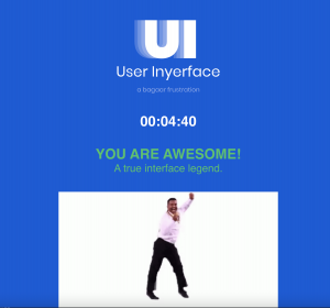
For this task, I completed a short game called User Inyerface that brings users’ attention to UI design in a frustrating way.

From the very first moment, User Inyerface effectively used design tactics to throw me off. The game sends you through a form that mimics many online forms, but with added barriers of deliberately infuriating design choices. For instance, the very first question asks you to choose a password. Already confused about the point of this game, I tried to input my go-to password, only to find that the greyed-out “Choose password” text in the input box was actually text that had to be deleted before entering your password. I finished the rest of the form only to find a long list of password requirements at the very bottom of the page – None of which I had yet met!

Playing the game allowed me to understand jsut how much of today’s user design choices has already been decided upon. For instance: the colour of buttons on the web. It seems to be a common unspoken design principle that the larger, coloured button is the button that is being proposed as a suggestion to the user. The buttons in the game were deliberately reversed with the smaller, opaque button being the button the user is more likely to select.  The developers of this quiz used that unconscious understanding against the user, putting the least commonly used button in the design forefront to throw the user off.

Even though the game is meant as an exaggeration of bad practices, I found myself thinking of my own frustrating past experiences. The captcha example in this game was deliberately vague (asking you to identify such things as glasses when the pictures contained eye glasses, drink glasses and panes of glass). This is not actually that different from other captchas I have experienced where the subject of the photo can be vague or partially fit the description. As a part of this game though, you can see just how frustrating this vagueness is. Almost like a satirical version of real-life captchas!

I had not heard the concept of “Dark Patterns” before playing this game and reading the article by Brignull (2010), though I was deeply aware of manipulative design practices. The game, User Inyerface is exceptionally useful at bringing your attention to poor design practices by throwing them all at you at once.  The explicit intention of the game seems to be to bring attention to poor design choices, but also to make the user reflect on what makes good design work so well. For myself, I feel like I will go into future web experiences being able to note the design practices and better discern the intentions of the creator.


Posted in Uncategorized | Leave a comment

Task 9: Network Assignment Using Golden Record Curation Quiz Data

Introduction

For this task, I am taking a look at the data produced by ETEC 540 66B in regards to our previous Task 8 Golden record assignment. The data has been run through a network-visualization tool called Palladio.

Getting started

I had quite a hard time understanding the data initially. I started by looking f0r my name, since I knew I would be best able to understand how my choices became visualized. Understanding that each line was a quiz answer, I continued by looking at the different layers of the data (facets) to understand where my choices met the choices of others.

Analysis

The facets seems to link certain grouping together. While there is some overlap between facets (i.e. a track that may be featured in multiple facets). The facets represent clusters of individuals with multiple choices in common. Displaying individuals and links to their choices in proximity to other individuals with common choices.

In analyzing the 4 facets that made up this cohort, I learned that my choices were more similar to Katie Muzyka and Jacey Bell, Jessica Presta, Jocelyn Fung. I generally came to understand that the closer the data is to the centre of the cluster, the more commonalities there were. For instance, in facet 3 you can see that Selene Joon was at the very centre of the data. Looking closer you can see that actually Selene’s data includes 27 values, meaning that each track was checked in her quiz. This is why we see her name at the middle of the cluster. This seems to have skewed the data quite a bit.

Analyzing the entire data visualization (without separating facets) gives us a good idea which tracks were most popular – those closer to the centre and with more connections are the most commonly chosen. For instance, two very popular choices were: “Track 18: Fifth symphony (first movement)”, and “Track 3: Percussion (Senegal).”  Though it is difficult to see from the data why people chose their choices, I can use my own experience to speculate. I had included both of these two tracks in my own choices. I justified these choices because I wanted a variety of geographical locations (Senegal being one of the only African tracks) and I wanted to prioritize cultural impact (i.e. chosing Beethoven’s symphony over the lessor known european “Track 27: string quartet no. 13 in B flat” for instance). In this way, I am able to speculate that some people had similar criteria to my own.

It is harder to distinguish why other people may have made choices that were very different from my own. For instance, Zoe Armstrong was the only member of our group to chose “Track 8: Men’s House Song”. Without more information about it, I cannot speculate as to why that choice was made.


Posted in Uncategorized | Leave a comment

Task 8: Golden Record Curation

Introduction:

For this assignment, we were asked to curate the record Golden Record, a physical record created in 1977 by a team of experts in their respective fields to show through sound (and a few visual etchings) the vast experience of life on earth. Two copies of the record were launched into space on the Nasa Voyager flights. For this, I took the 27 pieces and cut them down to 10.

Here are my 10 choices:

  1. “Greeting from Kurt Waldheim, Secretary-General of the United Nations”
  2. “Greetings in 55 Languages” (by Various Artists)
  3.  “The Sounds of Earth” (by Various Artists)
  4. “Navajo Night Chant, Yeibichai Dance” (Ambrose Roan Horse, Chester Roan, and Tom Roan) [Navajo Nation North America]
  5. “Muğam” (by Kamil Jalilov) [Azerbijan]
  6. “Symphony No. 5 in C Minor, Opus 67: I. Allegro Con Brio” (by Philharmonia Orchestra/Otto Klemperer) [Germany/Europe] 
  7. “Naranaratana Kookokoo (The Cry of the Megapode Bird)” (by Maniasinimae and Taumaetarau Chieftain Tribe of Oloha and Palasu’u Village Community) [South Pacific]
  8. “Liu Shui (Flowing Streams)” (by Guan Pinghu) [China]
  9. “Wedding Song” (by young girl from Huancavelica, recorded by John Cohen[48]) [Peru/ South America]
  10. “Bhairavi: Jaat Kahan Ho” Kesarbai Kerkar [India /South Asia] 

My criteria

I used the following 3 points of criteria:

  • Pertinence to the human experience
  • Wealth of information
  • Decipher-ability

Justification

To ensure the pertinence to the human experience I wanted to cast a wide net, including a sampling of music from diverse geographical locations and cultures with variation in instruments and presence of lyrics and emotional values. The original curation had a larger representation of western music and languages so I wanted to create a ratio that was more representative of humanity.

I evaluated tracks also based on their wealth of information. For instance, Kurt Walheim’s introduction (if it is able to be deciphered) provides the essential information as to WHY this record exists. Then, the track of greetings in many languages conveys a lot of necessary information about the language of earth and the variety of culture.

Finally, I wanted to prioritize the decipher-ability of the content – while some of the songs and music are quite beautiful, to a non human being, the information we hope to convey may be lost. While this factored in mostly in the way that I cut pieces out, it was important to balance the risk of a lack of decipher-ability with the pertinence or amount of information contained in the piece – for instance, the “Sounds of earth” piece would be extremely difficult to decipher without context, however, the amount of information housed within makes it an essential addition.


Posted in Uncategorized | Leave a comment

Task 7 – Mode Bending: ASMR Redesign

When beginning to brainstorm this project, I had a hard time thinking about the redesign process as proposed by the New London Group (1996) and how I could use those principles to redesign my task 1. It was important to recreate the mode of the presentation of information in a way that catered to the content I was proposing (i.e., me demonstrating the items in my bag). Then it hit me! ASMR. I was already pretty familiar with the genre of ASMR video where the ASMR-tist (as they are called) (Keiles, 2019) would present many small items, tapping and scratching them to create a variety of sensory experiences. All I needed to do was recreate this type of video using my own items.

As stated in the video, ASMR is a great example of using a multimodal pattern of meaning making as proposed by the New London Group. This type of video relies heavily on the audio-visual components to create a relaxing space. Many ASMR videos also have a strong linguistic component of soothing narration.  Then, due to the focus on materials (and their proximity to the viewer) ASMR lends well to gestural and spatial meaning-making as well. For these reasons, I decided to set out and my very own ASMR experience.

Personally, the most challenging element of this redesign process was overcoming the absolute silliness I felt while recording myself whispering about my various items.

Overall, I think this particular exercise demonstrates the power and limitations of this kind of redesign. That is to say that, while explaining the contents of my bag lends very well to ASMR, there are fewer applications of this genre for other learning activities. Though, perhaps this is an interesting thread to pull!


References

Keiles, J. L. (2019, April 4). How A.S.M.R. Became a Sensation. The New York Times. Retrieved on June 30, 2022. https://www.nytimes.com/2019/04/04/magazine/how-asmr-videos-became-a-sensation-youtube.html

The New London Group.  (1996). A pedagogy of multiliteracies: Designing social futures. (Links to an external site.)  Harvard Educational Review 66(1), 60-92.

Posted in Uncategorized | Leave a comment

Task 6 – An Emoji Story

Exhibit A:

Exhibit B: ????????????????????????????????

As an introductory note: Exhibit A above shows a screen capture of the emoji story I created. Exhibit B was originally the copy-pasted version of the emoji story, which was copied over to WordPress, but ‘broke’ and turned into question marks when I went to publish the blog post.

Synopsis: In this movie, a scrappy young character explores the culinary scene of Paris somewhat vicariously through a new friend. Together, they cook a signature dish to the delight and adoration of a stubborn food critic.


For this task, I tried to create one of my favourite movies in emoji form.  In order to reflect on the process, I used the following questions to guide me:

  • Did you rely more on syllables, words, ideas or a combination of all of them?
  • Did you start with the title? Why? Why not?
  • Did you choose the work based on how easy would it be to visualize?

When approaching this task, I chose to use the online emoji keyboard because the keyboard on my iPhone was not updated, so I knew I didn’t have all of the newest emojis. I noted that while having access to a free online version, I was somewhat hindered by my technology. If I had had the most up to date version, I would have had more options to effectively convey information.

To begin, I looked at the emoji keyboard and asked myself what movie would be easy to visually portray using the emojis that were available to me. I went through my mental list of favourite movies. I thought of an idea for a film that I knew I could use emojis to convey a few of the important elements of the plot: the location, the main character and the main activity taking place throughout the film. I chose to include elements of the title of the film and of the film plot itself – hoping that by adding as much visual info as I could, I would be able to reach a wider audience.

I found myself having to get creative with the emojis because the keyboard didn’t have the exact things I was looking for. For instance, I looked for an emoji of the Eiffel Tower, settling eventually for a flag of France. I wanted to use a rat emoji but had to settle for a mouse. And finally, had to use a hot pepper as a stand in for a regular pepper. I got creative with my choices here. Pictorally, there are a lot of deviations from the plot of the film I chose, but represented all together, and especially in the context of this assignment, the emojis should convey the film to those who are familiar with it.

Posted in Uncategorized | Leave a comment

Task 4: Manual Scripts

Intro

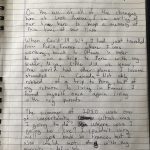
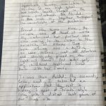
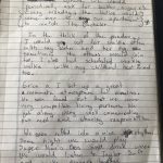
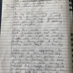
For this assignment, I decided to write a short diary entry about the building I live in with 5 other friends. Please view my entry in the gallery below:


After completing this entry and taking notes along the way, I used the following questions to prompt a reflection on producing manual scripts vs. digital ones.

  • Do you normally write by hand or type? Did you find this task difficult or easy? Explain.
  • What did you do when you made a mistake or wanted to change your writing? How did you edit your work? Did your choice of media play a part in how you edited your work?
  • What do you feel is the most significant difference between writing by hand and using mechanized forms of writing? Which do you prefer and why?

Reflection

Even from the very beginning of this assignment, I was made brutally aware of why I never write manually. I spent about 10 minutes scouring the house for lined paper, and even though I live with a grade school teacher for a roommate, I had to settle for using an old notebook. This was the first reminder to me that, in fact, my entire life is organized around productivity in a digital environment.

Since the beginning of my undergrad, I have almost wholly switched to digital writing, only writing by hand for quick notes around the house or the odd academic exam. I prefer writing by computer for many reasons. Firstly, writing by hand is an inconvenience in today’s world where files are shared so instantaneously. In many cases, writing by hand would be an additional step, as I may have to convert whatever it is to a digital format. For instance, if I were to take notes during a work meeting by hand, I may need to retype them to have a digital copy. Secondly, I personally have always had very bad handwriting, so I try to avoid writing by hand in a professional/academic setting if I can. Thirdly, the ability to easily edit digital writing is a huge plus for me. As can be seen in the writing entry I produced, many words or short phrases were crossed out, as I made small errors here and there. In a digital space, these are easy to correct.

The overall process of organizing ideas when writing by hand  is the largest difference for me and my biggest influence to write by computer.  When I am writing manually, I am likely to make mistakes, or change my mind about how I want to organize the content of the piece, so the result can be messy. See, for instance on  p.3-4 where I made an annotation to move a chunk of text from one page to the other. That being said, I make more of an effort to produce a well formulated piece, if I know that I will have to write it in one go from start to finish. It forces me to reflect before putting pen to paper.  Still, for producing a professional piece of writing, I would always chose to write digitally to have the control to edit draft versions and produce a cleaner overall document.

Posted in Uncategorized | Leave a comment

Task 3: Voice to Text Task

Image source: completemusicupdate.com

I was very intrigued coming into this task. I have done a lot of work in my professional life testing different speech-to-text softwares for their quality and different features (i.e. identifying speakers, multiple languages, etc). So I am well-versed in the use of speech-to-text, but I looked forward to explore in this exercise the questions around oral communication vs written and the effectiveness of speech to text in capturing this nuance.

I will be using the following questions to prompt my reflection:

  1. How does the text deviate from conventions of written English?
  2. What is “wrong” in the text? What is “right”?
  3. What are the most common “mistakes” in the text and why do you consider them “mistakes”?
  4. What if you had “scripted” the story? What difference might that have made?
  5. In what ways does oral storytelling differ from written storytelling?

Here is the story in audio form:

And here is the link to my Otter.Ai Transcript: https://otter.ai/u/Yb5vML19QyAKTVVEBlD0k_2lfCg 

Looking at the speech-to-text version, a few types of errors become immediately apparent. Of course, the accuracy of the text is quite good, however, a percentage of words are misheard or repeated. This ranged from small errors like “I myself, I’m Italian.” (supposed to be” I myself, am Italian,” to more obscure concepts like the Italian “Aperitivo” being misheard for an english translation of “Appa TiVo” and “app in a TiVo”. Similarly, names were sometimes misheard. Occasionally Turin became “Turn”.  My Friend Chandhi’s name became (comically) “Chad knees”. So, while this software was relatively effective, it struggled when it came to concepts and names outside of basic English.

Otter also tries to add appropriate punctuation to the text, which in some cases works quite well, but in other cases actually a little heavy-handed. For instance, we see this sentence: ” I was in my second Co Op work semester, in 2017.” Here, the additional comma actually detracts from the flow of the text and would not be added in written English. Importantly, in a story like this one, quotation marks would be used throughout, but this software did not have this capacity, so the reader is left to guess based on context clues: For example, when I explain the interaction with Ed Sheeran, Otter produced the following: “So I just tapped him on the arm. I said, Hello, I’m a huge fan. I hope you have a really nice night tonight. Can I shake your hand and he shook my hand […]”. Without quotation marks, as we would use in proper written English, the text comes out clunky and unclear.

While the text to speech technology has some aforementioned flaws, especially when it came to transcribing a casual narrative, there were some things that, it got ‘right’. In my oral story, I use filler words like “um” and “uh” quite often. These words were automatically taken out in the text, showing how “smart” this technology is becoming. Surely, if those words had remained in the transcript, it would have made the reading experience much more jumbled.

Overall, I think the clunkiness of the resulting text, has more to do with my style of oral storytelling than it did with errors in transcription. Even in areas where all of the right words were picked up, the text still does not read as a proper written story should. When I speak aloud, I will often jump around chronologically, or repeat things I have said before. For instance, I say a few times how important/ exciting this experience in Italy was for me. And in one case, I interrupt a my story of the evening in question to go back and relay the information that, earlier that day, I had mentioned to a friend that Ed Sheeran was performing a concert in the city. It is not uncommon in oral storytelling to have these small issues of repetition and chronology, whereas, in written storytelling, these issues are generally corrected during the writing process to create a better logical flow. I imagine in this way, my 6 minute story could have been written more clearly and concisely, resulting in a much shorter text. Similarly, if I had scripted the story ahead of recording, I am sure the result would have been more clear and concise.


Posted in Uncategorized | Leave a comment