Was there something particularly challenging in the process?
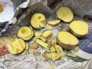
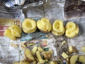
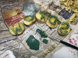
The five-letter word I decided on using for the potato stamps was “words.” I wanted to write the word letters but “words” was the next best thing. As a Kindergarten teacher, words are all around: on the walls, in books, on their paper, their names, etc. This is why I decided to choose this word. The first two letters, “W” and “O” were simple and straightforward but it took time to craft it how I wanted it to be. As I finished carving out the letter “R,” I showed my roommate how beautiful my “R” was and he said, “wait a minute, when you stamp that, it is going to be backwards.” Of course, with this process I then realized I messed up. I had to then cut it out in reverse so that when I did stamp it onto the paper, it would be correct. Another challenging part of this process was creating curved shapes with the knife. Thank goodness this mistake happened with just the “R” so I only wasted half of a potato. I knew that with the S, I had to mirror it.
How much time did it take for you to create the stamps?
This process of cutting the stamps took about 20 minutes to complete, although I was not timing myself and I was multitasking. Each letter took about three minutes and I had to carve out the letter “R” again. I found myself cutting out all the straight edges of the letters first before tackling the curves and smaller nooks. If I wanted to create the entire alphabet with upper and lowercase letters, I believe it would take me roughly 160 minutes (2 hours and 40 minutes) without errors. Creating the stamp does take the majority of the time. Once all of the stamp prints are done and cut, the ink or paint transfer then takes some time to make sure that the paint is evenly distributed. However, I suppose if one did not want it perfect, they could just dip the letters into the paint instead of brushing it on which would save some time.
Have you noticed anything particular about the letters that you have chosen to reproduce?
I clearly decided to do the letters in uppercase as I wanted to use the majority of the potato. Uppercase letters are also letters that Kindergarteners will learn first before lowercase letters so uppercase letters were my automatic choice. The font I chose is also very standard and is a straight cut as opposed to bubble letters which are simpler to create. Also, I did just notice that those five letters are letters that I see more often than others. For example, my mom’s name starts with a “W,” my dad and brother’s name starts with a “R,” my name starts with a “S,” “D” could be for dad and dog, “W” could also be turned upside down to create a “M” for mom, my sister’s name, and the name of the school I work at, “O” because it’s a shape that is seen daily. Could this be why this word came to me? Or is it just purely a coincidence?
Considering the time and effort that took you to create a 5-letter word, how do you feel about the mechanization of writing?
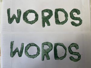
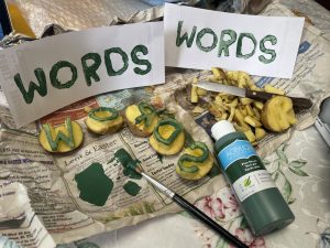
The paint I used was a Pine Green acrylic paint as that is what I had laying around. Yeah right, I had a whole bunch of colours as I am a craft freak and an obsessive collector of everything and anything crafty. However, I went with a dark colour as this is what I wanted to use for a bolder look once the words were printed. I lathered on a decent amount of paint so that the entire letter was covered generously. Then it was time to make two copies. The first print was darker and had more paint compared to the second print which was lighter. If I were to do another print, without applying anymore paint, I do believe that the letters would be patchy with the paint. I made the double prints letter by letter as I did not want the paint to fully dry out on the potato. This made the process easier to replicate.
The process and effort it took me to create a 5-letter word was time consuming and tedious. I had to make sure that each letter looked as perfect as possible. I also had to ensure that the thickness was consistent throughout. This entire process was challenging yet exciting as there was some technicality behind creating these letters. According to Bolter (2001), mechanization is involved in all writing as it is a technical skill. I made the letters and printed them onto the paper, they were quite large. However, this was not a concern of mine as this was just a simple five-letter word activity. If I wanted to create a story with these letters, the font would be too large to do so. According to Clement (1997), when Gutenberg and Schoeffer designed their first print, it “turned out to be too large” as they realized that they would only be able to fit so many lines of words on one piece of paper (p. 13). Even printing professionals make mistakes and have to adjust their sizing depending on the task. Like Bolter (2001) says, “each culture and each period has had its own complex economy of writing” (p. 21). Techniques that were used for some periods, will be different from those techniques used now. Bolter (2001) also observed that the mechanics of writing and its popularity were linked to efficient, clean, clear texts. In order to do this, time, accuracy, and efficiency must be obtained. Therefore, beautifully designed, hand-crafted print has faded throughout the years. It may not be as popular now due to the time and effort that is needed, however it is still in use by individuals who want invitations or cards hand-printed.
References
Bolter, Jay David. (2001). Writing space: Computers, hypertext, and the remediation of print [2nd edition]. Mahwah, NJ: Lawrence Erlbaum.
Clement, Richard W. (1997). “Medieval and Renaissance book production (Links to an external site.)“. Library Faculty & Staff Publications. Paper 10. https://digitalcommons.usu.edu/lib_pubs/10