During this task, we had to observe our Golden Record network that was created in Palladio where it showed the musical choices from the quiz that students in ETEC 540 took last week. In our class there are 22 students that chose 10 out of 27 tracks. The image below shows the network of connections between students and tracks. I moved around the network so that the tracks were on the outside and the students were in the middle.
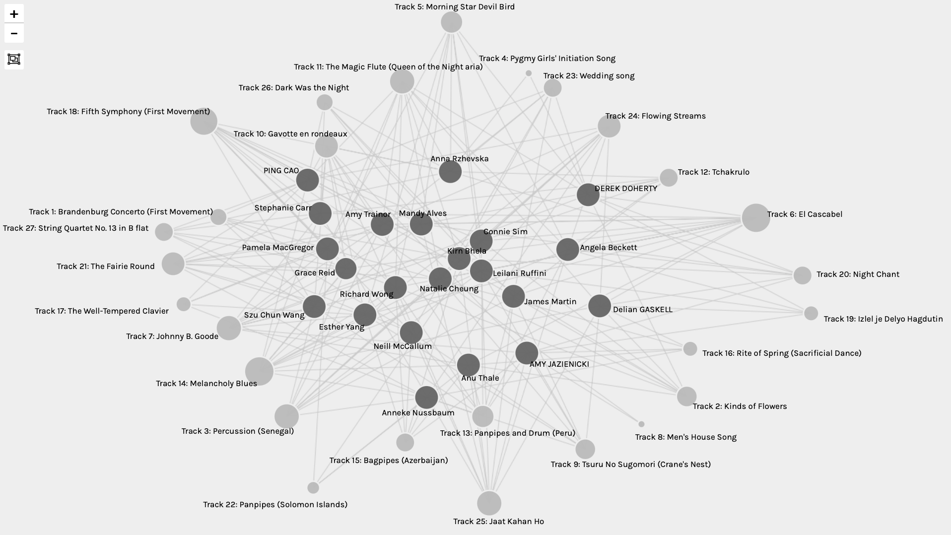
In this network graph, there are nodes and edges. The nodes represent the students which have dark grey circles and the edges in this network graph represent the connection between a student and the 10 tracks they chose during the quiz. Not only are the lines connecting a student to the 10 tracks that they chose, but with each track, there are connections that link together with all those chose that track. Surprisingly there were no tracks that did not have a connection. Track 4 (Pygmy Girls’ Initiation Song) and Track 8 (Men’s Housing Song) only have two degrees of connectivity that connect to the two individuals that chose that music. Whereas Track 6 (El Cascabel) and Track 18 (Fifth Symphony: First Movement) have the most connections and degree of connectivity with being linked to twelve students. I analyzed this by selecting the largest circle and then by counting the lines that I visually observed.
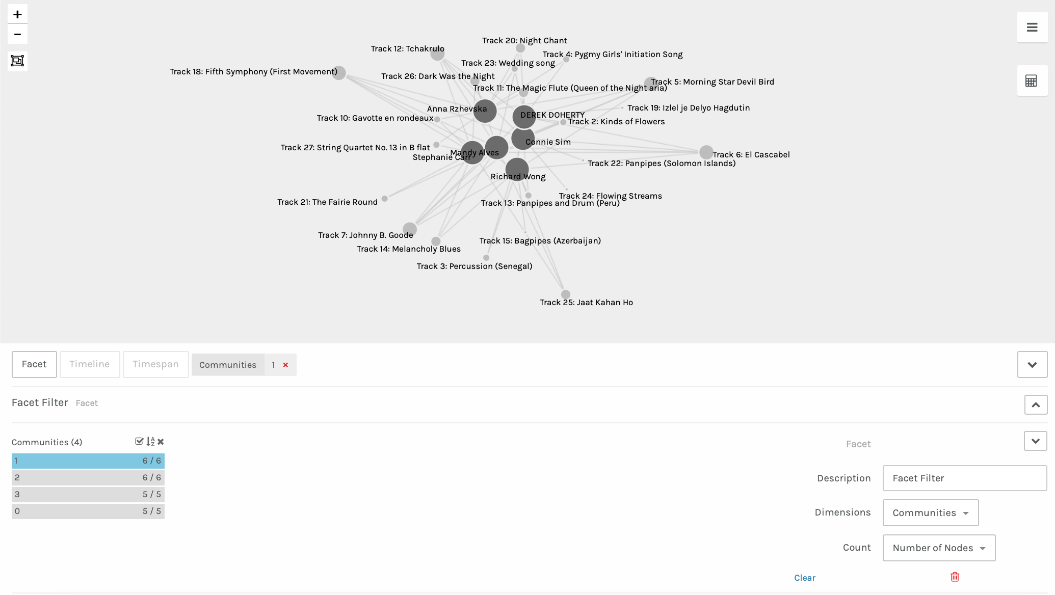
Next, I decided to explore and analyze Community 1 with the number of nodes. To me, it is unclear how these communities are made, but I assume it is because we had the most similar choices among the 10 tracks that we all picked. Myself and five others are in this community (Anna Rzhevska, Derek Doherty, Connie Sim, Richard Wong, and Mandy Alves). In this community, there were four tracks that only had 1 degree of connectivity. Those tracks were Track 15: Bagpipes (Azerbaijan), Track 19: Izlel je Delyo Hagdutin, Track 22: Panpipes (Solomon Islands), and Track 24: Flowing Streams. There were no tracks that had all of these students connected, however there were five tracks that had 5 degrees of connectivity. Those tracks were Track 5: Morning Star Devil Bird, Track 6: El Cascabel, Track 7: Johnny B. Goode, Track 12 Tchakrulo, and Track 18 (Fifth Symphony: First Movement).
It would be interesting to investigate this data further by figuring out why each student chose the tracks that they did. The graph does visualize the connections between tracks but there is no data on why each person selected these tracks. As well, it would have been effective to also have data where the tracks could also be connected to the instruments that occur in each song. With this data, we could see if there were any correlations between the types of instruments and all the tracks that each student picked for their top ten tracks. I wonder how many more connections there would have been between all students. Also, it would be so neat and visually appeasing if the tracks were categorized into colours depending on either the instruments used (for example, all wind instruments would be blue) or the pitch and tones of the instruments (for example, very high pitched sounds would have a red colour, whereas low pitches would be blue). There are so many different ways that data could have been collected in order for us to see all the different connections between one another. However, I enjoyed this task as we were able to get a taste of what data networking looks like with the only data being the ten tracks each student picked.
I then wanted to see which student I had the most connectivity with, so I analyzed myself with the five other students in pairs. I discovered that myself, Stephanie Carr, and Mandy Alves connected the most.
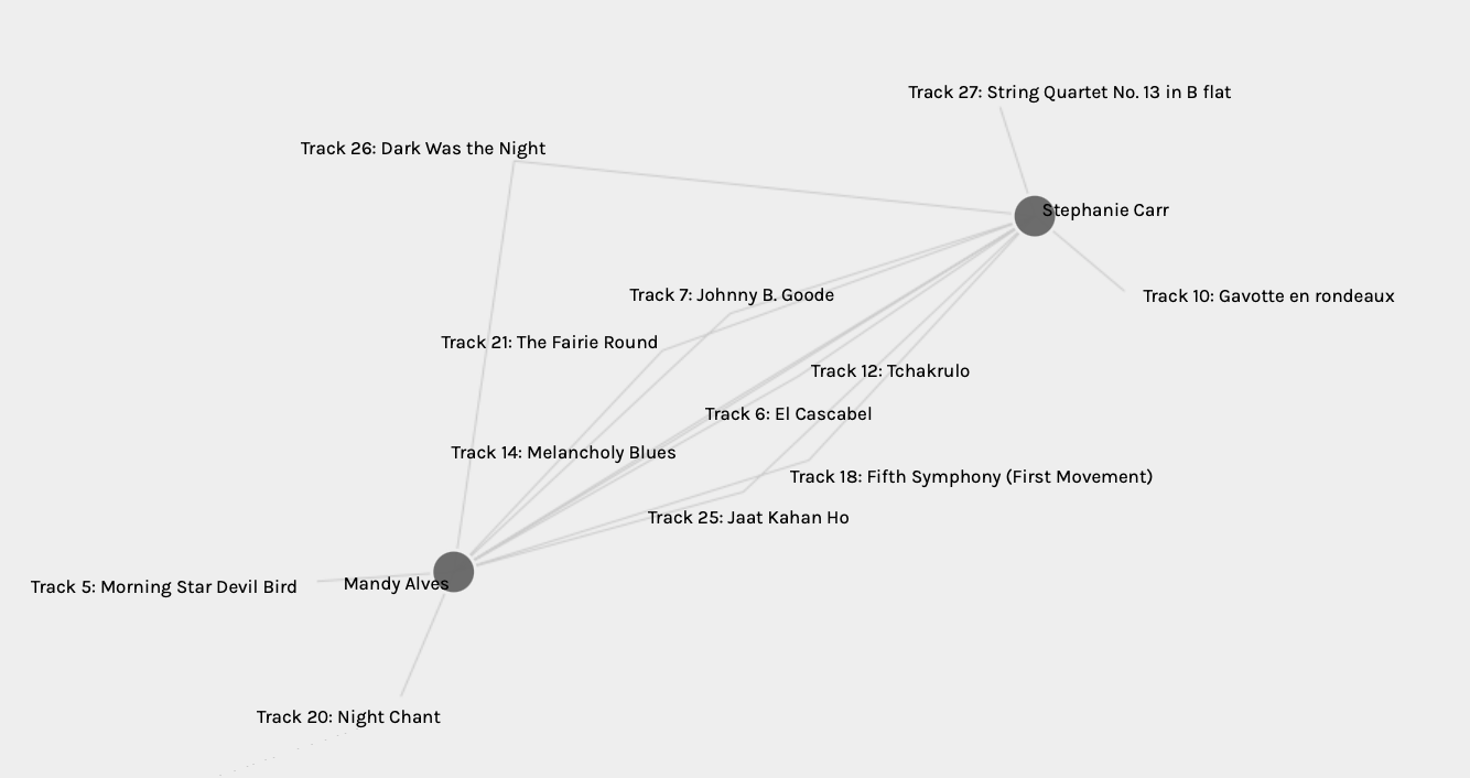
We both chose the same eight tracks out of the ten tracks we were allowed to choose. Do we both like the same types of music? Do we enjoy certain tones and instrumentals while listening to music? It would be fascinating to see why we both picked the eight tracks that we did. However, this data does not provide this information. I know this is not based on music, but I wonder if we were to both open up our Netflix to see what movie recommendations there would be, would it be similar? Does the type of music that you enjoy also correlate with the types of movies one enjoys? That would be neat to collect data on to see the similarities and differences.
When I think about the political implications, I think back to why I consider a committee from Cornell University were the chosen ones to determine which tracks would be placed on the Golden Record. Did they have biases on the tracks they decided to choose? Out of all the music in the world, how did they narrow it down to just 27 tracks? Also, how come not all musical genres were represented on this track? There are significant information gaps on the Golden Record and with the tracks that were selected for this voyage.
Now with reflecting on the political implications of the current data taken for this task, there are some missing gaps. With the visualizations of the data, viewers can identify which tracks were most liked and which were not. However, we can only see who the curators are and what tracks they chose instead of why they picked the tracks that they did. Were the tracks chosen only on the sound of the music? Or by the instruments played on the track? Or did individuals prefer instrumental music opposed to hearing someone sing? Or perhaps the curators just randomly picked ten tracks because it was too hard to choose? Or perhaps they did not have a liking to any of the tracks but had to pick ten for the purpose of these tasks? Without any reasoning or criteria behind why these tracks were chosen, the data really does not provide us with that much information.
Stephanie,
I had similar wonders about the data representation. Without context, the displayed data doesn’t share the story of why. Perhaps one has memories with one song over another, or perhaps they have great distaste for a particular genre.
I believe that an application such as Palladio is powerful, but the data story and the questions being provoked need to be clear. Instead of what are your top ten song choices to communicate the human experience? Perhaps a more precise question or story would need to be told. Maybe a question such as, what song on this list communicates the human ability to love? or, What song best depicts the intersection of humanity and the natural world?
I argue that the tool is wonderful, but the question is too vague and as a result the stories conveyed have little or no context.
Data is a powerful storyteller, but without the right questions, we’re left with disconnected bits of information and no system for decoding.