I enjoyed reading Mike’s speculative futures as I found them creative and intriguing to speculate about. Mike’s first speculative future found the world having tried to establish one world language: the Emoji language. However, this did not last long as, “officials didn’t realize that a language, especially one which uses symbols, is still open to interpretation depending on the different cultures.” I love the idea of having one global language. As explained by Dobson and Willinksy (2009), “digital literacy carries with it the potential for a far wider, more global access to knowledge” (p. 286), so it is a happy thought that we might one day all have equal access to knowledge. It was entertaining to think about the challenges we would face if we were to only rely on emojis to express ourselves though. Perhaps this was just a global written language, but I wonder how this would affect spoken languages. As Mike said, “language is intertwined with culture” and “culture across the globe is constantly evolving.” I wonder if the development of emojis would be able to keep up with the development of culture and expression.
Mike’s second speculative future was interesting as it followed a student going to school. By ‘going’ to school, this student walked downstairs and sat down in a chair in his own home, connecting to school via retinal detection through goggles and listening on a set of headphones. It was fun to see just how much Artificial Intelligence (AI) had taken over in the field of education, but also how there was a certain amount of freedom in his school day. David had to follow lessons, but had freedom in the order he completed them in. I felt jealous that David got to virtually visit other places. I know this is something that is greatly developing with virtual reality, but I have never experienced it myself. Some of my bigger questions about this future reality are: How are students socializing? What are students missing out on now that they don’t have a relationship with an actual teacher? Are there any humans included in David’s education?
Mike’s task was well laid out for it to visually stand out, but also to express what these speculative futures could look like. I appreciated how Mike included the task description at the top of the page as it reminded me what to expect from this task. Mike was able to bring in different modes of meaning like visual and audio meaning (Cazden et al., 1996) by including an audio version of ‘David’s Day’ at the bottom of the page and by inserting Emoji sequences at the end of each paragraph in the first speculative future.
Mike’s speculative futures seemed to show that the world was trying out new ways of doing things. In the first, it did not seem entirely successful and, in the second, it is unsure whether it would be the best way forward. When creating my speculative futures, I was worried that we would continue to rely on dated teaching methods, but Mike thought up of innovative ways that education might change, shaking up the way we teach our students in the future (Dunne & Raby, 2013).
Both Mike’s and my speculative futures included AI. I used it more as an assistant to teaching as I like to think that human interaction holds significance in a student’s learning journey, but we both saw AI as a positive development. Another similarity in our speculative futures was that we both saw negatives and positives to potential developments in education and expression. Mike’s speculative future included the desire for better communication amongst every individual, but also the realisation that this does not work in a world full of rich cultural diversity. My speculative future saw the advances of technology as a great time-saver, but that it did not encourage a consideration for good mental-health in terms of developing personal relationships with the people around us.
After seeing Mike’s speculative future, I wish that I had been more creative when it comes to showing what the world could look like in the future. I find it difficult to look to the more distant future, but there is fun and creativity that goes into thinking about what the future could look like.
Mike’s site is quite clean and easy to read. I enjoyed the emojis and pictures on this post and some others, but a few posts were a little bit bare. Although, I do not believe we have to include images to make content more interesting, but I am someone who enjoys having something to look at as a break from reading, whether it be a graph, an image, or even a change in font size or colour. That being said, I found Mike’s website to be user-friendly as it is easy to navigate and find the different posts. It is nice to have all the posts in one place.
Dobson, T.M., & Willinksy, J. (2009). Digital literacy. In D. R. Olson, & N. Torrance, The Cambridge handbook of literacy (pp. 286-312). Cambridge University Press.
Dunne, A., & Raby, F. (2013). Speculative everything: Design, fiction, and social dreaming. The MIT Press.
When I first opened Jackson’s blog, I thought I might have clicked on the wrong link as there was so much more information than I had expected to find. After a little exploring, I quickly found the blog page and saw how easy it was to find each individual assignment, task, and final project on one page. The pictures made the website engaging and different sizes of fonts kept my eyes moving and engaged on the different pages. One comment I would make is that it would be nice to have a comment section on the individual pages, however, I was still able to send a comment via the ‘contact’ page.
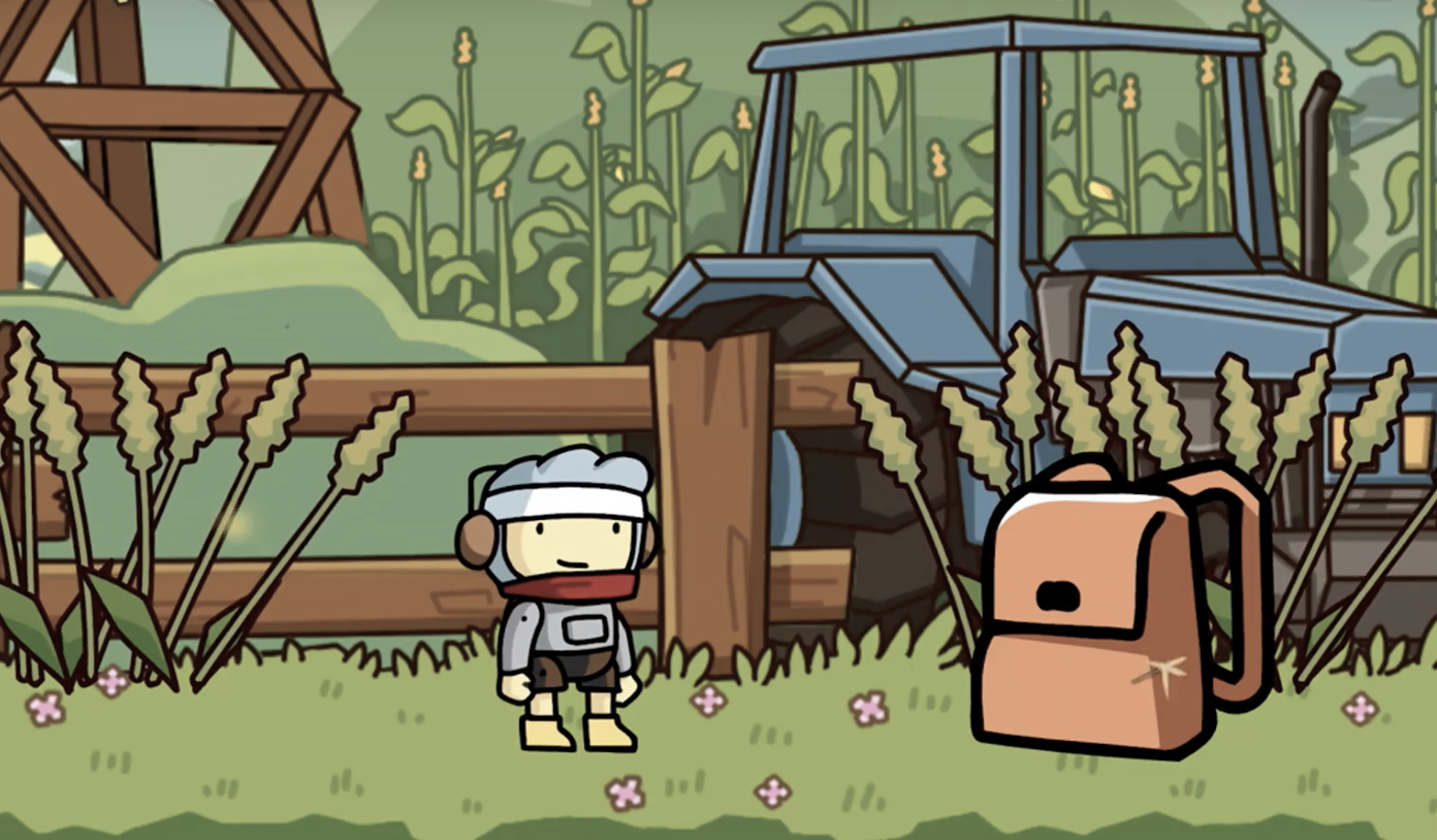
Jackson’s mode bending task was created using Scribblenauts. It interested me that their mode-bending task was being shown in a video format, but I was even more intrigued when I saw that it was created using a game. Especially one that encourages the use of fun adjectives!
As teachers, it is important to continuously re-evaluate our teaching practice to ensure that we are using technology in the most productive way for our students (Common Sense Education, 2016). Jackson addressed this by returning to a favourite childhood game. Despite not being able to create every single element in their backpack, we (the audience) were still able to observe the process of trying out different ways to include objects like medicine and a pencil case. Jackson was able to successfully collect an array of items with very diverse adjectives. It was also special to see how certain objects could be linked with other people of things, like his grandfather being the original owner of the red letter. This added another layer to their activity.
Jackson mentioned how the New London Group encouraged engaging with the students’ personal experience, cultural backgrounds, and subcultural diversity. This activity allowed for a creative way to display one’s individuality. I had also tried to address this through a multiliteracies approach as it allows for a broader representation of language, culture, and social differences (Cazden et al., 1996).
This redesigning of their ‘What’s in your bag’ task shows that Jackson considered the “six design elements in the meaning-making process: those of Linguistic Meaning, Visual Meaning, Audio Meaning, Gestural Meaning, Spatial Meaning, and the Multimodal patterns of meaning that relate the first five modes of meaning to each other” (Cazden et al., 1996, p. 65). I did this by including text, images, and audio, but after seeing Jackson’s activity, I would love to have been able to incorporate a written aspect to personalize it even more. As the SAMR model recommends, we must continually be evaluating and re-evaluating our teaching practices (Common Sense Education, 2016). I enjoyed getting more ideas from Jackson’s project.
References:
Cazden, C., Cope, B., Kalantzis, M., Luke, A., Luke, C., Nakata, M., & New London Group (1996). A pedagogy of multiliteracies: Designing social futures. Harvard Educational Review, 66(1), pp. 60-92. https://doi.org/10.17763/haer.66.1.17370n67v22j160u
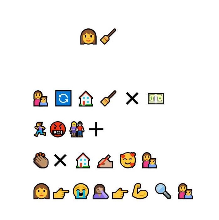
I am not entirely sure, but my guess is that Analesa’s emojis represent the Netflix short series ‘Maid’. I have not seen it myself, but from the trailer I have seen and the emojis Analesa chose for the title, I think I might be on the right track.
At a quick glance, although I notice some differences between Analesa’s and my emoji stories, I do notice some similarities as well. Both of our titles are short and simple, however, Analesa’s title is a representation of the character whereas my title emojis represent the three individual words of the title. We both wrote out our stories from left to write. This is another confirmation of what Kress (2005) said about order being fixed. As I stated in my task, although emoji order cannot (most of the time) mimic the syntax in a sentence, we can mimic the order of chapters, pages, and lines (Kress, 2005). Analesa remarked how the lack of punctuation marks was challenging, but I agree that, somehow, the change in lines kind of acted as a marker for the next ‘sentence.’
Another big difference is that I strangely tried to write out the entire plot of my movie, whereas Analesa gave a brief overview of the storyline. I like this idea better as I believe that this emoji activity becomes too complicated when there are too many emojis to interpret.
Analesa said that, initially, they wrote the plot out on paper and then tried to fill it in with emojis. I did not have that same initial thought as I just tried to go through the movie in my mind and select the pictures that fit the storyline the best. I do agree, however, that, as Analesa explained, “one emoji can represent two or more words and sometimes a phrase or a sentence.” This can complicate things as no one can predict exactly how the emojis will be interpreted. As individual words, as an expression, as a theme, etc.
When I initially completed this task, I agreed with what Analesa said about Emojis creating their own slang that not everyone can understand. Analesa went on to say that, for some people, emojis confuse reading and writing due to their many different interpretations. Bolter (2001) agreed that, although images can express meaning, they lack the ability to share information that does not allow for different interpretations. With text you can work on making things explicit, but this is more complicated with emojis as their meaning is not necessarily clear (Kress, 2005).
Although I agree that emojis can be interpreted in different ways depending on culture, age, etc., I also do think that emojis can enhance written texts to improve understanding as well. There is the obvious expression of emotions, but even when it comes to understanding the vocabulary in a new language, or emphasizing certain parts of the text, we can greatly enhance a text with emojis. There are also some situations where different interpretations are welcome, like when interpreting art, or creating something unique.
Analesa has a nice blog space that is easy to navigate. I have one set photo at the top of every page, but I like that Analesa has a set background. It is simple to get from the weekly tasks to the linking and final assignments. I especially like the setup of the weekly tasks as it is simple to get a clear overview of all of them. Finally, I like how at the bottom of the page, there’s the comment section, post information, and author information. I feel like the choice of theme for Analesa’s blog was well selected. My blog, although it offers navigation buttons, aesthetically it is harder for users to get around and see everything clearly.
References:
Bolter, J.D. (2001). The breakout of the visual. In Writing spaces: Computers, hypertext, and the remediation of print(2nd ed., pp. 47-76). Lawrence Erlbaum Associates. https://doi.org/10.4324/9781410600110
I enjoyed exploring Johanna’s Twine task because I felt like we faced some similar challenges when creating our Twines whereas our final product was quite different.
Johanna’s Twine had a bit of a darker theme. The background was dark while the font colours really popped with the pinks and purples. It was easy to read and caught the eye. Even the picture on the first page of the Twine added to the whole mystery
Another aspect I really enjoyed about Johanna’s ‘Let me tell you who you are’ Twine is how personalized it was. I could put in my name and, seeing as I could choose any answer, I know my results are completely unique to what I write. It is satisfying to know that I am (most likely) the only one who will get the results that I did. Johanna’s aim was “to connect with the player.” To do this, Johanna needed to “work with open-ended answers and variables” which would allow the player to have a unique experience.
All these aspects made Johanna’s Twine different to mine. My theme was more of a children’s book adventure with background pictures. I also only had one set story with no individualized choices. If they selected the ‘wrong’ path, they had to come back and try again until they got it right. The players in my Twine had less freedom than those playing Johanna’s Twine.
One of the similarities was the challenges we faced and how we solved them. We both used online resources to get tips from other Twine users and we both found it challenging to find ways to play around with the font sizes and colours. Johanna referred to how texts can function like images (Bolter, 2001). Their size, font and placement can add to the theme, the overall mood, and the interpretation.
Looking at Johanna’s blog space, I found a pleasing aesthetic. I enjoyed the white writing on black background which differs from my black writing on white background. Similarly, to my blog space, Johanna’s has one set background picture for all pages. My one challenge was finding where to go to access the different tasks without going back one task at a time. I eventually found them in the list of posts, all in one place.
References:
Bolter, J.D. (2001). The breakout of the visual. In Writing spaces: Computers, hypertext, and the remediation of print (2nd ed., pp. 47-76). Lawrence Erlbaum Associates. https://doi.org/10.4324/9781410600110
Lexie’s post appealed to me because I think we addressed it with different mindsets. Lexie is an art teacher and so was able to express the importance of art with respect to communication. How it can be used to share stories or can be read and interpreted, just like a book can. My perspective came more from the idea of how practical things are now when it comes to expressing ourselves. Anytime I need to write anything, I have something on hand like a pen or a phone. Thinking about how time consuming and complicated it was to get something aesthetically pleasing was what stood out to me.
I really enjoyed how Lexie saw this as an opportunity to have fun and express oneself. Lexie’s word was ‘learn’ in colourful, capital letters. My word was ‘smile’ in brown, cursive letters.
Lexie “consciously chose uppercase letters, believing they would be easier since they generally have fewer curves” whereas I consciously chose cursive stamps because I wanted to challenge myself. Lexie seemed comfortable in creating letters backwards in 30 minutes, but I found that rather challenging, using a mirror to help me complete this task in double the time.
I enjoyed Lexie’s reference to how a book is made for circulation, permanence, easy transportation, and used to transfer knowledge physical and into the future (Lamb & McCormick, 2021). With this definition, Lexie stated that whether text or art, a book is a book. Lexie’s stamps could be considered as art, whereas I had just seem my stamps are a means to express a word.
Like Lexie’s stamps, I found the webspace to be particularly pleasing in its simplicity and straightforward navigation. With one button for tasks, one for linking assignments, and one for the final project, I found it incredibly simple to find where things were. I found it quite challenging to find ways to post everything in one place, so I ended up having pages for tasks and posts for tasks.
Below I go delve a bit deeper into reimagining task 3, but first I wanted to make mention of Graeme’s blog layout. The website is incredibly easy to navigate and I really enjoyed that there were three main pages to look through: main tasks, final project, and linking assignment. The simplicity is calming and I found the font choice really satisfying to read. I think that I sometimes get lost in adding pictures or making things stimulating, but there is definitely a beauty in simplicity that I think I should embrace.
For this linking assignment, I wanted to take on this task once again, but with a little spin. Below you will find two recordings and two scripts. All of these have the same intention – to share my thoughts on my first link in this linking assignment.
There is no need to listen to and read everything, as they all have the same purpose. This was more to see the variety, and to put further thought into this task (the first audio is quite lengthy and maybe not the most coherent as I was expressing my thoughts using bullet points as a guide and not a full text – I struggle with this). At the bottom of this link, you will find some final thoughts.
First, you will find a recording is of me expressing myself orally, with no script, but some bullet points.
Second, there is a recording, but it was made with the purpose of voice-to-text turning it into a coherent text. I am reading this from a script, but I have not scripted in punctuation – I am trying to remember to do this as I go along.
Third, the text that has come from the voice-to-text recording. I used Microsoft Word, the same voice-to-text software that I used for my original task and one of the ones that Graeme used.
Fourth, my written text for this assignment.
1. Recording 1:
I could not upload this recording, so I am sharing it via my Google Drive.
2. Recording 2:
3. Speech-to-text:
I decided to look more closely at Graham’s post as they used both Microsoft Word and Google documents apostrophe speech to text software. For my task, I had only used Microsoft Word, but by using two different technologies for the same task, Graham was able to see the strengths and weaknesses of both. By seeing both texts side by side while listening to the recording, I was able to see the mistakes they both made. Surprisingly, both Microsoft Word and Google documents detected the same mistakes, but wrote down different interpretations.
One of the most visible challenges was the lack of punctuation. Grand stated how “while it is possible to identify sentence and phrase structures in the writing, there are instances where it isn’t clear where to punctuate.” this is a challenge when it comes to interpreting at times, as we need to “provide visual rather than auditory cues for information structure in written English” [more, 2016, P. One]. Graham also noted the lack of consistency with the tenses and, when the interpretation is incorrect, the text “careens toward nonsense”.
In my task, I had said that, when reading a text, the author must select words carefully and choose their punctuation wisely seeing as they are not able to use their voice to show the changes in emotion or energy. Graham also notice that “most obvious elements to disappear are the cadence and expression of the aural recording.” intonation and emotion are mostly last in written language [can an I guess he can, 2013].
When speaking with the intent of having a speech to text software write down the text, it feels quite unnatural. Graham shares how we need to change the way we speak, like our renunciations, the pace, and the fluency of our speech open brackets schmandt besserat, 2009]. This is not something we tend to focus on when communicating orally. Once we see our text written hour after using text to speech, we automatically see where we need to enunciate better, add in punctuation, etc. We can make our talk sound more like writing only after we see writingopen brackets Abe abboud, 2014 close brackets.
Finally, Graham mentions how, when giving this software to students with physical or learning difficulties, one would need to consider all these complications. During my first task, I miss the linking speech to text to its potential uses. Those that thrive in spoken word might struggle in writing, so speech to text holds a lot of potential. However, it would perhaps be too challenging to use as one has to think clearly about all these extra challenges like correcting misinterpretations and including punctuation. I also missed linking this back to all the oral traditions we may have lost in the transcription to written text. Oral storytelling gets disrupted when being turned into writing. Humans may be able to distinguish meaning and pick out mistakes, but there is still space for human error to change the original intonation and meaning of a story.
4. Written link:
I decided to look more closely at Graeme’s post as they used both Microsoft Word and Google Documents’ speech-to-text software. For my task, I had only used Microsoft Word, but by using two different technologies for the same task, Graeme was able to see the strengths and weaknesses of both. By seeing both texts side-by-side while listening to the recording, I was able to see the mistakes they both made. Surprisingly, both Microsoft Word and Google Documents detected the same mistakes, but wrote down different interpretations.
One of the most visible challenges was the lack of punctuation. Graeme stated how “While it is possible to identify sentence and phrase structures in the writing, there are instances where it isn’t clear where to punctuate.” This is a challenge when it comes to interpreting at times, as we need to “provide visual rather than auditory cues for information structure in written English” (Moore, 2016, p. 1). Graeme also noted the lack of consistency with the tenses and, when the interpretation is incorrect, the text “careens toward nonsense.”
In my task, I had said that, when reading a text, the author must select words carefully and chose their punctuation wisely seeing as they are not able to use their voice to show the changes in emotion or energy. Graeme also noticed that “most obvious elements to disappear are the cadence and expression of the oral recording.” Intonation and emotion are mostly lost in written language (Gnanagesikan, 2013).
When speaking with the intent of having a speech-to-text software write down the text, it feels quite unnatural. Graeme shares how we need to change the way we speak, like our enunciation, the pace, and the fluency of our speech (Schmandt-Besserat, 2009). This is not something we tend to focus on when communicating orally. Once we see our text written after using text-to-speech, we automatically see where we need to enunciate better, add in punctuation, etc. We can make our talk sound more like writing only after we see writing (Abe Aboud, 2014).
Finally, Graeme mentions how, when giving this software to students with physical or learning difficulties, one would need to consider all these complications. During my first task, I missed linking speech-to-text to its potential uses. Those that thrive in spoken word might struggle in writing, so speech-to-text holds a lot of potential. However, it would perhaps be too challenging to use as one has to think clearly about all these extra challenges like correcting misinterpretations and including punctuation. I also missed linking this back to all the oral traditions we may have lost in the transcription to written text. Oral storytelling gets disrupted when being turned into writing. Humans may be able to distinguish meaning and pick out mistakes, but there is still space for human error to change the original intonation and meaning of a story.
Final Thoughts:
I enjoyed creating this first part of my linking assignment. Originally, I wanted to simply write it out, but then I thought that I could perhaps create an audio in the spirit of changing up my delivery. From that and after reflecting on Graeme’s task, I felt that it would be interesting to see the difference between something shared orally with the intention of having an audience listening to the recording, and an audio recorded with the purpose of having it read as a written text. The result is as mentioned in my linking assignment seen above. The intent of how your text will be taken in (listened to or read) completely changes the tone of the delivery and the quality of the text itself. My first audio is quite relaxed, shows emotions, rhythm, tone, and mistakes. It’s not very concise and I lose my train of thought a few times. The second seems almost robotic. I am trying hard to pronounce words correctly, include punctuation, etc. All of this without the added complications of my original task where I included French names. The first text includes some mistakes, as with my and Graeme’s original tasks, even though it was done with care. Finally, the written text, although including very similar information, has a very different feel than the first recording. I was able to concisely share the information I wanted to share as I was able to edit it before including it in this post. It is formal and no emotion is shared. Without adding a lot of extra text, it would be very difficult to replicate the emotions and intonations from the first recording.
My very final thought is something I want to touch base on, especially after the feedback I was given from my original task. The whole changeover from oral tradition to written text seems more understandable to me after trying these out. Granted, voice-to-text uses a computer and my story or this assignment is not the same as a story including traditions, history or legends. However, I can see how my version of oral storytelling was completely changed and fully disrupted once I knew that the content would be received via legible text. How would you transcribe movement, dramatic pauses, intonation changes, noise levels, etc.? Even though a human may have detected more mistakes that a speech-to-text software, we must also leave room for human error, which leads us to wonder exactly how much was taken away when transitioning from oral storytelling to written stories.
Gnanadesikan, A. E. (2011). The First IT Revolution. In The writing revolution: Cuneiform to the internet (pp. 1-10). Wiley-Blackwell.
Moore, N. (2016). What’s the point? The role of punctuation in realising information structure in written English. Functional Linguist, 3(6). https://doi.org/10.1186/s40554-016-0029-x
Schmandt-Besserat, D., & Erard, M. (2009). Origins and Forms of Writing. In Bazerman, C. (Ed.). Handbook of research on writing: History, society, school, individual, text (pp. 7-26). Routledge. https://doi.org/10.4324/9781410616470
When I think about the future, I either think about the endless possibilities for human innovation and improvements in every sector, or I feel sadness about things stagnating because no positive changes are coming about. Taking all of these courses helps me to see the potential we have when we think outside the box, but in my experience in some schools, people fear change and the work that comes with it as well as the unknown. In some ways, the education model has not changed in the past 150 years (Boyce, 2019). Perhaps access to education has improved, but in some ways the focus remains on acquiring information rather than analyzing and thinking about it (Boyce, 2019). Thankfully, improvements in technology have allowed for quicker and easier access to information, but learning to differentiate between good and false information can continue to be a struggle (Heick, n.d.).
When looking to the future, I worry that we will continue to rely on dated teaching methods hidden in new technologies, however, I am hopeful that we will find ways to be creative and shake up the way we teach our students (Dunne & Raby, 2013).
°°°°°°
Dear 2021 Danya,
I am writing you this from 30 years in the future. I’ve been debating for a while whether or not I really should get in touch, but after a lot of thought, I figured it can’t hurt if I’m careful about what I share.
Things have changed as much as you probably would have expected in 30 years. It’s strange to think about the technologies we didn’t have access to back in 2021. It’s also a bit odd to be writing on a computer like I used to as we don’t really communicate this way anymore.
Without being too specific (some surprises are nice), we continued to prioritize time. Ease of communication, access to information online, getting jobs done. Technology was found to be far superior to humans due to our speed and how prone to making mistakes we are. In some ways, this is a blessing as I don’t have to waste time with shopping, cooking, figuring out taxes, getting lost getting places. It also allowed us to make great strides in the fields of medicine and engineering. AI didn’t turn out to be the scary development I had thought it would be. In fact, it’s been extremely helpful to me as a teacher.
We don’t have the same time constraints we had before. AI has facilitated making incredible individual learning plans for all of our students. They are able to individually advance in their learning, allowing us to spend more time on individual needs. Although for a moment there we thought teachers may become redundant, the need for human connection and relationships amongst students themselves and with their teachers proved to be as significant as we always said it was. More than ever before we live in our solitary bubbles and now our focus is on going back to the basics to establish relationships. I remember when we used to cook and do the dishes as a family. We don’t need to cook or clean anymore, so we find new ways to spend time together. I remember knowing getting to know the people working at my grocery store or meeting friendly faces at the post office. We have lost these seemingly insignificant moment of socializing, but we have gained others. However, for some it’s a challenging and lonely place to be.
Despite all of this progress, we still have people around the world who do not have access to our technologies. Not even just across different continents, but within our own cities. Some students have access to incredible learning technologies, individualized learning plans, support systems, AI teaching support, while others are still trying to keep up with the same systems they had access to 30 years ago. Unfortunately, this leaves us with a continually growing gap in education and future prospects for these students.
I wish I had more to share about how things have changed for the better. Perhaps I’m just focused on the changes I had wished to see, but I guess we’ll see where the next 30 years takes us!
Danya
°°°°°°
References
Boyce, P. (2019, August 18). Schools are outdated. It’s time for reform. Foundation for Economic Education. https://fee.org/articles/schools-are-outdated-its-time-for-reform/
Dunne, A., & Raby, F. (2013). Speculative everything: Design, fiction, and social dreaming. The MIT Press.
Heick, T. (n.d.). 10 ways teaching has changed in the last 10 years. Teach Thought. https://www.teachthought.com/the-future-of-learning/teaching-has-changed/
Exploring and getting through the User Inyerface was equally amusing as it was frustrating. I quickly realized that I have almost instinctive ways in which I interact with online forms. It reminds me of a video made by Vox (2016) where they explore how there are some doors, Norman doors, that people always try to open the wrong way. There is an art to the design of a door that allows the user to experience it with ease. Door design was not something I had ever thought of. Now I realise I took the ease with which I use online forms for granted, as a lot of thought is put into their design.
There were several steps to the User Inyerface that stood out to me. Starting on the first page (Figure 1), I wanted to go and click on the green button, then possibly the underlined ‘click’, or the capitalized ‘GO’. Ultimately, clicking ‘HERE’ to continue seemed to make sense when I finally selected it to take me on to the next page.
I spent a long time on the second page (Figure 2). Having to select or delete the words in the text box before putting in your own is a slight hassle you do not generally experience on other forms. Having to select ‘.com’ out of a list is curious, and so is finding that option near the bottom as it is quite popular. It seems to add on unnecessary time when typing it out would probably be quicker. The password requirements were not strong safety recommendations and the password was visible when typing it out which does not fit with the general safety we feel on other websites. Finally, unselecting the terms and conditions to accept them and avoiding the big blue ‘cancel’ button went slightly against what I normally do. The flashing number across the top did not help while trying to figure out how to get to the next page.
The next page (Figure 3) was also quite frustrating as the wheel kept spinning on the picture. It felt as if I was leaving something unfinished. Downloading instead of uploading is a mistake I should have avoided considering all the previous buttons were not obvious either. For the interests selection process, I looked at all of them before unselecting, so I thankfully quickly found the ‘unselect all’ button. Having a ‘select all’ button seems redundant as we are only supposed to select three interests. Most websites would have everything unselected already to facilitate a quick selection of three interests. Then, once again, ‘cancel’ is highlighted green while ‘next’ is not. I felt like I had started to get the hang of it, but I clicked on ‘cancel’ as I was trying to rush to the next page.
The page it brought up (Figure 4) puzzled me a bit for a second. In this case, the ‘cancel’ option would not be to cancel, but to cancel the cancel. Whereas the red ‘yes’ would cancel.
On this next page (Figure 5), once again, the text had to be highlighted or delete to insert mine. The age selection was amusing as you had to roughly guess where to let go as the age would only show once you stopped sliding and clicking with your mouse. The country selection did not offer a selection of names, but flags and these flags would be easier to spot if coloured, however, they only were coloured when hovered over with the mouse. The ‘male’ or female’ selection had to match the ‘title’ selected, but to select ‘female’, you had to click ‘male’.
The help box (Figure 6) was not helpful in the least. I often found it in the way and I could not close it. If I needed to access something behind it, I had to ‘Send to bottom’ after which it would slowly crawl down and then pop back up again shortly after.
Another pop up that I found extremely unhelpful was the constant time reminder (Figure 7). Having to close it and not accidentally enlarge the page with the button at the top right simply slowed down the process altogether.
Platforms on the web are designed to be appealing, clear, and simple to use. Everything is designed to encourage us to spend more time using it (TED, 2017), but User Inyerface seems to do the exact opposite. I am so used to having easy-to-follow instructions and obvious steps to take, that I found this incredibly frustrating as filling it out went against all my instincts.
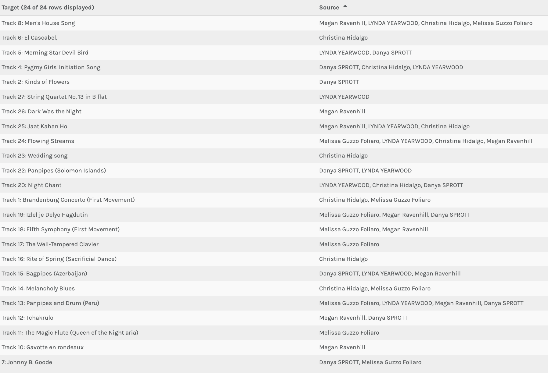
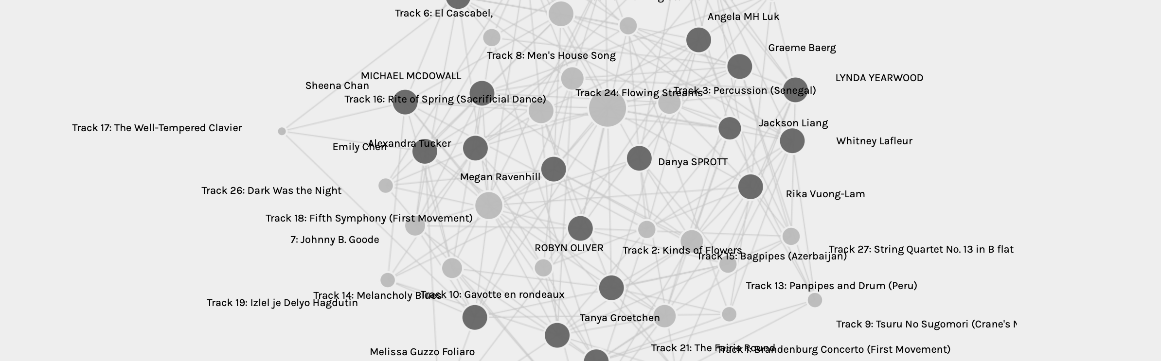
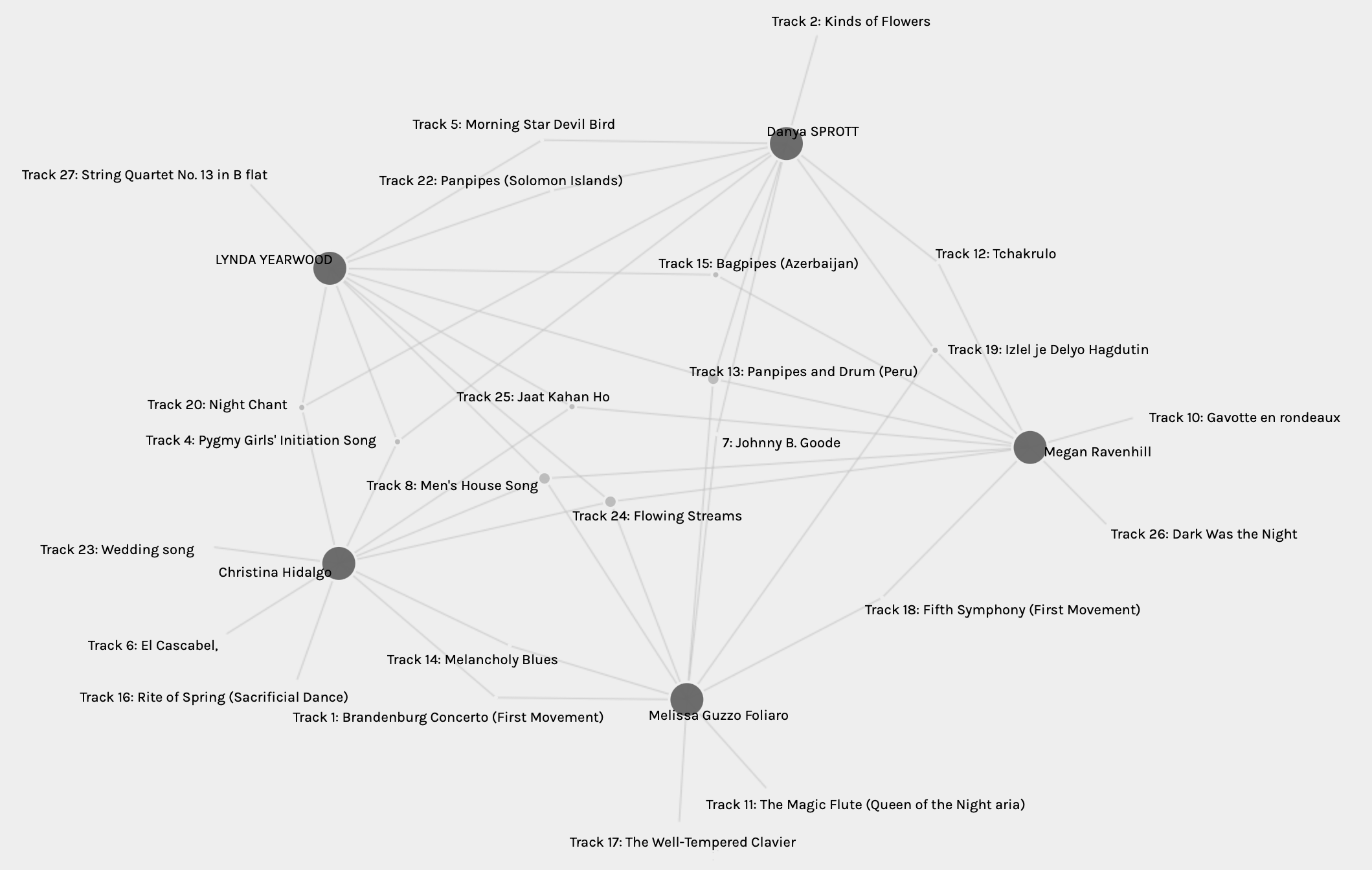
At first glance, I was intrigued to see the similarities and differences of the song choices between those the algorithm grouped me with and myself. There were quite a few songs that were only chosen by one of us and two songs were not represented at all. Which meant that all five of us had not chosen those songs.^
To explore some of these similarities and differences, I looked at my group members’ blog posts for task eight to see if we had any similar criteria when choosing our songs.
Christina – considering instruments, rhythm, and musical variety. Balance between vocal and no vocals and between male and female vocalists. Cultural diversity was a variety, removing euro-centric and western songs. Melissa – selected songs that spoke to them and described how they did. Lynda – wanted to represent a cross-section of culture and geography. Correcting any euro-centric bias. Megan – popularity, emotional impact, and cultural diversity. Wanting to represent different geographical areas. Danya – variety of music without considering geography. Trying to correct for biases by limiting classical music and popular music.
Both Christina and I wanted to represent musical variety and may of us tried to correct our biases. I had not considered Melissa’s criteria of selecting songs that trigger meaning when listening to them. In one way or another, we all tried to represent a diverse selection of songs either culturally, geographically, or musically.
After spending quite some time observing the graph and moving some of the nodes around, I decided to look at the different tables as they offer a different means of interpreting the data. Here, I quickly found out that my songs were not correctly displayed. As impressive as algorithms can be (Code.org, 2017), human error sometimes has a way of sneaking in. I am assuming that I must have selected the wrong songs in the quiz last week. Below is a picture of the table of songs and who they were selected by. Alongside are my list of 10 songs I shared on my blog for task eight.
Bach, Brandenburg Concerto No. 2 in F. First Movement, Munich Bach Orchestra, Karl Richter, conductor. 4:40
Senegal, percussion, recorded by Charles Duvelle. 2:08
Zaire, Pygmy girls’ initiation song, recorded by Colin Turnbull. 0:56
Mexico, “El Cascabel,” performed by Lorenzo Barcelata and the Mariachi México. 3:14
Mozart, The Magic Flute, Queen of the Night aria, no. 14. Edda Moser, soprano. Bavarian State Opera, Munich, Wolfgang Sawallisch, conductor. 2:55
Georgian S.S.R., chorus, “Tchakrulo,” collected by Radio Moscow. 2:18
“Melancholy Blues,” performed by Louis Armstrong and his Hot Seven. 3:05
Beethoven, Fifth Symphony, First Movement, the Philharmonia Orchestra, Otto Klemperer, conductor. 7:20
Bulgaria, “Izlel je Delyo Hagdutin,” sung by Valya Balkanska. 4:59
Holborne, Paueans, Galliards, Almains and Other Short Aeirs, “The Fairie Round,” performed by David Munrow and the Early Music Consort of London. 1:17
I decided to see how the results might have differed if this mistake had not been made.
Three of the songs would have become a single selection (tracks five, 22, and seven), one track would have not been selected at all (track two), and two tracks that had previously been unselected would now be selected (The Fairie Round, and the Senegal percussions).
If I were to ignore my error and just take a look at the given table and graph, now knowing our criteria for selecting our songs, I would see that we all had similarities in our selection process. The only stand-alone criteria being the one of how a song makes one feel. Several of us mentioned biases when it comes to our culture or western/euro-centric influences, but it would be interesting to see data showing if our cultural backgrounds had any significance in our selection of songs. Perhaps selecting which songs we were already familiar with and whether that caused us to select it over one we hadn’t heard. Or, if the fact that we were familiar with that song encouraged us not to select it. I was thinking about how a lot of us tried to correct our own biases, but, perhaps in doing so, we might have been playing into them as well.
Many of us explained why we chose the songs we did, but we did not often mention why we did not select the ones omitted from our lists. Some of us gave a brief explanation, but perhaps having an option to write one word explaining why we did not select it would show a pattern when looking at all of the words next to the songs the whole group omitted. Perhaps I do not see it, but I do not believe that the reasons for the ‘null’ choices are reflected or interpreted in the data. These song selections are very personal with everyone chosing their own criteria. This is very subjective, so I believe that to be able to get more out of the graph and tables, we would need to be able to include more data.
It is impressive that there are so many algorithms focusing on every facet of our connectivity. Not just to ensure relevancy while we search and explore, but also to correct human error and remove fake pages (Code.org, 2017). For example, when you type something into Google, and it says ‘Did you mean…’ offering the correct spelling. It is insane that these algorithms can use a form of artificial intelligence to best find the information we are searching for. However, they might not always be as accurate as we may think as they may include their own biases or errors (Rainie & Anderson, 2017).
Rainie, L., & Anderson, J. (2017, February 8). Code-dependent: Pros and cons of the algorithm age. Pew Research Center. https://www.pewresearch.org/internet/2017/02/08/code-dependent-pros-and-cons-of-the-algorithm-age/
 At a quick glance, although I notice some differences between Analesa’s and my emoji stories, I do notice some similarities as well. Both of our titles are short and simple, however, Analesa’s title is a representation of the character whereas my title emojis represent the three individual words of the title. We both wrote out our stories from left to write. This is another confirmation of what Kress (2005) said about order being fixed. As I stated in my task, although emoji order cannot (most of the time) mimic the syntax in a sentence, we can mimic the order of chapters, pages, and lines (Kress, 2005). Analesa remarked how the lack of punctuation marks was challenging, but I agree that, somehow, the change in lines kind of acted as a marker for the next ‘sentence.’
 Another big difference is that I strangely tried to write out the entire plot of my movie, whereas Analesa gave a brief overview of the storyline. I like this idea better as I believe that this emoji activity becomes too complicated when there are too many emojis to interpret.
 Johanna’s Twine had a bit of a darker theme. The background was dark while the font colours really popped with the pinks and purples. It was easy to read and caught the eye. Even the picture on the first page of the Twine added to the whole mystery
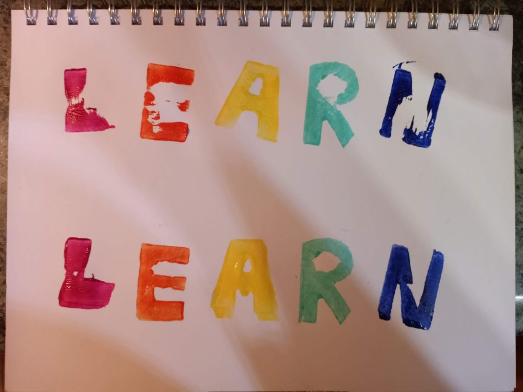 Lexie’s post appealed to me because I think we addressed it with different mindsets. Lexie is an art teacher and so was able to express the importance of art with respect to communication. How it can be used to share stories or can be read and interpreted, just like a book can. My perspective came more from the idea of how practical things are now when it comes to expressing ourselves. Anytime I need to write anything, I have something on hand like a pen or a phone. Thinking about how time consuming and complicated it was to get something aesthetically pleasing was what stood out to me.
 I enjoyed Lexie’s reference to how a book is made for circulation, permanence, easy transportation, and used to transfer knowledge physical and into the future (Lamb & McCormick, 2021). With this definition, Lexie stated that whether text or art, a book is a book. Lexie’s stamps could be considered as art, whereas I had just seem my stamps are a means to express a word.


 Exploring and getting through the User Inyerface was equally amusing as it was frustrating. I quickly realized that I have almost instinctive ways in which I interact with online forms. It reminds me of a video made by Vox (2016) where they explore how there are some doors, Norman doors, that people always try to open the wrong way. There is an art to the design of a door that allows the user to experience it with ease. Door design was not something I had ever thought of. Now I realise I took the ease with which I use online forms for granted, as a lot of thought is put into their design.
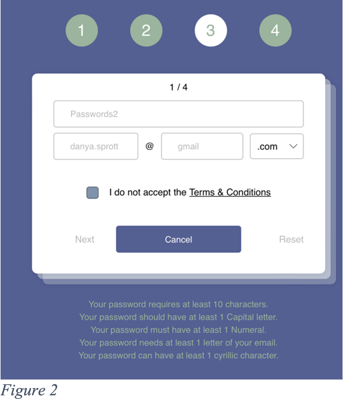 I spent a long time on the second page (Figure 2). Having to select or delete the words in the text box before putting in your own is a slight hassle you do not generally experience on other forms. Having to select ‘.com’ out of a list is curious, and so is finding that option near the bottom as it is quite popular. It seems to add on unnecessary time when typing it out would probably be quicker. The password requirements were not strong safety recommendations and the password was visible when typing it out which does not fit with the general safety we feel on other websites. Finally, unselecting the terms and conditions to accept them and avoiding the big blue ‘cancel’ button went slightly against what I normally do. The flashing number across the top did not help while trying to figure out how to get to the next page.
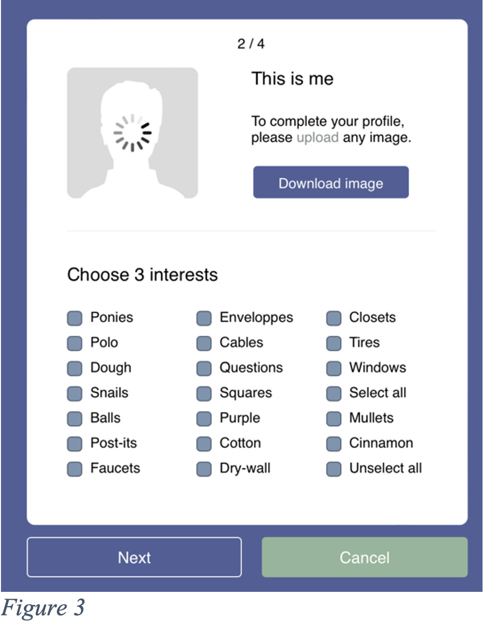 The next page (Figure 3) was also quite frustrating as the wheel kept spinning on the picture. It felt as if I was leaving something unfinished. Downloading instead of uploading is a mistake I should have avoided considering all the previous buttons were not obvious either. For the interests selection process, I looked at all of them before unselecting, so I thankfully quickly found the ‘unselect all’ button. Having a ‘select all’ button seems redundant as we are only supposed to select three interests. Most websites would have everything unselected already to facilitate a quick selection of three interests. Then, once again, ‘cancel’ is highlighted green while ‘next’ is not. I felt like I had started to get the hang of it, but I clicked on ‘cancel’ as I was trying to rush to the next page.
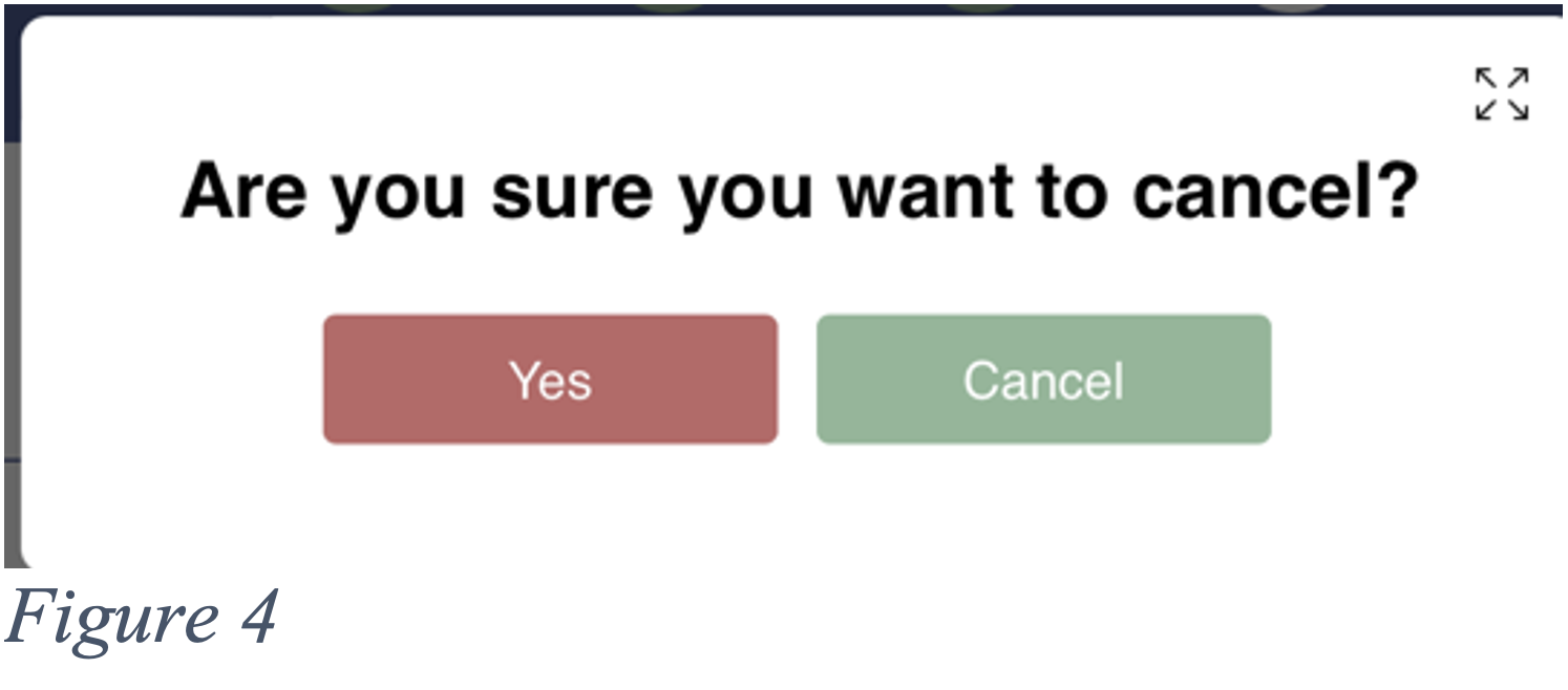 The page it brought up (Figure 4) puzzled me a bit for a second. In this case, the ‘cancel’ option would not be to cancel, but to cancel the cancel. Whereas the red ‘yes’ would cancel.
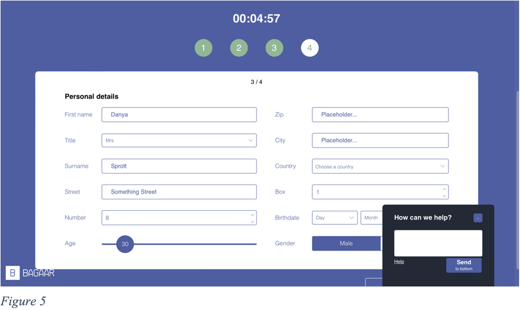 On this next page (Figure 5), once again, the text had to be highlighted or delete to insert mine. The age selection was amusing as you had to roughly guess where to let go as the age would only show once you stopped sliding and clicking with your mouse. The country selection did not offer a selection of names, but flags and these flags would be easier to spot if coloured, however, they only were coloured when hovered over with the mouse. The ‘male’ or female’ selection had to match the ‘title’ selected, but to select ‘female’, you had to click ‘male’.
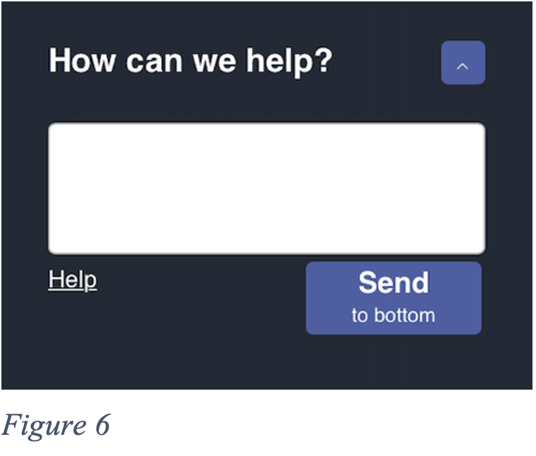 The help box (Figure 6) was not helpful in the least. I often found it in the way and I could not close it. If I needed to access something behind it, I had to ‘Send to bottom’ after which it would slowly crawl down and then pop back up again shortly after.
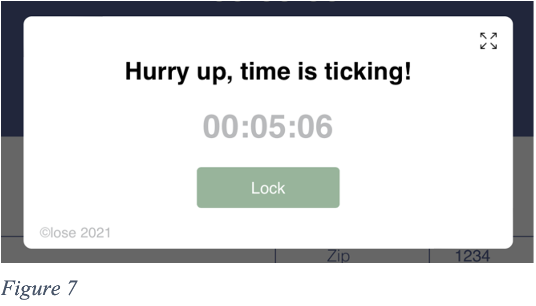 Another pop up that I found extremely unhelpful was the constant time reminder (Figure 7). Having to close it and not accidentally enlarge the page with the button at the top right simply slowed down the process altogether.
 Both Christina and I wanted to represent musical variety and may of us tried to correct our biases. I had not considered Melissa’s criteria of selecting songs that trigger meaning when listening to them. In one way or another, we all tried to represent a diverse selection of songs either culturally, geographically, or musically.