Attention economy

 Exploring and getting through the User Inyerface was equally amusing as it was frustrating. I quickly realized that I have almost instinctive ways in which I interact with online forms. It reminds me of a video made by Vox (2016) where they explore how there are some doors, Norman doors, that people always try to open the wrong way. There is an art to the design of a door that allows the user to experience it with ease. Door design was not something I had ever thought of. Now I realise I took the ease with which I use online forms for granted, as a lot of thought is put into their design.
There were several steps to the User Inyerface that stood out to me. Starting on the first page (Figure 1), I wanted to go and click on the green button, then possibly the underlined ‘click’, or the capitalized ‘GO’. Ultimately, clicking ‘HERE’ to continue seemed to make sense when I finally selected it to take me on to the next page.
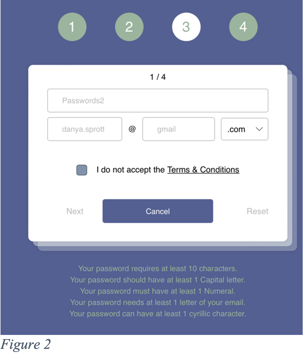 I spent a long time on the second page (Figure 2). Having to select or delete the words in the text box before putting in your own is a slight hassle you do not generally experience on other forms. Having to select ‘.com’ out of a list is curious, and so is finding that option near the bottom as it is quite popular. It seems to add on unnecessary time when typing it out would probably be quicker. The password requirements were not strong safety recommendations and the password was visible when typing it out which does not fit with the general safety we feel on other websites. Finally, unselecting the terms and conditions to accept them and avoiding the big blue ‘cancel’ button went slightly against what I normally do. The flashing number across the top did not help while trying to figure out how to get to the next page.
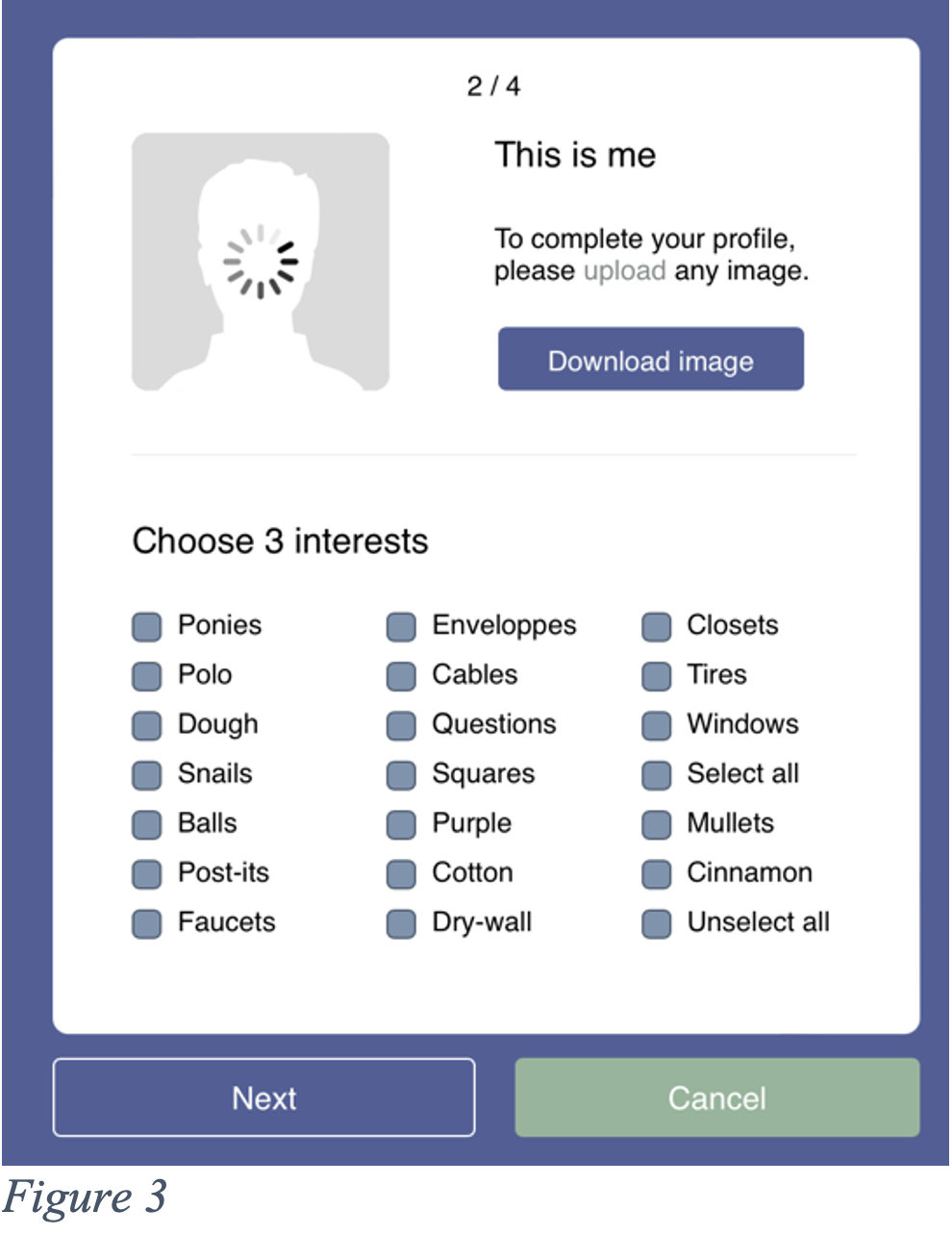 The next page (Figure 3) was also quite frustrating as the wheel kept spinning on the picture. It felt as if I was leaving something unfinished. Downloading instead of uploading is a mistake I should have avoided considering all the previous buttons were not obvious either. For the interests selection process, I looked at all of them before unselecting, so I thankfully quickly found the ‘unselect all’ button. Having a ‘select all’ button seems redundant as we are only supposed to select three interests. Most websites would have everything unselected already to facilitate a quick selection of three interests. Then, once again, ‘cancel’ is highlighted green while ‘next’ is not. I felt like I had started to get the hang of it, but I clicked on ‘cancel’ as I was trying to rush to the next page.
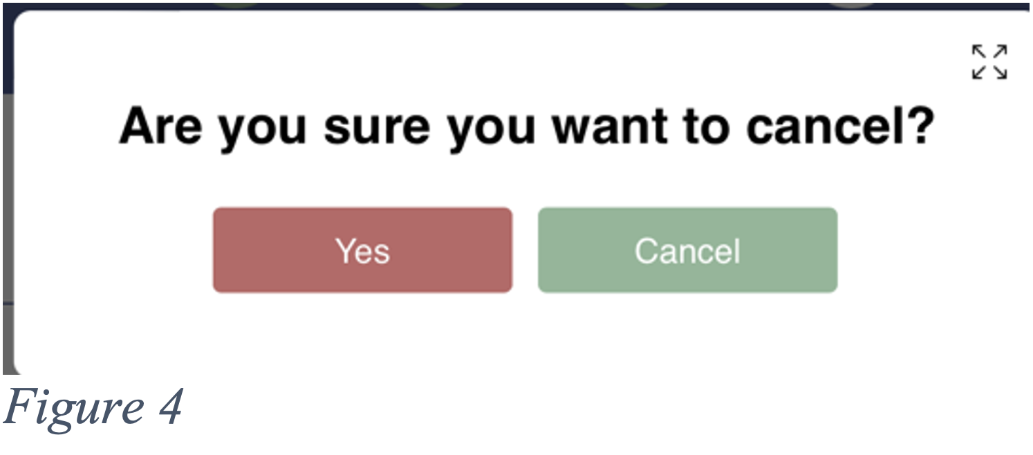 The page it brought up (Figure 4) puzzled me a bit for a second. In this case, the ‘cancel’ option would not be to cancel, but to cancel the cancel. Whereas the red ‘yes’ would cancel.
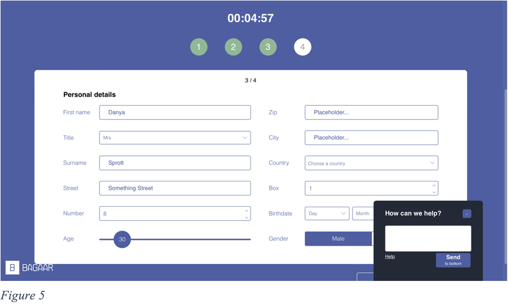 On this next page (Figure 5), once again, the text had to be highlighted or delete to insert mine. The age selection was amusing as you had to roughly guess where to let go as the age would only show once you stopped sliding and clicking with your mouse. The country selection did not offer a selection of names, but flags and these flags would be easier to spot if coloured, however, they only were coloured when hovered over with the mouse. The ‘male’ or female’ selection had to match the ‘title’ selected, but to select ‘female’, you had to click ‘male’.
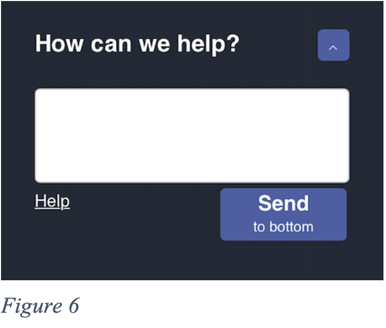 The help box (Figure 6) was not helpful in the least. I often found it in the way and I could not close it. If I needed to access something behind it, I had to ‘Send to bottom’ after which it would slowly crawl down and then pop back up again shortly after.
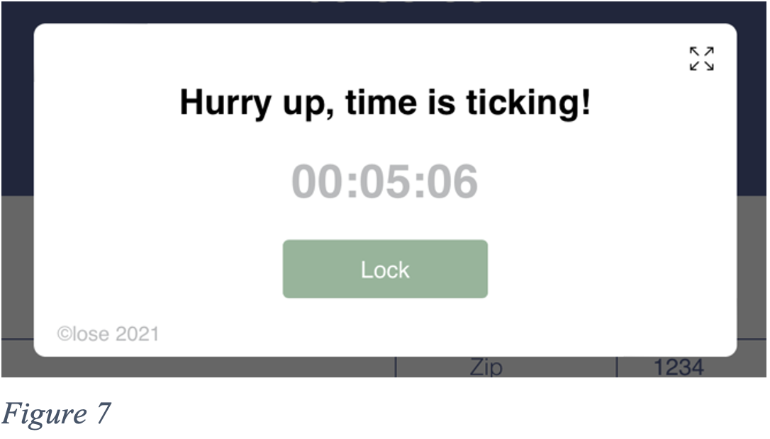 Another pop up that I found extremely unhelpful was the constant time reminder (Figure 7). Having to close it and not accidentally enlarge the page with the button at the top right simply slowed down the process altogether.
Platforms on the web are designed to be appealing, clear, and simple to use. Everything is designed to encourage us to spend more time using it (TED, 2017), but User Inyerface seems to do the exact opposite. I am so used to having easy-to-follow instructions and obvious steps to take, that I found this incredibly frustrating as filling it out went against all my instincts.

References
TED (2017, July 28). How a handful of tech companies control billions of minds every day ï Tristan Harris [Video]. YouTube. https://www.youtube.com/watch?v=C74amJRp730
Vox (2016, February 26). It’s not you. Bad doors are everywhere. [Video]. YouTube. https://www.youtube.com/watch?v=yY96hTb8WgI