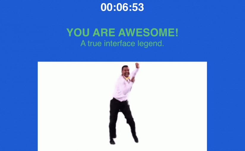
It took me roughly 7 minutes to complete the User Inyerface game, and I think about 4 – 5 of those minutes were spent trying to fulfill the supposed password requirements. I had to conduct a quick search on the meaning of cyrillic characters, and questioned the degree of information privacy I was afforded. Initially, I thought this was just an exceptionally poorly designed website, which raised a red flag for me in terms of what information I should truly divulge. As I progressed through the game, I came to realize this was simply a cleverly designed interface meant to challenge and frustrate internet users by highlighting a multitude of dark patterns.
Ultimately, the User Inyerface game by Bagaar is essentially and completely counterintuitive to the ways in which we’ve been (un)consciously trained to understand and utilize the fundamental design conventions within the Internet; basic patterns of recognition like directive buttons that draw your eyes, hyperlinked words and links, checkbox and form-filling functions and webpage symbols/ images have all been reworked in a way that do not reflect the current accordances of internet functionality. It almost felt like I was sort of learning a new internet language while playing this game. Perhaps more significantly, I was forced to recognize the depth of online marketing strategies and considerations developers need to contemplate when building web spaces and internet interfaces. I certainly won’t be taking the auto-delete function for granted anymore when I need to fill out an online form. With that said, however, the User Inyerface was not attempting to sell anything or truly strive to elicit dark patterns rather than venture to illustrate the degree to which dark patterns can appear within internet interfaces, challenge users to recognize them, and enquire about the importance they have within marketing strategies that influence social and cultural behaviours (Tufekci, 2017).
The most obvious deception is the giant green button on the first page; it draws your attention away from other page elements, tempting you to click it despite clearly reading “NO” as if satirically indicating it is not the right pathway. The button expands when you hover your cursor over it, implying the button actually does something. The small fine print below the button is written in a different colour font, and reads “Please click HERE to GO to the next page”- I could spend my entire post reflecting just on these 9 words.
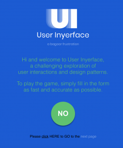
An internet user reads these words, recognizes the misdirection, and immediately becomes confused as to where exactly to be clicking. For me, my first instinct was to click on the underlined “click” particularly because I have come to understand typical hyperlinked words as underlined or shaded in different colours as a means of making a distinction from other text in that line. Of course, that goes nowhere. The next determination I made was to click on the “next page” text because it was written in a light blue hue. Nothing. Consequently, we are left with the capitalized words “HERE” and “GO”. Both words indicate a direction, but none make it clear where the next pathway leads; turns out we need to literally click HERE. None of these design features adhere to the traditional understanding of effectively navigating the internet.
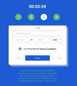
Perhaps the most frustrating aspect for me was the password creation page. Similar to the examples Brignull provides, the Inyerface UI utilizes a number of double negatives meant to confuse users (Brignull, 2011). Things like “I do not accept the Terms and Conditions” and “Your password is not unsafe” plastered in red text gives rise to concern for some users. For me, I noticed this and began continually reworking my password until I somehow met the requirements (It took me a few minutes to decipher that my password being ’not unsafe’ was actually a good thing). I absolutely despised the fact that when you click into the form-filling boxes, the text didn’t automatically disappear, and again, the button below labelled ‘cancel’ plays on the users traditional assumptions that this button is the correct button to use in proceeding to the next page.
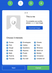
The user’s interest form is another example of an interface designed to play on the inherent design customs embedded within the traditional understanding of internet navigation. Firstly, the blue button labelled “download image” draws the users eyes and implores them to click, but any critical thinker will recognize that we do not need to download, but rather upload an image to proceed. Of course, this is uncharacteristically buried in a hyperlinked text above. Secondarily, the instructions prompt users to select three interests from a list of questionable selections. The twist, of course, is that all the selections are checked off, inclusive of both options providing users the possibility of selecting or deselecting all choices. I couldn’t help but remember a quotation from Brignull here:
Those who ignore both the checkboxes will unknowingly give some marketing permissions, while those who zealously tick both checkboxes will also end up giving some marketing permissions (Brignull, 2011).
The last step of the game is the CAPTCHA stage where the interface asks users to select all images pertaining to an incredibly ambiguous word in order to discern whether we are human. I was almost offended at this point – You want to confirm I’M human when you can’t even design a simple form properly? You can’t adhere to the basic conventions of internet navigation and you are challenging my humanity?
Regardless, “choose all the images of a bow” could be interpreted as selecting a bow tie, a bow and arrow, or perhaps the action of bowing. “Choose all the images of checks” could manifest itself in check marks, a monetary cheque, or the act of putting your opponent in check while playing chess. All of which turn out to be correct, and in fact, all of which are needed to be selected to succeed in this final task.
Consequently, this game is designed to infuriate the user on purpose. It’s meant to highlight the fundamental design aspects needed to be considered when navigating the internet on the most basic level. It challenges users to creatively problem solve when these patterns are not adhered to, and provokes participants to begin recognizing dark patterns in online marketing strategies. For me, it made me begin questioning: How did I learn to use the internet effectively? Who taught me how to navigate? To what degree are internet design aspects responsible for facilitating my unconscious understanding of online navigation?
Brignull, H. (2011). Dark Patterns: Deception vs. Honesty in UI Design. Interaction Design, Usability, 338.
Harris, T. (2017). How a handful of tech companies control billions of minds every day. Retrieved from https://www.ted.com/talks/tristan_harris_the_manipulative_tricks_tech_companies_use_to_capture_your_attention?language=en
Tufekci, Z. (2017). We’re building a dystopia just to make people click on ads. Retrieved from https://www.ted.com/talks/zeynep_tufekci_we_re_building_a_dystopia_just_to_make_people_click_on_ads?language=en