Analyze and reflect on the outcomes of the Golden Record Quiz Data.
1. Is the visualization able to capture the reasons behind the choices?
No. The visualization is unable to capture the reasons behind the data as that information is qualitative data. The visualization is made possible through raw data – quantitative. There are a myriad reasons why my fellow students and I chose the songs that we chose. I would posit that perhaps many of my peers did not listen to all them, and I did not listen to the entirety of each. For some, 30-60 seconds of listening were enough for me to “like” or “dislike”.
2. Using these visualizations as prompts, reflect on the political implications of such groupings considering what data is missing, assumed, or misinterpreted.
What was interesting for me is the initially, one of the songs that I knew and enjoyed was “Johnny Be Good” by Chuck Berry. I was going to include this in my top ten, especially because the importance of including a Black voice from the 20th Century to illustrate their contribution to Rock-n-roll and music as a whole. I then remembered, somewhere in the recesses of my brain, that he had a sordid past. After completing a Google search utilizing the word “Chuck Berry Bad”, I came upon this New York Post article from 2017. Child pornography is enough to have me “cancel him” (as the kids nowadays do a bit too often unfortunately).
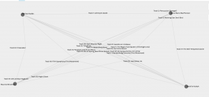
I enjoyed having the ability to select and to stretch the nodes (students) apart to see the individual undirected graph lines with the song titles connecting us. The screengrab above illustrates the web of song choices that connect the four of us.