https://userinyerface.com/game.html
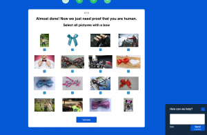
What an experience! I love the name of the site as it plays with the phrase “user interface” by saying “in yer (your) face”. Yes – navigating this website was like being slapped in the face. I was not able to get past the page which forced me to “prove I am human” by selecting bows or glasses or checks . The developers playfully, and frustratingly, used the heteronyms bow and bow (small formal necktie) and the verb (to lower your head as a sign of respect) to cause utter chaos for the user to correctly choose the images that correspond the the required word. Glasses and checks are examples of homographs since these are pronounced the same but have two or more meanings. The word “check” is additionally frustrating as the British, and by extension Canadian, spelling should be “cheque”. The biggest problem that I faced in this process was that the tick boxes seemed to correspond only to the top three rows and there weren’t any for the bottom row of images. Had the developers boxed the images in with a tick box, it would have been more clear to select the correct image.
The “How can we help” chat box was infuriating as the predict-a-text would choose preposterous words such as “Weltanschauungen ichthyoacanthotoxism” and the “command” + “z” delete shortcuts would not remove those words so that you could keep typing. There was no way of entering the information so that a bot or a rep could help and when you clicked on another tiny, underlined “help” button, it would then announce: “Please wait, there are 408 people in line.”
The password page illustrates how asinine password requirements have become and this is a weekly frustration for me. Yesterday I wanted to collect T&T Supermarket points with my app but I had been logged out due to an app update. On the spot, at the checkout, I did not remember my password and I couldn’t successfully complete a “password reset” in front of everyone. It was as if there. were an invisible countdown such as the time limit pop-up from the website, looming over me in real time. This password issue also happened the last time I was at this store, and as of now, I have zero T&T points. What are these points anyways and why do I even want to collect them?
The page uses the deceptive double negative dark pattern mentioned by Brignull as it states: “your password is not unsafe”…. so it works then? it’s safe? The text also appears in red, which typically illustrates a problem; yet, there is no problem here as I have chosen upper and lower case combinations (etc…) as well as a cyrillic example!
I wonder what I would have received had I been able to move past the picture selection screen. Perhaps a free trial to a video subscription service that collects my credit card data? In a month, when I forget about the trial, I would then notice a credit card charge since I was too lazy to read the fineprint and then I would have to call the company… or worse, talk to a bot in the bottom right corner of my screen…
SMH (shaking my head)…
Reference:
- Brignull, H. (2011). Dark Patterns: Deception vs. Honesty in UI Design. Interaction Design, Usability, 338.