Task 9 | Network Analysis
This week we are asked to analyze network visualizations based on a dataset generated from our selections in the previous task, “Golden Record Curation Quiz.” The visualizations were produced using “Palladio”, an online platform that creates bivariate networks consisting of nodes and edges representing the relationships between two dimensions.
Network analysis
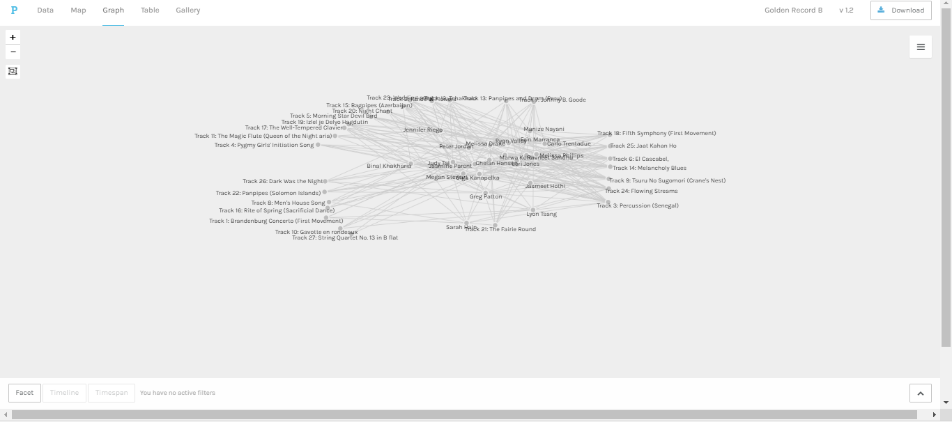
When I uploaded the dataset file to Palladio, the first visualization was an undirected graph showing the relationships between curators and tracks (see figure 1). The tangles of nodes and pathways seemed quite dense; there are 211 edges (i.e., Judy Tai has 11 choices instead of 10). The only thing I was able to tell from the visualization was that there are no isolated (a node with degree 0) or pendant (a node with degree 1) nodes, which indicates that all the tracks were chosen more than once. Otherwise, it was hard to read and decipher the visual data without manipulation.
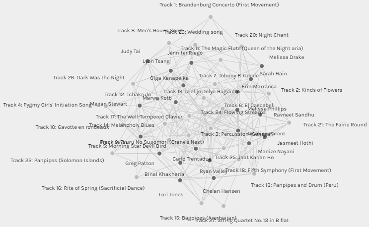
Figure 1: The original graph
In an initial attempt at data manipulation, I checked the “Size nodes” for the “Target” (i.e., Golden Record tracks), then pulled the “tracks” nodes apart and organized them based on the node size (see figure 2). Now it is possible to visualize: 1) The most selected pieces amongst the curators: “Percussion Senegal” (≈ 76% of the curators) followed by “Flowing Streams” (≈ 67%) then “Tsuru No Sugomori” (≈ 57). 2) The least selected pieces amongst the curators: “String Quartet No. 13” (≈ 9.5%) then “Rite of Spring”, “Brandenburg Concerto”, “Gavotte en rondeaux”, and “Men’s House Song” (each ≈ 19%). 3) The musical pieces in between.
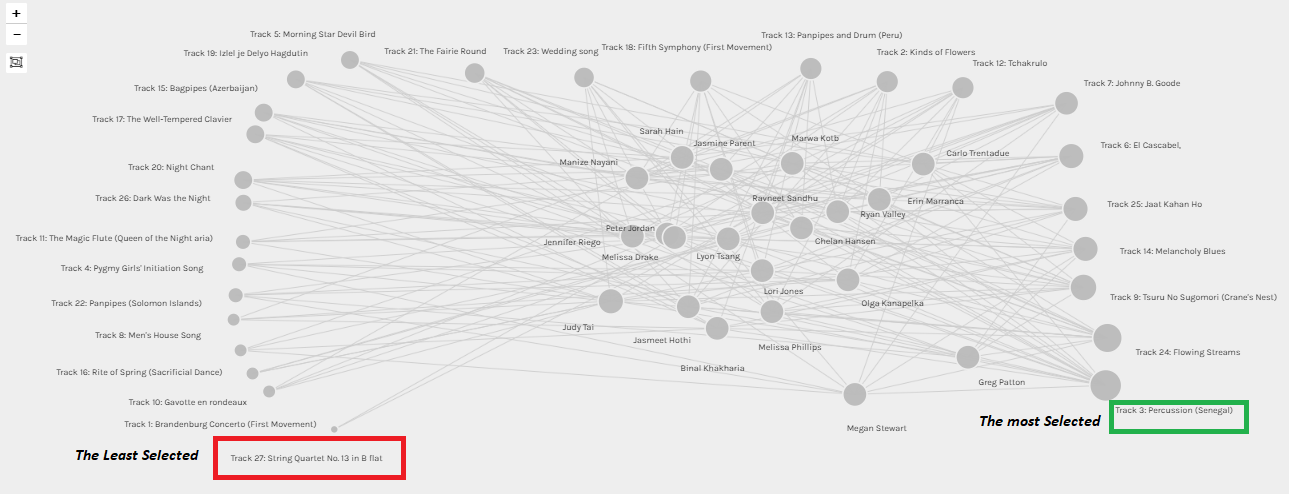
Figure 2: Tracks are sorted all around from the least to the most selected among curators.
One might make some fallible assumptions based on this visualization. For instance, the curators selected “the Senegalese percussion” (the most selected piece) because they were highly affected by the type of music (emotional response); on the other side, as most of the pieces in the ‘least chosen” list fall into the classical genre, they were the last ones selected by the curators. However, it is essential to guard against drawing conclusions from this simplistic data visualization; as per reading some of my colleagues’ blog, there is a wide range of factors for the selection phenomenon. Additionally, this network represents the curator’s choices without the knowledge of “why”. The assumptions made can be plausible only if we have a graph capturing the reasoning themes from the curators’ blogs. In such case, the visualization may enable viewing potential causal chains and possibly used it to infer the pieces of the puzzle that are missing (why some pieces are chosen more than others or null choices if there were any); but, that’s beyond the scope of the present visualizations and the dataset.
The next feature that we were required to examine was the communities in the network. We commonly refer to this sort of analysis as “clustering analysis.” Generally speaking, the definition of the groups of the nodes that are more connected within themselves than with the rest of the network will depend on the algorithm and the statistical method (e.g., the computation of transitivity or clustering coefficient). Palladio clustered the curators into six sets based on their musical commonalities (see figure 3).
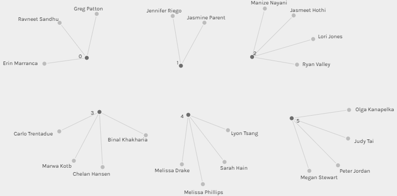
Figure 3 : Groups generated by Palladio
I was placed in group [3] along with three other classmates, Binal, Chelan, and Carlo (see figure 4). The four of us have three tracks in common (30% of each one’s choices), we also have one to two songs that none of us shared with the others. Carlo and I have seven songs in common (70%), and so do Chelan and Binal. This finding has intrigued me to glimpse into my colleagues’ blogs and view their selection criteria. For Binal and Chelan, it was interesting to know that both decided to focus on the emotional response while making their selection. Carlo and I have regarded diverse representations but we had distinctive aspects and prioritization. For me, most of the tracks were foreign pieces, so I regarded the gender representation (included almost all pieces that intake female contribution) and the social and cultural significance of the piece. Whereas, Carlo thought that “it pertinent to eliminate any specific cultural, ethnic, or social significance” because the listeners in the space won’t be aware of these underlying factors.
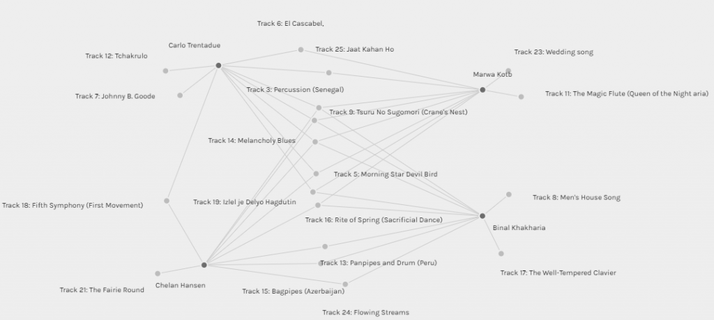
Figure 4: Group[3] connections
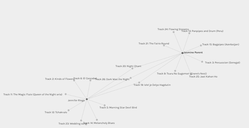
Figure 5: Group [1] connections
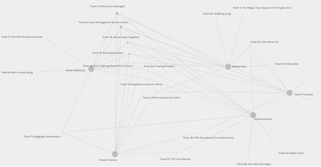
Figure 6: Group[3] and [1] manipulation
Reflection
Basing decisions on data networks seems stunningly obvious in tech giants, governments, and educational institutions too. However, what type of data was used to generate the networks? How about the nature of the question? As noted from the above analysis, the quantitative information may provide a useful starting point about the selection phenomena. Still, without the inclusion of the qualitative data that present the subjects’ data, selection conditions, and the reasons provided by the subjects involved, we are steered by false, biased, misleading, or overly narrow insights.
An equally important question to consider while using the visual networks: What are the statistical and algorithmic approaches behind the scene? Even though the formed groupings don’t seem to present significant political implications on the audience or the musical choices, however, let us imagine if these groupings were employed to aid in a college admission process? Or if they represent us based on the online interactions in a MET course? Can educators or decision-makers turn to such groups to decide on potential applicants or determine high-risk students without explicit explanations on how they were formed? I don’t think so. Analytic tools’ trustworthiness cannot be merely a function of their input/output execution but also of their processing.
Transparency is a vital requirement to grant fairness and ensure that there is no hidden bias (Rapaport, 2020). Several algorithms were found to be (intentionally or unintentionally) biased in some way, perhaps due to how its human programmer wrote it or—in the case of a machine-learning program because of the training set. Recently, we have been reading about biases existing in many classification algorithms, facial-recognition systems, and search engines (Singer& Metz, 2019; Snow, 2018). In the “The Internet: How search works” YouTube production, the authors revealed some criteria that govern the search results in search engines such as users’ behaviors, the ranks of webpages, and others. But, there is other criteria that has nothing to do with a neutral or value-free series of search results, such as, the weights placed to prioritize the site pages paying for Google Ads. In such a condition, the “good” links as labeled in the video production (code.org, 2017) may enlist “bad” webpages just because businesses or individuals have paid the search engine to link their sites prominently.
Final thoughts
In educational context, Long and Siemens (2012) stated that the most dramatic factor shaping the future of education “is something that we can’t actually touch or see: big data and analytics” (p.31). An essential challenge that we are encountering with the current and probably the future analytic solutions is that no one really knows how the algorithms do what they do; this problem is known as black-box problem. Taking an ethical standpoint, Rapaport (2020) puts the situation we are facing bluntly in front each one of us: “[Consider] a documentationless computer found in the desert. Suppose that we discover that it successfully and reliably solves a certain type of problem for us. Even if we cannot understand why or how it does that, there doesn’t seem to be any reason not to trust it. So, why should justifications matter? After all, if a computer constantly bests humans at some decision-making task, why should it matter how it does it?” (p.695). Analytic solutions (no matter how capable they are) cannot be exempted from rationalization and from ethical standards. Without laws and audits dealing with the black-box problem, without explicit justification or explanation for the analytic results/ networks, and without resolving the underlying issues of bias, the educational institutions will rightly be hesitant to place real trust in any analytic system or networks because they will be leaving more room for more biased models; these solutions may become more harmful rather than helpful.
References
- Code.org. (2017, June 13). The Internet: How Search Works . Retrieved from https://youtu.be/LVV_93mBfSU
- Penetrating the Fog: Analytics in Learning and Education. EDUCAUSE. Retrieved from https://er.educause.edu/articles/2011/9/penetrating-the-fog-analytics-in-learning-and-education
- Rapaport, W.(2020). Philosophy of Computer Science . Retrieved from https://cse.buffalo.edu/~rapaport/Papers/phics.pdf
- Singer, N. & Many Facial-Recognition Systems Are Biased, Says U.S. Study. The New York Times. Retrieved from https://www.nytimes.com/2019/12/19/technology/facial-recognition-bias.html?
- Snow, J. (2018).Bias already exists in search engine results, and it’s only going to get worse. MIT Technology Review. Retrieved from https://www.technologyreview.com/2018/02/26/3299/meet-the-woman-who-searches-out-search-engines-bias-against-women-and-minorities/
I felt so emotional when I was trying to figure out on what basis the groups were formed! Like you, I also wondered why Jennifer and Jasmine ended up in a group of 2, while they clearly shared more choices with some other participants than each other. Now at least I know that we have Palladium’s ‘black box’ to blame for that.
Its true, I know that there is a standardized approach for clustering. But attenuation is possible too. As I moved forward to the next learning modules I see the shades of the black-box problem. The algorithms might carry no bias or bad intentions but if they are having an impact on people’s life, we can’t just leave their users to guess how they work.