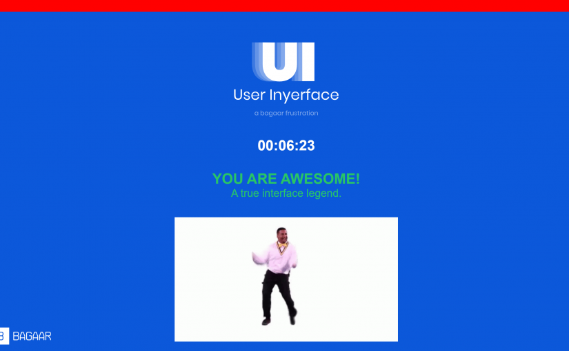
-internally screaming-
This was a frustrating and anxiety inducing hell-scape of a game to navigate through (+_+) It felt like one of those escape rooms where you’re trying to find an exit, but the more you click around, the more dead ends you run into!
I first learned of ‘dark patterns’ in my Cognitive Systems undergrad courses on human cognition and design, from none other than Don Norman’s book “The Design of Everyday Things”. He introduces some foundational concepts in design, specifically affordances and signifiers, which I find most relevant to this task.
Affordances are "the possibilities in the world for how an agent (person, animal or machine) can interact with something." In other words, potential interactions between people and the environment.

Signifiers are "signals" for what actions are possible and how they should be done. The must be perceivable signals (e.g. signs, labels, drawings, instructions, etc.) or else they fail to function.
In the slides below, I try and describe what makes these signifiers “unintuitive” or more maliciously, “misleading” when it comes to our everyday habits of navigating webspaces online.
Reflections
For this task, it seems like the signifiers are more important than affordances, as they communicate how to use the design.
In some ways, it almost presumes that there is an “expected” or “intended” way for users to interact with webspaces, whether it is through the many years of priming, or due to the fact that we are forced to change our interactions with each update and iteration of new software. Once we are habitualized to a certain way of interacting with the virtual environment, it almost becomes an expectation that all websites would follow this convention, and therefore our brains fall into autopilot mode, and that is where our attention fail us, especially in this game.
In true UI/UX Researcher style, I asked two of my roommates to play this game and observed their interactions. One of them happens to be a UI/UX designer themselves! Both of them struggled with navigating through these websites, and in similar places too!
For example, in the password set up stage, they both read aloud “your password can have at least 1 Cyrillic character” and both their reactions were “how do you even type Cyrillic characters!?” without registering the important “can have” part!!
Besides the “misleading signifiers” that miscommunicated what they actually meant, another great challenge of this game was “paying attention” to what we were doing — whether it was reading the instructions fully, or whether it was making sure that certain things corresponded with each other — it required one to exert more cognitive processing energy to respond correctly to not fall into their dark pattern traps!
References
Norman, D. A. (2013). The design of everyday things. MIT Press.


Yes, such a frustrating task! Everything about the task had me irritatingly repeating the same mistakes over and over. I was on alert as I knew the design of the game was to “trick” me into doing things incorrectly. But as you pointed out, we are often on auto pilot when working our way through webpages. Brignull (2011) says that many websites use this auto pilot for their own gain. In fact this game employed many of the dark patterns Brignull (2011) talks about: leaving the defaults selected, continuous scrolling, and confusing ways to word requests.
Do you think most people have gone complacent and are happy to have choices made for them? I have a new habit of always turning off cookies when visiting a new site. I don’t want to have the feeling of being tracked when I visit other pages just because that one time I was looking at an entry way bench and then for weeks those ads were all I saw. But there must be benefits. We do have habits on the internet and if we can have our experiences customized is there a problem with that?
History pages for example are a resource I fall back on when in study mode. I look for information in past pages and if I can remember what day I found the information then it’s helpful to have that recorded. I feel there is a distinct difference between webpages and social media. Social Media has a dark side that goes beyond selling.
Harris (2017) and Tufekci (2017) discuss the variety of ways that we are being lured into staying on a site for as long as possible. I am reminded of the design of casinos when I think of social media apps. Casinos want to immerse you into forgetting you have outside responsibilities. No windows to see the outside world, phones are discouraged, drinks at the ready, and easy access to money, all make staying and playing an easy choice. Social Media is no different and it plays into the voyageristic tendencies many people have, and now they just auto play so that you never have to make a choice for your self.
Brignull, H. (2011). Dark Patterns: Deception vs. Honesty in UI Design. Interaction Design, Usability, 338.
Harris, T. (2017). How a handful of tech companies control billions of minds every day. Retrieved from https://www.ted.com/talks/tristan_harris_the_manipulative_tricks_tech_companies_use_to_capture_your_attention?language=en
Tufekci, Z. (2017). We’re building a dystopia just to make people click on ads. Retrieved from https://www.ted.com/talks/zeynep_tufekci_we_re_building_a_dystopia_just_to_make_people_click_on_ads?language=en