Cardiac Arrest Management is a hospital simulation game where you are a nurse making your rounds, helping your patients stabilize in various cardiac arrest scenarios.
Though it was a “text heavy game”, it was interspersed with many vital chart graphics and pictures. It also offered a lot of clues and hints when returned to a previous step upon a mistake. This allowed for the continuation of the narrative, while providing correct information without taking the player out of the scenario.
The bustling hospital environment and sounds of beeping machinery makes it a very immersive experience reflecting the day-to-day as a nurse in medical care.
This game is very much catered towards those with a background in medical care settings, as there is a lot of medical terms and jargon. One should also be literate in ECG charts and know what the visuals mean to make the right decisions of what to do next to save the patient.
Once the patient has been stabilized, the player can return to the main menu and move on to the next patient. The “onus was on me to ensure this virtual pathway through my game was well planned out” (Presta, 2022) given the details and true-to-life nature of the game, was an important detail to keep in mind.
Reflection
This was a very anxiety-inducing game, because 1) I am not from a medical background and 2) I don’t know anything about cardiac arrest management!
Only a few minutes in, due to my medical malpractice and neglect, I already had to perform CPR on Patient #2 and use a defibrillator with maximum of 360 joules and some injection to get him breathing again (ಡ‸ಡ)
That aside, I thought it was very informational, and though I don’t know how to read the ECG charts, I came out of the game with more knowledge about defibrillators than I had in the beginning!
Using Twine as a medium for this game was a great idea, as it co-creates a learning environment where the player is an active participant of their own learning through this hospital simulation game to manage cardiac arrests. I am grateful that Jessica took the time to share her medical knowledge in a step-by-step manner, making professional experience and information accessible in an interactive way!
This was a frustrating and anxiety inducing hell-scape of a game to navigate through (+_+) It felt like one of those escape rooms where you’re trying to find an exit, but the more you click around, the more dead ends you run into!
I first learned of ‘dark patterns’ in my Cognitive Systems undergrad courses on human cognition and design, from none other than Don Norman’s book “The Design of Everyday Things”. He introduces some foundational concepts in design, specifically affordances and signifiers, which I find most relevant to this task.
Affordances are "the possibilities in the world for how an agent (person, animal or machine) can interact with something." In other words, potential interactions between people and the environment.

Signifiers are "signals" for what actions are possible and how they should be done. The must be perceivable signals (e.g. signs, labels, drawings, instructions, etc.) or else they fail to function.
In the slides below, I try and describe what makes these signifiers “unintuitive” or more maliciously, “misleading” when it comes to our everyday habits of navigating webspaces online.
Reflections
For this task, it seems like the signifiers are more important than affordances, as they communicate how to use the design.
In some ways, it almost presumes that there is an “expected” or “intended” way for users to interact with webspaces, whether it is through the many years of priming, or due to the fact that we are forced to change our interactions with each update and iteration of new software. Once we are habitualized to a certain way of interacting with the virtual environment, it almost becomes an expectation that all websites would follow this convention, and therefore our brains fall into autopilot mode, and that is where our attention fail us, especially in this game.
In true UI/UX Researcher style, I asked two of my roommates to play this game and observed their interactions. One of them happens to be a UI/UX designer themselves! Both of them struggled with navigating through these websites, and in similar places too!
For example, in the password set up stage, they both read aloud “your password can have at least 1 Cyrillic character” and both their reactions were “how do you even type Cyrillic characters!?” without registering the important “can have” part!!
Besides the “misleading signifiers” that miscommunicated what they actually meant, another great challenge of this game was “paying attention” to what we were doing — whether it was reading the instructions fully, or whether it was making sure that certain things corresponded with each other — it required one to exert more cognitive processing energy to respond correctly to not fall into their dark pattern traps!
References
Norman, D. A. (2013). The design of everyday things. MIT Press.
I chose to link to Erin’s post because of her unique audio and visual form to share what is in her bag in a very familiar, effective and clever way through Tik Tok.
Erin approached the task in a very literal way, showing the contents of what is in her bag. In terms of the content in her bag, I would say we both have similar items with similar purposes. One main difference is that Erin drives and I rely on public transit, which might be the deciding factor of the divergence in our blog posts.
Erin’s post expands across both audio and visual media, with a few components that work cohesively in conjunction, which is distinctive of a Tik Tok:
Background Music: considered the mood and length for the Tik Tok
Text: visually displayed the key words on screen next to items as they appear
Audio Speech-to-text Description: brief text-to-speech description “with key words to describe a sentiment without actually saying what it was” (Duchesne, 2022).
Video: using trending zoom-in/zoom-out effect of items in her bag
Should one isolate any one component, they might not understand the context of what is happening as they rely on each other to make-meaning.
Though it is not required, having some background knowledge of the trends on Tik Tok can help understand the context of the presentation format and why it is “entertaining”.
Reflection
Though I have seen Tik Toks and understand this format of social media, I personally do not use the platform at all, so I am impressed by her use of the functions that the app has to offer. It is a very entertaining way to condense information in such a short amount of time, and grab one’s attention!
” It forced me to think about many possibilities that I normally would not pursue and work out the creative details of different ideas until I found one that would fit the criteria and that I could execute.” (Duchesne, 2022) reminded me that social media can be a powerful tool and robust platform for the intent of creating and sharing information in the realm of educational technology. It definitely breaks down the barrier and idea of “educational technology” being confined to the structure of institutions, and is more ubiquitous than we make it seem!
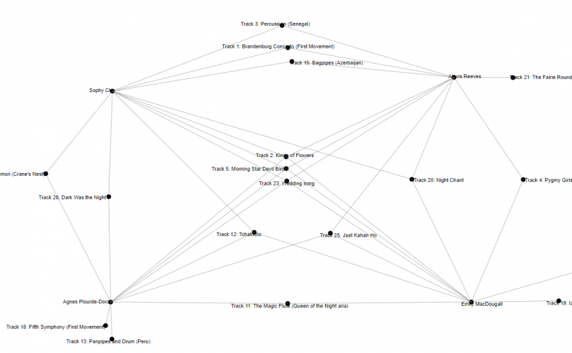
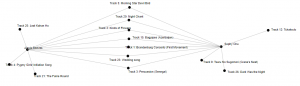
Seeing the data of everyone’s choices for their record curation was somewhat difficult to interpret, due to all the edges and nodes that were involved.
Therefore, for my reflection, I will do an analysis on a smaller scale.
I had parsed the information according to the different communities first to see who I overlapped with the most– Agnes, Alexis and Emily.
Next, I tried positioning the nodes of our names in the four corners to form a quadrant. In the center are the tracks that all four of us have. Depending on who has similar tracks, the nodes of the track names are listed in relative location to our names.
Criteria
I was prompted me to take a look at their blog post and read up on the criteria of their choices and what their justifications were behind their decision-making process.
Agnes: “showcase aspects of civilization on earth and how humans live and interact with the planet; varied types of musical formats” (Plourde-Doran, 2022)
Alexis: “geographical and cultural diversity of sound, instruments, and languages” (Reeves, 2022) with more tracks for larger continents (i.e. Asia and Africa)
Emily: “songs that included vocals, for sampling human voices in different frequencies, languages, dialects and tones” then filtered geographically (MacDougall, 2022)
Both Agnes and I thought about the aspects of civilization as a criterion.
Alexis, Emily, and I all had geography as a criterion.
Agnes, Alexis and I included tracks in music, vocals or both (i.e. we did not exclude based on musical format) as a reflection of diversity.
Connectivity
Now knowing the above information, I assumed that I would have greatest overlap with Alexis, given we chose the tracks based on geography; next would be Agnes, as we considered the civilization aspects of the tracks; lastly with Emily, as she first filtered via whether or not tracks have vocals, which would have disqualified a good portion of tracks to begin with.
According to the network visualization, below is the count of our overlapping tracks (i.e. connected nodes). This reflects the assumptions that I had made!
Looking into the track choices, I found 3 songs that all four of us had chosen:
Track 2: Kinds of Flowers
Track 5: Morning Star Devil Bird
Track 23: Wedding Song
Geographically speaking, Track 5 was the only song from the Australia/Oceania region; Track 23, as it was the only song from South America region; Track 2 was the only song from Southeast Asia region.
One interesting thing to note is the ways that each of us have categorized the geographical regions.
Alexis categorized America into North and South America, but did not divide Asia into sub-regions. She did account for continent size and included extra songs accordingly from Asia and Africa.
Emily did not clarify the regions when choosing the tracks, though in her list she did include Mexico which was separate from her choice for North America, so, there is an assumption that it was divided by sub-regions, which was made clearer when she decided to prioritize Indigenous voices when it came to narrowing down the three songs from “North America”.
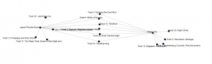
In looking at the visualization, though one can see the commonalities of tracks chosen between each person from the cohort, and where we overlap and “connect”, it does not reveal the “why” and decision-making processes, which needed to be supplemented with other sources of information.
Along similar lines, even when the “why” and decision-making processes were clear, differences in the “algorithm” such as weight in the sequence of information parsing or categorization can also influence how the original data is processed “upstream” which then alters it as it flows “downstream” to data-post-production of the visualization.
References
Code.org. (2017, June 13). The Internet: How Search Works . Retrieved from https://youtu.be/LVV_93mBfSU
It is interesting to think of the future as known and the past is ever-changing and dependent on context of what is preserved and what is not (Brown University, 2017).
Though scholars did try to include music from various cultures, languages and time-periods, the current track selection on the Golden Record reflected an intellectual monoculture that is very much Western and male-dominated.
As I curated the playlist into 10 tracks, I wanted to reflect:
geographical and cultural diversity of music around the globe
include both vocal and instrumental components of the songs
contents of the songs reflect conceptual aspects of human civilization
Bach, Brandenburg Concerto No. 2 in F. First Movement Location: Europe
Musical Content: Orchestra
Conceptual Aspects: as mentioned by Ferris, the mathematical foundations in this piece may be deciphered, given that the extraterrestrial life forms may have other ways of perception than that of humans. I think it also showcases the complexity and organization in orchestral pieces.
Peru, wedding song, recorded by John Cohen. 0:38
Location: South America
Musical Content: female vocals
Conceptual Aspects: Rituals and social norms surrounding “coming of age”, “fertility” and “reproduction” and the important role of such ceremonies across different cultures
Georgian S.S.R., chorus, “Tchakrulo,” collected by Radio Moscow. 2:18
Location: Eurasia
Musical Content: male vocals
Conceptual Aspects: the song is a drinking song in preparation for battle, reflection of war and conflict as an integral part of the rise and fall of civilizations throughout history. In addition, it highlights the cultural significance that “alcohol” plays in many cultures
Java, court gamelan, “Kinds of Flowers,” recorded by Robert Brown. 4:43 Location: Southeast Asia
Musical Content: gamelan, vocals
Conceptual Aspects: Connections to the different spiritual and philosophical states as represented through the relationship humans have with nature.
Australia, Aborigine songs, “Morning Star” and “Devil Bird,” recorded by Sandra LeBrun Holmes. 1:26 Location: Oceania
Musical Content: Vocals, Didgeridoo, unknown percussion instrument
Conceptual Aspects: After some research, there seems to be a mistake in the description, as the song that “Morning Star” cuts off into is not “Devil Bird” but another piece called “Moikoi”. Morning Star is a piece about the journey souls make after death; Moikoi is about “malicious spirits who entice newly deceased souls away from their clan country”, and “perhaps can be read as a message about the journey of the human spirit between Earth and space” (Rosen, 2013).
Japan, “Tsuru No Sugomori” (“Crane’s Nest,”) performed by Goro Yamaguchi. 4:51 Location: East Asia
Musical Content: shakuhachi
Conceptual Aspects: this song depicts the various stages in the life cycle of the crane, which symbolizes longevity in many East Asian cultures. The piece is thought to emphasize the Buddhistic values of affection between family members. Given that context, I think it shows the natural cycle of life and death of life forms on Earth, in addition to the values that can be learned from nature. Another note is that the techniques used to play the piece mimic the wing flutters and cries of the crane, which is demonstrative of “life imitates art, art imitates life”.
“Dark Was the Night,” written and performed by Blind Willie Johnson. 3:15 Location: North America
Musical Content: vocals, guitar
Conceptual Aspects: according to Ferris, the song was included because “Johnson’s song concerns a situation he faced many times: nightfall with no place to sleep. Since humans appeared on Earth, the shroud of night has yet to fall without touching a man or woman in the same plight.” (Sagan, 1978). I think this speaks to the difference in socio-economical statuses around the world and the affects of poverty, and on a more relevant note, inaccessible housing in the recent times.
Azerbaijan S.S.R., bagpipes, recorded by Radio Moscow. 2:30 Location: Eurasia
Musical Content: woodwind
Conceptual Aspect: I learned that this kind of composition includes classical poetry and musical improvisation, in which the scale and harmonics follow specific foundation of principles. Most of mugham songs are concerned with themes relating to spiritual search for god. I think that speaks to the importance and ubiquity of religion in civilization.
Navajo Indians, Night Chant, recorded by Willard Rhodes. 0:57 Location: North America
Musical Content: vocals
Conceptual Aspect: the song is part of a dance in which the Navajo medicine man call upon Yeibichai, the supernatural beings that created them, to heal someone. I think this shows communal healing as integral aspect of medicine, health and well-being, communal responsibility and aid during times of disease and sickness.
Alima Song” – Mbuti of the Ituri Rainforest
Location: Africa
Musical Content: vocals, percussion
Conceptual Aspects: I learned that the Mbuti people are nomadic people living in the rainforest in societies with no chiefs or leaders and share responsibilities amongst themselves. The song is composed by each individual singing one or two notes in circulation building up to a harmony.
Reflection
This was a very challenging task to approach — the responsibility of creating such a time capsule of humanity for extraterrestrial life-forms feels like a heavy burden upon my shoulders!
While listening to the Twenty Thousand Hertz Podcast introducing the Golden Record, I found it comforting to hear that even the scientists had a difficult time curating the record, and acknowledged that “you are automatically going to exclude almost all of the great music because there’s so much of it.”
Abby Smith in her lecture on digital memory and information preservation also mentions:
"When we think about what we want to preserve, inscribing our memory and outsourcing it into physical objects that we have no control over, we do lose some responsibility for the materials that we actually have." ( Brown University, 2017)
As we send out the Golden Record into the void, it is unclear how extraterrestrial life forms will understand or interpret our messages, and in some cases, it is out of our control.
With this new-found reassurance, I realized that regardless of what I include or exclude, it will still capture a sliver of humanity, even in its most pixelated and grainiest verisimilitude.
References
Brown University. (2017, July 11). Abby Smith Rumsey: “Digital Memory: What Can We Afford to Lose?” https://www.youtube.com/watch?v=FBrahqg9ZMc
Contents of the Voyager Golden Record. (2022). In Wikipedia. https://en.wikipedia.org/w/index.php?title=Contents_of_the_Voyager_Golden_Record&oldid=1094094672
Music of the ituri forest. Smithsonian Folkways Recordings. (n.d.). Retrieved July 10, 2022, from https://folkways.si.edu/music-of-the-ituri-forest/world/album/smithsonian
Nelson, R. (n.d.). The International Shakuhachi Society. Retrieved July 10, 2022, from https://www.komuso.com/pieces/pieces.pl?piece=2218
Rosen, R. J. (2013, November 13). Is the official description of the Aboriginal music on the Voyager Records Wrong? The Atlantic. Retrieved July 10, 2022, from https://www.theatlantic.com/technology/archive/2013/11/is-the-official-description-of-the-aboriginal-music-on-the-voyager-records-wrong/280676/
Sagan, Carl (1978). Murmurs of Earth : the Voyager interstellar record (1st ed.). Random House. p. 178. ISBN0-394-41047-5.
For this assignment, I have created a soundscape, which seems to be a deviation from “what is in my bag” but I wanted to approach it in a somewhat more “abstract” way , so… hear me out (hehe).
Before continuing reading, please take a listen and see if you can piece together the “narrative” and what the soundscape is about!
This soundscape was created from found sounds that I pieced together to form a more cohesive “narrative” of my commute to work — taking the bus, transferring via Skytrain and walking to school and unlocking the door to my office.
A soundscape can be a combination of sound that forms or emerges from an immersive environment, including sounds from nature, natural elements, and sounds created by humans. It can also include the listener’s perception of sound of “how the environment is understood by those living within it” (Truax, 2001).
Most of the sounds are of the (man-made) environment; the alarm of the doors closing, the beeping at the entrance gates, the movement of the trains.
Another big majority of the sounds are made by people; incoherent conversations on the phone, squeals from children, my own humming.
There are also some sounds that I make as I take out and use the things I have in my bag; unzipping my bag to take out my wallet, my headphones booting up, fumbling for my keys.
Designs of Meaning
Immediately, I introduce the ‘design” of the soundscape — a commute on public transportation. Now knowing the context of this immersive experience, one can assemble the “order of discourse” and the conventions that come with using public transportation, which can be culturally dependent.
This can be inferred through the alarm that sound as the doors are about to close on the bus, a mumbled “sorry” as people try to squeeze onboard, and the beeping of the fare card.
It is further reinforced by the announcements on the train. One can know a lot about the people, culture and history through the languages spoken over the announcement system. In Vancouver, the Skytrain announcements are in English only. In Taipei, the MRT announcements are in Mandarin, English, Taiwanese and Hakka. On my recent trip to San Francisco, the MUNI announcements included English, Spanish, Cantonese and Tagalog, which I found really interesting.
I am unsure where the “designing” and “redesigning” processes take part in this entire experience… I hope that through engaging in the New London Group paper and re-contextualization of What’s In My Bag Task, the process is on its way!
On Changing Public and Private Lives
I wanted to do a soundscape of public transit, as I believe it is a very embodied way of experiencing the socio-cultural-anthropological landscape of an environment. One can catch a glimpse of an individual’s private life in this public space, which I find very fascinating
If each individual is considered a “vessel” (or “bag” in this case), then the subcultural differences –gender, ethnicity, generation, sexual orientation, etc. — can be considered the “contents” that they carry with them, as they traverse through the multiple lifeworlds they are members of, in which their identities are in complex relation to each other.
This ties into the necessity of having skills to navigate through the cultural and linguistically diverse civic pluralism that resulted along with the shift of global geopolitics, especially when it comes to regional, ethnic, class-based dialects, cross-cultural discourses and code-switching amongst them (The New London Group, 1996)
The concept of civic pluralism mentioned in the paper really resonated with me, especially seeing that in the context of public transit.
Civic pluralism changes the nature of civic spaces, and with the changed meaning of civic spaces, everything changes, from the broad content of public rights and responsibilities to institutional and curricular details of literacy pedagogy.
Public transit in some ways depicts civic pluralism on a smaller scale, and it is apparent how diverse and divergent the boundaries between public and private are. It also blurs the boundaries between the multiple lifeworld each individuals carry along with them on their journey, which creates more autonomy and space for them to move more transiently between them.
References
Soundscape (n.d.) Wikipedia. Retrieved July 6, 2022 from https://en.wikipedia.org/wiki/Soundscape
Recently, the newest software update on my phone added new emojis to my keyboard. This was really helpful to describe more “tangible” ideas in the TV show, such as the characters and the setting of the story. I found it challenging to describe the more abstract concepts, such as the translation of the title, as it was an attribute of the character in the story in a non-English language. I would put emojis into smaller clusters as a “constituent” to show that they belonged together as a unit, and a space in between the next cluster.
The way that I clustered emojis together to express a concept reminds me of Blissymbols, an ideographic writing system with basic symbols that could be composed together to generate new symbols to represent different concepts. The creator Charles K. Bliss developed this system during his refugee in the Shanghai Ghetto during exile as a Jew during 1942-1949. He was inspired by the logographic nature of Chinese characters, which he learned during his time there.
Here are some basic symbols and what they look like:
There are ways to compound the symbols to form more complex words:
The word “friend” is represented by:
person
feeling
positive ( plus + intensity)
Apparently, after reading more about emojis and how it works in Unicode, one can modify the emojis to join them as well!
With a zero-width-joiner (a non-printing character used in computerized typesetting), one can compound multiple emojis that behaves like a single unique emoji character.
An example taken from the Wikipedia entry of “joining emojis“:
Originally, Blissymbols was created for as a universal language for speakers of different languages could communicate with each other. It wasn’t until the 1970s that it gradually became a communication aid for people with limited or no ability to use spoken or written languages.
In regards to emojis, a primary function of emojis is to fill in the gaps of emotional cues that we would otherwise miss in typed and written conversations.
However, I think one main distinction between Blissymbols and Emojis is that the former is an attempt at abstraction of language where one can rely only on the symbols to convey meaning, whereas the latter is more a synthesis between language and symbols to create meaning.
Kress (2005) differentiated that words are founded on order, and image-representations are founded on depictions, with the main crucial difference of words being highly “conventionalized” entities, such that they will always be general and vague, nearly empty of meaning, which need to be filled with the reader’s meaning.
In terms of images and its depictions, Kress states:
With depiction and with images the situation is
different: that which I wish to depict I can depict, at the moment at any rate. I can draw whatever
I like whenever I like to draw it. Unlike words, depictions are full of meaning; they are always specific. So on the one hand there is a finite stock of words—vague, general, nearly empty of meaning; on the other hand there is an infinitely large potential of depictions—precise, specific, and full of meaning.
I think his differentiation reveals a big reason why emojis are useful and important when it comes to interpreting and meaning making in text messages, for example.
A message can be interpreted differently from the sender’s intention vs the receiver’s perception. A message with an emoji can however provide more information with the depiction of the symbol, which in turn grounds the message to a specific meaning.
Both Blissymbols and Emojis are concretely grounded in their visual medium, as one can really only engage with these two systems through reading and writing as part of the trend to renegotiate the relationship between arbitrary signs and picture elements in communication (Bolter, 2001).
Blissymbols (n.d.) Wikipedia. Retrieved June 21, 2022 from https://en.wikipedia.org/wiki/Blissymbols
Emojis (n.d.) Wikipedia. Retrieved June 21, 2022 from https://en.wikipedia.org/wiki/Emoji
Bolter, J. D. (2001). Chapter 4. in Writing space: Computers, hypertext, and the remediation of print (2nd ed.). Mahwah, N.J: Lawrence Erlbaum Associates. doi:10.4324/9781410600110
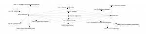
If “the Internet is a physical expression of hypertext” (Bolter, 2001), it couldn’t be more fitting to turn to the Internet to create a hypertext game! This game is based on some of the missed connection posts I have collected throughout the past few years from Craigslist Vancouver.
I browse the site once in a while for fun and I always find some intriguing posts. Most of the time it’s people wanting to reach out to someone that caught their eye in passing, and expressing regret for being too shy to initiate interaction. Oftentimes, I find people searching for long lost connections from their past, or recollections of fond memories with those who they are no longer in touch with. Sometimes I come across very cryptic poetry!
As a preface and disclaimer, I did not write any of the content and do not take credit for the collective collaborative efforts of the Internet. I tried to keep most of the posts true to its original form and content as written by their author(s), with only minor stylistic edits for legibility.
One main challenge is creating the links connecting one post to another, as there is no start nor beginning to this game. Mostly, I’ve created the links by association, and players are able to follow the one that piques their interest.
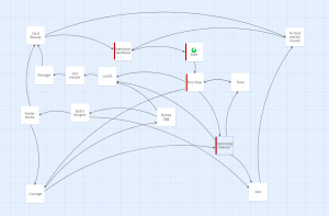
Since craigslist posts are mostly text (sometimes with map next to it to show the location that it happened at), I did not embellish it with illustrations.
Below is a map of what the nodes look like:
The red nodes are part of the main narrative
Just as we tend to “conceive of hypertext spatially”, every missed connection post is a topographically and temporally grounded node that connects one event to another to “constitute a path through virtual spaces where the reader becomes a visitor or traveler in that space” (Bolter, 2001). This is the feeling I hope to evoke, an observer peering into the lived experiences of others.
I can’t really express or describe why I enjoy reading missed connections so much, perhaps it is something about the serendipity and invisible networks of the universe that creates opportunities for connection in strange ways!
References
Bolter, Jay David. (2001). Writing space: computers, hypertext, and the remediation of print. New York, NY: Routledge.
Looking through the blogs of my colleagues, I noticed most of them opted for the manual script task, so when I saw Katie and Simin’s potato printings, I wanted to do the linking task on their project observations.
On Katie and Simin’s websites, they included a picture of their completed print, with a written description of their experience and process.
Katie made a colorful potato print of her dog’s name “DAiSY”
Simin made a bright yellow print of the words “Light”, with the letters “g” and “h” mirrored in the print.
Below is a brief categorization of the themes I found in their observations:
Tools
Katie used a paring knife to carve on small potatoes.
Simin used a larger carving knife that is about 5-inches long.
The difference in tool size and length definitely affected the carving experience, which in Simin’s experience was difficult to carve with precision to create legible letters.
Typography
Both of them forgot that the letters would appear in mirror image when printed, and didn’t realize it until they created the print!
This can be seen in Simin’s print, which I am glad they kept instead of correcting it, as it reflects part of the learning process.
They also noticed the symmetry and mirror-ability of some the letters, such as the “D”, “i”, “S” in Katie’s print, and “i”, “t” in Simin’s print.
Katie deliberately chose to use uppercase, whereas Simin used camel-case. With more curves and roundness in lowercase letters, it can pose as a greater challenge compared to the angular and pointed uppercase letters when carving on potatoes. Both were in san-serif fonts.
Katie mentioned it was difficult to maintain a consistent size and style, which can be illustrated through Simin’s “g” looking more like an “e” in comparison to the size of the neighboring letters.
Printing
When making the prints, Katie was able to maintain a fairly consistent spacing in the duplicate words. The only noticeable difference would be the pressure when stamping them, as seen in the uneven-ness in the “D” “A” and “S”. The paint seemed pretty consistently spread onto the stamps in a thinner layer, so the letters seemed to be a bit transparent.
Simin mentioned the sliminess of the potato made it difficult to pick up, which made the print blurry by slipping around on paper. Looking at the prints themselves, it seems like Simin’s layer of paint was thicker as well, which could also have contributed to the slipperiness.
Time
Simin’s prints took around 30 mins to complete, with most time spent on planning and cutting. Katie’s prints took around 10 mins to complete.
Both mentioned how labor-intensive and inefficient process was to create these prints manually. Katie mentioned the “perceived” value of traditional processes and how they developed a certain personal attachment to the potato stamps, knowing how much work went into it.
Connection with Readings:
“Human connection” + “Accessibility”
Katie centered her reflection of the task around “what is lost in increasing efficiency” during the mechanization of printing — mainly the connections people have with the physical medium itself. She believes that the earlier practices do not need to be completely erased in favor of new developed technologies.
Simin centered their reflection on mechanization or print “creating a base understanding of tangible language to reach beyond limited repetition”, placing emphasis on breaking down the barriers of writing as a scholar-limited tool to one that is more accessible to the masses.
I think this resonates with some of the similar sentiments I had while writing about the revival of risograph printing, in particular the “human connection” and “accessibility” aspects behind the many reasons that artist continue to use risoprint to create and distribute their artwork.
Reflection
Having been introduced to linocut and other types of printing early on, their observations reminded me of my own learning process when I first started experimenting with the method and medium, and how different our experiences were.
I first encountered printmaking in a classroom setting, therefore I had access to suitable tools and materials with a more structured learning process. I was able to fast-track onto experimenting with carving and printing technique, as I didn’t need to spend as much time trying to figure out the peripheral technicalities of the tools and materials like Katie or Simin did. However, it was through their straightforward approach through trial and error that highlighted the importance of exploration and learning through hands-on practice.
This was another very (((exciting))) assignment for me, as it intersected with A LOOOOOT of things that I am passionate about in art and technology, specifically in the context of print-making.
For this assignment, I wanted to deviate from the homework description a bit to share and reflect more deeply on a novel print-making method that I was able to experiment with this past year and how that ties into the “handwritten” vs “mechanized” dichotomy in an analogous way. Nevertheless, I have still included a brief write-up for the task this week.
Assignment
In my day-to-day I do both typing and writing by hand quite often!
On one hand, most of the tasks I need to do for work and studying for the MET program are done via typing. There is a lot of information and correspondence that is currently hosted virtually with technological devices, therefore it is more feasible and reasonable to complete them in this medium. On the other hand I have my mechanical pencil for practicing French verb conjugations, drawing comics in my zines, or journaling in my diary. Therefore, this task was somewhat familiar and easy for me to complete.
My tool of choice is usually my mechanical pencil — I don’t need to sharpen it, and it is easy to edit my work with an eraser. This is useful for language learning or creating sketches for my comics, as it is easy to alter mistakes and make edits on paper. Usually I use fine-tip pens for writing in my diary or warming up for drawing. When it comes to making changes, sometimes I cross the word out and resume, or work with the mistakes as a practice in accepting imperfections and being more open to where my creativity takes me. Sometimes, for sharing creative work online, I will create sketches with pencil and paper and then upload the sketch onto my computer to finish my linework and coloring. Though it is mediated by software (Photoshop) and hardware (Wacom tablet and stylus), I think there are still the traces of the analog similar to handwriting.
For me, I don’t think there is a preference in terms of media or method of writing. The most significant difference between choosing handwriting versus mechanized forms of writing is mainly driven by intention.
For example, handwriting was useful for learning how to write Japanese Kanji. I needed to pay attention to the strokes and how they differ from the Chinese characters, which was helpful for learning written word production. However, when I want to focus on sentence structure and syntax in written essays, I would probably choose to type instead of handwrite, as it saves some time and effort in the process.
Another example would be choosing to handwrite a card or letter. I was (and still am!) into snail mail and other analog forms of correspondence! When I receive handwritten letters, it feels like the intentions and good wishes have more weight permeates through lopsided, wriggly penmanship and silly illustrations.
Reflections
Module 4 was a fun deep dive into the history of mechanization and learning about the evolution and development of paper and printing technologies!
This intersects with my interests and previous experiences that I have with art and experimenting with different mediums (i.e. linocut ex libris, screen-printing on fabric, paper-making and book-binding, Chinese calligraphy)
Currently, I have found a comfy corner where I can explore all of these and integrate it with language, storytelling, and comics in the form of zines!
Recently, I volunteered at the Vancouver Comic Arts Festival (VanCAF) that finally happened after 2 whole years of hiatus due to the pandemic. It felt so revitalizing to see all the wonderful art and chat with the talented artists, and it made me realize once again how wonderful art can be!
Risograph Revival
One thing that I noticed (for sometime now) and saw at the festival is the revival of risograph printing in the zine and art community in the past few years. Risograph originated in post-war Japan by Noboru Hayama, and can be described as the hybrid of screen-printing and photocopy. It is both the name of the printer and the soy-based ink that was a more affordable alternative to emulsion ink at the time. A few reasons why it is so beloved by the art community is its ability to create high-quality prints with many vibrant color options, and is usually less expensive when printed at high volumes, which makes it a fast and accessible way to create and distribute artwork in general!
Below I have included a brief comprehensive introduction made by Moniker Press, a local risograph print studio based in Vancouver!
Experimentation- trial and error (so many!!)
Last year when I was living in Taipei, I had the chance to learn and experiment with riso-printing at local print studio RetroJam.
One main thing that I forgot and re-experienced during this experience is how much of the creative process is just understanding the technological aspect of the medium and the mechanisms involved in the process. There are so many intricate details to pay attention to when it comes to preparing artwork so that you can maximize the potentials of riso-printing, while working within its limitations!
On the topic of “handwritten” vs “mechanized” comparison in this assignment, there was something that I found analogous to this dichotomy in context of riso-printing. Below, I will share the two different methods that I approached riso-printing, and my thoughts about the process, while relating it back to some of the readings from Module 4.
As a preface, here are some things to know about riso-printers and the printing process. I have also included my own art to illustrate how it works!
Riso-printers register grayscale information and converts to bitmap to create “master” stencil for the color layers
Riso-printers are similar to a copy machine, as it has a scanner table on top. Therefore, one can create hand-drawn sketches and scan them for print.
The other option is to create digital files and connect to printer for print.
Riso-printers are similar to screen-printing, as it prints colors in separate layers. Therefore, you would need to create a separate stencil (or file) for each color you use
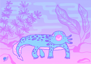
Axolotl Blue LayerAxolotl Pink LayerAxolotl Color Proof
Digital distress – file setup and challenges
My axolotl print was hand-drawn on my tablet on Photoshop, though the process was manual, most of the post-editing was done digitally. My biggest challenge was the color separation process and visualizing what it would look like in color. I had to constantly switch back and forth between the my layers to make sure I was drawing on the correct one for the color that I wanted. In addition, the grayscale % can also affect the opacity and tone when colors overlap, so my color proof is just an approximation of what the final print can look like.
I went to the studio and got a sample print to see what it actually looks like. For my gradient background, there was a part where it just stopped abruptly, as the grayscale % was too light for the printer to register. In another part, it was difficult to see the pink through the blue, so I had to make adjustments to so that only the pink line art shows through. Much of riso-printing is through trial-and-error, which is both a fun and painstaking process!
Correcting mistakes and making adjustments is both convenient and inconvenient. It is convenient as most of the adjustments are made by the tools in the software. It is inconvenient, as I will need to depend on the tools to even correct anything!
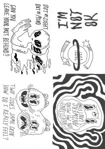
Manual method – pen and pencil!
I had tried creating another zine manually with pencil and paper with the intention of scanning it with a riso-printer to see what the pencil texture would look like. First I created the line art in a black color pencil, since I wanted it to stand out more. Next I taped my line art sketch to my window, and overlaid another piece of paper onto it to create the layer for shading. That way, when the light shines through, I can see both layers while drawing. Though I could’ve done this with Photoshop, the fact that they were “physical paper layers” helped my mind process everything a lot easier. Also, with using pencils, I did not need to fine tune any grayscale %, as I could just change how much pressure I put into my hand, so having that immediate tactile feedback was very helpful.
Making adjustments in this method is a lot easier, as I can do it immediately with any pencil and eraser if needed. However, more technical things like gradients would probably require more technical skill on my end to produce that effect. Though I have to say, this zine was a lot easier to make, with less technical challenges. I probably bit off more than I could chew with my previous print project!
Sadly, I never got to print this zine in riso-print, so I do not know what it would look like physically– it is something that I eventually plan to do!
Zine Line ArtZine ShadingZine Proof
Risograph as a print technology is unique as it captures the characteristics of screen-printing AND photocopy, which ties into the concept “remediation”(Bolter, 2001) , not only paying homage to previous methods of printing, but rivaling it in its efficiency and cost, making it an ideal printing technology at its time.
What really stood out to me in my exploration and experimentation in the revival of risograph printing is that artists are actively choosing to use this medium for their artwork, instead of other existing cutting-edge print technology. Similar to Gutenberg and his aim to refine production value rather than change the characteristics of the medium, the riso-printer is really good at doing that for artwork, especially with its various available colors (even in fluorescent inks, which often in unavailable for digital print) , the way it looks when overprinted, and how well it captures texture on paper. Often times, it is the unpredictability and “happy accidents” that adds to the charm!
Lastly, risograph printing is affordable and high in quality, creating more opportunities for independent and self-publishing artists to distribute publications, making it accessible and welcoming for everyone!
References
Bolter, Jay David. (2001). Writing space: Computers, hypertext, and the remediation of print [2nd edition]. Mahwah, NJ: Lawrence Erlbaum.
Moniker Press. (2015). Inside the Riso: A Visual Introduction to the Risograph Machine and Printing Process [Video]. Vimeo. https://vimeo.com/141237371
Risograph. (2022, January 26). In Wikipedia. https://en.wikipedia.org/wiki/Risograph

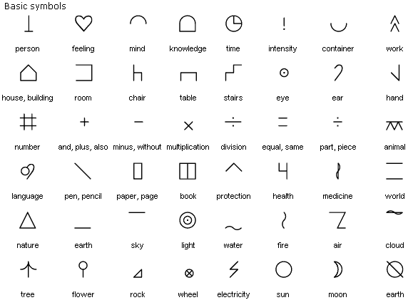
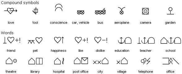
 “friend” is represented by:
 person
 feeling
 positive (
 plus +
  intensity)