This was another very (((exciting))) assignment for me, as it intersected with A LOOOOOT of things that I am passionate about in art and technology, specifically in the context of print-making.
For this assignment, I wanted to deviate from the homework description a bit to share and reflect more deeply on a novel print-making method that I was able to experiment with this past year and how that ties into the “handwritten” vs “mechanized” dichotomy in an analogous way. Nevertheless, I have still included a brief write-up for the task this week.
Assignment
In my day-to-day I do both typing and writing by hand quite often!
On one hand, most of the tasks I need to do for work and studying for the MET program are done via typing. There is a lot of information and correspondence that is currently hosted virtually with technological devices, therefore it is more feasible and reasonable to complete them in this medium. On the other hand I have my mechanical pencil for practicing French verb conjugations, drawing comics in my zines, or journaling in my diary. Therefore, this task was somewhat familiar and easy for me to complete.
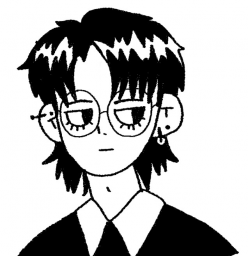
My tool of choice is usually my mechanical pencil — I don’t need to sharpen it, and it is easy to edit my work with an eraser. This is useful for language learning or creating sketches for my comics, as it is easy to alter mistakes and make edits on paper. Usually I use fine-tip pens for writing in my diary or warming up for drawing. When it comes to making changes, sometimes I cross the word out and resume, or work with the mistakes as a practice in accepting imperfections and being more open to where my creativity takes me. Sometimes, for sharing creative work online, I will create sketches with pencil and paper and then upload the sketch onto my computer to finish my linework and coloring. Though it is mediated by software (Photoshop) and hardware (Wacom tablet and stylus), I think there are still the traces of the analog similar to handwriting.
For me, I don’t think there is a preference in terms of media or method of writing. The most significant difference between choosing handwriting versus mechanized forms of writing is mainly driven by intention.
For example, handwriting was useful for learning how to write Japanese Kanji. I needed to pay attention to the strokes and how they differ from the Chinese characters, which was helpful for learning written word production. However, when I want to focus on sentence structure and syntax in written essays, I would probably choose to type instead of handwrite, as it saves some time and effort in the process.
Another example would be choosing to handwrite a card or letter. I was (and still am!) into snail mail and other analog forms of correspondence! When I receive handwritten letters, it feels like the intentions and good wishes have more weight permeates through lopsided, wriggly penmanship and silly illustrations.
Reflections
Module 4 was a fun deep dive into the history of mechanization and learning about the evolution and development of paper and printing technologies!
This intersects with my interests and previous experiences that I have with art and experimenting with different mediums (i.e. linocut ex libris, screen-printing on fabric, paper-making and book-binding, Chinese calligraphy)
Currently, I have found a comfy corner where I can explore all of these and integrate it with language, storytelling, and comics in the form of zines!
Recently, I volunteered at the Vancouver Comic Arts Festival (VanCAF) that finally happened after 2 whole years of hiatus due to the pandemic. It felt so revitalizing to see all the wonderful art and chat with the talented artists, and it made me realize once again how wonderful art can be!
Risograph Revival
One thing that I noticed (for sometime now) and saw at the festival is the revival of risograph printing in the zine and art community in the past few years. Risograph originated in post-war Japan by Noboru Hayama, and can be described as the hybrid of screen-printing and photocopy. It is both the name of the printer and the soy-based ink that was a more affordable alternative to emulsion ink at the time. A few reasons why it is so beloved by the art community is its ability to create high-quality prints with many vibrant color options, and is usually less expensive when printed at high volumes, which makes it a fast and accessible way to create and distribute artwork in general!
Below I have included a brief comprehensive introduction made by Moniker Press, a local risograph print studio based in Vancouver!
Experimentation- trial and error (so many!!)
Last year when I was living in Taipei, I had the chance to learn and experiment with riso-printing at local print studio RetroJam.
One main thing that I forgot and re-experienced during this experience is how much of the creative process is just understanding the technological aspect of the medium and the mechanisms involved in the process. There are so many intricate details to pay attention to when it comes to preparing artwork so that you can maximize the potentials of riso-printing, while working within its limitations!
On the topic of “handwritten” vs “mechanized” comparison in this assignment, there was something that I found analogous to this dichotomy in context of riso-printing. Below, I will share the two different methods that I approached riso-printing, and my thoughts about the process, while relating it back to some of the readings from Module 4.
As a preface, here are some things to know about riso-printers and the printing process. I have also included my own art to illustrate how it works!
-
- Riso-printers register grayscale information and converts to bitmap to create “master” stencil for the color layers
-
- Riso-printers are similar to a copy machine, as it has a scanner table on top. Therefore, one can create hand-drawn sketches and scan them for print.
The other option is to create digital files and connect to printer for print.
- Riso-printers are similar to a copy machine, as it has a scanner table on top. Therefore, one can create hand-drawn sketches and scan them for print.
-
- Riso-printers are similar to screen-printing, as it prints colors in separate layers. Therefore, you would need to create a separate stencil (or file) for each color you use


Digital distress – file setup and challenges
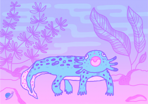
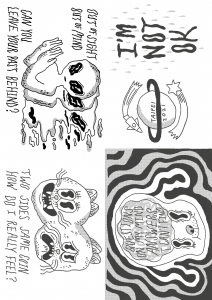
My axolotl print was hand-drawn on my tablet on Photoshop, though the process was manual, most of the post-editing was done digitally. My biggest challenge was the color separation process and visualizing what it would look like in color. I had to constantly switch back and forth between the my layers to make sure I was drawing on the correct one for the color that I wanted. In addition, the grayscale % can also affect the opacity and tone when colors overlap, so my color proof is just an approximation of what the final print can look like.
I went to the studio and got a sample print to see what it actually looks like. For my gradient background, there was a part where it just stopped abruptly, as the grayscale % was too light for the printer to register. In another part, it was difficult to see the pink through the blue, so I had to make adjustments to so that only the pink line art shows through. Much of riso-printing is through trial-and-error, which is both a fun and painstaking process!
Correcting mistakes and making adjustments is both convenient and inconvenient. It is convenient as most of the adjustments are made by the tools in the software. It is inconvenient, as I will need to depend on the tools to even correct anything!
Manual method – pen and pencil!
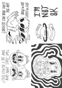
I had tried creating another zine manually with pencil and paper with the intention of scanning it with a riso-printer to see what the pencil texture would look like. First I created the line art in a black color pencil, since I wanted it to stand out more. Next I taped my line art sketch to my window, and overlaid another piece of paper onto it to create the layer for shading. That way, when the light shines through, I can see both layers while drawing. Though I could’ve done this with Photoshop, the fact that they were “physical paper layers” helped my mind process everything a lot easier. Also, with using pencils, I did not need to fine tune any grayscale %, as I could just change how much pressure I put into my hand, so having that immediate tactile feedback was very helpful.
Making adjustments in this method is a lot easier, as I can do it immediately with any pencil and eraser if needed. However, more technical things like gradients would probably require more technical skill on my end to produce that effect. Though I have to say, this zine was a lot easier to make, with less technical challenges. I probably bit off more than I could chew with my previous print project!
Sadly, I never got to print this zine in riso-print, so I do not know what it would look like physically– it is something that I eventually plan to do!
Risograph as a print technology is unique as it captures the characteristics of screen-printing AND photocopy, which ties into the concept “remediation”(Bolter, 2001) , not only paying homage to previous methods of printing, but rivaling it in its efficiency and cost, making it an ideal printing technology at its time.
What really stood out to me in my exploration and experimentation in the revival of risograph printing is that artists are actively choosing to use this medium for their artwork, instead of other existing cutting-edge print technology. Similar to Gutenberg and his aim to refine production value rather than change the characteristics of the medium, the riso-printer is really good at doing that for artwork, especially with its various available colors (even in fluorescent inks, which often in unavailable for digital print) , the way it looks when overprinted, and how well it captures texture on paper. Often times, it is the unpredictability and “happy accidents” that adds to the charm!
Lastly, risograph printing is affordable and high in quality, creating more opportunities for independent and self-publishing artists to distribute publications, making it accessible and welcoming for everyone!
References
Bolter, Jay David. (2001). Writing space: Computers, hypertext, and the remediation of print [2nd edition]. Mahwah, NJ: Lawrence Erlbaum.
Moniker Press. (2015). Inside the Riso: A Visual Introduction to the Risograph Machine and Printing Process [Video]. Vimeo. https://vimeo.com/141237371
Risograph. (2022, January 26). In Wikipedia. https://en.wikipedia.org/wiki/Risograph