This paper explores how marginalized people use humanitarian makerspaces to create projects that meet both basic and high-level needs, like belonging and self-actualization. This supports Max-Neef’s idea that personal fulfilment comes from satisfying multiple needs at once. Further research should focus on how the design process itself can empower marginalized people and lead to impactful outcomes.
Question: The article emphasizes designing with and for marginalized people, what could that look like in your own personal contexts?
This paper explores how gender identity affects participation in makerspaces. The available technologies often send gendered signals, making men feel more welcome than women. A deeper look at the environment and materials in the spaces may help promote greater gender equity and representation.
Question: What were your personal experiences with interacting with tools in makerspaces, were you intimidated by certain tools and technologies more than others?
Kye, H. (2020). Who is welcome here? A culturally responsive content analysis of makerspace websites. Journal of Pre-College Engineering Education Research (J-PEER), 10(2). https://doi.org/10.7771/2157-9288.1190
This paper shows though makerspaces can help create more equitable STEM opportunities for marginalized students through collaborative learning, intentional efforts of integrating culturally responsive pedagogy (CRP) is needed to support both the academic success and student’s cultural identities. More practical guidelines on CRP principles are needed to better ensure equity and diversity in makerspaces both in-person and online.
Question: In your personal contexts, what are some practical culturally responsive pedagogical changes that can be applied?
Convergences All three papers highlight the need for more intentional design of makerspaces to promote equity and inclusion for marginalized groups. Without conscious efforts, makerspaces risk perpetuating existing inequities related to gender, race and socioeconomic status. Fostering inclusive environments require purposeful frameworks and guidelines to empower marginalized participants and support diverse identities.
Formulate a conception of usability and what is missing from the conception from an educational perspective — what is educational usability?
Human Computer Interaction (HCI) is an interdisciplinary field of study concerned with the iterative design, evaluation, and implementation of interactions between humans and technological interfaces as a system.
The principals of usability are guidelines that help measure the quality of human-computer interactions, taking into consideration of interface functionality, efficiency and effectiveness depending on user’s needs, contexts and level of satisfaction (Issa & Isaias, 2015, p. 30)
From an educational perspective, I believe that context and user’s needs should be prioritized when it comes to evaluating the educational usability of educational technologies and resources within a learning context. Ideally, this would be implemented as a system, such that the interfaces can assist the user’s with their learning process, and can be adapted to fit the user’s ever-changing needs. This means necessarily having interfaces that are accessible to fit the user’s needs physically, cognitively, culturally, and digitally to provide support that is contextualized.
Based on Woolgar’s paper, identify and discuss 2 examples of “usability gone wrong”.
In Woolgar’s paper (1990), he seemed to be concerned about usability testing within the “right context” of both the user and the environment.
Having chosen employees within the company as test subjects (p. 81) , it is unclear whether or not their behaviors will reflect that of what is expected by their target users. Even with the provided manuals, it is uncertain that the instructions are “sufficiently clear” to target users, such that the errors made in the usability tests could be misattributed to other factors (p.82). Lastly, due to the simulated environment, the test subjects even ironicized their attempts of creating an “objective test” , making it challenging to discern whether the test subjects behave in a way “natural” to target users at all (p. 86).
Lacking concrete definition of the machine and user personas, and simulation of “objective tests of natural user behavior” overall undermines the robustness and reliability of the usability test.
Discuss the differences seen in the two excerpts of “usability”
…the usability evaluation stage is an effective method by which a software development team can establish the positive and negative aspects of its prototype releases, and make the required changes before the system is delivered to the target users" (Issa & Isaias, 2015, p. 29).
“…the design and production of a new entity… amounts to a process of configuring its user, where 'configuring' includes defining the identity of putative users, and setting constraints upon their likely future actions” (Woolgar, 1990).
Based on the two excerpts, it seems like both of them are converging on the idea of iterative and interactive systems to adjust and create better experiences for users when they utilize the interface.
The main difference seems to be that Issa and Isaias’s approach is more from “after-the-fact” feedback, such that improvement is based on the reactions and responses of users. On the other hand, Woolgar seems to make “before-the-fact” assumptions of the users to see whether the hypotheses are confirmed or not — hence “configuring” its users.
While both approaches create recursive feedback loops to push development of the interface and are initially “human-driven” in design, it makes me wonder — how much of our interactions with technology are directed by human agency, and how much of our interactions are shaped more by the affordances of our technology?
References
Issa, T., & Isaias, P. (2015). Usability and human computer interaction (HCI) In Sustainable Design (pp. 19-35). Springer.
Woolgar, S. (1990). Configuring the user: The case of usability trials. The Sociological Review, 38(1, Suppl.), S58-S99.
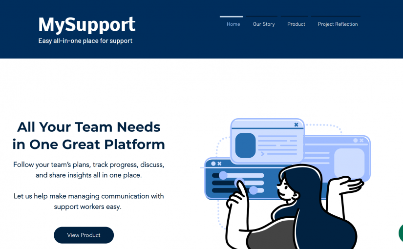
Our MySupport App was very much one that was relevant to both Helena and I, as we have had previous experience working in the health and education sector such that we were able to see and understand the need for such a centralized platform.
In Theory
Drawing from the approaches of data-mining and pedagogical documentation of “the living wall”, we hoped to center students’ in special education and their perspectives alongside data- driven methodologies such that we can have a more comprehensive approach to support their needs.
I believe both these quantitative and qualitative approaches can be seen as extensions of core concepts in Media Ecology and New Materialism, specifically the “intra-action and diffusion” of information between the “selbstbildung” of the individual student, surrounding support workers, and their environment, as well as the artifacts and progress they make in the learning process.
In Practice
Framework
In terms of our design process, we were drawing from approaches in UI/UX design and research principles, though not as vigorous as we had hoped to, due to time constraints and limitations.
Moving forward, I believe having a stronger understanding of UX design processes will be helpful with finding more robust solutions to serve the needs of the different people this app was intended for, especially with such a broad range of professions we need to take into consideration.
Challenges and New Skills Unlocked
I believe we have a strong conceptual idea very early on in the term, however, the execution and technical difficulties we ran into was what set us back in terms of time.
I think the biggest challenge was trying to find a suitable platform to host our application on, and then altering their offered features to fit the functions of what we wanted for our app.
In some ways, perhaps it would’ve been easier overall to choose a simpler/familiar platform (perhaps a learning management platform instead of a customer relationship management platform). However, we both wanted to rise up to the challenge and stretch our abilities with this final project.
We spent a lot of time tinkering around on many different platforms, including Salesforce and Hubspot before we settled on Odoo, due to the modular features and was less complex than the other two platforms for what we needed.
Since Odoo does not have the best user interface and not geared for management in health and education, we spent a lot of time trying to re-structure what they offered to fit our own application needs. The process of that was just really getting hands-on experience playing around with how the features work, understanding the functions that it can afford, and see what we can do to leverage these affordances.
Due to the limited free trial timeframe of the Odoo platform, we also had to start from scratch to recreate the app, as the trail would’ve ended before we were able to present. This was also a big set-back in our progress, and we were really worried if we were even able to create a (semi-)functioning app for demonstration. Fortunately, a meeting with the instructor and clarification that documenting and making our creation process transparent was most crucial made us regain some composure just before the presentation date.
Collaboration
In the beginning when we were trying to come up with the conception of this app, Helena and I were trying to find a converging point, which happened to be in the intersection of health and education.
From my experience as a support worker for youths on the autism spectrum, I provided some of the different perspectives of the support workers and their potential user experience concerns, which was necessary for creating the features to our app. Helena also chimed in with her experience as well, having also experience in a similar supporting role working with individuals in special education.
We both put our heads together with the technical aspect of creating the app, as we needed to understand the strengths and weaknesses of each feature. Helena had a lot more experience with using CRM platforms from her previous professional experiences and was immensely helpful with some of the troubleshooting.
When I was feeling overwhelmed and uncertain about our vision, she also provided a lot of encouragement which really uplifted our team morale, which really gave me motivation and that extra push at the end of the semester.
Our goal is to offer a digital centralized health management platform for special education students. Oftentimes, special education students have a large support network that can include a multitude of personal support workers (PSW) and individuals. For example, special education students can have school teachers, external tutors, speech therapists, physical therapists, and more depending on their needs.
Through our experiences working the public health system (Helena) and working with youths on the autism spectrum (Sophy), we realized there lacked an accessible and centralized platform for parents and PSWs to communicate and collaborate with each other.
Our platform serves to create a centralized space where all the support workers can input data, information, and clinical notes about the child’s progress for the parents and all the other PSWs to access.
Challenges MySupport Tackles
Parents are overburdened with administrative tasks Students with special needs or extra support often need a large and expansive support network. Oftentimes, communication between PSWs is limited and parents need to devote a lot of time and energy to reiterating, organizing, and archiving information about their special needs child. Parents struggle with updating new PSWs and they are usually left with the task of ensuring that new PSW are given the information needed to appropriately support their child. Parents, who require more support to begin with, then are tasked with administrative duties that take time away from their ability to better care for their child and family.
Information is not centralized between PSWs Currently, information about special education students is not centralized in one place. The challenges this presents is that, they don’t have access to the information and progress that is being made by other PSWs that could better inform their practice and give the student the best support possible. An example being, that a student’s teacher could better help the student in the classroom if they are aware of the progress being made with the tutors or the speech therapist.Oftentimes, there can be a huge turnover rate of certain PSWs members on the team (e.g. tutors, educational assistants, etc.) such that it takes extra time and effort onboarding someone new. Having a centralized communication platform with information of the child available can streamline the process, and hopefully help with building rapport quickly between the child and new team members. An example being that with the profile and additional information available on the platform, the new member can have a better idea of how the child is motivated, their preferred ways of communication, and any additional behavior that PSWs should know such that they can build a connection to support their needs.
There is a limited ability to extrapolate data The disconnection between all the progress being made by each support worker also means there is no easy way to collectively track the child’s progress and attain real ent and important data. Oftentimes, there is no way for the parents or the PWS to collectively assess the child’s behavior and recognize patterns or changes. In addition, having context specific records of behavior patterns that pop up can also help the team understand what needs to be done to provide the right support.
MySupport Solutions
MySupport seeks to make the lives of parents and families easier by removing the burden of tracking and organizing feedback and progress between PSWs. Parents, especially in blended or divorced families where guardians are not always together to support the child may benefit from centralized communication. Further, with children that require a high level of support, extended family like grandparents might also be involved. MySupport allows all relevant parties caring for the child to stay updated and aware of their development. Effectively, the platform streamlines communication across all stakeholders and removes the possibility that information will be forgotten, lost, or missed.
Demographic and Target Audience
Guardians of Special Education Children Parents of special education children could use this platform as a means of centralizing communication and communicating with all PSW.
PSWs Supporting Special Education Children The personal support workers who are working to support special needs children in all aspects of their life would benefit from a centralized platform that allows for progress management.
How Does it Work?
All personal support workers would be given access to the child’s profile and each PSW worker would have a respective section where they would be able to upload documents, add updates, and keep track of the child’s progress. Over the period in which they are supporting the child, each PSW would also have access to the other PSWs sections to be able to see their updates as well. Parents would be able to control who has access to each section, for example a parent might not feel comfortable with a tutor seeing the physical therapists updates, so the tutor would only have access to the school teachers updates. The control of visibility would be determined by the parents and the respective PSW. However, each PSW would have a dashboard where all the updates from other PSW would be centralized and organized so that they could stay in the loop with the students’ progress through written documentation.
Further, our platform would include integrated survey and questionnaire methods that allow parents and PSW to keep track of progress being made using assessment methods that could then be extrapolated to find patterns and helpful data.
Platform Outcomes
The centralized platform would mean that all the information and required documents would be added to the platform by individuals. Each individual would need to have a place to store their respective materials as well as one place where all the updates could be easily displayed, preferably in a chronological order. Further, this dashboard would act as a database that allows parents and PSW to search for information if they need to reference anything.
Technical Components
We intend on deploying our product ona cloud-based customer relationship management (CRM) platform. The benefit of using a CRM platform in a healthcare management setting, is that it includes several automation and integration features that would make catering our product to several PSWs more inclusive. For example, being able to integrate Google Classroom schedules as well as an Outlook calendar into a centralized calendar system ensures that all important dates are automatically populated. Further, contact management and pipeline management are needed to help track and manage progress and internal development.
Salesforce would be an ideal platform, as it is expansive, versatile, and scalable depending on the team’s needs, and the cloud-based portal would make the platform accessible. However, a limitation to using this platform is that the service is not free for small business or individual users. Meaning, it is more cost effective for the development of our prototype to look elsewhere and find a product that is more financially accessible in the time being.
Similar CRM technologies include Hubspot, Zoho, Freshsales, Insightly, etc.
For the demonstration of our tool, we plan to use Hubspot as it is more user-friendly on smaller scales and has more affordable plans. In the Free CRM Plan, the automation function is limited, and requires upgrade and payment. It can also be easily integrated with other external applications for file storage, spreadsheets, emails, databases, etc.
Limitations
Our main limitation is to ensure that the healthcare management system must comply with HIPPA health regulations and privacy concerns.
First, stick to Taylor’s specific arguments (supplemented by the Harry Potter excerpt) to identify and explain how online learning can risk reverting to The Umbridge Approach.
Then, using Taylor’s own terms, supplemented by Baynes et al. paper on being “at” UBC as a distance education student. What has been your own experience of online learning? Describe current situation in the MET program at UBC, how would one take up Taylor’s argument(s) about the “relative value” of your degree under the massification of online education?
Taylor (1996) outlines many of the pedagogical benefits and challenges of open learning, specifically under the concept of looking at borders in the context of “social resources associated with the use of educational artifacts”, especially around the focus of social conventions which are integral to such artifacts (p. 60).
One challenge was how open learning lacks social inertia which is strongly associated with authority, as the material properties that lend authority to the educational experience are stripped away by the usage of information and communication technologies (p. 68).
The physical demassification of the classroom and the social demassification of higher education in this sense means higher customizability of pedagogical practices to particular groups. However, the paradox to this would be that the social conventions and identities of “student” and “teacher” are stripped away by the adoption of open learning, which challenges authority and legitimacy of knowledge and pedagogical practices once it has moved beyond the confines of a physical institution.
Relating back to the Harry Potter excerpt per essay prompt, this can be illustrated through Prof. Umbridge’s approach to teaching the Dark Arts (Rowling, 2003).
In her class, Prof. Umbridge holds the authority and commands the classroom with her tyrannical rules. The students parrot “Yes, Prof. Umbridge” or “No, Prof. Umbridge”, which reinforces her reign and those who do not follow, or question her approach will receive negative consequences (p. 240).
Her use of the textbook “Defensive Magical Theory” also upholds the legitimacy of knowledge that is “carefully structured, theory-centered, Ministry-approved” written by “Ministry-trained educational experts” (p. 242)
This poses as a problematic reverting and overcompensation of “packaging the course into an extensive syllabus” and “strong preoccupation of what to teach rather than how to teach”. This pedagogy is limiting and leads to an overly teacher- and curriculum-centered approach that is more “closed” where both teacher and students have less space to make and influence decisions (Taylor, 1996, p. 72).
Reflecting on my current experiences in this course, I now understand what Taylor means by the “stripping away” of social conventions and social inertia in distance education, especially in the ways of interaction and collaboration with my instructor and peers.
With most of the course communication on Slack, the immediacy and ability to instantaneously contact others was a strange spatial break down in terms of the social and material interactions which take place within in. (Baynes, 2014, p. 572).
The renegotiation of professional and hierarchical boundaries renders the rapport and interaction between student and instructor rather casual and friendly. On one hand, this equalized the dimension of authority within the class, opening up the space for more student-centered co-contribution within the course. On the other hand, with the lack of facilitated discussions or peer feedback on assignments, this “inconsequential” quality of interaction permeates the learning atmosphere such that it feels quite difficult to co-create my learning experience with others, more like shouting out into the void.
I think this is an example of attempting to find equilibrium between the physical and social demassification of open education, and the renegotiation of social conventions surrounding such fluid and mobile learning environments, especially through the mediation of communication technology, reiterating the notion that “technology is neither good nor bad in itself, but it is the way that it is used that matters” (Taylor, 1996).
References:
Bayne, S., Gallagher, M. S., & Lamb, J. (2014). Being ‘at’ university: The social topologies of distance students. Higher Education, 67(5), 569-583. doi:https://doi.org/10.1007/s10734-013-9662-4
Rowling, J. K. (2003). Chapter 12 Professor Umbridge. In Harry Potter and the Order of the Phoenix. New York
Taylor, P. G. (1996). Chapter 3: Pedagogical challenges of open learning: Looking to borderline issues. Counterpoints (New York, N.Y.), 29, 59-77.
Looking through the blogs of my colleagues, I noticed most of them opted for the manual script task, so when I saw Katie and Simin’s potato printings, I wanted to do the linking task on their project observations.
On Katie and Simin’s websites, they included a picture of their completed print, with a written description of their experience and process.
Katie made a colorful potato print of her dog’s name “DAiSY”
Simin made a bright yellow print of the words “Light”, with the letters “g” and “h” mirrored in the print.
Below is a brief categorization of the themes I found in their observations:
Tools
Katie used a paring knife to carve on small potatoes.
Simin used a larger carving knife that is about 5-inches long.
The difference in tool size and length definitely affected the carving experience, which in Simin’s experience was difficult to carve with precision to create legible letters.
Typography
Both of them forgot that the letters would appear in mirror image when printed, and didn’t realize it until they created the print!
This can be seen in Simin’s print, which I am glad they kept instead of correcting it, as it reflects part of the learning process.
They also noticed the symmetry and mirror-ability of some the letters, such as the “D”, “i”, “S” in Katie’s print, and “i”, “t” in Simin’s print.
Katie deliberately chose to use uppercase, whereas Simin used camel-case. With more curves and roundness in lowercase letters, it can pose as a greater challenge compared to the angular and pointed uppercase letters when carving on potatoes. Both were in san-serif fonts.
Katie mentioned it was difficult to maintain a consistent size and style, which can be illustrated through Simin’s “g” looking more like an “e” in comparison to the size of the neighboring letters.
Printing
When making the prints, Katie was able to maintain a fairly consistent spacing in the duplicate words. The only noticeable difference would be the pressure when stamping them, as seen in the uneven-ness in the “D” “A” and “S”. The paint seemed pretty consistently spread onto the stamps in a thinner layer, so the letters seemed to be a bit transparent.
Simin mentioned the sliminess of the potato made it difficult to pick up, which made the print blurry by slipping around on paper. Looking at the prints themselves, it seems like Simin’s layer of paint was thicker as well, which could also have contributed to the slipperiness.
Time
Simin’s prints took around 30 mins to complete, with most time spent on planning and cutting. Katie’s prints took around 10 mins to complete.
Both mentioned how labor-intensive and inefficient process was to create these prints manually. Katie mentioned the “perceived” value of traditional processes and how they developed a certain personal attachment to the potato stamps, knowing how much work went into it.
Connection with Readings:
“Human connection” + “Accessibility”
Katie centered her reflection of the task around “what is lost in increasing efficiency” during the mechanization of printing — mainly the connections people have with the physical medium itself. She believes that the earlier practices do not need to be completely erased in favor of new developed technologies.
Simin centered their reflection on mechanization or print “creating a base understanding of tangible language to reach beyond limited repetition”, placing emphasis on breaking down the barriers of writing as a scholar-limited tool to one that is more accessible to the masses.
I think this resonates with some of the similar sentiments I had while writing about the revival of risograph printing, in particular the “human connection” and “accessibility” aspects behind the many reasons that artist continue to use risoprint to create and distribute their artwork.
Reflection
Having been introduced to linocut and other types of printing early on, their observations reminded me of my own learning process when I first started experimenting with the method and medium, and how different our experiences were.
I first encountered printmaking in a classroom setting, therefore I had access to suitable tools and materials with a more structured learning process. I was able to fast-track onto experimenting with carving and printing technique, as I didn’t need to spend as much time trying to figure out the peripheral technicalities of the tools and materials like Katie or Simin did. However, it was through their straightforward approach through trial and error that highlighted the importance of exploration and learning through hands-on practice.
This was another very (((exciting))) assignment for me, as it intersected with A LOOOOOT of things that I am passionate about in art and technology, specifically in the context of print-making.
For this assignment, I wanted to deviate from the homework description a bit to share and reflect more deeply on a novel print-making method that I was able to experiment with this past year and how that ties into the “handwritten” vs “mechanized” dichotomy in an analogous way. Nevertheless, I have still included a brief write-up for the task this week.
Assignment
In my day-to-day I do both typing and writing by hand quite often!
On one hand, most of the tasks I need to do for work and studying for the MET program are done via typing. There is a lot of information and correspondence that is currently hosted virtually with technological devices, therefore it is more feasible and reasonable to complete them in this medium. On the other hand I have my mechanical pencil for practicing French verb conjugations, drawing comics in my zines, or journaling in my diary. Therefore, this task was somewhat familiar and easy for me to complete.
My tool of choice is usually my mechanical pencil — I don’t need to sharpen it, and it is easy to edit my work with an eraser. This is useful for language learning or creating sketches for my comics, as it is easy to alter mistakes and make edits on paper. Usually I use fine-tip pens for writing in my diary or warming up for drawing. When it comes to making changes, sometimes I cross the word out and resume, or work with the mistakes as a practice in accepting imperfections and being more open to where my creativity takes me. Sometimes, for sharing creative work online, I will create sketches with pencil and paper and then upload the sketch onto my computer to finish my linework and coloring. Though it is mediated by software (Photoshop) and hardware (Wacom tablet and stylus), I think there are still the traces of the analog similar to handwriting.
For me, I don’t think there is a preference in terms of media or method of writing. The most significant difference between choosing handwriting versus mechanized forms of writing is mainly driven by intention.
For example, handwriting was useful for learning how to write Japanese Kanji. I needed to pay attention to the strokes and how they differ from the Chinese characters, which was helpful for learning written word production. However, when I want to focus on sentence structure and syntax in written essays, I would probably choose to type instead of handwrite, as it saves some time and effort in the process.
Another example would be choosing to handwrite a card or letter. I was (and still am!) into snail mail and other analog forms of correspondence! When I receive handwritten letters, it feels like the intentions and good wishes have more weight permeates through lopsided, wriggly penmanship and silly illustrations.
Reflections
Module 4 was a fun deep dive into the history of mechanization and learning about the evolution and development of paper and printing technologies!
This intersects with my interests and previous experiences that I have with art and experimenting with different mediums (i.e. linocut ex libris, screen-printing on fabric, paper-making and book-binding, Chinese calligraphy)
Currently, I have found a comfy corner where I can explore all of these and integrate it with language, storytelling, and comics in the form of zines!
Recently, I volunteered at the Vancouver Comic Arts Festival (VanCAF) that finally happened after 2 whole years of hiatus due to the pandemic. It felt so revitalizing to see all the wonderful art and chat with the talented artists, and it made me realize once again how wonderful art can be!
Risograph Revival
One thing that I noticed (for sometime now) and saw at the festival is the revival of risograph printing in the zine and art community in the past few years. Risograph originated in post-war Japan by Noboru Hayama, and can be described as the hybrid of screen-printing and photocopy. It is both the name of the printer and the soy-based ink that was a more affordable alternative to emulsion ink at the time. A few reasons why it is so beloved by the art community is its ability to create high-quality prints with many vibrant color options, and is usually less expensive when printed at high volumes, which makes it a fast and accessible way to create and distribute artwork in general!
Below I have included a brief comprehensive introduction made by Moniker Press, a local risograph print studio based in Vancouver!
Experimentation- trial and error (so many!!)
Last year when I was living in Taipei, I had the chance to learn and experiment with riso-printing at local print studio RetroJam.
One main thing that I forgot and re-experienced during this experience is how much of the creative process is just understanding the technological aspect of the medium and the mechanisms involved in the process. There are so many intricate details to pay attention to when it comes to preparing artwork so that you can maximize the potentials of riso-printing, while working within its limitations!
On the topic of “handwritten” vs “mechanized” comparison in this assignment, there was something that I found analogous to this dichotomy in context of riso-printing. Below, I will share the two different methods that I approached riso-printing, and my thoughts about the process, while relating it back to some of the readings from Module 4.
As a preface, here are some things to know about riso-printers and the printing process. I have also included my own art to illustrate how it works!
Riso-printers register grayscale information and converts to bitmap to create “master” stencil for the color layers
Riso-printers are similar to a copy machine, as it has a scanner table on top. Therefore, one can create hand-drawn sketches and scan them for print.
The other option is to create digital files and connect to printer for print.
Riso-printers are similar to screen-printing, as it prints colors in separate layers. Therefore, you would need to create a separate stencil (or file) for each color you use
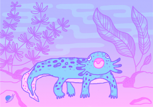
Axolotl Blue LayerAxolotl Pink LayerAxolotl Color Proof
Digital distress – file setup and challenges
My axolotl print was hand-drawn on my tablet on Photoshop, though the process was manual, most of the post-editing was done digitally. My biggest challenge was the color separation process and visualizing what it would look like in color. I had to constantly switch back and forth between the my layers to make sure I was drawing on the correct one for the color that I wanted. In addition, the grayscale % can also affect the opacity and tone when colors overlap, so my color proof is just an approximation of what the final print can look like.
I went to the studio and got a sample print to see what it actually looks like. For my gradient background, there was a part where it just stopped abruptly, as the grayscale % was too light for the printer to register. In another part, it was difficult to see the pink through the blue, so I had to make adjustments to so that only the pink line art shows through. Much of riso-printing is through trial-and-error, which is both a fun and painstaking process!
Correcting mistakes and making adjustments is both convenient and inconvenient. It is convenient as most of the adjustments are made by the tools in the software. It is inconvenient, as I will need to depend on the tools to even correct anything!
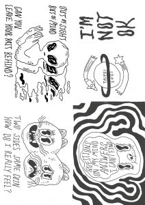
Manual method – pen and pencil!
I had tried creating another zine manually with pencil and paper with the intention of scanning it with a riso-printer to see what the pencil texture would look like. First I created the line art in a black color pencil, since I wanted it to stand out more. Next I taped my line art sketch to my window, and overlaid another piece of paper onto it to create the layer for shading. That way, when the light shines through, I can see both layers while drawing. Though I could’ve done this with Photoshop, the fact that they were “physical paper layers” helped my mind process everything a lot easier. Also, with using pencils, I did not need to fine tune any grayscale %, as I could just change how much pressure I put into my hand, so having that immediate tactile feedback was very helpful.
Making adjustments in this method is a lot easier, as I can do it immediately with any pencil and eraser if needed. However, more technical things like gradients would probably require more technical skill on my end to produce that effect. Though I have to say, this zine was a lot easier to make, with less technical challenges. I probably bit off more than I could chew with my previous print project!
Sadly, I never got to print this zine in riso-print, so I do not know what it would look like physically– it is something that I eventually plan to do!
Zine Line ArtZine ShadingZine Proof
Risograph as a print technology is unique as it captures the characteristics of screen-printing AND photocopy, which ties into the concept “remediation”(Bolter, 2001) , not only paying homage to previous methods of printing, but rivaling it in its efficiency and cost, making it an ideal printing technology at its time.
What really stood out to me in my exploration and experimentation in the revival of risograph printing is that artists are actively choosing to use this medium for their artwork, instead of other existing cutting-edge print technology. Similar to Gutenberg and his aim to refine production value rather than change the characteristics of the medium, the riso-printer is really good at doing that for artwork, especially with its various available colors (even in fluorescent inks, which often in unavailable for digital print) , the way it looks when overprinted, and how well it captures texture on paper. Often times, it is the unpredictability and “happy accidents” that adds to the charm!
Lastly, risograph printing is affordable and high in quality, creating more opportunities for independent and self-publishing artists to distribute publications, making it accessible and welcoming for everyone!
References
Bolter, Jay David. (2001). Writing space: Computers, hypertext, and the remediation of print [2nd edition]. Mahwah, NJ: Lawrence Erlbaum.
Moniker Press. (2015). Inside the Riso: A Visual Introduction to the Risograph Machine and Printing Process [Video]. Vimeo. https://vimeo.com/141237371
Risograph. (2022, January 26). In Wikipedia. https://en.wikipedia.org/wiki/Risograph