|
Tracks |
Frequency |
| Track 6: El Cascabel |
14 |
| Track 14: Melancholy Blues |
14 |
| Track 18: Fifth Symphony (First Movement) |
13 |
| Track 7: Johnny B. Goode |
11 |
| Track 11: The Magic Flute (Queen of the Night aria) |
11 |
| Track 25: Jaat Kahan Ho |
11 |
| Track 3: Percussion (Senegal) |
11 |
| Track 21: The Fairie Round |
10 |
| Track 10: Gavotte en rondeaux |
10 |
| Track 24: Flowing Streams |
10 |
| Track 5: Morning Star Devil Bird |
9 |
| Track 13: Panpipes and Drum (Peru) |
9 |
| Track 9: Tsuru No Sugomori (Crane’s Nest) |
8 |
| Track 2: Kinds of Flowers |
8 |
| Track 23: Wedding song |
7 |
| Track 15: Bagpipes (Azerbaijan) |
7 |
| Track 20: Night Chant |
7 |
| Track 12: Tchakrulo |
7 |
| Track 27: String Quartet No. 13 in B flat |
7 |
| Track 1: Brandenburg Concerto (First Movement) |
6 |
| Track 26: Dark Was the Night |
6 |
| Track 16: Rite of Spring (Sacrificial Dance) |
5 |
| Track 19: Izlel je Delyo Hagdutin |
5 |
| Track 17: The Well-Tempered Clavier |
5 |
| Track 22: Panpipes (Solomon Islands) |
4 |
| Track 8: Men’s House Song |
2 |
| Track 4: Pygmy Girls’ Initiation Song |
2 |
|
Communities |
Number of Edges |
|
Community 1 |
60/60 |
|
Community 2 |
60/60 |
| Community 3 |
50/50 |
|
Community 0 |
49/49 |
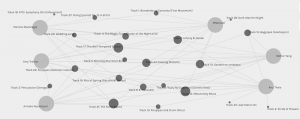
It was a great way to visualize connectivity of members in each community generated by Palladio. The size of nodes indicates the “order” of the track among the community members. The higher order (the track is shared by higher number of members) means the bigger node size. I could move the nodes around and extend/shorten the edges to see the connections more clearly.
I noticed that each track is selected by at least two people and the most popularly selected tracks are shared by 14 out of 22 people. Comparing my 10 choices with the above table, I noticed that majority of my selections are in the top half of the table.
There are 22 curators (ie, the participants to the Voyager’s Golden Record curation quiz) and they are grouped into 4 different communities. Examining the number of nodes and edges in the graphs, I noticed that one of the curators in Community 0 has selected only 9 tracks as opposed to 10 tracks and this explains the total number of edges (49) in Community 0. Also, I noticed that in all 4 communities, there are no tracks shared by all members of the community.
To attempt to figure out Palladio’s criteria of generating these 4 communities out of these 22 curators in such ways, I examined each community’s shared tracks, frequency/degree, “null” choices (ie, unselected tracks), number of nodes, average degree, and density. The last two properties can be found under Global Metrics in Palladio.
Both Community 1 and Community 2 share the same number of tracks (22), the same number of curators (6) and the same average degree value (4.28571429). I have looked through the data and maps/visual representations and some mathematical calculations to justify Palladio’s interpretation of the data. Despite my efforts to discover logical or mathematical reasons behind creating such communities, I could only conclude that the most popularly shared tracks in each group of Community 1, 2, 3, and 0 tend to be in lower part of the frequency table of 27 tracks as their average degree values decrease. (I am not sure if that makes sense to explain my findings to you)
I can only assume that the program performed some mathematical calculations to generate each group’s highest possible average degree value. As I did not indicate my reasons for selecting my 10 tracks when I completed the Quiz, obviously, reasons for choosing and not choosing such tracks are not evident in the visualization. Just because two people chose the same track does not mean that they made their choices for the same justification. The members who share the same community may have been connected by misleading, misinterpretation, or assumption of the given data.