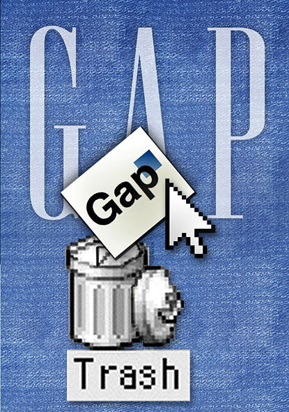
I was reading Simon McEvoy’s marketing blog relating to Gap’s recent embarrassing blunder when Gap’s attempted re-branding of its logo was met with strong criticism and disapproval from Gap’s customers .
For those of you who don’t know what I’m talking about…earlier this month, Gap changed its logo on its website from the identifiable white letters in a plain blue box to one where a small blue box edges off the top right hard corner of the lower-case black letters spelling Gap.
Like the thousands of customers who vented their spleen on Gap’s website and social media websites such as Facebook, I feel that the new logo lacks innovation and creativity. It fails to ingrain itself in my brain. Instead, it leaves a painful indentation, marked by a sense repulsion and displeasure…and I have science to back me up here too!
A neuroscience study investigating the reasons why customers were so hostile with the branding was released just last week. It found that the “new logo failed to resonate with consumers on key metrics like attention, emotional engagement and memory retention” (http://www.marketingmag.com.au/news/view/neuroscience-study-analyses-gap-logo-disaster-2468). The researchers concluded that the logo lacked novelty and also violated several neurological best practises:
- The superimposition of the ‘p’ with the blue square results in the brain ignoring the word in favour of the image, which is problematic when the word is the brand name.
- The font is ordinary and thus does not appeal to the subconscious.
- Lack of contrast between the ‘p’ and the blue box also means that the brain is less likely to register the letter.
- As part of the evolutionary process, brains are tuned to avoid sharp edges. Therefore, the sharp edges of the box provoke an ‘avoidance response’ which deters us from the logo.
However, I think that Gap has prevented this blunder from turning into a catastrophic calamity. As Simon McEvoy comments, instead of investing time, resources and money on introducing and changing the logo in its stores, its advertisements and on its products, Gap wisely inserted the new logo onto its website only. In this way, it could test customers’ reactions and opinions – I like to think of it as something similar to exploratory market research.
Secondly, Gap allowed its customers to submit their own designs. I like to think of this as value co-creation, which is a technique many value-based firms use nowadays to increase the value of its product/service and to build relationships with its customers.
Thirdly (and probably the best of all), Gap decided to scrap its new logo completely. With the bombardment of condemnation and disapproval, Gap did what all value-based firms would do; it listened to their needs and satisfied them by recalling the new logo. In actual fact, for such a large company to admit guilt and concede defeat is one damn daring, courageous act, which is testament to Gap placing its customers at the forefront of its decisions. This decision was announced on the social media platform, Facebook.
However, some question the legitimacy of the mistake such as Grant Davidson of Davidson Branding who believes it to be a marketing stunt. He claims that it was a clever way of making customers realise and recognise their loyalty to Gap, which would in turn tighten their link to the brand…not a bad way of creating customer loyalty, eh?
We must keep in mind, however, that Gap did dip its feet into a very unreceptive crowd but to the extent that, in doing so, it hurt its branding and image, I think Gap came out better. Why? Because at the end of day, Gap’s quick, strategic response to customers’ complaints really demonstrates that it is willing to listen to its customers, which is proof that customers are at the core of its values.

