Final Project
For my final project myself and three others looked into the potential harm of the area surrounding Lelu island in Northern BC if the proposed LNG facility were to have a major disaster.
Maps and Flowchart made by me
View PDF document below for the Report
Garibaldi at Squamish Ski Resort
I have evaluated the proposed mountain resort on Brohm Ridge north of Squamish using the attached maps and have several recommendations to be considered for the project going forward.
The maps attached were created using data from the DataBC data catalogue and the UBC Geography Data collection. For my analysis I created a model depicting the various protected areas and natural resources on the site area including red-listed ecosystems, habitats, riparian and fisheries areas and old growth forest sites. In total 52.67% of the proposed project area will fall within these protected areas while individually they occupy as follows:
- Old Growth Forests: 6.78%
- Mule Deer and Mountain Goat habitat: 7.89%
- Red-listed species: 24.83%
- Fish habitat and Riparian areas: 26.29%On the attached map (Fig.2) you can see that for analysis I added shape files for each respective protected area as well as a 50m buffer on either side of the rivers below 600m of the vertical and 25m buffers above 600m of the vertical. Symbolized by the light hatch you can see that a large portion of the proposed project area is below 600m of vertical, 31.79% of the total area to be exact. It can also be seen that the majority of protected areas fall below 600m of vertical as well.
Climatological considerations rule out reliable skiing below 600m of the vertical so the potential harm to protected areas will be minimal above 600m of the vertical as only 21% of the remaining area above that 600m marker consists of protected land. Taking this into consideration the largest area of concern would be the village development on the lower potion of the ridge. From my perspective there are two main areas to take special consideration into preserving for natural resource purposes. The first component that should be taken into consideration when developing this project is the large amount of Fish habitat and Riparian areas that occupy the project area (26.29%). As a means to mitigate the damage to fish spawning I recommended building beyond 50m buffer on either side of the rivers below 600m of vertical and developing outside of the 25m buffer above 600m of vertical. By doing this damage to fish habitat and Riparian areas will be minimal and will mitigate damage to fish bearing streams. The second major area of concern is the old growth forest locations dispersed throughout the project area. As Old Growth forests are important habitat and potential resource locations it would be beneficial to
keep their damage to a minimum, perhaps hiking trails could be added so the forest space can still be enjoyed.
In conclusion the potential damage from ski hills and lifts is small due to the lower distribution of protected areas above 600m of the vertical. However, Great care should be taken in preserving the integrity of fish habitat and old growth forests in the interests of resource management.
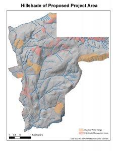
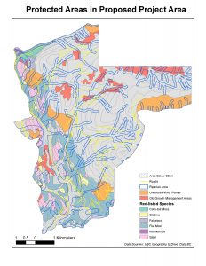
This project should be allowed to continue assuming considerable effort will be put into developing responsibly in sensitive areas. This is the stance I took in the report.
Comparing Housing Affordability in Vancouver and Ottawa
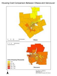
Housing affordability is determine by normalizing median housing cost with the median household income. This way you get an index number that can be applied to different cities that with different median household costs and incomes.
The housing affordability index categories are as follows
- Severely unaffordable: 5.1 and over
- Seriously unaffordable : 4.1 to 5
- Moderately unaffordable: 3.1 to 4
- Affordable 3 and under
Affordability is a good indicator of a city’s livability. Where comparing only housing costs may show drastic differences between Vancouver and Ottawa affordability take median income into account when creating the index. This way the viewer can see that although housing may be cheaper in Ottawa he may be making less and therefore paying the same amount ratio of his income for housing.
Data Classification: Different Ways to Visualize Data
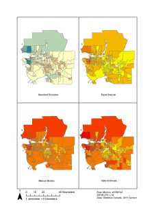
Choosing an appropriate data classification when creating maps is extremely important. Shown above are four different classification examples including, standard deviation, equal interval, manual breaks and natural breaks.
The different classification methods alter the range in which the data is categorized. I will briefly go over the four depicted.
- Standard deviation: creates a zero value at the mean of the data. It then organizes points above and below the mean within the standard deviation they land in. This classification method is best when classifying variables that can be above or below zero e.g. temperature.
- Equal interval: equal interval classification divides the range into classes of equal ranges.
- Manual breaks: this classification method allows the map creator to choose the data ranges for the different classifications
- Natural break: natural break or the jenks classification locates natural breaks in the distribution of data to situate its class breaks.
Acquired skills in GEOB 270
For this map it was required to take spatial data and create a comprehensive visualization of Vancouver land areas and healthcare/education facilities at risk of damage from tsunamis.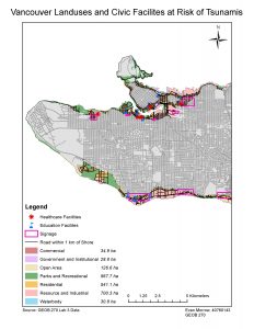
I used various analyst tools such as clips, buffers, intercepts, search queries etc. to create visual layers showcasing areas of Vancouver below 15 meter elevation. The Result, attached above, is an effective map that allows views to visually understand Vancouver areas at risk of Tsunamis.

Being able to attach tabular data to spatial units can allow an analyst to communicate data in a more digestible way to viewers. In this map I created a map comparing housing cost between Vancouver and Ottawa. Along with linking tabular data to the city census tracts I also had to alter the data classification method so the two maps could be compared on identical data range scale. The final product is a map showcasing the higher housing costs in Vancouver compared to Ottawa.

To make effective maps it is important to familiarize yourself with various data sources and catalogues. For this map I retrieved data from DataBC and using the various analyst tools mentioned earlier I produced this map that highlighted the various habitat, old growth forest areas and vegetation species residing within the proposed boundary for the Garibaldi at Squamish ski resort.
Low Lying Areas at Risk of Tsunamis in Vancouver

Finding the Total Vancouver Area at Risk
15.5% of Vancouver’s total area is in the risk area. To find this I created a buffer of 1km island from the shore, then from within that buffer I isolated areas less that or equal to fifteen meters above sea level. This area totalled to (20.3 square kilometers). I then did a simple calculation dividing the risk area by the total area of Vancouver (131.03 square kilometers).
Education Facilities Inside the Risk Area
- Education Facilities in danger
- Emily Carr Institute of Art and Design
- Institute of Indigenous Government
- Henry Hudson Elementary
- False Creek Elementary
- St. Francis Xavier
- Vancouver Montessori School
- St. John’s International
- Heritage 3R’s School
- St. Anthony of Padua-
- Ecole Rose des Vents
Healthcare Facilities Inside the Risk Area
- False Creek ResidenceVilla
- Cathay Care Home
- Coast West Community Home
- Broadway Pentecostal Lodge
- Yaletown House Society
The Benefits of Remote Sensing for Geographic Analysis
Remote sensing and Landsat data imagery provide many provide substantial benefits when analyzing a space.
Landsat imagery allows you to differentiate the space between it’s different land uses and land covers. remote sensing does this by recording the wavelength of light reflected off the surface back to the camera and creates raster data based off the dominant material in the grid cell.
This can be especially useful in scenarios where you’re trying to isolate surfaces within a large range. For example if you were looking for invasive species cover within Vancouver parks you would just need to determine the wavelength signature of the species then use Landsat imagery data to determine all cells reflecting the wavelength signature specific to that species.
Problems with Project on the Fly: Aligning Misaligned Spatial Data
Project-on-the-fly is the process that Esri’s Arcmap uses to align spatial data layers projected using different coordinate or spatial reference systems.
Project-on-the-fly makes it so at face level different map layers align nicely above one another. However, if you’re planning on performing any spatial analysis it must be noted that project on the fly, while appearing accurate is actually still distorting the some map properties (distance, area and direction).
To manually project a layer to align with your data frame you must use the spatial analysis tool ‘project’. You place your desired layer into the input bar then select your desire projection from the drop down menu for output projection.
This will create a copy of the input layer that is projected in your desired coordinate system!!