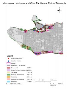
For this map it was required to take spatial data and create a comprehensive visualization of Vancouver land areas and healthcare/education facilities at risk of damage from tsunamis.
I used various analyst tools such as clips, buffers, intercepts, search queries etc. to create visual layers showcasing areas of Vancouver below 15 meter elevation. The Result, attached above, is an effective map that allows views to visually understand Vancouver areas at risk of Tsunamis.

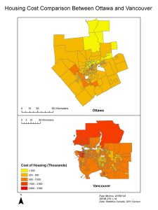
Being able to attach tabular data to spatial units can allow an analyst to communicate data in a more digestible way to viewers. In this map I created a map comparing housing cost between Vancouver and Ottawa. Along with linking tabular data to the city census tracts I also had to alter the data classification method so the two maps could be compared on identical data range scale. The final product is a map showcasing the higher housing costs in Vancouver compared to Ottawa.

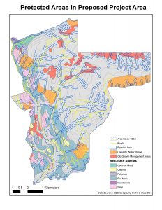
To make effective maps it is important to familiarize yourself with various data sources and catalogues. For this map I retrieved data from DataBC and using the various analyst tools mentioned earlier I produced this map that highlighted the various habitat, old growth forest areas and vegetation species residing within the proposed boundary for the Garibaldi at Squamish ski resort.