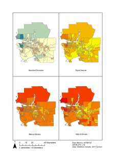
Choosing an appropriate data classification when creating maps is extremely important. Shown above are four different classification examples including, standard deviation, equal interval, manual breaks and natural breaks.
The different classification methods alter the range in which the data is categorized. I will briefly go over the four depicted.
- Standard deviation: creates a zero value at the mean of the data. It then organizes points above and below the mean within the standard deviation they land in. This classification method is best when classifying variables that can be above or below zero e.g. temperature.
- Equal interval: equal interval classification divides the range into classes of equal ranges.
- Manual breaks: this classification method allows the map creator to choose the data ranges for the different classifications
- Natural break: natural break or the jenks classification locates natural breaks in the distribution of data to situate its class breaks.