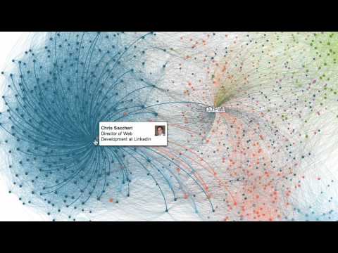
LinkedIn, the professional connections tool that many of us use to stay in touch with current and former colleagues has added a cool new add on: InMap. Showing a cloud of all of your professional contacts, LinkedIn brings itself from a somewhat linear online networking tool up closer to the ranks of Facebook. And the map is way cool.
InMap shows a colour coded map of your contacts (colours based on how you know them) and also maps your relationships to them… and to each other. I think that’s the interesting part. You know who you know but it’s interesting to who knows each other and how. Yeah, I know this was there before but it was a little hard to follow. Now, visual and virtual. Cool.
So, what does this offer consumers of LinkedIn. More value? Yes. Certainly fodder for cocktail party conversations “Hey, I saw on LinkedIn that you know Brad Pitt. He’s my sister-in-law’s dog walker’s cousin.” Beyond that, however, having a visual perspective on how big and broad and varied your network is, courtesy of LinkedIn, takes the site more into the realm of social networking. Kind of more Facebook for professionals. Sounds useful.