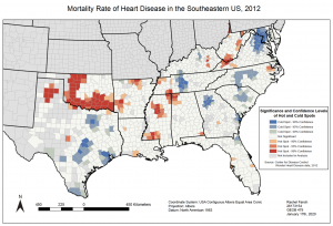
Data from 1999-2016 was taken from the CDC’s Wonder Heart Disease dataset. By using hot spot analysis, a time series was created with maps from 1999-2016. The year 2012 was selected for a more in depth written pattern analysis.
The image below depicts hot and cold spots of heart disease deaths throughout the Southeastern portion of the United States, specifically in 2012. As shown in the map, there are counties with higher or lower than normal rates of heart disease related deaths, ranging in degrees of statistical confidence from 90-99%.
When looking at the image, it is easy to see the clustering pattern of these counties with abnormal rates of heart disease deaths, whether they be elevated or reduced. For the most part, much of this clustering also stays within state boundaries, except with some similarities of counties found at state borders.
Solely by visualizing the patterns, it is also obvious that there are more hot spots with high confidence levels in the interior of the United States, such as in states like Oklahoma, Arkansas, and inland parts of Texas and Mississippi. Cold spots with high confidence levels are mainly found along the coastline, with outliers being Tennessee and North Carolina.
