Where the Action Is at Places: Examining Spatio-Temporal Patterns of Juvenile Crime and Places Using Trajectory Analysis and GIS: A Review

This article, titled “Where the Action Is at Places: Examining Spatio-Temporal Patterns of Juvenile Crime and Places Using Trajectory Analysis and GIS”, focuses on the theory that “crime places” (i.e. places where crime occur) are more helpful in crime prevention than focusing on individual people who have committed crimes. Written in 2009 by Groff et al, this work draws from the theories of environmental criminology and routine activity theory, which emphasize the role of places in impeding or inspiring criminal activity. This analysis aims to answer the question of whether micro areas (such a blocks) vary in their criminal activity, or whether these aggregations occur on more of a macro geographic level (neighborhoods, Census Tracts, etc.). Through a dataset created by Weisburg et al of juvenile crime in Seattle, WA over a 14 year period, trajectory analysis, and spatial autocorrelation, Groff et al found that there were both positive and negative relationships between the different blocks.

Overall, I found this analysis to be quite interesting. The article was quite long, over 20 pages, so I do believe that they could have shortened it, or added interesting facts about the Seattle area as opposed to GIS issues that were not necessary. I wish the maps were in color as well, but I know that choice was likely up to the journal. I would score this analysis an 8.5 out of 10.

Mapping Cancer Disease Using Geographical Information System (GIS) in Gezira State-Sudan: A Review

Between the years of 1999 and 2008, many researchers and cancer specialists were noticing an increase in the incidents of cancer in Sudan. Alarmed, four researchers, Elebeaad, Amna Hamid, Hilmi and Galal, came together to determine whether there was a presence of geographical patterns, or clusters, of cancer occurrences. The article, titled Mapping Cancer Disease Using Geographical Information System (GIS) in Gezira State-Sudan, was conducted for the purpose of generation base maps to implement into the Cancer Control Program. Using data gathered from the University of El Gezira State of cancer incidents from 1999-2008, correlation analysis and cluster analysis, it was determined that there was an increase in the incidence rate of cancer in some localities over the ten-year span.

The three cancers, blood, breast, and prostate, were analyzed through a correlation analysis to see if there was a distribution pattern. However, there was found to be significant dispersion across the study area, and therefore no clustering of the distribution. A clustering and outlier analysis were conducted after the correlation analysis. There were found to be three clusters within Gezira; Elmanagil City, Madani City, and Elhosh.

Following these findings, it was recommended that GIS be utilized to make decisions regarding land use and land management practices. It was also stated that data should be collected regularly, as more data allows for more regular analyses. More time and money should also be invested into finding the possible link between pollution due to fertilizer and pesticides and cancer.

While I find this application of GIS extremely interesting, I found that the article was a bit confusing. The grammar was not always clear, and they mentioned and defined spatial autocorrelation, but never related it back to their own analysis. The maps also could have used a bit more effort, as some of the color choices were a bit confusing (colors that looked lighter to me were supposed to signify higher rates of cancer, etc.). I am not sure if they could have done a better job and a more thorough analysis as I could not entirely tell which analyses they did. However, it did seem to serve the purpose. Therefore, I am giving this article a 7 out of 10.

Applying GIS and landscape ecological principles to evaluate land conservation alternatives: A Review

In 1998, there was a relatively large (7245 ha) parcel of undeveloped and unconserved land that rested on the border between New York and New Jersey. This parcel, known as Sterling Forest, was located in an area that had significant potential for development, but was also a piece of large unfragmented land, making it an optimal place to try and preserve. The result was a compromise between a coalition of land conservation trusts, the developer, and the landowner. The article, titled Applying GIS and landscape ecological principles to evaluate land conservation alternatives, illustrated the use of GIS in creating a unified agreement between a multitude of stakeholders. The authors and assumed researchers, Richard Lathrop and John Bognar, achieved this by firstly conducting an environmental constraints assessment, and secondly, by allocating areas with lower environmental costs and constraints to development and those with high environmental costs and constraints to conservation.

After the environmental constraint assessment was conducted, the stakeholders began parceling out land deemed development or conservation. They did not employ an MCE, but instead decided to rank all 5 parameters equally during the negotiation process. Overall, they decided to allocate areas with lower environmental costs and constraints to development and those with high environmental costs and constraints to conservation. They attempted to cluster development into blocks, so as to diminish the overall environmental impact, as well as steer clear of important watersheds and the general area of the Appalachian Trail.

While the target for development was 1,100 ha, negotiations resulted in 900 ha of development and 6345 ha of conserved land. However, it was mentioned that there were regions in the New York metropolitan area that may have been better suited for this kind of development. Despite this, the use of GIS in this project illustrates the use of this software and analysis type in the realm of public policy and multi-stakeholder agreement.

In terms of the GIS analysis, however, I give this article a 7 out of 10. Though a preliminary analysis for development, I believe that they could have used other data or conducted further analysis, such as analyzing how much core area would be left once the 900 ha was developed. I also believe an MCE would have enhanced their analysis, and could have honed in on the point that no development was necessarily good for Sterling Forest.

Modeling Crime in Ottawa, Ontario

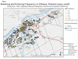
Using the CrimeStat application to conduct Nearest Neighbor Analysis, Fuzzy Mode Hot Spot Analysis, Nearest Neighbor Hierarchical Clustering, and Risk Adjusted Hierarchical Clustering, the relative risk of crime as well as crime hot spots for Ottawa were modeled. Only one map, and therefore one form of analysis, is displayed in this post. When looking at the result below, it is evident that the majority of fuzzy mode clusters with higher incidents of B&Es are also included within the NNH clusters. The higher number of B&E incidents occur in the downtown core, which is illustrated by the fuzzy mode results. The NNH results also mimic the fuzzy mode results, as there are many more clusters within the downtown core. They are also closer together. As shown in Map 1, there are very few ellipses that also include smaller fuzzy mode results (particularly values from 1-15).

Evaluating Language Scores of Children in Vancouver, BC

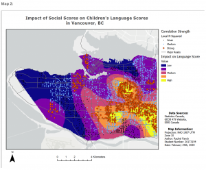
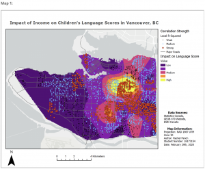
Data gathered from Statistics Canada’s Early Development Instrument (EDI) has information regarding early childhood development, including social ability, emotional maturity, communication skills, physical health, and language and cognitive development. Utilized by kindergarten teachers, each child is given a score in each one of these categories. By combining EDI data and Census Data from Statistics Canada, five variables were found to be influential in determining language scores of children across Vancouver, BC: Income, ESL, Social Scores, Lone Parent, and Recent Immigrant. Using these variables, a Geographically Weighted Regression (GWR) and clustering analysis were conducted to analyze the impact of each variable on language scores. The results showed a strong spatial pattern: each variable has a stronger impact on the eastern part of Vancouver compared to the western regions. This phenomenon can be seen in the maps below.


Evaluating Land Use Change in Edmonton, Alberta

This analysis was conducted for the City of Edmonton to aid them in properly managing their city, as well as the regions beyond. The following report depicts ways in which the landscape has changed from 1966 and 1967. Overall, a large proportion of land use change has been converted into urban landscape as well as productive woodland, resulting in urban areas increasing 181% in size and productive woodlands increasing by 109%. While the increase of productive woodland and urban landscape point to a growing economy, the City of Edmonton should be careful of their encroachment on cropland, as there was a 7.5% decrease in this land use from 1966-76. As the report shows, the main land use that cropland was converted into was urban areas (approximately 7.5%). In order to support the local agricultural economy as well as the livestock industry, cropland ought to be preserved. It is also worth mentioning that while the mining industry seems to be growing in Alberta with an increase of 85% (1,681 km2 in 1966 versus 3,116 km2 in 1976), approximately 21% of land use denoted as mines and quarries was converted into urban areas. While the reclamation of mines can be an optimal switch, it is important to pay attention to these areas, as there is potential for hazardous materials as well as unsafe foundational conditions. It is also encouraged that the city attempt to preserve whatever swamp/marsh remains.
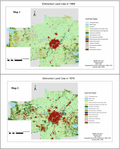
The impacts of the urbanization of Edmonton can also be seen by analyzing Fragstat landscape metrics. For example, the total number of patches (NP) has decreased overall from 8496 to 8287. However, the total number per land use has increased for certain land uses, such as cropland, productive woodland, and urban areas. The total core area (TCA) also shows an overall increase since 1966, but again some, such as cropland, show a decrease.

While this may signify increase in timber operations as well as overall urbanization, this could mean trouble for agricultural croplands. TCA is calculated as the area of the patch minus a specified edge depth, which in this case was set to 100 m. Core area is often preferred by many species of flora and fauna alike, as this area is often more protected from the elements and predators, and is impacted less by surrounding land uses. Unfortunately, TCA has shown a decrease for cropland, which could reduce crop yields. This is likely due to the fact that cropland is relatively easy to build upon, as it is quite flat, and it is also easy to convert into other land uses, such as productive woodland. Where there once was an abundance of cropland and unproductive woodland now maintains quite large parcels of urban area and productive woodland.

The number of disjunct core areas (NDCA), which is the same as NP minus the edge depth, also decreased by 31% between 1966 and 1976. This is likely because edges of approximately 100m were removed to allow urbanization through roads and buildings. While there was a decrease for croplands, what is more staggering is the 336% NDCA increase of urban areas. What this likely signifies is patches of urban area becoming larger, while NP signifies the spread of individual patches of urbanization across the landscape. This suggests that while NP increase is occurring simultaneously with NDCA increase for urban areas, NP increase and NDCA decrease is occurring simultaneously for cropland.
Heart Disease Related Deaths in the Southeastern US

Data from 1999-2016 was taken from the CDC’s Wonder Heart Disease dataset. By using hot spot analysis, a time series was created with maps from 1999-2016. The year 2012 was selected for a more in depth written pattern analysis.

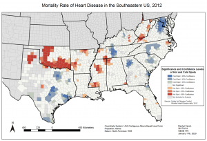
The image below depicts hot and cold spots of heart disease deaths throughout the Southeastern portion of the United States, specifically in 2012. As shown in the map, there are counties with higher or lower than normal rates of heart disease related deaths, ranging in degrees of statistical confidence from 90-99%.

When looking at the image, it is easy to see the clustering pattern of these counties with abnormal rates of heart disease deaths, whether they be elevated or reduced. For the most part, much of this clustering also stays within state boundaries, except with some similarities of counties found at state borders.

Solely by visualizing the patterns, it is also obvious that there are more hot spots with high confidence levels in the interior of the United States, such as in states like Oklahoma, Arkansas, and inland parts of Texas and Mississippi. Cold spots with high confidence levels are mainly found along the coastline, with outliers being Tennessee and North Carolina.

Week 4 Summary

Week 4 began with the topic of geography and health. As I’m sure is quite apparent, geography is intrinsically linked to health in many ways. For example, the environment we live in, the people we are surrounded by, and our demographics all influence our health. Some individuals are located in more polluted regions, while others have less access to health services. As the population is growing and the climate is changing, it is becoming even more important to understand the linkages between these two topics, and how we can use this information to our advantage.

We spent this week talking about two kinds of geography: medical geography and health geography. Medical geography is the application of geographical perspectives and methods to the study of health, disease, and health care. This concept has been around for centuries, but it really took off in the 16th century. Due to the strong activity of the military in the 18th century, medical cartography emerged. Prior to the 1950s, medical geography was led by physicians as they had a good grasp of the disease in question. However, since the 1960s, geographers have taken over the field. Medical geography is seen as an integrative, multi-stranded sub discipline of geography, however, it comes from very colonialist roots.

Health geography also looks at local variations in health status and health care provisions, but also looks at the access to, location, and utilization of health facilities. It has two main approaches: Traditional, which accepts diseases as naturally occurring and culture free, and Contemporary, which adopts the stance that notions of health, disease and illness are problematic and are ultimately linked to power relations within a society.

While similar and absolutely linked, these two sub-disciplines are both extremely important to understanding geography, health, and all the connections they share.

Week 3 Summary

Week 3 was spent continuing on Lab 2, which analyzed the changing landscape of Edmonton between 1966 and 1976. However, during lecture we dove into some key concepts relating to landscape ecology, mainly focusing on abiotic conditions and biotic interactions.

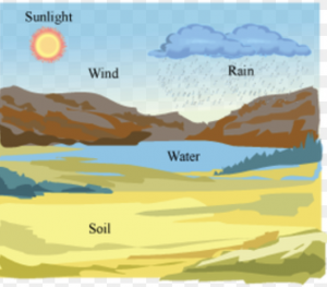
Abiotic conditions, such as climate, topography, and soils, play a large role in what plants and animals can live within an ecosystem as well as how well they prevail. For example, constant weather patterns and conditions form the climate in which flora and fauna are expected to live. Heavy rains allow some species of plants to grow while excluding others that flourish under drier conditions. Topography also plays a role in climate (i.e. the rain shadow effect), but can also impact other disturbances. For example, wildfire moves more easily uphill.

Biotic interactions impact each other (i.e. species), but also the environment they live in. Competition within and between species forces patterns to emerge within landscapes. On top of competition, there lies species that are so important in an ecosystem that without them the ecosystem could collapse. These are known as keystone species and every ecosystem has one. As humans, knowing the way in which these landscape patterns occur is crucial so we do not damage them beyond repair, such as through removing a keystone species.

Week 2 Summary

Week 2 focused on geographic and landscape metrics such as patterns, processes, and scale. We discussed some issues between pattern and scale, which is deemed the central problem in ecology. As there are different spatial and temporal scales, as well as different ecological organizations, it is very difficult to decide at what spatial and temporal scale an ecological phenomenon should be studied.

Due to the geographic nature of the software, GIS almost always maintains some level of spatial autocorrelation. That is, if the presence of some quantity in a sampling unit makes its presence in neighboring sampling units more or less likely, that phenomenon exhibits spatial autocorrelation. This is contrary to spatial statistics, which assumes that everything is random.

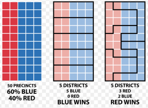
One particular way that spatial autocorrelation exhibits itself is through MAUP, or the modifiable areal unit problem. This problem arises when different areal arrangements of the same data produce different results. One example of MAUP in the real world that I believe is quite relevant in todays day and age is gerrymandering. The figure below exhibits this phenomenon perfectly. Depending on how governments divide census units, they can in essence force an election to go in favor of Democrats or Republicans.

.

During analysis, a spatial analyst must be extremely careful in how they approach MAUP.

Spam prevention powered by Akismet