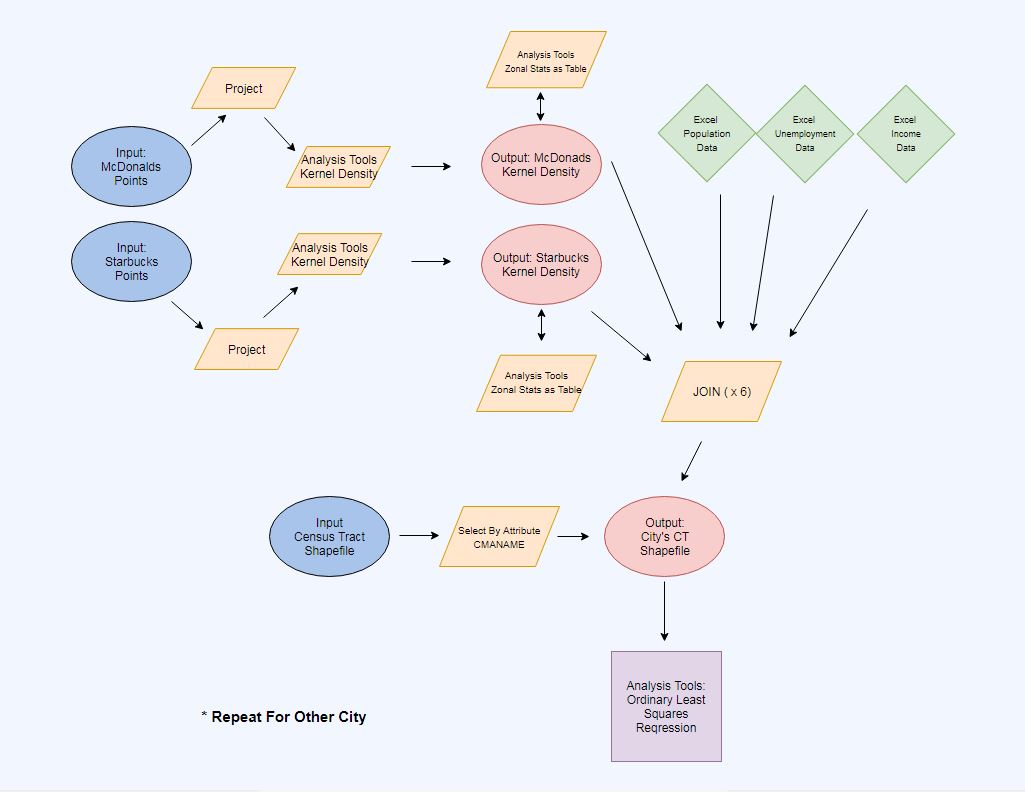
 Pictured above is a flow chart that outlines my methodology. I wish reality were as simple as this flow chart. Discussed below is the chronological order of my methodology (with maps!).
I initially mined a Census Tract shapefile of Canada from Stats Canada, making sure to use the boundaries for the 2011 census. I saw that the CMANAME in the attribute table for the enormous Census Tract shapefile represented each metropolitan area, hence the MA, so I created two layers from ‘Select by Attribute’ that displayed Toronto and Vancouver. From there I began plotting points that represented Starbucks and McDonalds locations. This data was readily available on the McDonalds restaurant locator page and the Starbucks Cafe locator page, which uses Google Maps software.
I quickly realized I needed more spatial reference information to plot the individual points accurately and precisely, so I actually mined Dissemination Area shapefiles of Toronto and Vancouver from Stats Canada and plotted the points on those shapefiles and then removed them once I was done.
Then I needed to use the Project tool to make sure all of the locations plotted stuck to, and used, the projected UTM coordinate systems used for the Vancouver and Toronto Census Tract shapefiles.
Then I mined the unemployment rate, median household income, and population density data from the CHASS data center that corresponded to Vancouver and Toronto’s Census Tracts in the form of Excel files. I had to manipulate the CTNAMEs in Excel to match the CTNAMES in the attribute table by adding “0000.00” text to each CTNAME allow for ArcMap to join the data. From there I added each Excel file to ArcMap and joined the data to the corresponding Census Tract layer.
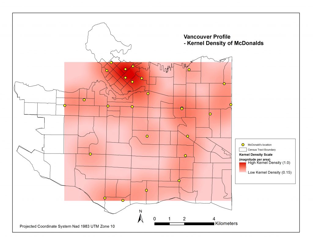
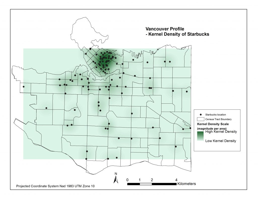
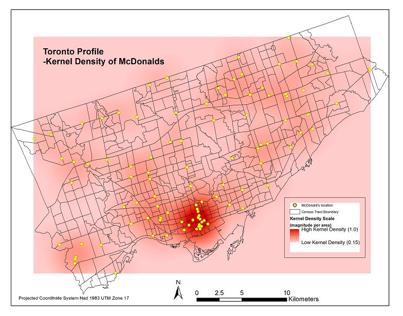
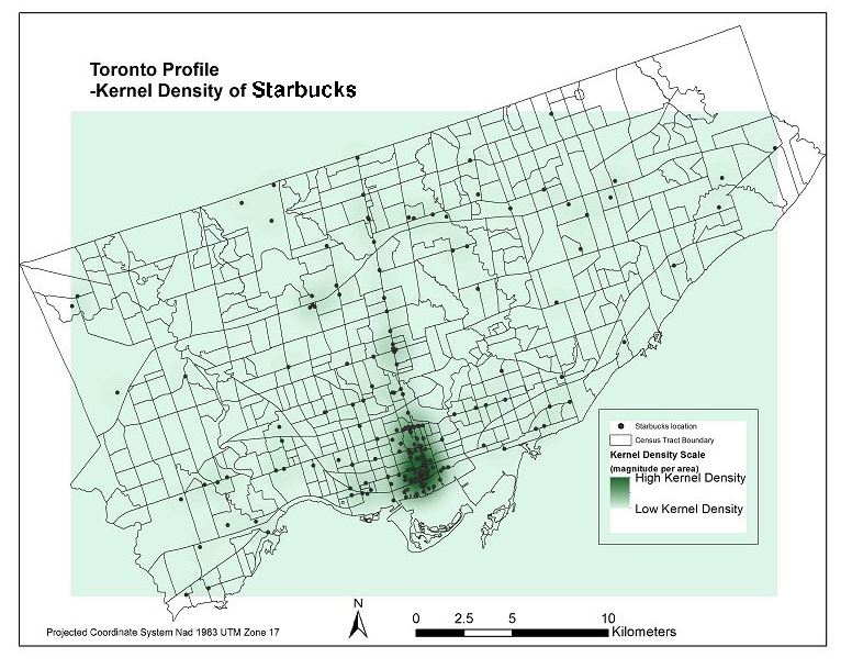
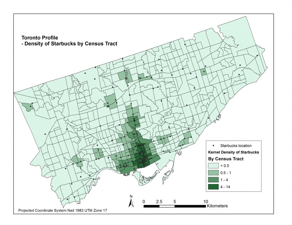
Now came the challenge of assigning a measure that would indicate how spatially dense the distribution of Starbucks and McDonalds are in and around each Census Tract. I began with creating a Kernel Density raster surface of the McDonalds and Starbucks locations in each city. Pictured below are four maps representing these density surfaces.
I then applied the ‘Zonal Statistics as Table’ tool to compute the average density within each Census Tract. I joined each table to the cities’ Census Tract layers and now had all of my data in the same attribute tables for each city. Pictured below are four resulting choropleth maps displaying the average magnitude of Starbucks & Mcdonalds locations per census tract area.
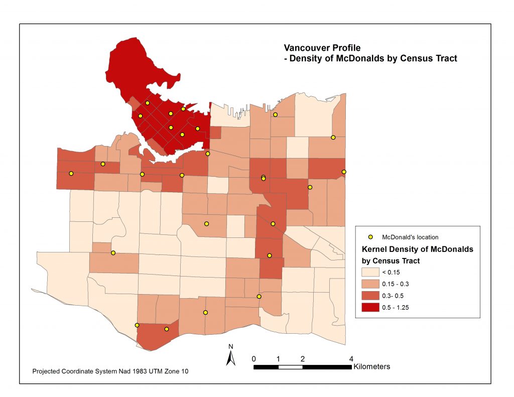
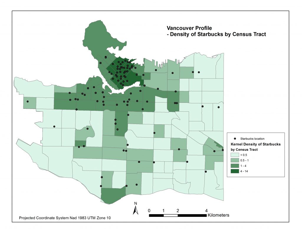 *It is important to note that the ranges of Kernel Densities are different in the legends between Starbucks and McDonalds. Starbucks’ range goes up to about 14 simply because there are so many more Starbucks locations, and because they are more clustered than McDonalds locations. You’ll also note certain Census Tracts, like Stanely Park’s, pictured above fit into the higher Kernel Density ranges even though there are no Mcdonalds or Starbucks in its area. That is because of its close proximity to downtown. Interestingly people residing northwest of Denman St. and northeast of Nelson St. fit into this Stanley Park Census Tract.
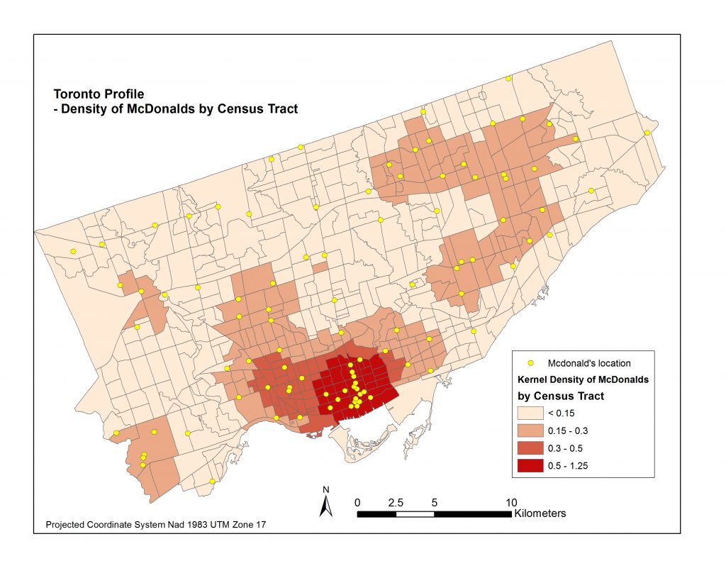
Now I was ready for a good ol’ fashioned ordinary least squared (OLS) regression! I ran the OLS regression report with the average Kernel Density of each Census Tract as the dependent variable and the unemployment rate, median household income, and population density data as the independent variables. See the Results page to learn more!
Data Sources:
- McDonald’s Restaurant Locator (2017) – retrieved from https://www.mcdonalds.com/ca/en-ca/restaurant-locator.html
- Starbucks Locator (2017) – retrieved from https://www.starbucks.ca/store-locator?map=57.751076,-101.645508,4z
- Statistics Canada Census & National Housing Survey (2011), retreived from CHASS Data Centre dc1.chass.utoronto.ca
- Statistics Canada – 2011 Census Boundary files retrieved from http://www12.statcan.gc.ca/census-recensement/2011/geo/bound-limit/bound-limit-2011-eng.cfm