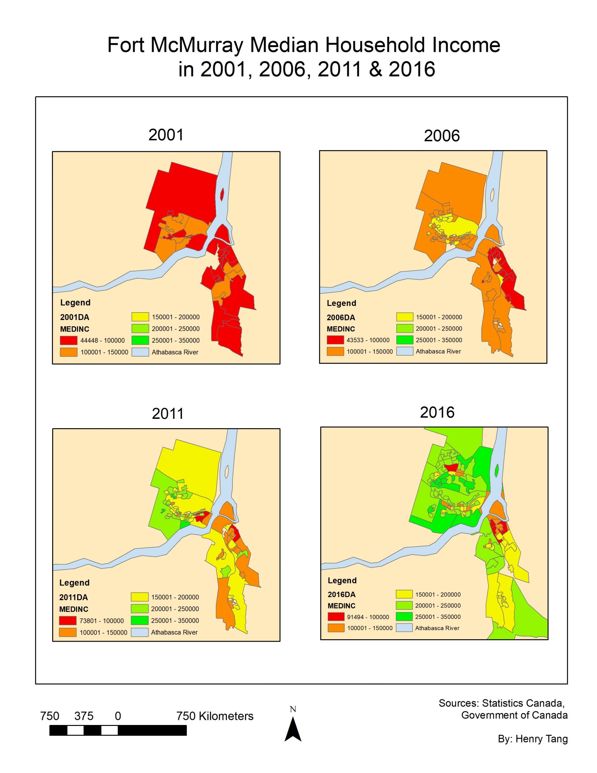
I. Visualizing changes in housing density and median household income over time
The relevant census data from 2001, 2006, 2011 and 2016 was downloaded and joined to the respective dissemination area (DA). DAs with no data were filtered out and removed from the analysis. The areas of the DAs were calculated with the ‘Calculate Geometry’ tool in ArcMap and is measured in hectares. The two metrics were then classified by manual intervals to be comparable across the four census years.
![]()
II. Locating the neighborhoods that were most impacted by the wildfire
Using the 2015 and 2016 Pictometry imagery provided by the Regional Municipality of Wood Buffalo, I zoomed in and individually counted each house or apartment that had been destroyed by the wildfire. A road shapefile was overlaid on top of the DA layer in order to identify which DA a burned building belonged to. The number of buildings burned was then divided by the total number of dwellings in the DA to obtain the percentage of dwellings burned for each DA.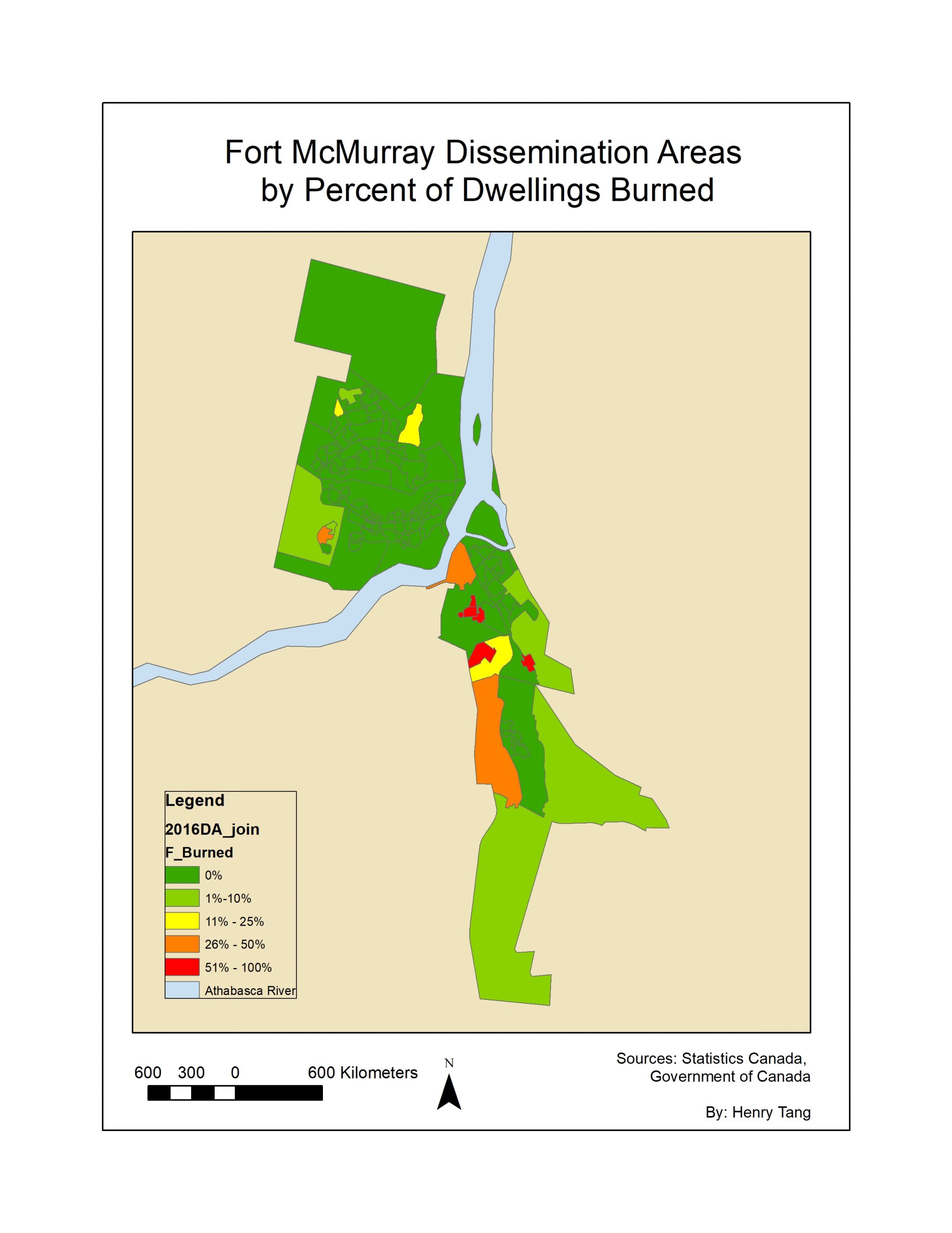
III. Modelling the relationship between percentage of dwellings burned and dwelling density & median household income
An OLS regression was performed using the percent of dwellings destroyed in a DA as the dependent variable and both housing density and median household income as independent variables. The resulting standardized residuals classified according to size for each DA. In addition, spatial autocorrelation was measured using the Global Moran’s I tool in ArcMap. Images and further discussion are available on the ‘Results’ page.
IV. Mapping the progression of the Fort McMurray wildfire throughout the city
The data from NASA’s Fire Information for Resource Management System (FIRMS) was narrowed down to the first week of the wildfire (May 1- May 7, 2016) and organized by acquired date of the fire. Each day of the week was assigned a corresponding color to visualize the progression of the wildfire. The fire history layer was then overlaid on top of the percentage of dwellings burned layer to show where the fire spread the most. 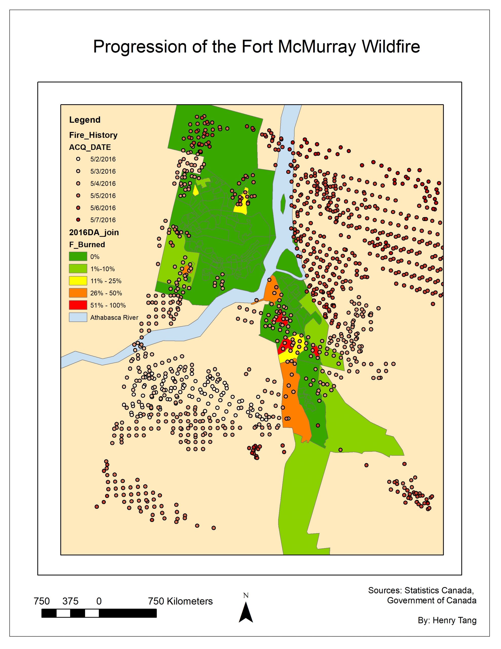
V. Assessing how Firesmart practices may have affected the spread of the wildfire
For this analysis I shifted focus to the center of Fort McMurray, where the fire hit the hardest, in neighborhoods like Abasand, Beacon Hill, and Waterways. FireSmart Priority Zones are set at 10m, 10-30m, and 30-100m so a multi-ring buffer using the previous distances was placed around each of the three neighborhoods. Each ring was denoted with a different color and the wildfire history layer was overlaid on top of the buffers. Images and further discussion are available on the ‘Results’ page.