Monthly Archives: October 2015

Thoughts On My Progress in GEOB 270

Much have been done in just three GEOB 270 labs. This post is to reflect on some of the concepts or skills that I have learnt so far:


Lab 1 – Introduction to GIS

My main accomplishment: Researched on GIS applications posted on the internet and questioned the ethics and integrity of the data used to produce a map for one of these GIS applications (deforestation in Brazil), in order to become more aware of the sources of data and techniques being used to create visual maps for achieving certain objectives.

The most important concept that I learnt in Lab 1 is about data integrity. When given a choice, most people would prefer looking at aesthetically pleasing maps and visuals rather than hard numbers and data. However, Lab 1 has taught me that the maps that people produce are often not always what they seem to be, especially with regards to their accuracy.

The outcome of maps (i.e. the visual output) can very easily be affected by the datasets used by the cartographer. As what data scientists like to say, “rubbish in, rubbish out”. This phrase means that using bad data will result in a bad map even if the methodology was proper. Thus, before proceeding to analyze any map, it is important to examine the datasets used by the cartographer and check for their source and integrity.


Lab 2 – Coordinate Systems & Spatial Data Models

My main accomplishment: Worked with both raster and vector datasets to understand more about their properties and characteristics in practice (not just theoretically), so that I am more aware of which data model is better suited for analyzing certain types of data and the techniques required for the analysis.

Raster and vector data models are very different both in terms of properties and visual output. The raster data model represents the world as a regular grid of cells (known as pixels) while the vector data model represents the world as objects with clearly defined geometries and boundaries (through the use of points, lines or polygons). Neither model is superior over the other, as both have their advantages and disadvantages. However, knowing which model is better suited for certain types of data is very important in ensuring proper GIS analysis of data. For example, continuous data such as precipitation and elevation is usually better represented with the raster data model while discrete data such as number of burglary incidents in a country is usually better represented with the vector data model.

Also, the proper use of some GIS analysis tools are specific to each data model even though it may be possible to apply them to both types of data models. Understanding more about raster and vector data models and the analysis associated with them will be key to detecting improper use of analytical tools by cartographers, if any.


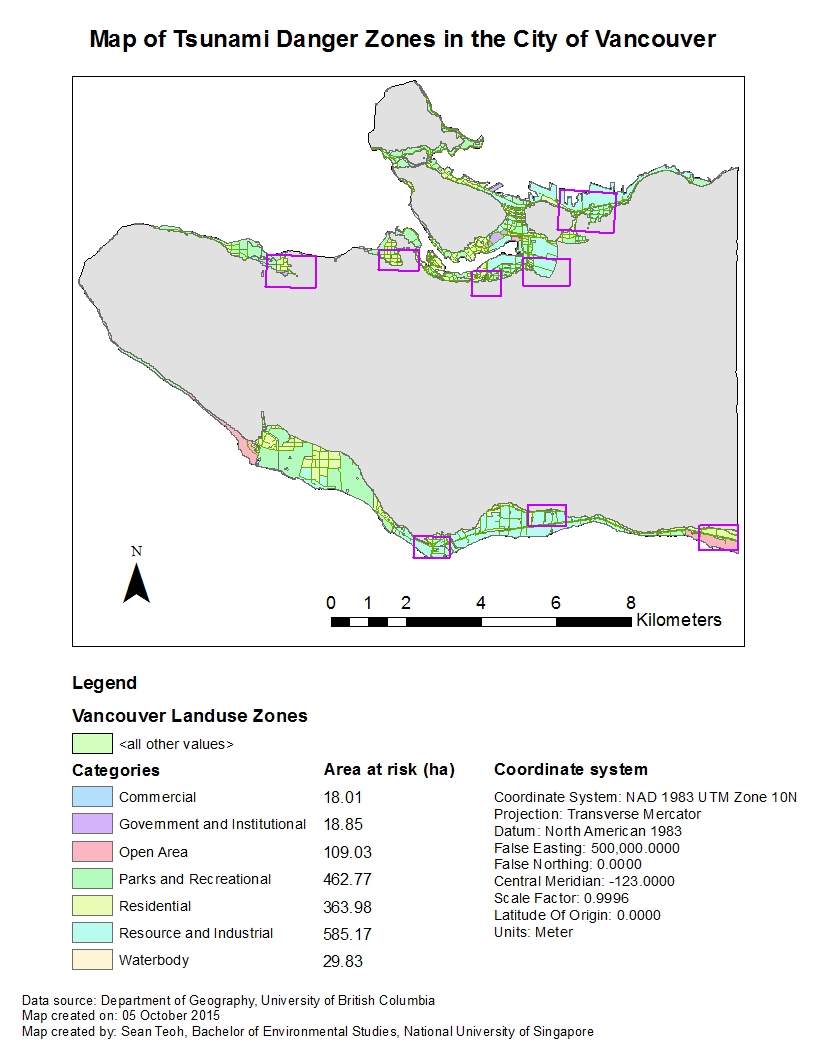
Lab 3 – Planning for a Tsunami

Main accomplishment: Calculated statistics of Vancouver land use and roads affected by a potential tsunami, to familiarize myself with some of the statistical tools available in the ArcMap programme.

In Lab 3, I was tasked to conduct a GIS analysis on areas of the City of Vancouver at risk of a tsunami, and prepare a map highlighting these areas. Part of these analyses was to calculate some statistics relating to Vancouver land use and roads that may be affected if a tsunami strikes. Apart from the geospatial aspect, the mathematical aspect is also an important part of analyzing datasets and maps because it is a way to quantify results and analyses. For example, while we can show visually on a map which parts of Vancouver are likely to be affected by a tsunami, we have to have some numbers to work with in order to make certain decisions, such as how much resources to allocate to disaster recovery, etc.

Planning for a Tsunami

Learning objectives

This post is about topics explored in the third GIS laboratory session, which had the following learning objectives:

1. Perform basic geographic analysis to determine areas for possible tsunami:

  • Perform buffer proximity analysis;
  • Reclassify raster layers;
  • Convert raster to vector data files;
  • Combine vector data layers with polygon overlay tool intersect.

2. Performing geographic analysis to extract Vancouver data affected by possible tsunami:

  • Combine vector data layers with the polygon overlay tool intersect;
  • Perform a proximity analysis using select by location;
  • Extract datasets with the polygon overly tool clip.

3. Calculate statistics (areas, length) of Vancouver land use and roads affected by a potential tsunami:

  • Create summary tables by area of land use;
  • Create lists of facilities affected;
  • Create summary tables of road infrastructure affected.

4. Add layer of potential signage points:

  • Learn how to create a new feature class, explaining the different types (point, multipoint, etc…);
  • Introduce basic editing of features and tables (change values on individual table cells, modification/creation/deletion of features);
  • Introduce the concept of snapping parameters for more accurate positioning of new feature.

 Why a study of tsunami risk for Vancouver?

During the Lab 3 session for GEOB 270, I was tasked to conduct a GIS analysis on areas of the City of Vancouver at risk of a tsunami, and prepare a map highlighting these areas. Why conduct a study on Vancouver’s coastal areas at risk of a tsunami when the risk is so small due to the presence of Vancouver Island? The answer is that we always need to anticipate the worst possible outcome and take precautions to ensure that we are not caught offguard even if the odds are against our favour; the idea of “Precautionary Principle”. After all, we know how strong the forces of Nature are and a tsunami that can breach Vancouver Island is not impossible.

In summary, I had to analyze:

  • The percentage of the City of Vancouver’s total area at risk of being hit by a tsunami (“danger zone”); and
  • The healthcare and educational facilities within the danger zone.

Percentage of City of Vancouver’s total area at risk of being hit by a tsunami

To calculate this percentage, we essentially need only two values: (1) the area of the City of Vancouver at risk of being hit by a tsunami (or “area of danger zone”); and (2) the total area of the City of Vancouver. We then use the following formula to calculate the required percentage: (Area of danger zone) / (Total area of the City of Vancouver) x 100%

Before we can calculate this percentage though, we need to obtain the two values first through GIS analysis of the datasets provided. The way I did it through ArcMap, is as follows:

1. First, I found the intersected the “Vancouver_landuse” and “Vancouver_Danger” datasets and exported it as a new layer “Vancouver_landuseDanger“. What this does is that it selects the parts of Vancouver where it is 1 meter above sea level and below, which are usually along the coast lines.

2. Then, I opened the attribute table of “Vancouver_landuseDanger” and used a function called “Summarize” on the categories of landuse. This creates an output summary table that shows you the total area for each landuse zones that are at risk of being hit by the tsunami (this is the first value required in the formula).

Here is the output summary table generated:

Category Sum of area (m2)
Commercial 180116.661665
Government and Institutional 188548.87032
Open Area 1090308.182289
Parks and Recreational 4627741.339941
Residential 3639795.736536
Resource and Industrial 5851705.112399
Waterbody 298316.863803
Total 15876532.766953

3. For the other value required in the formula, I simply opened the attribute table of the “Vancouver_landuse” layer and applied a function called “Statistics” on the area of each landuse zone. The output contains a sum of the areas of all landuse zones in the City of Vancouver, which is equal to 131020600.022758 m2

4. I then apply the formula to obtain the area of danger zone:

Percentage of Vancouver’s tsunami danger zone = 15876532.766953 / 131020600.022758 x 100% = 12.12%


Healthcare and educational facilities within the danger zone

To find out the healthcare and educational facilities within the danger zone, we use a process similar to how we find the Vancouver tsunami danger zone above. The method I used in ArcMap to do this is as follows:

1. I used the “Select By Location” function under the “Selection” tab in the top menu, and selected features under the “Vancouver_education” and “Vancouver_health” datasets that are within the “Vancouver_Danger” source layer. Recall that the “Vancouver_Danger” layer shows areas of Vancouver that are 1 metre above the sea level and below. This essentially works like the “Intersect” tool used above, where only the educational and healthcare facilities that can be found in the areas of Vancouver that are 1 metre above the sea level and below are selected.

2. Then, I exported the selected educational and health facilities within the danger zone as a new layer each. I used the “Merge” tool to come both layers, and opened the attribute table to extract the required information. Alternatively, you can open the attribute table and extract the required information from each exported layer without merging them.

Educational facilities in the danger zone:

  • EMILY CARR INSTITUTE OF ART & DESIGN (ECIAD)
  • HENRY HUDSON ELEMENTARY
  • FALSE CREEK ELEMENTARY
  • ST ANTHONY OF PADUA
  • ECOLE ROSE DES VENTS

Healthcare facilities in the danger zone:

  • FALSE CREEK RESIDENCE
  • VILLA CATHAY CARE HOME
  • BROADWAY PENTECOSTAL LODGE
  • YALETOWN HOUSE SOCIETY

Finally

To end off, this is a map of the City of Vancouver, that I created, showing the areas at risk of being hit by a tsunami.

GEOB270_Lab3_PlanningForATsunami_Q8