Monthly Archives: November 2015

Ethics of Environmental Projects

Learning objectives

This post is about topics explored in the fifth GIS laboratory session, which had the following learning objectives:

  • Learn how to independently acquire spatial datasets online;
  • Parse and filter data based on your analytical objectives;
  • Evaluate and use different spatial analysis tools, based on your objectives;
  • Further develop your cartographic and written communication skills by producing a map and short memo summarizing your results for a non-technical audience.

The “Garibaldi at Squamish” project

The “Garibaldi at Squamish” project is proposed development of a year-round mountain resort on Brohm Ride, 15 km north of Squamish on Highway 99. An application for the approval of this project was first submitted by Northland Properties and Aquilini Investment Group of Vancouver (“Northland and Aquilini”) to the Government of British Columbia (B.C. government) in 1997 under the Environmental Assessment Act.

Following a series of addendums (additions) to the application submitted, the B.C. Environmental Assessment Office released a report in 2010 describing the lack of information on the potential environmental impacts of the proposed project and recommended several measures to prevent or reduce any significant environmental, social, economic, heritage and health effects. In April 2015, Northland and Aquilini submitted a supplemental application which they claimed addressed these issues brought up by the B.C. Environmental Assessment Office.

If approved, Garibaldi at Squamish will include 124 ski trails, 23 lifts, resort accommodation and commercial developments. It is expected to provide 900 jobs during its construction and 3,000 seasonal jobs during its operation.

There was a two month community consultation in May and June 2015, during which the Resort Municipality of Whistler submitted a 14-page letter opposing the project. It cited economic and environmental concerns and the practical viability of the project with skiing on areas of elevation less than 555 metres.


My task as a GIS analyst

In this laboratory session, I was given a scenario whereby I am a natural resource planner tasked by the British Columbia Snowmobile Federation (BCSF) to examine the report and recommendations of the B.C. Environmental Assessment Office report and the concerns of the Resort Municipality of Whistler. I am to evaluate whether there is sufficient evidence to continue to oppose the project, or whether the concerns can be addressed as part of the project.

To carry out my task, I conducted a geospatial analysis of the environmental conditions at project area using the Geographical Information System (GIS) programme, ArcGIS. This was done through the following seven steps:

1. Acquire – Obtaining data:

  • I acquired data required for the geospatial analysis: ungulate winter range, old growth management areas, terrestrial ecosystems, elevation, contours, roads, rivers, project boundaries, and park boundaries.
  • The datasets for ungulate winter range and old growth management areas were obtained from the DataBC website, which is a public database managed by the provincial government of British Columbia. As for the rest of the data, they were obtained from the Department of Geography, University of British Columbia.

2. Parse – Organizing data by structuring and categorizing them:

  • Through the use of ArcCatalog, a geodatabase was created as the location to store all project datasets and analysis. The datasets acquired in the previous step were imported into the geodatabase.
  • A file naming convention was created and all datasets and layers were named according to this convention.
  • The datasets were also checked for uniformity in geographic coordinate systems and projected coordinate systems. All datasets were standardized to the GCS North American 1983 for the geographic coordinate system, and NAD 83 UTM Zone 10 for the projected coordinate system by changing the data frame’s properties.

3. Filter – Removing all data except for the data of interest:

  • Some of the datasets had data that extended beyond the project boundaries. Using ArcMap, the data was restricted to within the project boundaries through the use of the “Clip” tool for both the raster and vector datasets. The clipped datasets were exported as separate files so as to retain the original datasets in case they are needed.

4. Mine – Analysis of datasets to obtain more information:

  • The datasets were further processed in order to perform basic statistical analysis on them.
  • The old growth management areas dataset and ungulate winter range dataset required no further processing and each dataset had their total area calculated as a percentage of the total project areas.
  • The Digital Elevation Model (DEM) raster dataset containing data about the elevation of the project area was reclassified into two classes: “elevation < 555 m” and “elevation > 555 m”. The layer was then converted into polygons so that the area of elevation < 555 m can be calculated as a percentage of the total project area.
  • The Terrestrial Ecosystem Mapping (TEM) layer contains data about common red-listed ecosystems in the project area. Red-listed ecosystems likely to be affected by the planned mountain resort were selected based on biogeoclimatic conditions and soil moisture and nutrient regime conditions that were similar to the project area, their total areas summed and calculated as a percentage of the total project area.
  • The TRIM dataset contains data about riparian management zones and fish habitats. A multi-width buffer of protected area was created around the streams in the project area. Streams above 555 m are considered less likely to be fish-bearing and given a buffer of 50 while streams below 555 m are considered more likely to be fish-bearing and given a buffer of 100 m. These buffers were merged using the “Dissolve” tool, and the area calculated as a percentage of the total project area.

5. Represent – Choosing a basic visual model:

  • The datasets were rearranged, their symbology edited, and represented on a map with a legend, title, scale, information on the coordinate system, and data source.

The general results were:

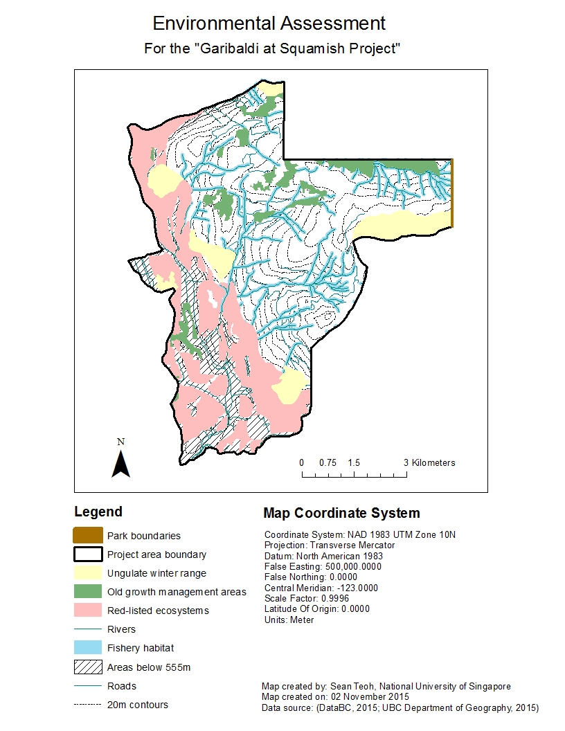
  • 74% of the project area are protected areas because they were either old growth management areas, ungulate winter range, sensitive fish habitat or red-listed ecosystems. Developing the resort on any of these areas would directly impact the wildlife in these areas.
  • 9% of the project area are 555 m in elevation and below, indicating that there may potentially be insufficient snow outside of winter to support the resort activities all year-round. Taking into account climate change and global warming, the minimum elevation required for year-round snowfall could decrease below 555 m and annual snowfall could also decrease year-on-year, reducing the amount of snow that will fall even during winter.

The following figure shows environmental assessment of the “Garibaldi at Squamish” project location.

Figure 1 - Environmental assessment of the "Garibaldi at Squamish" project location.

Figure 1 – Environmental assessment of the “Garibaldi at Squamish” project location.

As the red-listed ecosystems and ungulate winter range are found more at the lower elevations and around the borders of the project area at higher elevations, the two greatest environmental concerns to project development are direct impacts to fishery habitats and old growth management areas.

  • If the project is to be developed on the northern part of the project area with elevation > 555 m, it will impact both old growth forests and fish habitats. Considering that only 1% of total land area in B.C. is covered by old growth forests, destroying any old growth management areas will have dire implications on the state of biodiversity of B.C. To mitigate this, the project could be developed on the southern part of the project area with elevation > 555 m, where it will impact only fish habitats. Another way to mitigate impacts on them would be to implement buffers and setbacks from the old growth management areas where no development or urban structures can be built. Fences could be built to prevent people from entering old growth management areas and causing damage.
  • The Fish Protection Act under Canadian law provides provincial governments with legal power to protect riparian areas. As protecting riparian areas while facilitating urban development that embraces high standards of environmental stewardship is a priority of the B.C. government, mitigating direct impacts on these fish habitats will require more detailed environmental impact assessments by collecting data about the ecology and biology of the fish and other aquatic organisms that breed or live in these rivers, and the potential consequences if they were to be impacted. Other ways to mitigate impacts on these fish habitats would be to incorporate these natural rivers as part of the mountain resort and not drain them or develop over them. However, doing this may require the project developers to design the resort differently from initially planned.

My personal take on this project

Personally, I feel that this project should not be allowed to continue. Doing a quick check online, I found that there were already around 40 ski resorts in British Columbia alone. A study on the demand and supply of all services provided by ski resorts in British Columbia should be conducted first. If there is evidence that the supply for such services outstrip total demand, and that the supply of these services can also cater to future growth in demand, there is no strong justification to build new ski resorts. Also, if new proposed ski resorts are not substantially different from existing ski resorts (i.e. there is no novelty factor), any new ski resorts built will seem to be simply “replicas” of existing ski resorts and would thus result in only a marginal increase in the value of British Columbia as a province for skiing.

Even if we assume that there is greater demand for ski resorts than available supply and there is thus a need to increase the number of ski resorts in British Columbia, building a resort in Squamish does not make sense in terms of urban planning. This is because there is already a ski resort nearby at Whistler. Any new ski resort should be built somewhere where ski resorts are relatively inaccessible to the population nearby, so that accessibility to ski resorts would improve within the province from a macro perspective.

Also, there is a large area of riparian habitats and old-growth forests on what I imagine to be the best areas to build the ski resort on. Old-growth forests currently cover only 1% of total land area in British Columbia. While they are not protected by law (yet), they form a very important part of the ecological diversity in British Columbia, and should be conserved as long as possible. Riparian habitats, on the other hand, are protected by law; the B.C. government needs to be thoroughly evaluate this proposal because if approval is given for this project to proceed, it could set a dangerous precedent for future ski resorts to be built on other mountains with riparian habitats.
Housing Affordability

Learning objectives

This post is about topics explored in the fourth GIS laboratory session, which had the following learning objectives:

1. Developing a working knowledge of Canadian Census Data:

  • Downloading Spatial and Tabular Census Data
  • Join tabular data to spatial layers
  • Visualizing housing data
  • Terms of Canadian Census Data collection

2. Understanding quantitative data classification, and creating a map to illustrate the difference between four methods of classification:

  • Natural breaks,
  • Equal interval,
  • Standard deviation; and
  • Manual breaks

3. Working with ratios to compare datasets, and normalizing data to determine housing affordability.

4. Creating maps of GIS analyses results.


What is affordability?

Affordability is a measure of a person’s ability to buy a specific item relative to the person’s income. In the context of purchasing a house, housing cost alone is often not sufficient to accurately determine the affordability of a house. This is because of differences that exist between people’s income and the cost of a house. For example, a house may cost $300,000. To a person who earns $10,000 a month, it may seem that the house is very affordable. However, the same cannot be said for a person who earns only $2,000 a month, who may feel that the house is too pricey for the income s/he is earning. As such, affordability is a better indicator of housing affordability compared to housing cost alone.


Housing affordability rating categories

There are four housing affordability rating categories:

  1. Severely unaffordable
  2. Seriously unaffordable
  3. Moderately unaffordable
  4. Affordable

These categories were created the Annual Demographia International Housing Affordability Survey to assess the level of affordability of housing in countries that are part of the survey. They are based on the “Median Multiple” concept, defined as the “median house price divided by gross annual medium household income”, which is widely adopted and recommended by many international organizations such as the World Bank, United Nations, etc.

How do we interpret Median Multiple values? A Median Multiple value of 2.0 means that median house prices are 2 times median household incomes, indicating that if all income by the household is used to pay off the cost of a house, two year’s worth of salary would be needed to pay the full cost. Similarly, a Median Multiple value of 4.5 means that median house prices are 4.5 times median household incomes. This essentially means that the higher the Median Multiple value, the more unaffordable housing becomes.

Historically, the Median Multiple value has remained at 2.0 to 3.0 among six surveyed nations of the Annual Demographia International Housing Affordability Survey (i.e. Australia, Canada, Ireland, New Zealand, the United Kingdom, the United States). A Median Multiple standard of 3.0 was also cited in academic research by Arthus C. Grimes, who previously served as Chair of the Board of the Reserve Bank of New Zealand for 13 years. Hence, a Median Multiple value of 3.0 is considered to be the benchmark for determining affordable housing–any Median Multiple value greater than 3.0 would indicate that housing is unaffordable (albeit with varying degrees of unaffordability).

Adding in the range of Median Multiple values into the four housing affordability rating categories mentioned above, we can now quantify the affordability of housing in a region or country:

  1. Severely unaffordable (Median Multiple of 5.1 and over)
  2. Seriously unaffordable (Median Multiple of 4.1 to 5.0)
  3. Moderately unaffordable (Median Multiple of 3.1 to 4.0)
  4. Affordable (Median Multiple of 3.0 and under)

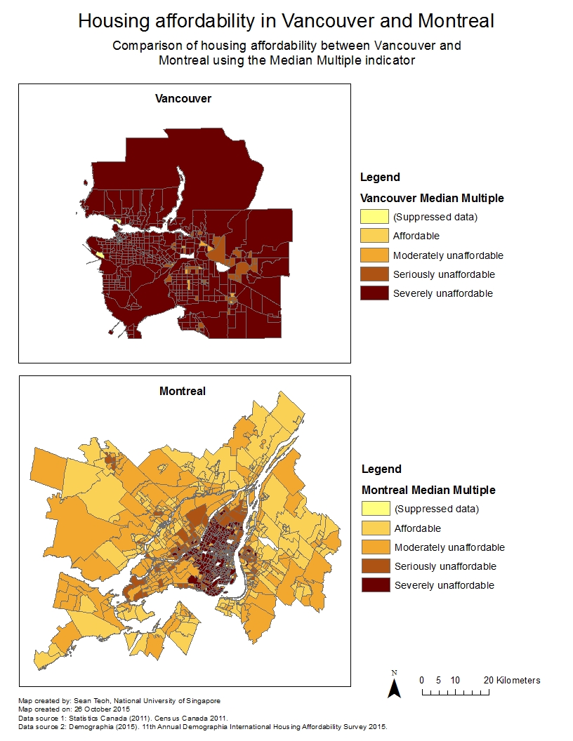
The following figure shows a map comparing housing affordability in Vancouver and Montreal I created for my fourth laboratory session in GEOB 270.

Figure 1 - Comparison of housing affordability between Vancouver and Montreal using the Median Multiple from Demographia, based on the "manual breaks" method of data classification.

Figure 1 – Comparison of housing affordability between Vancouver and Montreal using the Median Multiple from Demographia, based on the “manual breaks” method of data classification.


Is there a relationship between housing affordability and a city’s ‘liveability’?

Housing affordability is not a good indicator of a city’s liveability, mainly because liveability defines the quality of life a resident can expect in a city which comprises so much more than purely economic or financial factors. Apart from economic or financial factors, liveability is also affected by social and environmental factors — How safe is the city? Are people generally polite and considerate? Are there many natural and urban amenities for recreation? Are healthcare facilities established and accessible?

Furthermore, housing affordability does not give any sense of the quality of housing! While a house can be very affordable, the house may not have been built or maintained properly due to cost-cutting measures adopted. Any defects or repairs required will incur not only additional costs but also cause a headache for the home owner. Such problems, if widespread in a city, will undoubtedly reduce the liveability of the city. Housing affordability is an important factor to consider when evaluating the liveability of a city, because not having a roof over your head is a serious problem. However, we also have to be mindful of other factors that determine the quality of life.


References

Demographia (2015). 11th Annual Demographia International Housing Affordability Survey 2015: Ratings for Metropolitan Markets. Accessed 14 November 2015 from http://www.demographia.com/dhi.pdf.

How Data Classification Influence Data Interpretation on Maps

Learning objectives

This post is about topics explored in the fourth GIS laboratory session, which had the following learning objectives:

1. Developing a working knowledge of Canadian Census Data:

  • Downloading Spatial and Tabular Census Data;
  • Join tabular data to spatial layers;
  • Visualizing housing data;
  • Terms of Canadian Census Data collection.

2. Understanding quantitative data classification, and creating a map to illustrate the difference between four methods of classification:

  • Natural breaks,
  • Equal interval,
  • Standard deviation; and
  • Manual breaks.

3. Working with ratios to compare datasets, and normalizing data to determine housing affordability.

4. Creating maps of GIS analyses results.


Methods of data classification

Often times, maps will show distinct visual differences between ranges of values (or classes) for a specific type of data, e.g. different shades of a colour to indicate different levels housing affordability in Metro Vancouver. The cartographer or GIS analyst often have to make important decisions regarding the number of classes to categorize data into, as well as the range of values within each class. Generally speaking, not more than five classes should be used to categorize the data because anything more would make it difficult for the map user to distinguish between the different shades of colour accurately. But in the case of the range of values for each class, how is this determined?

The range of values for each class of data is determined by the method of data classification adopted when constructing the map using the GIS software. There are many methods of data classification, but the four most commonly used are:

  • Natural breaks,
  • Equal interval,
  • Standard deviation; and
  • Manual breaks.

Natural breaks classifies data based on natural groupings inherent in the dataset. This is the default method on ArcGIS and algorithms mathematically “decide” what these natural groupings are. Equal interval divides the range of values (from maximum to minimum) into “x” number of equal-sized ranges, where “x” is decided by the GIS analyst. Standard deviation is a method based on statistical principles, grouping values based on how much they vary from the mean (or average) of the dataset. Last but not the least, manual breaks are simply classes defined purely by the GIS analyst–the GIS analyst inserts break manually into the dataset to categorize them into classes.

What everybody should know is that every method of data classification has its use and purpose, coupled with its own advantages and disadvantages. There is no superior method of data classification, as the best method would depend on the problem and situation at hand. However, when comparing between two or more datasets e.g. housing affordability in Vancouver and in Montreal, the same range of values has to be used for a meaningful comparison–meaning that manual breaks would be the “best” method of classifying the data for meaningful comparison. However, whether it is effective will ultimately depend on the judgment of the GIS analyst in defining the range of values for each class.

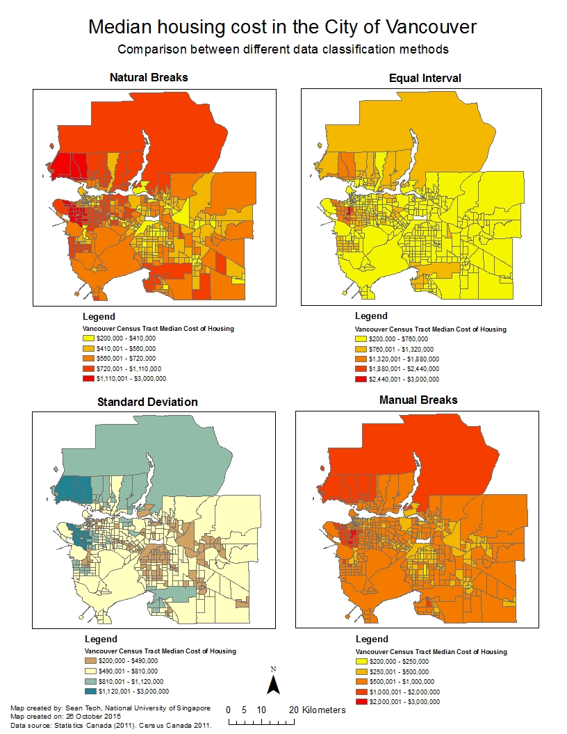
The following figure shows how different methods of data classification produce vastly different visual maps even though the same dataset is used for all four maps.

Figure 1 – Different maps showing the median cost of housing in the City of Vancouver resulting from different data classification methods, although the same dataset was used.


Ethical implications on the choice of data classification method

Now that you know that data classification is to some extent subjective, the implication is that the method of data classification used can influence how maps turn out visually even though the same dataset is used. If the GIS analyst or client is unethical, the method of data classification could be manipulated in such a way that the map could steer the map user towards their goals and objectives.

Let’s look at two scenarios where this could happen: Scenario 1 where I am a journalist putting together maps of housing cost in Vancouver, and Scenario 2 where I am a real estate agent preparing a presentation for prospective home buyers near University of British Columbia.

Scenario 1: As a journalist, I may be under pressure to sensationalize news and thus choose the equal interval method of data classification. The equal interval method will divide the cost of housing into classes that contain an equal range of values. However, since only a select number of houses is so much more expensive than most houses, the equal interval method will tend to isolate these houses and allocate them to a class of their own. Visually on the map, only a very small part of the map will be of one class (i.e. the most expensive houses), drawing the public’s attention to this area when they see the map. The ethical implication of choosing this classification method is that it may not be representative of datasets that are not equally distributed hence the map may mislead the public.

Scenario 2: As a real estate agent, I would want to generate as much sales as possible; hence I would choose the manual breaks method of data classification so that I can create a map of housing cost that is able to suit the needs of the prospective home buyers. If my prospective home buyers are tight on their budget, I would choose manual breaks that are smaller in range at the lower end of the housing cost spectrum so that I can emphasize the difference in cost between such houses. On the other hand, if my prospective home buyers are more wealthy and are looking for more expensive housing, I would choose manual breaks that are smaller in range at the higher end of the housing cost spectrum so that I can emphasize the difference in cost between such houses. This will enable my home buyers to make better decisions. The ethical implication of choosing this classification method is that the manual breaks are decided by me and I can choose what to emphasize and what to de-emphasize. If I have an intention to mislead my buyers, I can manipulate the manual breaks to my advantage.

Now that you know more about methods of data classification and how it may be used unethically, it would be good to stop and think more deeply and critically about the maps that you see around you in your daily life, on the newspaper, on websites, etc.:

  • What are the possible goals and objectives of the people or organizations who created these maps; and
  • Why are the maps you see presented the way they are and how is this related to the previous question?