Learning objectives
This post is about topics explored in the fourth GIS laboratory session, which had the following learning objectives:
1. Developing a working knowledge of Canadian Census Data:
- Downloading Spatial and Tabular Census Data;
- Join tabular data to spatial layers;
- Visualizing housing data;
- Terms of Canadian Census Data collection.
2. Understanding quantitative data classification, and creating a map to illustrate the difference between four methods of classification:
- Natural breaks,
- Equal interval,
- Standard deviation; and
- Manual breaks.
3. Working with ratios to compare datasets, and normalizing data to determine housing affordability.
4. Creating maps of GIS analyses results.
Methods of data classification
Often times, maps will show distinct visual differences between ranges of values (or classes) for a specific type of data, e.g. different shades of a colour to indicate different levels housing affordability in Metro Vancouver. The cartographer or GIS analyst often have to make important decisions regarding the number of classes to categorize data into, as well as the range of values within each class. Generally speaking, not more than five classes should be used to categorize the data because anything more would make it difficult for the map user to distinguish between the different shades of colour accurately. But in the case of the range of values for each class, how is this determined?
The range of values for each class of data is determined by the method of data classification adopted when constructing the map using the GIS software. There are many methods of data classification, but the four most commonly used are:
- Natural breaks,
- Equal interval,
- Standard deviation; and
- Manual breaks.
Natural breaks classifies data based on natural groupings inherent in the dataset. This is the default method on ArcGIS and algorithms mathematically “decide” what these natural groupings are. Equal interval divides the range of values (from maximum to minimum) into “x” number of equal-sized ranges, where “x” is decided by the GIS analyst. Standard deviation is a method based on statistical principles, grouping values based on how much they vary from the mean (or average) of the dataset. Last but not the least, manual breaks are simply classes defined purely by the GIS analyst–the GIS analyst inserts break manually into the dataset to categorize them into classes.
What everybody should know is that every method of data classification has its use and purpose, coupled with its own advantages and disadvantages. There is no superior method of data classification, as the best method would depend on the problem and situation at hand. However, when comparing between two or more datasets e.g. housing affordability in Vancouver and in Montreal, the same range of values has to be used for a meaningful comparison–meaning that manual breaks would be the “best” method of classifying the data for meaningful comparison. However, whether it is effective will ultimately depend on the judgment of the GIS analyst in defining the range of values for each class.
The following figure shows how different methods of data classification produce vastly different visual maps even though the same dataset is used for all four maps.
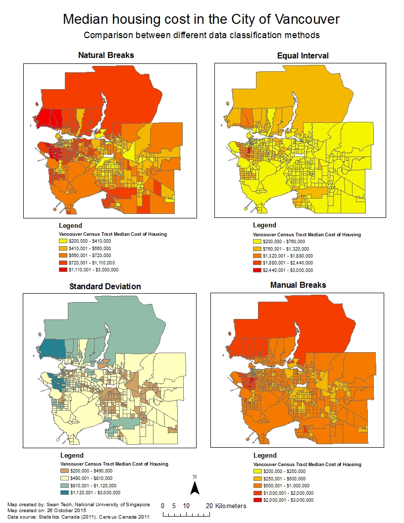
Figure 1 – Different maps showing the median cost of housing in the City of Vancouver resulting from different data classification methods, although the same dataset was used.
Ethical implications on the choice of data classification method
Now that you know that data classification is to some extent subjective, the implication is that the method of data classification used can influence how maps turn out visually even though the same dataset is used. If the GIS analyst or client is unethical, the method of data classification could be manipulated in such a way that the map could steer the map user towards their goals and objectives.
Let’s look at two scenarios where this could happen: Scenario 1 where I am a journalist putting together maps of housing cost in Vancouver, and Scenario 2 where I am a real estate agent preparing a presentation for prospective home buyers near University of British Columbia.
Scenario 1: As a journalist, I may be under pressure to sensationalize news and thus choose the equal interval method of data classification. The equal interval method will divide the cost of housing into classes that contain an equal range of values. However, since only a select number of houses is so much more expensive than most houses, the equal interval method will tend to isolate these houses and allocate them to a class of their own. Visually on the map, only a very small part of the map will be of one class (i.e. the most expensive houses), drawing the public’s attention to this area when they see the map. The ethical implication of choosing this classification method is that it may not be representative of datasets that are not equally distributed hence the map may mislead the public.
Scenario 2: As a real estate agent, I would want to generate as much sales as possible; hence I would choose the manual breaks method of data classification so that I can create a map of housing cost that is able to suit the needs of the prospective home buyers. If my prospective home buyers are tight on their budget, I would choose manual breaks that are smaller in range at the lower end of the housing cost spectrum so that I can emphasize the difference in cost between such houses. On the other hand, if my prospective home buyers are more wealthy and are looking for more expensive housing, I would choose manual breaks that are smaller in range at the higher end of the housing cost spectrum so that I can emphasize the difference in cost between such houses. This will enable my home buyers to make better decisions. The ethical implication of choosing this classification method is that the manual breaks are decided by me and I can choose what to emphasize and what to de-emphasize. If I have an intention to mislead my buyers, I can manipulate the manual breaks to my advantage.
Now that you know more about methods of data classification and how it may be used unethically, it would be good to stop and think more deeply and critically about the maps that you see around you in your daily life, on the newspaper, on websites, etc.:
- What are the possible goals and objectives of the people or organizations who created these maps; and
- Why are the maps you see presented the way they are and how is this related to the previous question?
Wonderful job
Thank for sharing such informative blog about classification of data.
Keep sharing more.