Final Thoughts

Lab 4 – Housing Affordability

My main accomplishment: Worked with various methods of data classification (natural breaks, equal interval, standard deviation, and manual breaks), which increased my understanding of the advantages and disadvantages of each method and the purposes for which they are suited for.

The most important part of Lab 4 is working with methods of data classification. Many people who look at maps are not be aware that the method of data classification will have a tremendous impact on the visuals of the final product, which can sway the map user towards certain narratives. Through Lab 4, I understood exactly how data can be classified using GIS software and saw for myself how the visuals can be manipulated through data classification even though the same dataset was used.


Lab 5 – Environmental Impact Assessment

My main accomplishment: Obtained and organized data from external sources, to familiarize myself with the sources of data provided by governments and organizations.

In the real world, a GIS analyst would need to acquire his or her own data for the project at hand. Lab 5 allowed me to work with data from various sources and understand how different sources of data have varying data quality. I also understood that using other entities’ data meant that I would need to clean or format the data into a manner that is useful for my project analysis, as often times the format of the data follows the convention or structure set by the data provider.

Agricultural Land Reserves of the Central Okanagan, British Columbia

Learning objectives

This post is about topics explored in the final GIS laboratory session, which had the following learning objectives:

  • Identify, manage, and manipulate data sets appropriate for GIS analysis;
  • Conduct GIS analyses that demonstrate mastery of GIS concepts and software;
  • Design and implement a project approach;
  • Build teamwork skills;
  • Produce maps, flowcharts and work logs, and a detailed report describing your analysis.

Agricultural Land Reserves of the Central Okanagan, British Columbia

Project goal and report

In the final lab of my GIS module, GEOB 270, I was tasked to analyze the Agricultural Land Reserves (ALR) in Central Okanagan, British Columbia (B.C.). This project was to be completed together with my team, which consisted of Zhu An Lim, MacKenzie Baxter, Ron Blutrich and I.

Agriculture contributes significantly to the regional economy of British Columbia. As the ALR consists of land reserved for agricultural production under B.C. law, it is thus vital for maintaining or improving the state of agriculture in B.C. Although estimates of the total area of ALR have previously been made, these numbers may contain errors due to the lack of consideration for various non-agricultural use of land within the ALR. This results in inaccuracies in terms of the actual usable areas for agricultural production within the ALR. My team was tasked to improve estimates of ALR land through GIS analysis, through the exclusion of non-agricultural use of ALR land. To do this, datasets were obtained from various government and academic databases.

The final project report and maps can be downloaded here:

Project management

As the coordinator of my team, I split the project into three phases: data collection, analysis, and report-writing. Each of my team members (including myself) would have to search for datasets from specific databases that we thought would contain the data that we needed. For example, Zhu An would search Statistics Canada, Ron would search for TRIM data, MacKenzie would search DataBC, and I would search for other sources of data. Our project required the production of 8 different maps, thus I assigned maps to each person to work on for the analysis. Once all maps were produced, those who did a lesser number of maps during analysis would work on a greater number of sections on the report. Finally, I would edit the whole report to ensure that formatting is properly done and all sections flow and corroborate with one another.

Contributions and acknowledgements

Some my most valuable contributions for the project were to:

  • Work on a large proportion of the analysis;
  • Standardize the maps that were created;
  • Manage the data and analyzed files on Google Drive;
  • Edit the entire report.

I did about half of the analysis required for Biogeographical and Social, some in collaboration with Zhu An and MacKenzie, and worked with Zhu An to complete the analysis for Overview and Summary. I also standardized the maps that were created. Ron and MacKenzie wrote most of the report, and as the coordinator of the project I eventually edited the entire report and worked on filling in missing information in the different sections. Finally, Zhu An created most of the flowchart of the analyses for the report, which I also chipped in for some areas.

I wish to express my sincere thanks to Zhu An for working side-by-side with me for most of the analysis and flowchart, and Ron and MacKenzie for writing most of the report.

Learning points

Some of the interesting things that I’ve learnt through this project are:

  • In terms of the ALR. although legally protected by B.C. law for agricultural use of land, it is actually possible to do land swaps (i.e. trading non-ALR land for ALR land) as long as approval is sought from the Government of B.C. Inevitably, this would affect the soil quality of the ALR as it is likely that ALR land that is highly suitable for agricultural production would be swapped for low quality non-ALR land.
  • In terms of GIS techniques, an interesting GIS analysis technique that I encountered in this project is the “Erase” tool, which allows the GIS analyst to erase parts of a layer that intersects with the spatial features of another layer. It was certainly handy when I had to remove non-agricultural use of ALR land from the original shapefile.
  • In terms of project management, the stark reality that hit me is that team members often have other commitments, be it in school or in the workplace. Not everyone would be available to work on the project at the same time that I am, therefore communication and forward planning is most important to ensure that there is progression for the project. Without a team leader, nothing would get done because everyone will place their other priorities ahead of the project until the project is close to the deadline.
  • In terms of data management, I learnt first-hand the importance of having a naming convention for the different shapefiles that were produced during the analysis. Some of the shapefiles produced by my team members were not named properly and I did not know what tools were used to arrive at that shapefile. This increased the amount of work as I had to go back to my team members and check with them the steps they took.
  • In terms of publicly available data, I learnt that their quality is usually not as fantastic as data that needs to be purchased. We downloaded data from a variety of online sources that were free. However, when compared to data from the Terrain Resource Information Management (TRIM) Program, these publicly available data could not match the quality of the data from the TRIM Program. In the end, most of the data that we used for the analysis was TRIM data, which we would need to pay for if we were not UBC students or staff.

Ethics of Environmental Projects

Learning objectives

This post is about topics explored in the fifth GIS laboratory session, which had the following learning objectives:

  • Learn how to independently acquire spatial datasets online;
  • Parse and filter data based on your analytical objectives;
  • Evaluate and use different spatial analysis tools, based on your objectives;
  • Further develop your cartographic and written communication skills by producing a map and short memo summarizing your results for a non-technical audience.

The “Garibaldi at Squamish” project

The “Garibaldi at Squamish” project is proposed development of a year-round mountain resort on Brohm Ride, 15 km north of Squamish on Highway 99. An application for the approval of this project was first submitted by Northland Properties and Aquilini Investment Group of Vancouver (“Northland and Aquilini”) to the Government of British Columbia (B.C. government) in 1997 under the Environmental Assessment Act.

Following a series of addendums (additions) to the application submitted, the B.C. Environmental Assessment Office released a report in 2010 describing the lack of information on the potential environmental impacts of the proposed project and recommended several measures to prevent or reduce any significant environmental, social, economic, heritage and health effects. In April 2015, Northland and Aquilini submitted a supplemental application which they claimed addressed these issues brought up by the B.C. Environmental Assessment Office.

If approved, Garibaldi at Squamish will include 124 ski trails, 23 lifts, resort accommodation and commercial developments. It is expected to provide 900 jobs during its construction and 3,000 seasonal jobs during its operation.

There was a two month community consultation in May and June 2015, during which the Resort Municipality of Whistler submitted a 14-page letter opposing the project. It cited economic and environmental concerns and the practical viability of the project with skiing on areas of elevation less than 555 metres.


My task as a GIS analyst

In this laboratory session, I was given a scenario whereby I am a natural resource planner tasked by the British Columbia Snowmobile Federation (BCSF) to examine the report and recommendations of the B.C. Environmental Assessment Office report and the concerns of the Resort Municipality of Whistler. I am to evaluate whether there is sufficient evidence to continue to oppose the project, or whether the concerns can be addressed as part of the project.

To carry out my task, I conducted a geospatial analysis of the environmental conditions at project area using the Geographical Information System (GIS) programme, ArcGIS. This was done through the following seven steps:

1. Acquire – Obtaining data:

  • I acquired data required for the geospatial analysis: ungulate winter range, old growth management areas, terrestrial ecosystems, elevation, contours, roads, rivers, project boundaries, and park boundaries.
  • The datasets for ungulate winter range and old growth management areas were obtained from the DataBC website, which is a public database managed by the provincial government of British Columbia. As for the rest of the data, they were obtained from the Department of Geography, University of British Columbia.

2. Parse – Organizing data by structuring and categorizing them:

  • Through the use of ArcCatalog, a geodatabase was created as the location to store all project datasets and analysis. The datasets acquired in the previous step were imported into the geodatabase.
  • A file naming convention was created and all datasets and layers were named according to this convention.
  • The datasets were also checked for uniformity in geographic coordinate systems and projected coordinate systems. All datasets were standardized to the GCS North American 1983 for the geographic coordinate system, and NAD 83 UTM Zone 10 for the projected coordinate system by changing the data frame’s properties.

3. Filter – Removing all data except for the data of interest:

  • Some of the datasets had data that extended beyond the project boundaries. Using ArcMap, the data was restricted to within the project boundaries through the use of the “Clip” tool for both the raster and vector datasets. The clipped datasets were exported as separate files so as to retain the original datasets in case they are needed.

4. Mine – Analysis of datasets to obtain more information:

  • The datasets were further processed in order to perform basic statistical analysis on them.
  • The old growth management areas dataset and ungulate winter range dataset required no further processing and each dataset had their total area calculated as a percentage of the total project areas.
  • The Digital Elevation Model (DEM) raster dataset containing data about the elevation of the project area was reclassified into two classes: “elevation < 555 m” and “elevation > 555 m”. The layer was then converted into polygons so that the area of elevation < 555 m can be calculated as a percentage of the total project area.
  • The Terrestrial Ecosystem Mapping (TEM) layer contains data about common red-listed ecosystems in the project area. Red-listed ecosystems likely to be affected by the planned mountain resort were selected based on biogeoclimatic conditions and soil moisture and nutrient regime conditions that were similar to the project area, their total areas summed and calculated as a percentage of the total project area.
  • The TRIM dataset contains data about riparian management zones and fish habitats. A multi-width buffer of protected area was created around the streams in the project area. Streams above 555 m are considered less likely to be fish-bearing and given a buffer of 50 while streams below 555 m are considered more likely to be fish-bearing and given a buffer of 100 m. These buffers were merged using the “Dissolve” tool, and the area calculated as a percentage of the total project area.

5. Represent – Choosing a basic visual model:

  • The datasets were rearranged, their symbology edited, and represented on a map with a legend, title, scale, information on the coordinate system, and data source.

The general results were:

  • 74% of the project area are protected areas because they were either old growth management areas, ungulate winter range, sensitive fish habitat or red-listed ecosystems. Developing the resort on any of these areas would directly impact the wildlife in these areas.
  • 9% of the project area are 555 m in elevation and below, indicating that there may potentially be insufficient snow outside of winter to support the resort activities all year-round. Taking into account climate change and global warming, the minimum elevation required for year-round snowfall could decrease below 555 m and annual snowfall could also decrease year-on-year, reducing the amount of snow that will fall even during winter.

The following figure shows environmental assessment of the “Garibaldi at Squamish” project location.

Figure 1 - Environmental assessment of the "Garibaldi at Squamish" project location.

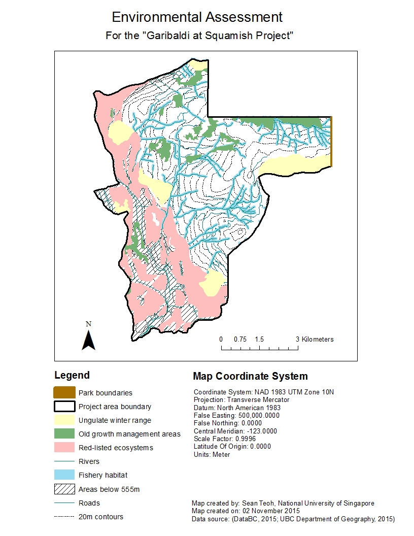
Figure 1 – Environmental assessment of the “Garibaldi at Squamish” project location.

As the red-listed ecosystems and ungulate winter range are found more at the lower elevations and around the borders of the project area at higher elevations, the two greatest environmental concerns to project development are direct impacts to fishery habitats and old growth management areas.

  • If the project is to be developed on the northern part of the project area with elevation > 555 m, it will impact both old growth forests and fish habitats. Considering that only 1% of total land area in B.C. is covered by old growth forests, destroying any old growth management areas will have dire implications on the state of biodiversity of B.C. To mitigate this, the project could be developed on the southern part of the project area with elevation > 555 m, where it will impact only fish habitats. Another way to mitigate impacts on them would be to implement buffers and setbacks from the old growth management areas where no development or urban structures can be built. Fences could be built to prevent people from entering old growth management areas and causing damage.
  • The Fish Protection Act under Canadian law provides provincial governments with legal power to protect riparian areas. As protecting riparian areas while facilitating urban development that embraces high standards of environmental stewardship is a priority of the B.C. government, mitigating direct impacts on these fish habitats will require more detailed environmental impact assessments by collecting data about the ecology and biology of the fish and other aquatic organisms that breed or live in these rivers, and the potential consequences if they were to be impacted. Other ways to mitigate impacts on these fish habitats would be to incorporate these natural rivers as part of the mountain resort and not drain them or develop over them. However, doing this may require the project developers to design the resort differently from initially planned.

My personal take on this project

Personally, I feel that this project should not be allowed to continue. Doing a quick check online, I found that there were already around 40 ski resorts in British Columbia alone. A study on the demand and supply of all services provided by ski resorts in British Columbia should be conducted first. If there is evidence that the supply for such services outstrip total demand, and that the supply of these services can also cater to future growth in demand, there is no strong justification to build new ski resorts. Also, if new proposed ski resorts are not substantially different from existing ski resorts (i.e. there is no novelty factor), any new ski resorts built will seem to be simply “replicas” of existing ski resorts and would thus result in only a marginal increase in the value of British Columbia as a province for skiing.

Even if we assume that there is greater demand for ski resorts than available supply and there is thus a need to increase the number of ski resorts in British Columbia, building a resort in Squamish does not make sense in terms of urban planning. This is because there is already a ski resort nearby at Whistler. Any new ski resort should be built somewhere where ski resorts are relatively inaccessible to the population nearby, so that accessibility to ski resorts would improve within the province from a macro perspective.

Also, there is a large area of riparian habitats and old-growth forests on what I imagine to be the best areas to build the ski resort on. Old-growth forests currently cover only 1% of total land area in British Columbia. While they are not protected by law (yet), they form a very important part of the ecological diversity in British Columbia, and should be conserved as long as possible. Riparian habitats, on the other hand, are protected by law; the B.C. government needs to be thoroughly evaluate this proposal because if approval is given for this project to proceed, it could set a dangerous precedent for future ski resorts to be built on other mountains with riparian habitats.

Housing Affordability

Learning objectives

This post is about topics explored in the fourth GIS laboratory session, which had the following learning objectives:

1. Developing a working knowledge of Canadian Census Data:

  • Downloading Spatial and Tabular Census Data
  • Join tabular data to spatial layers
  • Visualizing housing data
  • Terms of Canadian Census Data collection

2. Understanding quantitative data classification, and creating a map to illustrate the difference between four methods of classification:

  • Natural breaks,
  • Equal interval,
  • Standard deviation; and
  • Manual breaks

3. Working with ratios to compare datasets, and normalizing data to determine housing affordability.

4. Creating maps of GIS analyses results.


What is affordability?

Affordability is a measure of a person’s ability to buy a specific item relative to the person’s income. In the context of purchasing a house, housing cost alone is often not sufficient to accurately determine the affordability of a house. This is because of differences that exist between people’s income and the cost of a house. For example, a house may cost $300,000. To a person who earns $10,000 a month, it may seem that the house is very affordable. However, the same cannot be said for a person who earns only $2,000 a month, who may feel that the house is too pricey for the income s/he is earning. As such, affordability is a better indicator of housing affordability compared to housing cost alone.


Housing affordability rating categories

There are four housing affordability rating categories:

  1. Severely unaffordable
  2. Seriously unaffordable
  3. Moderately unaffordable
  4. Affordable

These categories were created the Annual Demographia International Housing Affordability Survey to assess the level of affordability of housing in countries that are part of the survey. They are based on the “Median Multiple” concept, defined as the “median house price divided by gross annual medium household income”, which is widely adopted and recommended by many international organizations such as the World Bank, United Nations, etc.

How do we interpret Median Multiple values? A Median Multiple value of 2.0 means that median house prices are 2 times median household incomes, indicating that if all income by the household is used to pay off the cost of a house, two year’s worth of salary would be needed to pay the full cost. Similarly, a Median Multiple value of 4.5 means that median house prices are 4.5 times median household incomes. This essentially means that the higher the Median Multiple value, the more unaffordable housing becomes.

Historically, the Median Multiple value has remained at 2.0 to 3.0 among six surveyed nations of the Annual Demographia International Housing Affordability Survey (i.e. Australia, Canada, Ireland, New Zealand, the United Kingdom, the United States). A Median Multiple standard of 3.0 was also cited in academic research by Arthus C. Grimes, who previously served as Chair of the Board of the Reserve Bank of New Zealand for 13 years. Hence, a Median Multiple value of 3.0 is considered to be the benchmark for determining affordable housing–any Median Multiple value greater than 3.0 would indicate that housing is unaffordable (albeit with varying degrees of unaffordability).

Adding in the range of Median Multiple values into the four housing affordability rating categories mentioned above, we can now quantify the affordability of housing in a region or country:

  1. Severely unaffordable (Median Multiple of 5.1 and over)
  2. Seriously unaffordable (Median Multiple of 4.1 to 5.0)
  3. Moderately unaffordable (Median Multiple of 3.1 to 4.0)
  4. Affordable (Median Multiple of 3.0 and under)

The following figure shows a map comparing housing affordability in Vancouver and Montreal I created for my fourth laboratory session in GEOB 270.

Figure 1 - Comparison of housing affordability between Vancouver and Montreal using the Median Multiple from Demographia, based on the "manual breaks" method of data classification.

Figure 1 – Comparison of housing affordability between Vancouver and Montreal using the Median Multiple from Demographia, based on the “manual breaks” method of data classification.


Is there a relationship between housing affordability and a city’s ‘liveability’?

Housing affordability is not a good indicator of a city’s liveability, mainly because liveability defines the quality of life a resident can expect in a city which comprises so much more than purely economic or financial factors. Apart from economic or financial factors, liveability is also affected by social and environmental factors — How safe is the city? Are people generally polite and considerate? Are there many natural and urban amenities for recreation? Are healthcare facilities established and accessible?

Furthermore, housing affordability does not give any sense of the quality of housing! While a house can be very affordable, the house may not have been built or maintained properly due to cost-cutting measures adopted. Any defects or repairs required will incur not only additional costs but also cause a headache for the home owner. Such problems, if widespread in a city, will undoubtedly reduce the liveability of the city. Housing affordability is an important factor to consider when evaluating the liveability of a city, because not having a roof over your head is a serious problem. However, we also have to be mindful of other factors that determine the quality of life.


References

Demographia (2015). 11th Annual Demographia International Housing Affordability Survey 2015: Ratings for Metropolitan Markets. Accessed 14 November 2015 from http://www.demographia.com/dhi.pdf.

How Data Classification Influence Data Interpretation on Maps

Learning objectives

This post is about topics explored in the fourth GIS laboratory session, which had the following learning objectives:

1. Developing a working knowledge of Canadian Census Data:

  • Downloading Spatial and Tabular Census Data;
  • Join tabular data to spatial layers;
  • Visualizing housing data;
  • Terms of Canadian Census Data collection.

2. Understanding quantitative data classification, and creating a map to illustrate the difference between four methods of classification:

  • Natural breaks,
  • Equal interval,
  • Standard deviation; and
  • Manual breaks.

3. Working with ratios to compare datasets, and normalizing data to determine housing affordability.

4. Creating maps of GIS analyses results.


Methods of data classification

Often times, maps will show distinct visual differences between ranges of values (or classes) for a specific type of data, e.g. different shades of a colour to indicate different levels housing affordability in Metro Vancouver. The cartographer or GIS analyst often have to make important decisions regarding the number of classes to categorize data into, as well as the range of values within each class. Generally speaking, not more than five classes should be used to categorize the data because anything more would make it difficult for the map user to distinguish between the different shades of colour accurately. But in the case of the range of values for each class, how is this determined?

The range of values for each class of data is determined by the method of data classification adopted when constructing the map using the GIS software. There are many methods of data classification, but the four most commonly used are:

  • Natural breaks,
  • Equal interval,
  • Standard deviation; and
  • Manual breaks.

Natural breaks classifies data based on natural groupings inherent in the dataset. This is the default method on ArcGIS and algorithms mathematically “decide” what these natural groupings are. Equal interval divides the range of values (from maximum to minimum) into “x” number of equal-sized ranges, where “x” is decided by the GIS analyst. Standard deviation is a method based on statistical principles, grouping values based on how much they vary from the mean (or average) of the dataset. Last but not the least, manual breaks are simply classes defined purely by the GIS analyst–the GIS analyst inserts break manually into the dataset to categorize them into classes.

What everybody should know is that every method of data classification has its use and purpose, coupled with its own advantages and disadvantages. There is no superior method of data classification, as the best method would depend on the problem and situation at hand. However, when comparing between two or more datasets e.g. housing affordability in Vancouver and in Montreal, the same range of values has to be used for a meaningful comparison–meaning that manual breaks would be the “best” method of classifying the data for meaningful comparison. However, whether it is effective will ultimately depend on the judgment of the GIS analyst in defining the range of values for each class.

The following figure shows how different methods of data classification produce vastly different visual maps even though the same dataset is used for all four maps.

Figure 1 – Different maps showing the median cost of housing in the City of Vancouver resulting from different data classification methods, although the same dataset was used.


Ethical implications on the choice of data classification method

Now that you know that data classification is to some extent subjective, the implication is that the method of data classification used can influence how maps turn out visually even though the same dataset is used. If the GIS analyst or client is unethical, the method of data classification could be manipulated in such a way that the map could steer the map user towards their goals and objectives.

Let’s look at two scenarios where this could happen: Scenario 1 where I am a journalist putting together maps of housing cost in Vancouver, and Scenario 2 where I am a real estate agent preparing a presentation for prospective home buyers near University of British Columbia.

Scenario 1: As a journalist, I may be under pressure to sensationalize news and thus choose the equal interval method of data classification. The equal interval method will divide the cost of housing into classes that contain an equal range of values. However, since only a select number of houses is so much more expensive than most houses, the equal interval method will tend to isolate these houses and allocate them to a class of their own. Visually on the map, only a very small part of the map will be of one class (i.e. the most expensive houses), drawing the public’s attention to this area when they see the map. The ethical implication of choosing this classification method is that it may not be representative of datasets that are not equally distributed hence the map may mislead the public.

Scenario 2: As a real estate agent, I would want to generate as much sales as possible; hence I would choose the manual breaks method of data classification so that I can create a map of housing cost that is able to suit the needs of the prospective home buyers. If my prospective home buyers are tight on their budget, I would choose manual breaks that are smaller in range at the lower end of the housing cost spectrum so that I can emphasize the difference in cost between such houses. On the other hand, if my prospective home buyers are more wealthy and are looking for more expensive housing, I would choose manual breaks that are smaller in range at the higher end of the housing cost spectrum so that I can emphasize the difference in cost between such houses. This will enable my home buyers to make better decisions. The ethical implication of choosing this classification method is that the manual breaks are decided by me and I can choose what to emphasize and what to de-emphasize. If I have an intention to mislead my buyers, I can manipulate the manual breaks to my advantage.

Now that you know more about methods of data classification and how it may be used unethically, it would be good to stop and think more deeply and critically about the maps that you see around you in your daily life, on the newspaper, on websites, etc.:

  • What are the possible goals and objectives of the people or organizations who created these maps; and
  • Why are the maps you see presented the way they are and how is this related to the previous question?


Thoughts On My Progress in GEOB 270

Much have been done in just three GEOB 270 labs. This post is to reflect on some of the concepts or skills that I have learnt so far:


Lab 1 – Introduction to GIS

My main accomplishment: Researched on GIS applications posted on the internet and questioned the ethics and integrity of the data used to produce a map for one of these GIS applications (deforestation in Brazil), in order to become more aware of the sources of data and techniques being used to create visual maps for achieving certain objectives.

The most important concept that I learnt in Lab 1 is about data integrity. When given a choice, most people would prefer looking at aesthetically pleasing maps and visuals rather than hard numbers and data. However, Lab 1 has taught me that the maps that people produce are often not always what they seem to be, especially with regards to their accuracy.

The outcome of maps (i.e. the visual output) can very easily be affected by the datasets used by the cartographer. As what data scientists like to say, “rubbish in, rubbish out”. This phrase means that using bad data will result in a bad map even if the methodology was proper. Thus, before proceeding to analyze any map, it is important to examine the datasets used by the cartographer and check for their source and integrity.


Lab 2 – Coordinate Systems & Spatial Data Models

My main accomplishment: Worked with both raster and vector datasets to understand more about their properties and characteristics in practice (not just theoretically), so that I am more aware of which data model is better suited for analyzing certain types of data and the techniques required for the analysis.

Raster and vector data models are very different both in terms of properties and visual output. The raster data model represents the world as a regular grid of cells (known as pixels) while the vector data model represents the world as objects with clearly defined geometries and boundaries (through the use of points, lines or polygons). Neither model is superior over the other, as both have their advantages and disadvantages. However, knowing which model is better suited for certain types of data is very important in ensuring proper GIS analysis of data. For example, continuous data such as precipitation and elevation is usually better represented with the raster data model while discrete data such as number of burglary incidents in a country is usually better represented with the vector data model.

Also, the proper use of some GIS analysis tools are specific to each data model even though it may be possible to apply them to both types of data models. Understanding more about raster and vector data models and the analysis associated with them will be key to detecting improper use of analytical tools by cartographers, if any.


Lab 3 – Planning for a Tsunami

Main accomplishment: Calculated statistics of Vancouver land use and roads affected by a potential tsunami, to familiarize myself with some of the statistical tools available in the ArcMap programme.

In Lab 3, I was tasked to conduct a GIS analysis on areas of the City of Vancouver at risk of a tsunami, and prepare a map highlighting these areas. Part of these analyses was to calculate some statistics relating to Vancouver land use and roads that may be affected if a tsunami strikes. Apart from the geospatial aspect, the mathematical aspect is also an important part of analyzing datasets and maps because it is a way to quantify results and analyses. For example, while we can show visually on a map which parts of Vancouver are likely to be affected by a tsunami, we have to have some numbers to work with in order to make certain decisions, such as how much resources to allocate to disaster recovery, etc.

Planning for a Tsunami

Learning objectives

This post is about topics explored in the third GIS laboratory session, which had the following learning objectives:

1. Perform basic geographic analysis to determine areas for possible tsunami:

  • Perform buffer proximity analysis;
  • Reclassify raster layers;
  • Convert raster to vector data files;
  • Combine vector data layers with polygon overlay tool intersect.

2. Performing geographic analysis to extract Vancouver data affected by possible tsunami:

  • Combine vector data layers with the polygon overlay tool intersect;
  • Perform a proximity analysis using select by location;
  • Extract datasets with the polygon overly tool clip.

3. Calculate statistics (areas, length) of Vancouver land use and roads affected by a potential tsunami:

  • Create summary tables by area of land use;
  • Create lists of facilities affected;
  • Create summary tables of road infrastructure affected.

4. Add layer of potential signage points:

  • Learn how to create a new feature class, explaining the different types (point, multipoint, etc…);
  • Introduce basic editing of features and tables (change values on individual table cells, modification/creation/deletion of features);
  • Introduce the concept of snapping parameters for more accurate positioning of new feature.

 Why a study of tsunami risk for Vancouver?

During the Lab 3 session for GEOB 270, I was tasked to conduct a GIS analysis on areas of the City of Vancouver at risk of a tsunami, and prepare a map highlighting these areas. Why conduct a study on Vancouver’s coastal areas at risk of a tsunami when the risk is so small due to the presence of Vancouver Island? The answer is that we always need to anticipate the worst possible outcome and take precautions to ensure that we are not caught offguard even if the odds are against our favour; the idea of “Precautionary Principle”. After all, we know how strong the forces of Nature are and a tsunami that can breach Vancouver Island is not impossible.

In summary, I had to analyze:

  • The percentage of the City of Vancouver’s total area at risk of being hit by a tsunami (“danger zone”); and
  • The healthcare and educational facilities within the danger zone.

Percentage of City of Vancouver’s total area at risk of being hit by a tsunami

To calculate this percentage, we essentially need only two values: (1) the area of the City of Vancouver at risk of being hit by a tsunami (or “area of danger zone”); and (2) the total area of the City of Vancouver. We then use the following formula to calculate the required percentage: (Area of danger zone) / (Total area of the City of Vancouver) x 100%

Before we can calculate this percentage though, we need to obtain the two values first through GIS analysis of the datasets provided. The way I did it through ArcMap, is as follows:

1. First, I found the intersected the “Vancouver_landuse” and “Vancouver_Danger” datasets and exported it as a new layer “Vancouver_landuseDanger“. What this does is that it selects the parts of Vancouver where it is 1 meter above sea level and below, which are usually along the coast lines.

2. Then, I opened the attribute table of “Vancouver_landuseDanger” and used a function called “Summarize” on the categories of landuse. This creates an output summary table that shows you the total area for each landuse zones that are at risk of being hit by the tsunami (this is the first value required in the formula).

Here is the output summary table generated:

Category Sum of area (m2)
Commercial 180116.661665
Government and Institutional 188548.87032
Open Area 1090308.182289
Parks and Recreational 4627741.339941
Residential 3639795.736536
Resource and Industrial 5851705.112399
Waterbody 298316.863803
Total 15876532.766953

3. For the other value required in the formula, I simply opened the attribute table of the “Vancouver_landuse” layer and applied a function called “Statistics” on the area of each landuse zone. The output contains a sum of the areas of all landuse zones in the City of Vancouver, which is equal to 131020600.022758 m2

4. I then apply the formula to obtain the area of danger zone:

Percentage of Vancouver’s tsunami danger zone = 15876532.766953 / 131020600.022758 x 100% = 12.12%


Healthcare and educational facilities within the danger zone

To find out the healthcare and educational facilities within the danger zone, we use a process similar to how we find the Vancouver tsunami danger zone above. The method I used in ArcMap to do this is as follows:

1. I used the “Select By Location” function under the “Selection” tab in the top menu, and selected features under the “Vancouver_education” and “Vancouver_health” datasets that are within the “Vancouver_Danger” source layer. Recall that the “Vancouver_Danger” layer shows areas of Vancouver that are 1 metre above the sea level and below. This essentially works like the “Intersect” tool used above, where only the educational and healthcare facilities that can be found in the areas of Vancouver that are 1 metre above the sea level and below are selected.

2. Then, I exported the selected educational and health facilities within the danger zone as a new layer each. I used the “Merge” tool to come both layers, and opened the attribute table to extract the required information. Alternatively, you can open the attribute table and extract the required information from each exported layer without merging them.

Educational facilities in the danger zone:

  • EMILY CARR INSTITUTE OF ART & DESIGN (ECIAD)
  • HENRY HUDSON ELEMENTARY
  • FALSE CREEK ELEMENTARY
  • ST ANTHONY OF PADUA
  • ECOLE ROSE DES VENTS

Healthcare facilities in the danger zone:

  • FALSE CREEK RESIDENCE
  • VILLA CATHAY CARE HOME
  • BROADWAY PENTECOSTAL LODGE
  • YALETOWN HOUSE SOCIETY

Finally

To end off, this is a map of the City of Vancouver, that I created, showing the areas at risk of being hit by a tsunami.

GEOB270_Lab3_PlanningForATsunami_Q8

Coordinate Systems & Spatial Data Models

Learning objectives

This post is about topics explored in the first GIS laboratory session, which had the following learning objectives:

1. Understanding geographic data:

  • How to review the properties of data to be used.
  • The difference between “geographic coordinate systems” and “projected coordinate systems” and the reasons for using them.
  • The problems associated with using each type of coordinate system.

 Misalignment and/or improperly referenced data

One problem that frequently occurs when dealing with geospatial data obtained from different sources is misaligned and/or improperly referenced data. Different parts of the world have different official or commonly used projected coordinate systems (or “projections”). Each projection is normally best suited for use in a specific area because of the geography of the local context. For example, the “Albers equal-area conic projection” is a standard projection used by the provincial governments of British Columbia and Yukon . However, this also means that they bear subtle differences between one another in terms of how they align and reference coordinates, and may thus cause inaccuracy if data layers use different projections. These inaccuracies could potentially be disastrous to the outcome of construction projects, for example.

These misaligned and/or improperly referenced geospatial data can be fixed through the use of a Geographic Information System (GISystems). Examples of GISystems are “Quantum GIS”, “ArcGIS” and “TerraView”.

Here is an outline of what needs to be done to fix misalignment and/or improperly referenced geospatial data:

  1. Check whether there is misalignment or improper referencing in the first place by viewing the properties of each of the datasets or its metadata. The projection used by each dataset should be noted down. If this information are not available, it should be obtained directly from the provider of the dataset.
  2. Next, check for the official or commonly used projections in the area of study. All datasets should be standardized to one projection and those datasets that do not use the selected projection should have their projections changed through the use of the GISystem.

More detailed steps (in ArcGIS) are as follows:

  1. Preview the data and examine their attributes by right-clicking each file and going to “Properties”. Key information to look out for would be the coordinate system, projects, datum and units of measurement. For tiffs (raster layers), this information can be retrieved by going to the “General” tab and scrolling down until the “Spatial Reference” information can be seen. For shapefiles (vector layers), this information can be retrieved by going to the “XY Coordinate System” tab and looking at the box under the “Current coordinate system”.
  2. Check for the official or common projections used for the area of study. For datasets that have projections different from the official or common projections, take note of them as there is a need to change or fix them. If a dataset is lacking in coordinate system information, the required information may be found in its metadata which can be accessed by going to the “Description” tab; if it is still absent, then there is a need to contact the provider of the dataset for the missing information.
  3. The projection of the data frame should match the official or common projections used for the area of the study. Check (and change if required) its projection by right-clicking the data frame > “Properties” > “Coordinate System” > “Projected Coordinate Systems” and then selecting the required projection.
  4. For those datasets where their projections are different from the official or common projections or they are lacking in coordinate system information, there is a need to change their projection by going to the Catalog window on the right and right-clicking the datasets > “Properties” > “XY Coordinate System” and then selecting the required projection.

 Advantages of using remotely sensed Landsat data

Landsat is a programme launched by the National Aeronautics and Space Administration (NASA) of the United States Government to apply space technology to Earth mainly for the enhancement of environmental management (NASA, 2015). A total of eight Landsat Earth observation satellites have been launched since the start of the programme in 1972, with two (Landsat 7 and Landsat 8) currently still in operation. Still images are captured by Landsat satellites about 350 number of times every day (USGS, 2012), with the images captured by Landsat 7 being made freely available to the public since October 2008.

Although other Earth-observing satellites exist, there are several advantages of using Landsat images (FORT, 2015):

  1. Landsat satellites take still photos of moderate resolution of the entire globe every day which have been archived since 1972, allowing for both global studies and longitudinal studies of up to 43 years and counting.
  2. Landsat data is free for public use. Satellites are expensive to manufacture and operate; having remotely sensed imagery of such quality being made freely available to the global public is rare.
  3. Landsat imagery “contain many layers of data collected at different points along the visible and invisible light spectrum”, allowing users to manipulate these images for detailed studies of Earth’s surfaces.

These advantages of Landsat images have benefited society by not only reducing the economic costs of environmental management but also enhanced academic research towards many disciplines related to the environment (climate change, agriculture, forestry, water, land-use and land cover change, natural disaster management, and wildfires) which would have improved government policies and decision-making (USGS, 2012).

References

[FORT] Fort Collins Science Center. Landsat imagery: A unique resource. Retrieved September 28, 2015 from https://www.fort.usgs.gov/landsat-study.

[NASA] National Aeronautics and Space Administration (September 24, 2015). Case studies: How Landsat helps us. Retrieved September 28, 2015 from http://landsat.gsfc.nasa.gov/?page_id=6724.

[USGS] United States Geological Society (2012). Benefits of open availability of Landsat data. Retrieved September 28, 2015 from http://www.unoosa.org/pdf/pres/stsc2012/2012ind-05E.pdf.

Introduction to GIS

Learning objectives

This post is about topics explored in the first GIS laboratory session, which had the following learning objectives:

Demonstrate basic use of GIS software ArcGIS by completing the Introduction to ArcGIS on-line tutorial from ESRI:

  • Display map features;
  • Add data to your map;
  • Manipulate data tables;
  • Create a map (layout);
  • Save your map and associated data files.

GIS applications:

  • Explore GIS applications posted on the internet;
  • Describe spatial data and geographic analysis for GIS map;
  • Discuss data integrity and ethical implications for GIS map.

Completion of basic course by ESRI

The Environmental Systems Research Institute (ESRI) provides an online basic course for everyone who is interested in learning about Geographical Information Systems (GIS). The basic course introduces students to GIS concepts and the interface of ArcGIS through a series of videos, lessons, and exercises.

I completed the basic course and was awarded a Certificate of Completion!