Step 1: Collecting Data
First, we gathered our dataset for overall murders and the number of firearms-related murders by states/provinces in 2018 from for the United States and Canada from the FBI and Statistics Canada.
Step 2: Exporting Data
We then exported both data onto an Excel spreadsheet for each country and made applicable changes to the data so that we can join the data to the appropriate states and provinces. Next, we standardized the data and chose an appropriate colour to display our data.
Step 3: Calculating the percentage of murders involving firearms
To calculate the percentage of murders involving firearms, we divided the number of murders involving firearms by the overall number of murders for both maps of Canada and the United States.
[the number of murders involving firearms / the overall number of murders]
Step 4: Categorizing and correlating
Before comparing the data for these two countries, we found the mean for both the overall number of murders and the percentage of murders in the state/province. We then categorized them into a high number of murders with a high percentage of murders (1 indicating included and 0 indicating null), a high number of murders with a low percentage of murders, low number of murders with a high percentage of murders, and a low number of murders with a low percentage of murders across states on the US mainland and provinces in Canada.
Step 5: Creating maps
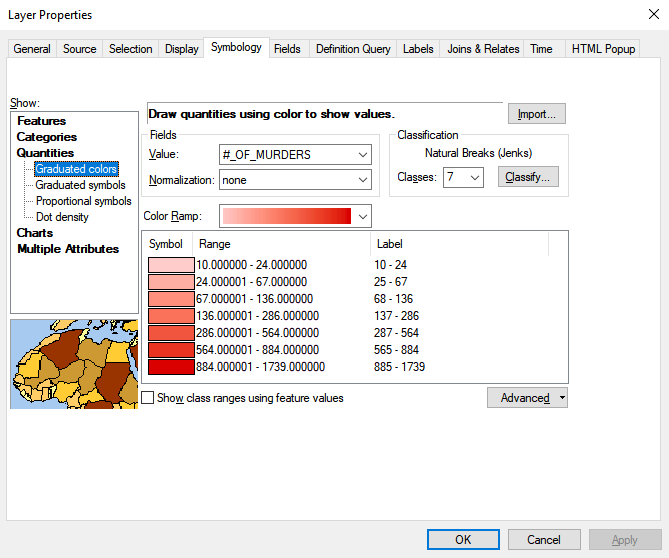
We first downloaded the base map of the United States, Canada and Mexico and opened them on ArcMap 10.7. With the data we have collected and calculated, we used the “Add Data” tool to add the data into the Table of Contents. After doing that, we used the “Joins and Relates” tool to combine the data onto the base map. Also, for maps of the United States, we used USA_Contiguous_Lambert_Conformal_Conic for the contiguous United States and Canada_Lambert_Conformal_Conic because it maintains direction, angles, and shapes and reduces distortion on the map (ArcMap). After joining the data, we went to properties -> symbology -> quantities -> graduated colours and divided them into seven classes using natural breaks. With this, it was easy to observe and analyze the differences between the number of murders according to the colour scheme (higher the number of murders, the darker the colour gets). As for the percentage of murders involving firearms, we used the graduated symbols to observe the differences between the percentage according to the size of the circle (higher the percentage of murders involving firearms, the bigger the circle becomes). Last but not least, we used the unique values for the correlation part, using the value of 1 to indicate included and 0 to indicate null/not included.
Class. The Number of murders in Contiguous United States 2018
Step 6: Analysis
With the maps created using these data, we compared and correlated the states and provinces that have a close relationship with one another. In our research, we chose states and provinces that have the closest economies to one another (Maine and Quebec for example). We then created two group layers in the Table of Contents (one for the state in the United States and the other one for the province in Canada) to compare and correlate the two geographic areas and to provide a deeper analysis. Although we debated whether to use the same projection, scale bar, scale number, values of the number of murders, etc, because that would make it harder for the users to observe, we decided to make it easier for the reader to understand the data that is being presented by neglecting these cartographic conventions.
