This first set of results were created by examining the distribution of each type of crime on a global level through the production of kernel density maps. Before the maps were produced we used the collect event tool to ensure any overlapping points were taken into account. These maps can be seen below:

Kernel Density for Narcotics
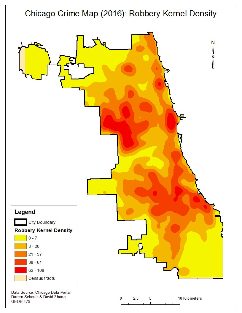
Kernel Density for Robbery

Kernel Density for Criminal Damage

Kernel Density for Homicide
There are some clearly identifiable hotspots for each crime type displayed in the kernel density maps. It should be noted that the scales are drastically different from one map to the next. For example it may seem like there is a greater number of homicides compared to narcotics, however this is simply because the cases of narcotics are far more concentrated to one particular area.
The next step was to examine the same four types of crime comparing fuzzy mode and nearest neighbour analysis. As part of the nearest neighbour analysis we wanted to compare the index of each crime type and the resulting graph is displayed below.

Graph of Nearest Neighbour Analysis

Narcotics Fuzzy vs NNA

Robbery Fuzzy vs NNA
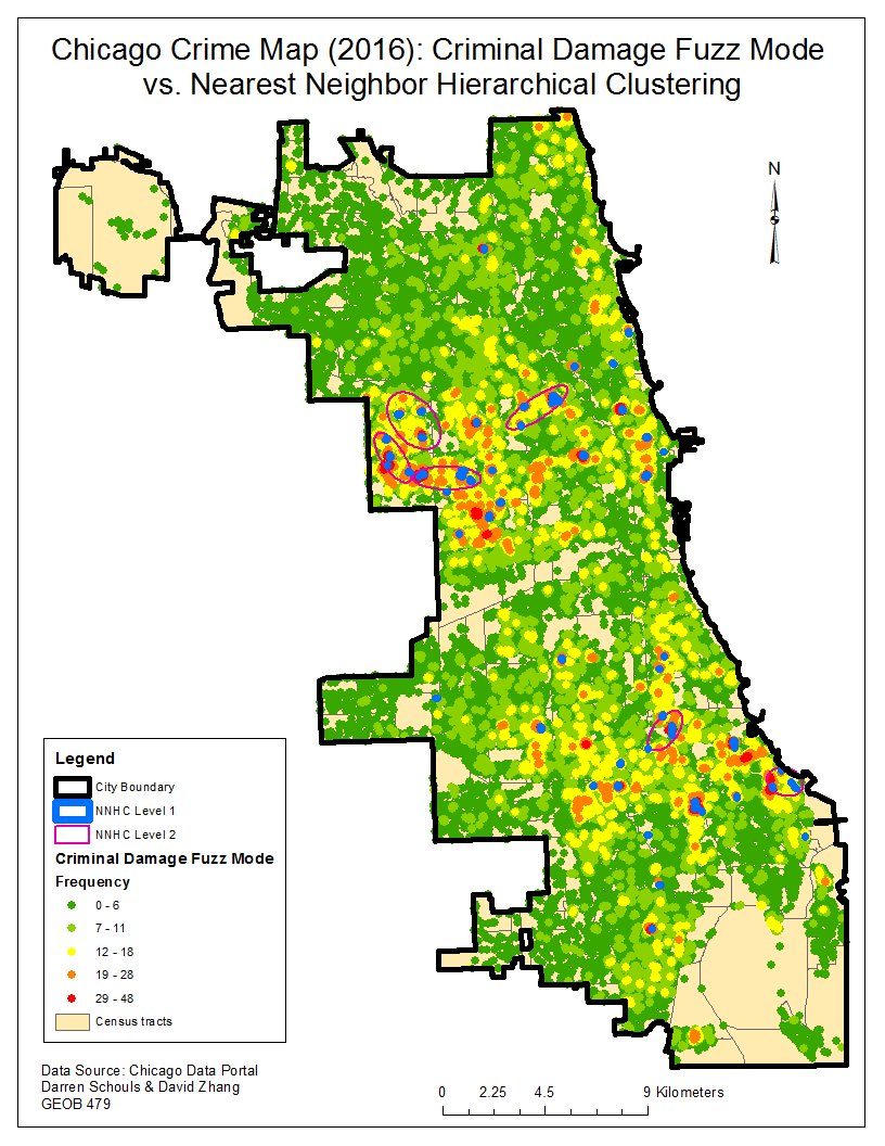
Criminal Damage Fuzzy vs NNA

Homicide Fuzzy vs NNA
The nearest neighbour graph supports one of the findings from the kernel density maps, that the narcotic offenses are far more spatially clustered than any of the other three crime types. On the contrary, the fairly elevated indexes indicate that there is not an extremely high amount of clustering throughout the city. This could be caused by the high number of offenses that occur all across Chicago, rather than being confined to a certain neighbourhood. However, there is one neighbourhood that was identified as containing clusters of crime for all four types of offenses. In the Northwest portion of the city, all four fuzzy membership and nearest neighbour analyses found a significant aggregation of crime. This is important to note because the train stations or sport stadiums in the area may not be the reason behind the clusters of crime, it may be the neighbourhood itself. With the fuzzy mode and nearest neighbour results obtained we had more context for the analysis of train stations and sport stadiums as crime attractors in Chicago.
We began by analyzing all the train stations and determining the number of offenses that were committed within each distance interval of the multi-ringed buffer. The calculations from our procedure indicated a trend of increasing criminal density as the distance from a train station decreased. For all four types of crime, the density was highest within 100 meters of the stations, and even within 500 meters of a station the density was higher than the average across the city. These numbers would suggest that train stations are in fact crime attractors in Chicago, and the maps below support this conclusion.
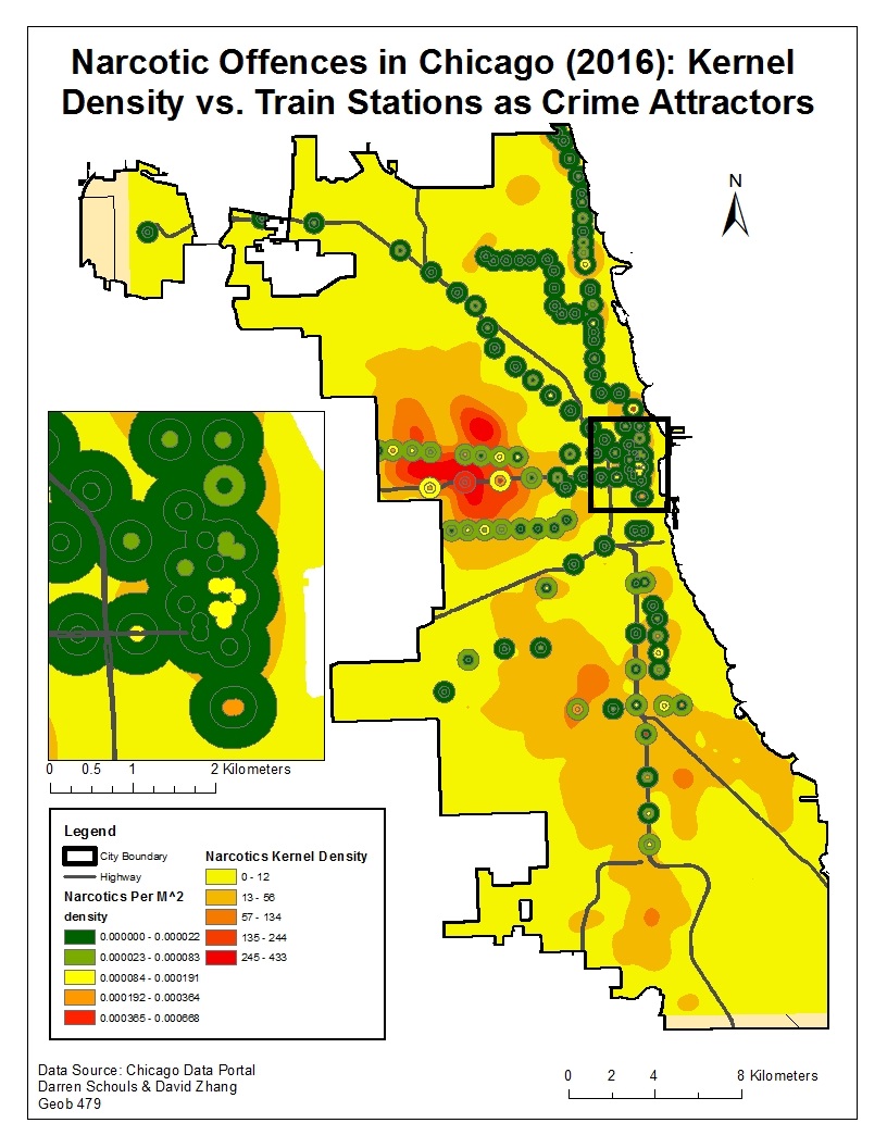
Narcotics – Train Stations vs Kernel Density

Robbery – Train Stations vs Kernel Density
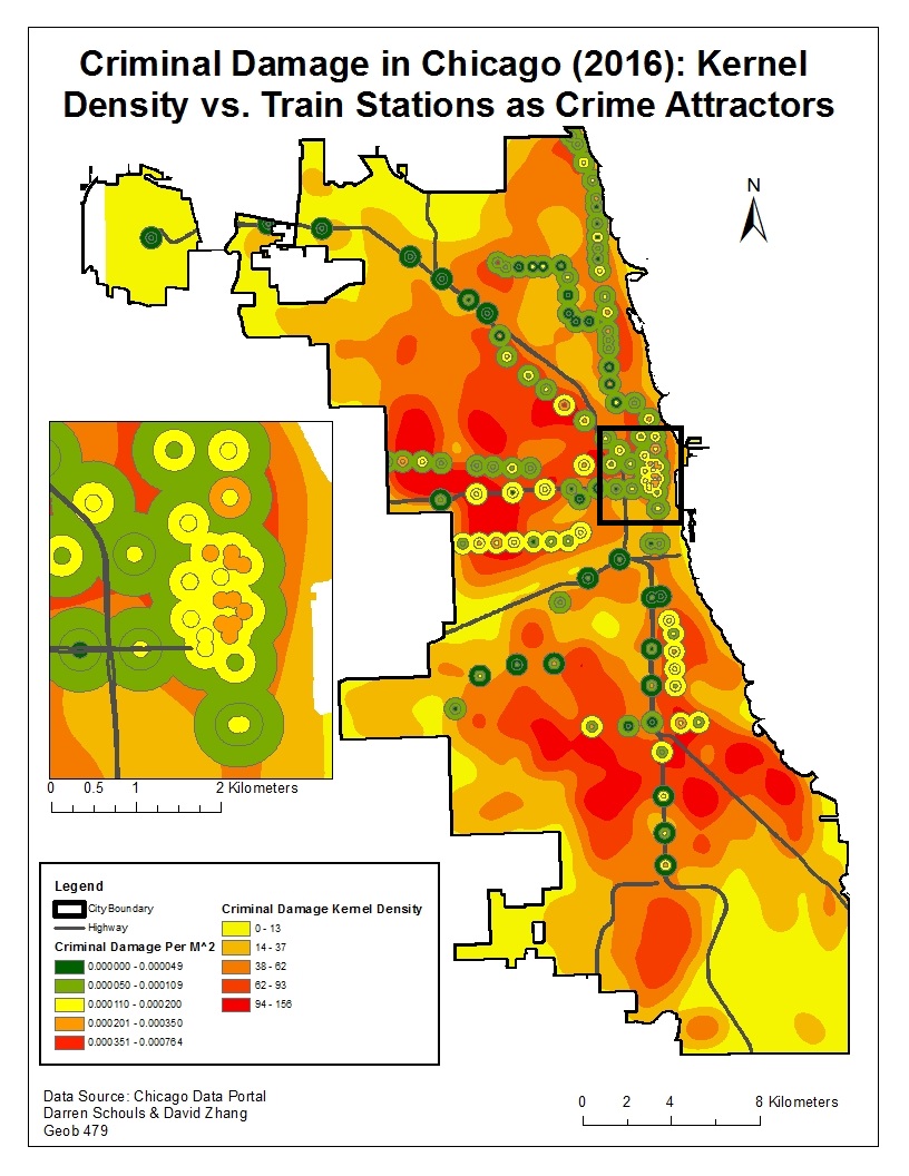
Criminal Damage – Train Stations vs Kernel Density

Homicide – Train Stations vs Kernel Density
In each map several of the stations display a higher concentration of crime within the 100 meter buffer. We decided to include an inset map of the large clustering of stations within downtown Chicago. In each case, with the exception of homicide, there is a greater number of offenses per square meter within 100 meters of the stations compared to the 250 meter and 500 meter rings. It should also be noted that the stations seem to attract a greater concentration of robbery and criminal damage compared to narcotics and homicide. Once again this finding was corroborated by the results of the calculations in our procedure, as robbery and criminal damage had the highest rate of offenses per square meter inside of the 100 meter buffer. Finally, the kernel density was included in these maps to provide a visual of the locations of the crime hotspots on a city wide level. This is important because any stations located within the hotspots could be interpreted as crime attractors yet the neighbourhood is the cause of this apparent attraction. In particular, the neighbourhood in the Northwest region of the city that was identified in the fuzzy mode and nearest neighbour analyses should be scrutinized. The stations located in this region may still act as crime attractors, however there are other factors outside of this analysis that are causing the hotspots.
The results of our analysis focusing on sport stadiums as crime attractors produced very different looking maps compared to those examining the train stations. The calculations from our procedure did not produce a pattern that would suggest sport stadiums are crime attractors in Chicago, and the maps supported this finding.

Narcotics – Sport Stadiums vs Kernel Density

Robbery – Sport Stadiums vs Kernel Density

Criminal Damage – Sport Stadiums vs Kernel Density

Homicide – Sport Stadiums vs Kernel Density
When examining the four different maps there is no visible trend from one type of crime to the next. In fact, many of the stadiums experience a higher density of offenses per meter squared in the outer most ring of the buffer, rather than the one closest to the venue. There is a possible explanation for this lack of evidence regarding sport stadiums as crime attractors and it is discussed further in the limitations. The kernel density, fuzzy membership and nearest neighbour analyses did not provide any further insight because, for the most part, the sport stadiums are not located within hotspots that were identified in these previous steps. Overall, the reduced concentration of criminal offenses in close proximity of sport stadiums indicates they are not crime attractors in Chicago.