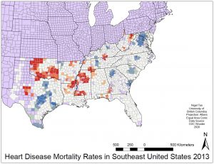
The map displays hot and cold spots for heart disease mortalities in the year 2013 in the South East United States. The map is divided up and coloured by county, with the vast majority of the area being white, or not a concentration spot. The red shades show areas that are at least 90% likely to be an above average concentration of heart disease fatalities, with the deepest red colour indicating a 99% hotspot confidence level. The greatest number of hot spots appear to occur in the states of Oklahoma and Missouri, while the greatest number of cold spots are in Texas, Maryland, and Virginia. Florida and South Carolina seem to be relatively clear of hot and cold spots, with no 99% confidence counties appearing at all. The overall pattern shown tends somewhat to concentrate hot spots closer to the centre of the country, with cold spots occurring slightly more frequently to the extremities. Hot and cold spots on the map also exhibit certain degrees of clustering, where deeper red or blue counties tend to occur together, with lighter shades of each respective colour appearing around them. This may be a case of spatial autocorrelation, where presence of a phenomenon influences occurrence in adjacent area parcels. It is also possible that an unknown external factor plays a part in encouraging or discoursing heart disease in the hot and cold spot areas. Data obtained from this map is limited in scope as it displays only information for select states in the South. Furthermore, data shown on this particular map only spans a single year, 2013. With regards to the animation, turning it on reveals that over the years hot spots have remained fairly constant. Although individual counties may vary in shade year to year, overall map appearance is consistent.