Here’s my project looking at the impact of dams on salmon species for Vancouver Island. Click the map to visit my web page.
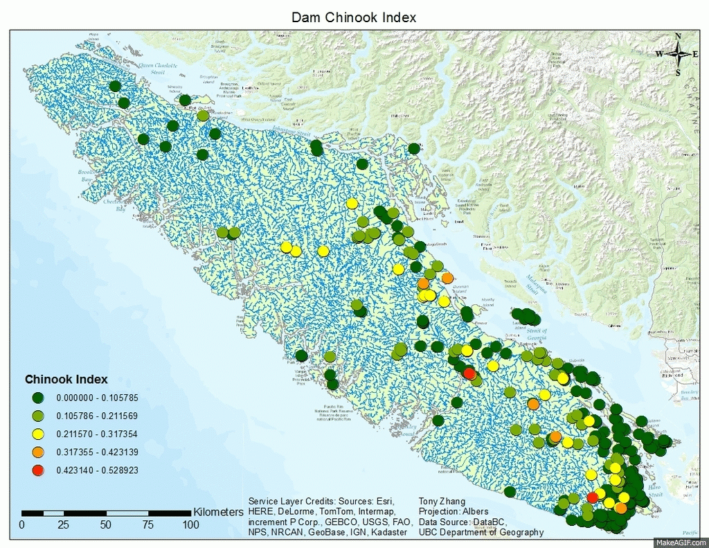
Here’s my project looking at the impact of dams on salmon species for Vancouver Island. Click the map to visit my web page.
This week we had our third and last journal article presentation, focused on crime analysis. The article I chose was called Comparing Police and Residents’ Perceptions of Crime in a Phoenix Neighbourhood Using Mental Maps in GIS, (link here). The objective of this article was to use mental maps created through resident and police interviews to see how perceptions differ between police and residents, and also to compare their perceptions to actual crime. The mental maps created through interview for both police and residents were digitized and aggregated into ArcGIS for analysis. The researchers found that police and residents had very different perceptions of crime, with residents emphasizing areas of safety while police emphasizing areas of danger. Also, perceptions of neither groups showed good correlation to actual crime. The researchers believed this is because residents tend to feel safer in their own neighbourhoods regardless of actual crime, while police are heavily influenced by historical events, and even if an area no longer have frequent crimes police will still feel danger in that area. Overall this article did a good job improving upon previous studies of a similar nature, but I felt that the surveying methods were too different between residents and police for comparison, and the presentation of maps could have been better.
One other article I liked was the on the relations between parks and housing values. The researchers found that parks can lower the housing price of surrounding areas. I thought this was surprising because I always thought of parks as a point of interest like schools or shopping centres which home buys often look for. But it turns out parks can also be hotspots for crime which in turn makes a neighbourhood less desirable.
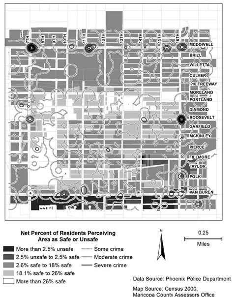
Maps could have been better
This week was just time to work on our projects, but I was away on a school choir trip to New York. Here’s a picture taken from the stage of the famous Carnegie Hall.

On the stage of Carnegie Hall, NY
This week we talked about GIS in relation to crime. This is similar to health geography in that GIS can be used to both map trends and to mitigate/prevent future problems. There are several major criminology theories. The first one is called Routine Activity Theory which is based on the activity patterns of both criminals and victims. For example criminals will more likely commit crimes car thefts at malls than at parks. Another theory is called Rational Choice Theory, which describes that criminals will pick time and place where they are likely to maximize profit and minimize being caught. A third is called Criminal Pattern Theory, which says that crimes will be related to the daily patterns of criminals. These three theories are all part of Environmental Criminology, which focuses on both the spatial distribution of offenders and offences. One way of minimizing crime is through Geographic Profiling, which is to locate and focus on areas of highest crime likelihood. Criminals are also divided into commuters (commit crimes far from home) and marauders (commit crimes around home), and different crimes will likely have different proportions of commuters and marauders. All of these theories and patterns, especially spatial patterns, are used in GIS to help with crime analysis.
We also finished Lab 4 this week, which uses the CrimeStat program for crime analysis. We looked mainly at spatial trends but explored temporal trends too for Ottawa crime data. CrimeStat is able to calculate different kinds of indices relating to distance such as nearest neighbour clustering and Moran’s I correlograms. Moran’s I and Nearest Neighbour analysis is similar, but differs in that Moran’s I looks at the predictability of crime among various regions (Dissemination Areas in our case) while Nearest Neighbour looks at spatial clustering between actual points. Despite small differences, both Moran’s I and Nearest Neighbour appears to show decreased correlation the farther it is from the chosen point/area.
Various methods of identifying crime hotspots were examined. One method we used was Fuzzy Mode, which produces frequency points by analysing crime from its surroundings. One advantage of Fuzzy mode is that it can easily identify hotspots without creating exact areas or points since it samples nearby points. Another method was Nearest Neighbour Hierarchical Spatial Clustering. This method is split between Standard and Risk-Adjusted Nearest Neighbour Hierarchical Spatial Clustering, both of which tries to create ellipses that represent clusters of crime. In theory both methods should be able to create multiple orders, with higher orders being larger ellipses that groups lower orders, but only the Risk-Adjusted version created higher order clusters in our lab. This might be because Risk-Adjusted Nearest Neighbour is normalized rate, while Standard Nearest Neighbour maps absolute crime volume. Another hotspot analysis method was Kernel Density Estimates, which is split between Single surface and Double surface. Single Surface Kernel Density maps absolute crime volume like Fuzzy and Standard Nearest Neighbour while Double Surface Kernel Density maps normalized crime rate like Risk-Adjusted Nearest Neighbour.
Lastly we examined the Knox Index in relation to car theft. This tool looks at both temporal and spatial relations by examining at whether the thefts are close or not close in space, and whether thefts are close or not close in time.
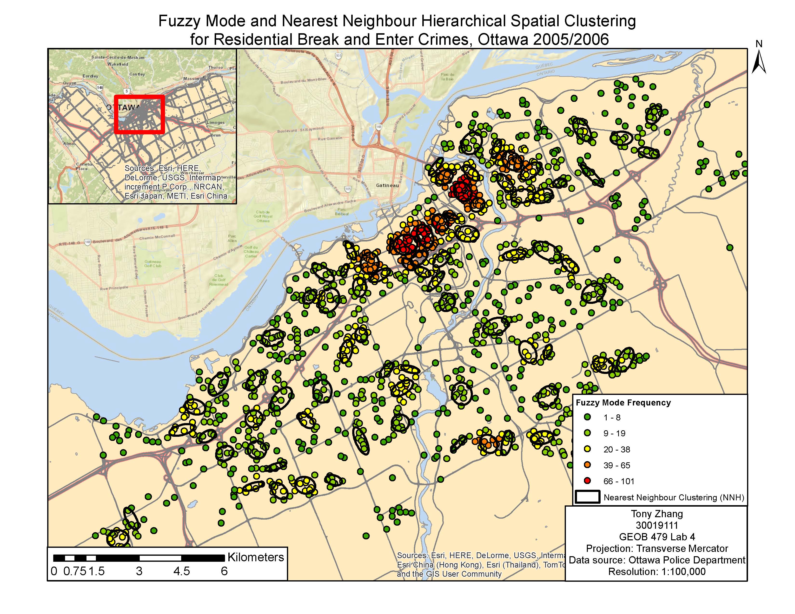
Fuzzy Mode Clustering vs Nearest Neighbour Hierarchical Spatial Clustering
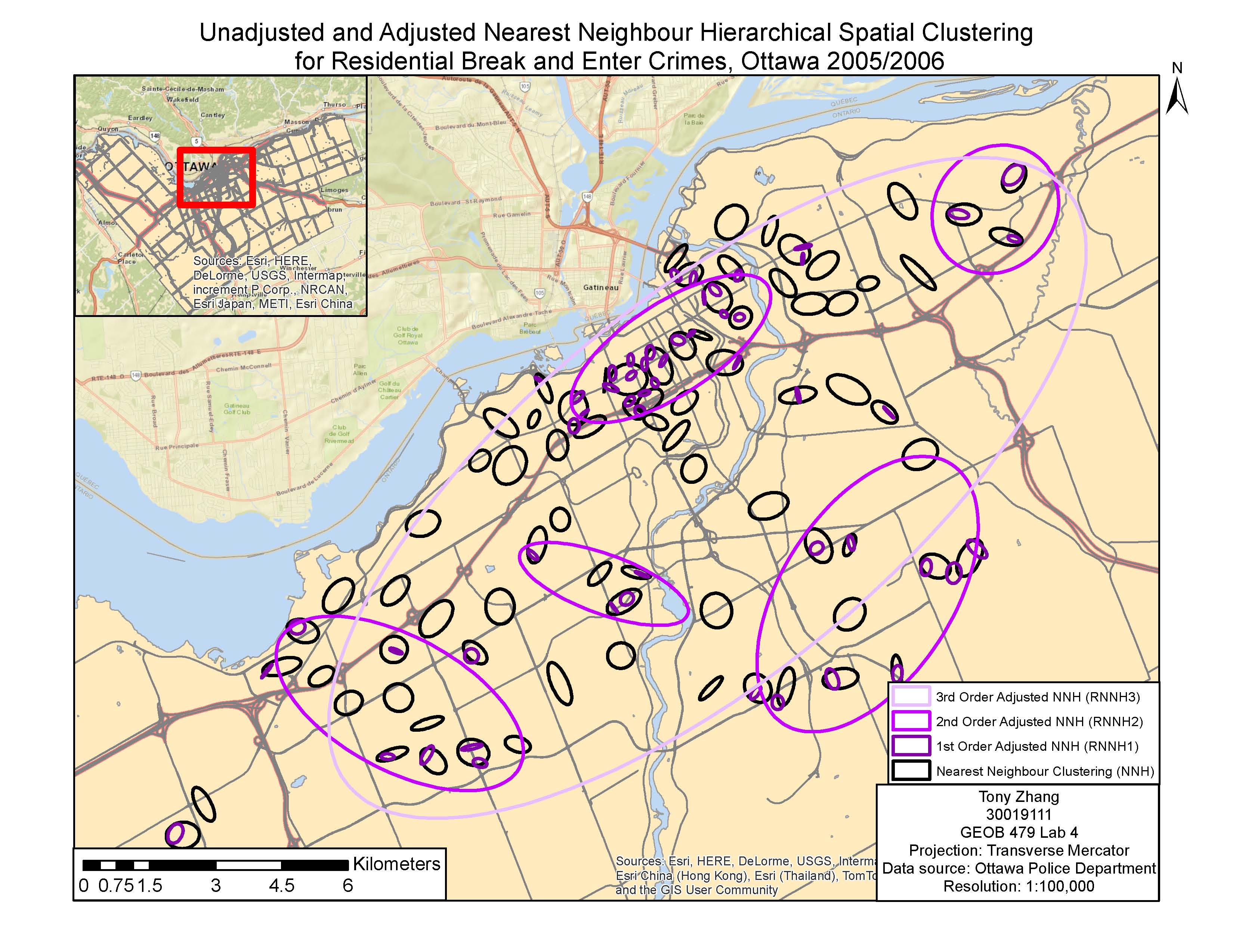
Unadjusted and Adjusted Nearest Neighbour Hierarchical Spatial Clustering
This week we had presentations on journal articles related to health geography. The article I chose is called Mapping Risk of Plague in Qinghai-Tibetan Plateau, China (link). I chose to look at an article related to the Plague because it’s interesting how such a devastating disease from the past is nearly forgotten by most people, but it is still occurring in many places and can be deadly if people have no immediate access to antibiotics. The objective of the article was to map risk of Plague by examining the distribution of its host, the marmots.
The methods are not over-complicated as seen below:
1) Ecological Niche Modelling
– Use infected marmot data and environmental variables to create Plague probability map
– Use Maxent program to train 75% of presence data, and test accuracy with remaining 25%
2) Human Risk Assessment
– Calculate optimal probability cut-off point, pixels with values higher than cut-off point predicted to have Plague
– Overlay with human distribution data to determine at-risk areas
Map:
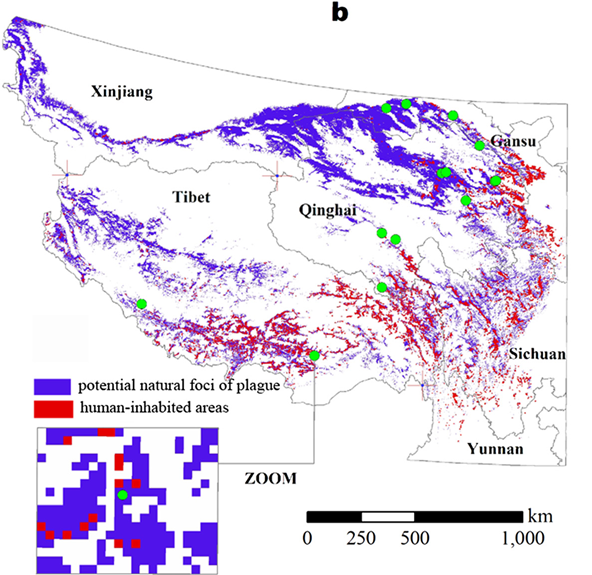
Overall I felt this was a pretty good article, with statistically significant results and through explanations. The authors also discussed a lot of limitations to the method. One thing they didn’t address that I felt was important was the difference between enzootic infections (longer periods of low infection rates) and epizootic infections (rare and short periods with very high infection rates).
There were many interesting articles being presented with various kinds of objectives. For example one article looking at relation between travelling time to health centres and heights in Rwanda showed that the closer homes are to health centres, the taller people are. This relates to the topic of inequality that we talked about in previous classes, and in this case people with better access are likely to be healthier (with height as indicator).
This week we talked about the uses of GIS in health geography. There are four major areas where GIS is used, which reflect the major ideas of health geography that we talked about last week. The four areas of application are spatial epidemiology, environmental hazards, modelling health services, and identifying health inequalities. The first major application, spatial epidemiology, is using GIS to understand spatial variations in health geography. Statistical measures are useful in learning about trends and mapping variations, but everything still depends on having good, up-to-date data which is usually not the case. The second application is environmental hazards, which can both map hazards and to prevent/mitigate future problems. The third and fourth applications, modelling health services and identifying health inequalities, are interrelated. Because mapping access to health services can usually expose inequality between different groups of people.
We also focused on the topic of epidemiology, which is “the study of the distribution and determinants of health and disease-related states in populations, and the application of this study to control health problems (lecture notes).” There is also a difference between health and disease. Health is more general and describes overall well-being, while disease requires a definition of some sort of debilitation. There are different ways of quantifying disease such new cases versus total cases, and the best way will usually depend on what the objective is. Finally, there are a variety of methods of displaying data, including smoothing which can help reduce irregularities and better visualize patterns, and standardization which can help make different areas more comparable.
This week we discussed Health Geography. Geography is very important in determining many human factors like health. Spatial analysis can help look at health trends such as obesity, disease, mental wellbeing and many others. Initially the study of health in relation to geography was called Medical Geography, which was looking at health through a geographical point of view. This point of view was followed by Health Geography, which is broader and gives more importance on the social and environmental points of view instead of the medical-centric Medical Geography.
There are 5 core ideas within Health Geography. The first idea is spatial patterning of diseases and health, which is finding health trends in relation to space, such as the famous John Snow’s cholera map. The second idea is spatial patterning of service provision, which relates health providers to medical needs. This is useful for things like creating new hospitals/clinics. The third idea is humanist approaches to Medical Geography, which relates health to social perspectives. The fourth idea is structuralist/materialist/critical approaches to Medical Geography, which links health to social constructs and equality. This is an interesting topic because health care availability usually tends to be more beneficial to the rich. The last idea is cultural approaches to Medical Geography, which highlights the cultural or local differences that might not be noticed at a broader regional/national level.
We only had one day of class this week because of Family Day, and on Wednesday we brainstormed ideas about our final projects. In a previous course with Professor Marwan Hassan we touched on the topic of dams and dam removal. I thought of doing something related to looking at changes before and after dam removal and comparing the differences. But the main limitations to any project would be data availability.