Labs
Lab 1 – Spatial Statistics Using Model Builder
In the first lab, worked on building models in ArcMap in order to run analysis on the data that we obtained from the Center for Disease control and Prevention. The map produced looks at heart disease as a factor of mortality in the southern United States in 2016 (Figure 1). This specific year was chosen because it has the most recent data that was acquired. The map results show that areas such as Kentucky, Arkansas, West Virginia, Virginia, Tennessee, Texas and Oklahoma, there are hot spots. By in large, there is a trend that more inland areas are heavily affected by heart disease. Moreover, heart disease mortality data presents itself in a similar manner as crime data. That is counties with high heart disease mortality rates seem to cluster together. The same is true for counties with low heart disease mortality rates. This means that there is an association geographically with cases of life-threatening heart diseases. This idea reflects back on Tobler’s First Law, that near things are more related to each other than they are to farther things. So, one could conclude that there is a factor that correlates location with health data. This could be attributed to various factors ranging from different healthcare policies between states, socioeconomic standing and so forth. Clusters of blue also tend to occur around major cities such as Austin, Houston, Atlanta, Washington, New Orleans and Baltimore. This could be because it is easier to get access to health care in more developed, metropolitan areas rather than in rural areas. In addition, these areas that are mapped with a 99% confidence interval may be because they can afford to have research done in the locations. Furthermore, since the United States has a privatized healthcare system, people who can afford to live in the city, can afford better healthcare which would lead to lower mortality rates due to heart disease. Whereas for people who have lower income, or poorer facilities in rural communities, they can be more susceptible to fatal heart diseases. It is also interesting to see note that States such as South Carolina, Florida and Mississippi are predominantly neutral. Meaning that either there is not enough data collected in these areas to fit within the confidence interval of the study, or that the data collected shows that it does not lean in one direction or another in terms of mortality caused by heart disease.
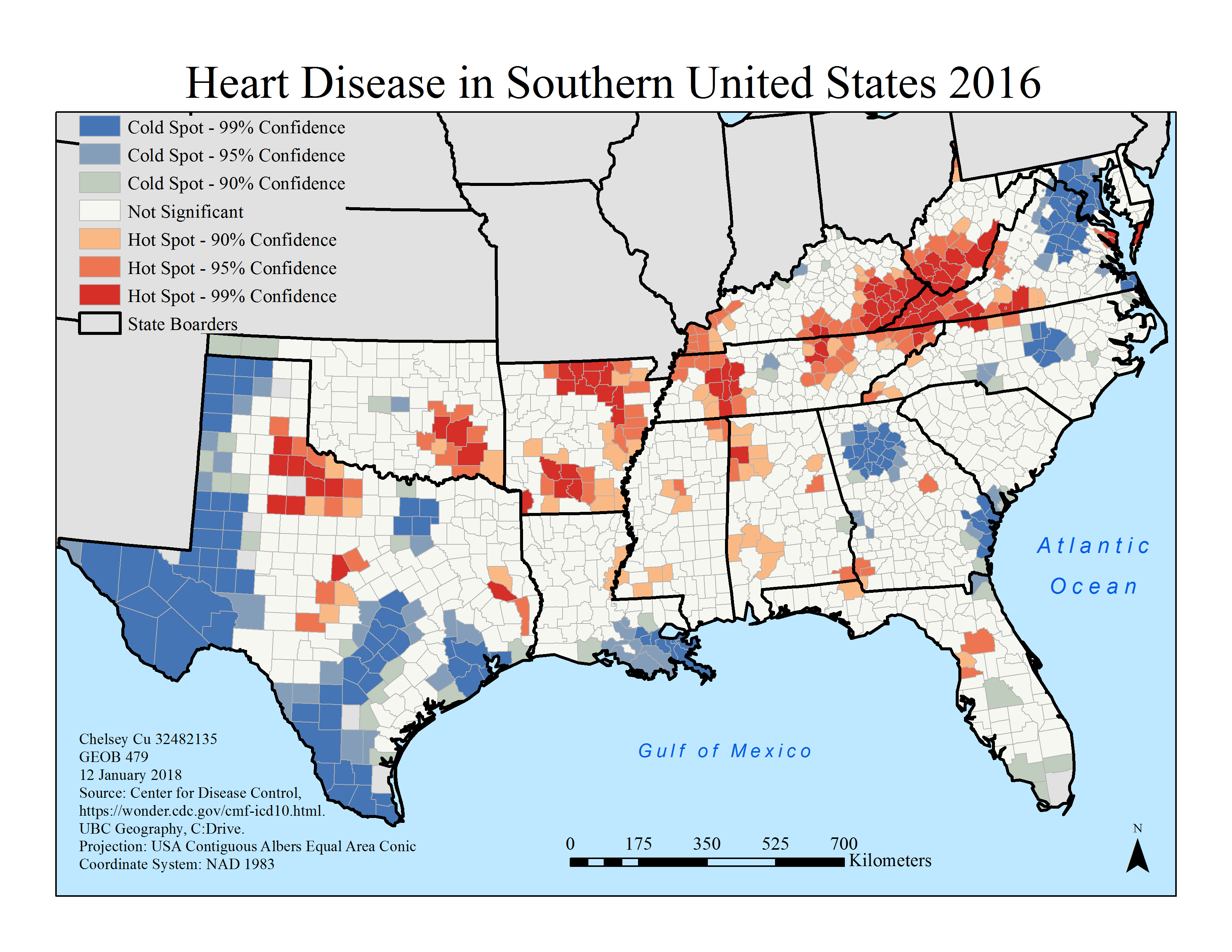
Figure 1. Map of the 2016 heart disease occurrence hot spot analysis, utilizing the CDC database.
Lab 2 – Exploring Fragstats
In this lab, we observed landscape changes in Edmonton, Alberta between 1966 and 1976 with data taken from the Canada Land Use Monitoring Program (CLUMP). In order to do this, we used a software called Fragstats, which does complex analysis on .TIF files. A series of landscape-level and class level metrics were separately created for each year.
The results showed that there was a generally expanding trend of urban areas between 1996 to 1976. It is important to note which areas have been deemed the most appropriate for expansion. Looking at the map (Figure 2), the initial impression that one notices is that the majority of urban expansion that occurred in the decade was converted from unimproved pasture and range land as well as non-productive woodland. This this means that areas that were not productive in 1966 were repurposed and improved by 1976. While areas that have are useful to the inhabitants of the area such as improved pastures and crops, remained fairly unchanged.
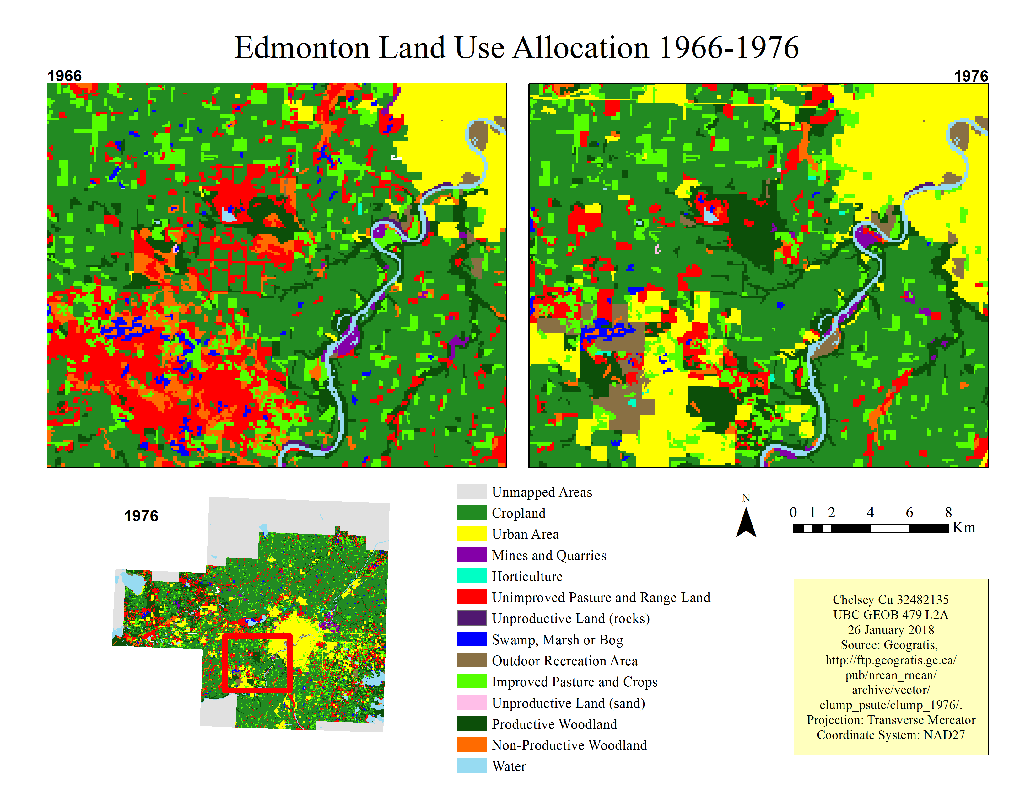
Figure 2. Edmonton land use allocation 1966-1976.
To view the full lab write up, click here.
Lab 3 – Geographically Weighted Regression
Geographically-Weighted Regression (GWR) is an extremely useful tool for spatial analysis. locations are assumed to be where the data is collected from, allowing a separate estimate of the parameters to be mapped. With GWR taking into account local geography, it ensures that observation points that are near to each other have a greater effect (weight) in the estimation than points that are further away. Weights are for a computation of a weighing scheme (also known as a kernel) which have bandwidths that grow larger as the GWR model approaches the Ordinary Least Squares (OLS) model.
GWR analysis is a useful analysis tool that can be used for a variety of different purposes. It can be used to better understand phenomenon through looking at how changes in one variable can cause changes in another. Moreover, it can create a consistent and accurate model which is useful in predicting phenomenon. However, it is important to remember that with GWR, all independent variables that affect the dependent variable must be taken into account, otherwise the model produced in the analysis will be an inaccurate representation. The accuracy of a GWR model can be determined by looking at the residuals, like in an OLS model.
In this Lab, we looked at a case study of Vancouver children’s social scores. We selected the best variables for this study by running an analysis and using the ones with the highest R-squared values. Then an Ordinary Least Squares analysis was preformed to determine the level of correlation in the absence of spatial information (see Figure 3). Finally, a Geographically Weighted Regression analysis was done to determine the spatial correlation between children’s social skills and the given parameters (see Figure 4).
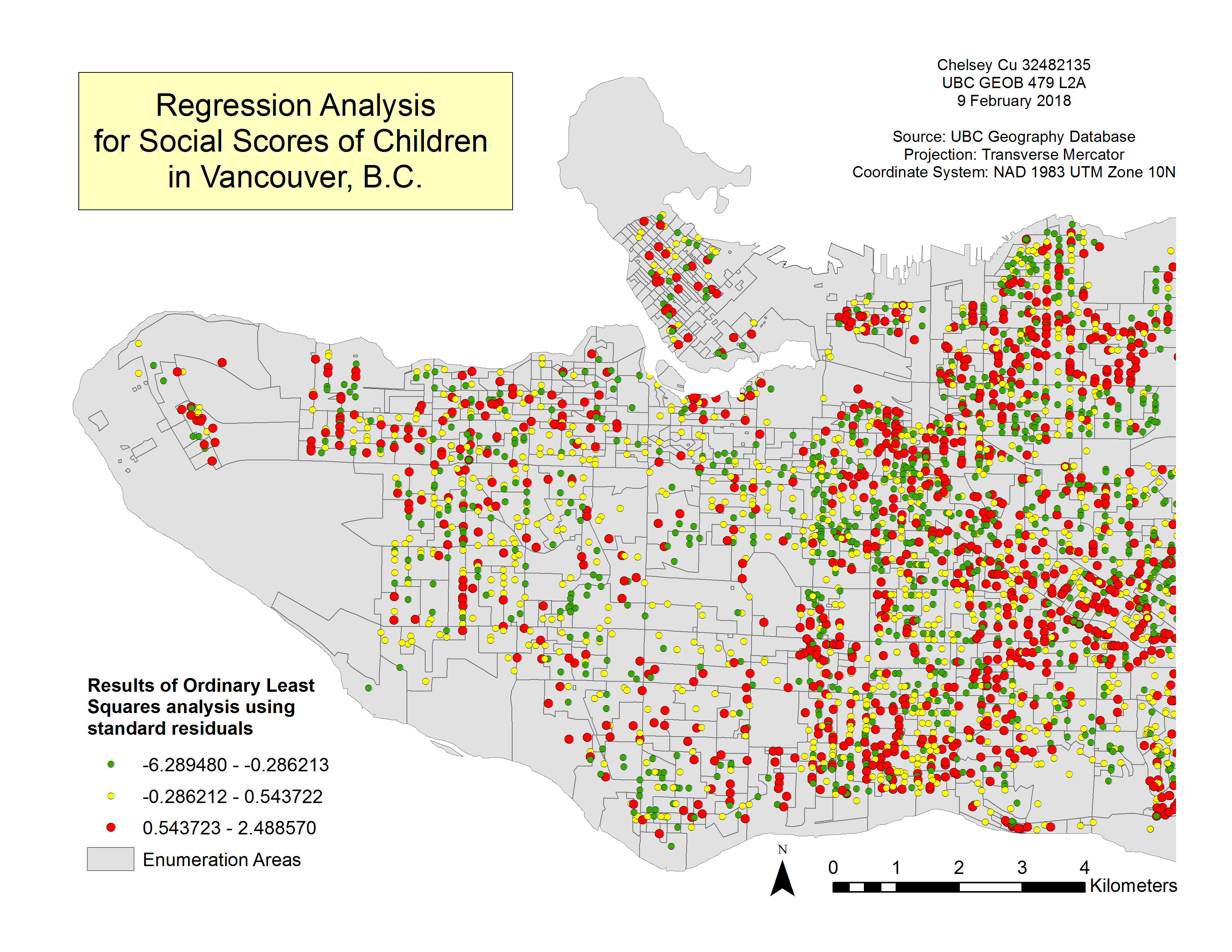
Figure 3. Regression Analysis for Social Scores of Children in Vancouver, BC. This map shows the standard residuals of the OLS analysis results. The adjusted R2 value is 0.374.
The figure shows that mostly there is a large discrepancy between OLS and GWR results in the east side of Vancouver, where the majority of the red points are. On the west side of the map, there is less discrepancy, showing that the two models fit well with one another in this particular instance.
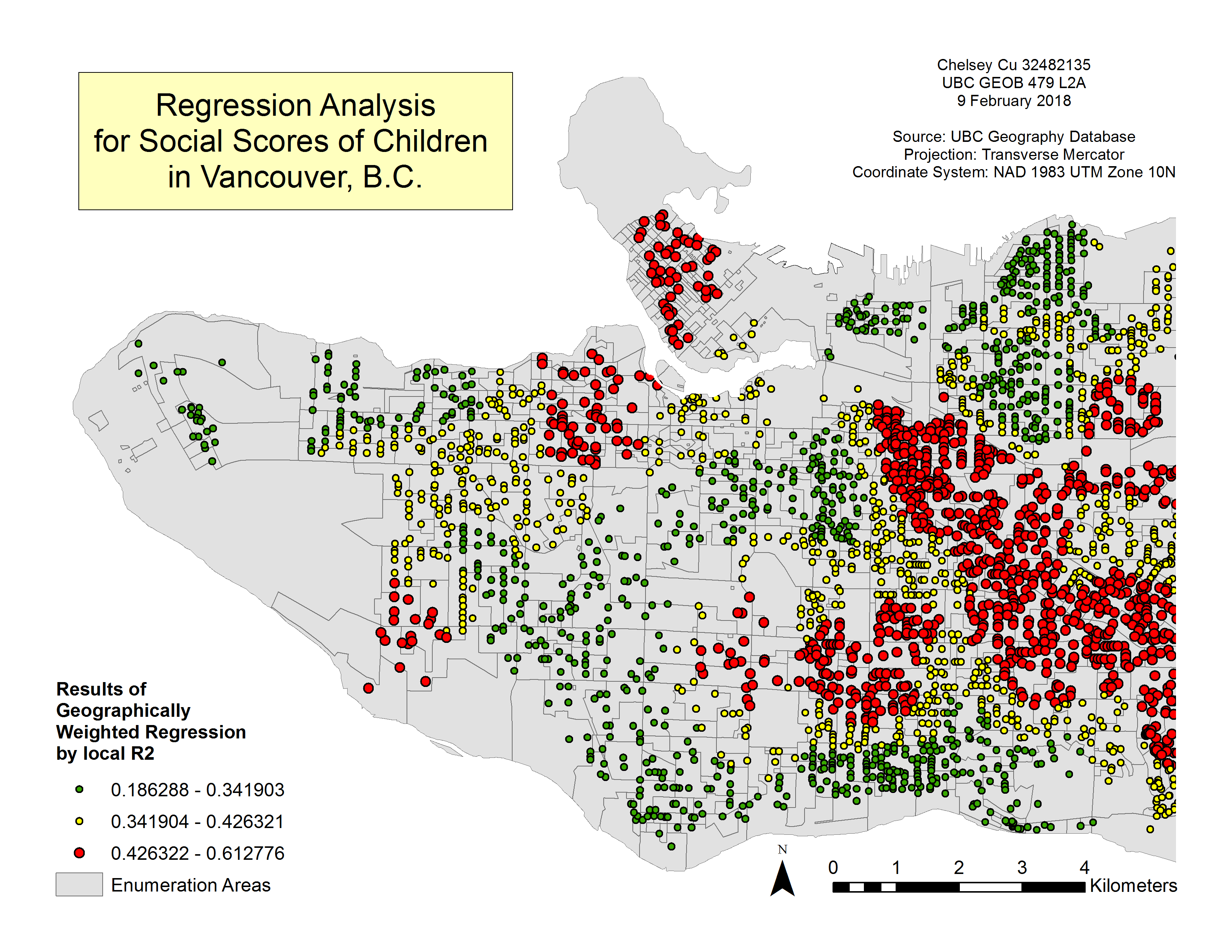
Figure 4. The Difference in Regression Analysis. This was computed by taking the absolute value of the difference between the estimated/predicted values of the GWR and OLS that was calculated for each child.
In order to look further into the spatial contexts and the given parameters, a grouping analysis was performed. This took natural clusters in the data and clumped them together to form 4 groups. Through grouping similar neighbourhood characteristics, the variation in social skills in terms of another factor can be more easily pinpointed. Figure 5 shows the relationship between 5 different factors and their impacts on the social scores of children. Here, one can see that the east side of Vancouver is predominantly Group 2 while the downtown area is dominated by Group 3 and the west side is a mixture of Group 1 and 3. For the most part, children living in the red areas (Group 2) experience larger negative impacts to social scores with the different variables (income, gender, and language scores).
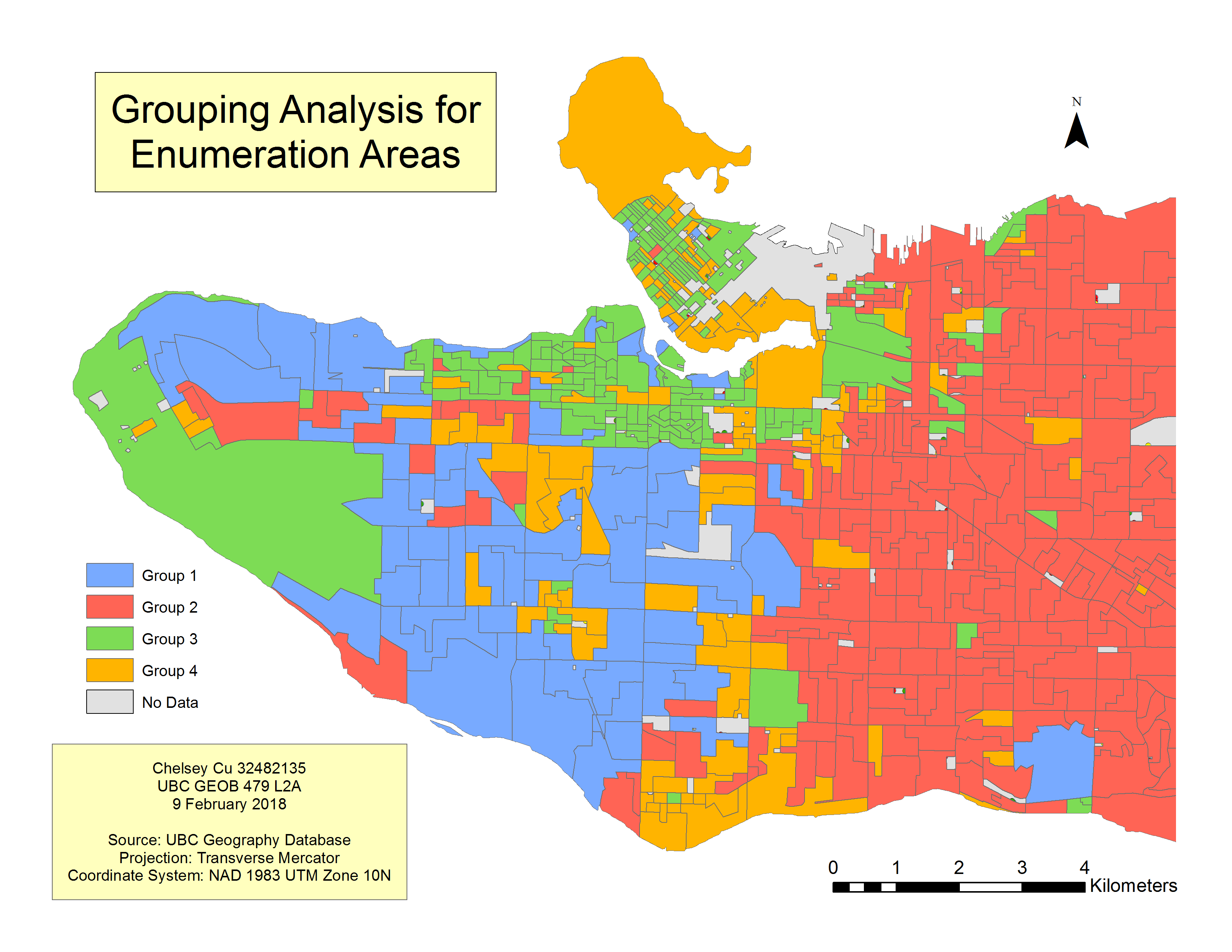
Figure 5. Grouping Analysis for Enumeration Areas. This map corresponds with the categories laid out in Table 1. The analysis shows which neighbourhoods have similar characteristics in terms of: income, family size, childcare, single parents, and immigrants. Areas that are similar in variables are grouped together.
The following map indicates that there is a connection between income and a child’s social skills (see Figure 6). For this parameter, every increase in $1000 will positively or negatively affect children’s social scores by either decreasing their score by 2 points (red areas) or increasing their score by 2 points (green areas). Income has a lower impact on a child’s social skills in the east side of Vancouver as opposed to the west side of Vancouver. This could be because with higher income, children can afford additional opportunities to socialize, such as extra-curricular activities. In opposition, children living in lower income areas are not afforded the same opportunities due to limits in factors such as family funds or parental time constraints. In certain areas, like the east side of Vancouver, where income varies greatly among neighbours, social scores decrease substantially with change in income.
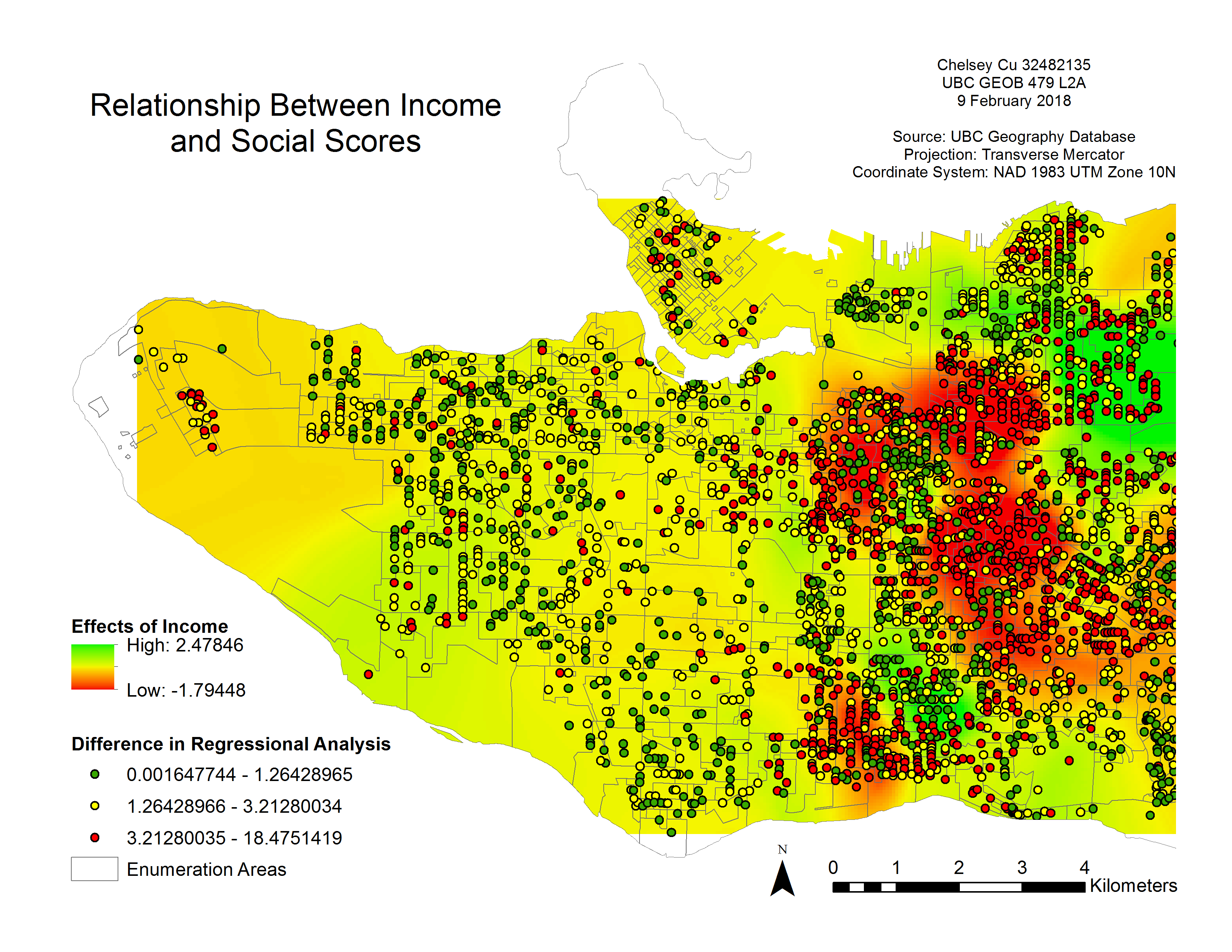
Figure 6. Relationship between Income and Social Scores with the difference in regression analysis. For every thousand dollars of increase in income, there is the above represented change in social scores.
The Local R2 values from the GWR analysis show that the results around the Downtown, Kitsilano and East Vancouver region area are the most accurate (see Figure 7). This is because R2 is the proportion of variation in the dependent variable (social skills) that is explained by the model. It is measured from 0 to 1 with a number closer to one showing the higher accuracy in data. In the case of Figure 6, the accurate points are shown in red. With green being points with higher uncertainty.
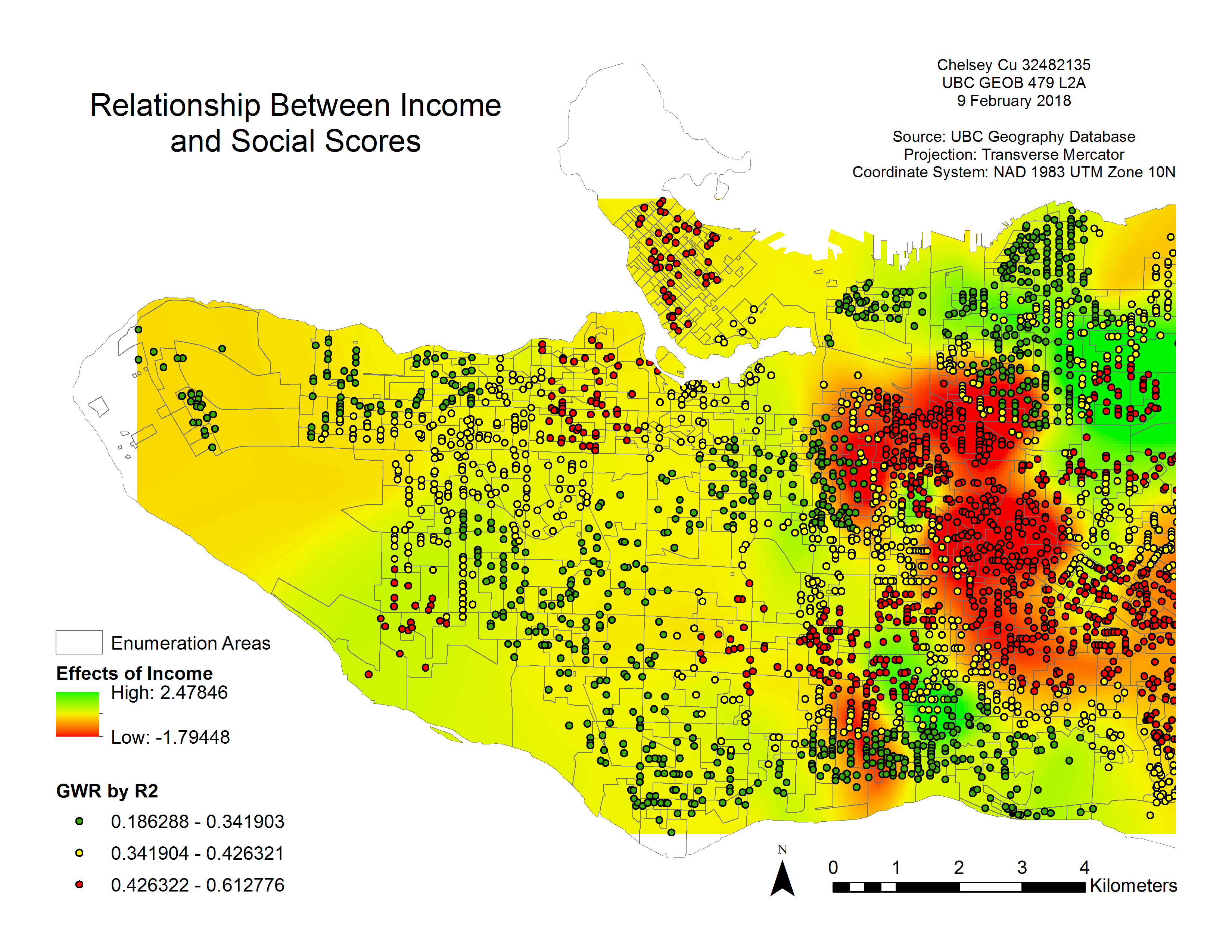
Figure 7. Relationship between Income and Social Scores with the GWR by local R2.
To view the full lab write up, click here.
Lab 4 – Crimestats
Through the use of several different types of spatial distribution analysis, this exercise evaluated the distribution pattern of crimes in the Ottawa Nepean area. The analysis of crime, such as what is seen in the attached report, can be a crucial asset to aiding law enforcement personnel determine strategies and policies for improving the city. Through different statistical analysis techniques, such as nearest neighbor index, Moran’s Index, hot spot analysis, Knox Index, and Kernel density estimation, varying patterns can are revealed. The results of this lab show clusters which can be used to determine policing strategies and policies surrounding areas that should be more closely monitored.
For this lab we focused on vehicle theft and commercial and residential breaking and entering. Using the CrimeStats software, we were able to generate cartographic representations of crime hot spots. From there, risk-adjusted clusters were determined based on population over the age of 15 living in the area (see Figure 8). The first order clusters, are determined based on number of reported crimes and distance. The difference between nearest neighbour clustering and first order clusters is that, by taking into account population densities, the latter results show the areas that are pose the highest risks rather than merely the highest volume of crimes. The second order clusters are formed through identifying clusters of groups of criminal activities based around the centers of the first order clusters. Likewise, the third order clusters are determined in a similar grouping fashion of criminal activities, but representing a convergence of all the crime sites. The latter order is the final cluster possible for the analysis as there is no larger cluster possible past this point. Through the different order clusters, becomes easier to generalize areas where a higher number of crimes are reported.
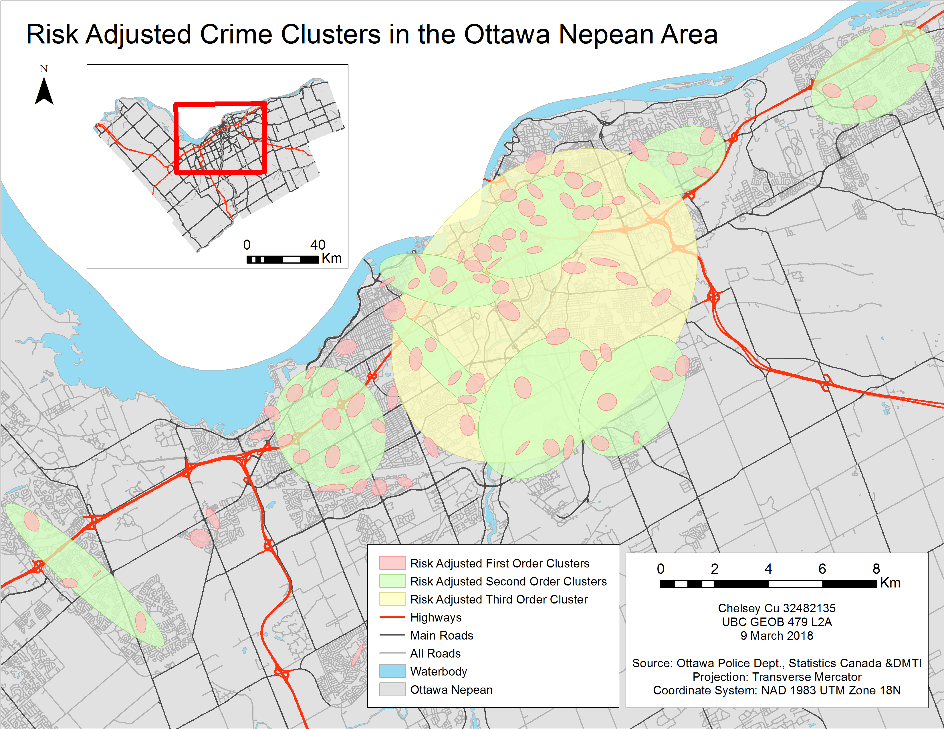
Figure 8. Results of the risk-adjusted crime cluster analysis.
Kernal density mapping differs from spatial distribution methods in that it takes data incidents which were statistically determined and generalizes it to an entire region by placing a symmetrical surface over each point. The result is an estimated intensity variable (Z-value) at a particular location.
A single and duel Kernel density analysis were conducted. For this, a similar method for producing the risk –adjusted cluster analysis was used with the number of crimes set to 250 per square metre area. The single Kernel density results were of absolute density crimes. Here, as seen in Figure 9, a high number of crimes are clustered in the core of the city, giving the same results as the previous analyses (ie. hot spot clusters, non-risk adjusted clusters and risk-adjusted clusters). In the duel Kernel density analysis looks at the relative density of residential break-ins with regards to the density of the population over 15 years old. The results show areas with high rates of reported crime in comparison to the number of residents in the area. In the duel Kernel density map, one can see that the core of the city is no longer a hot spot for crimes (see areas in red). This is because with an increase in population, there would be an increased volume in crime rates. Therefore, the ratio of population to reported crime in downtown area is lower than the same ration in some suburban residential areas.
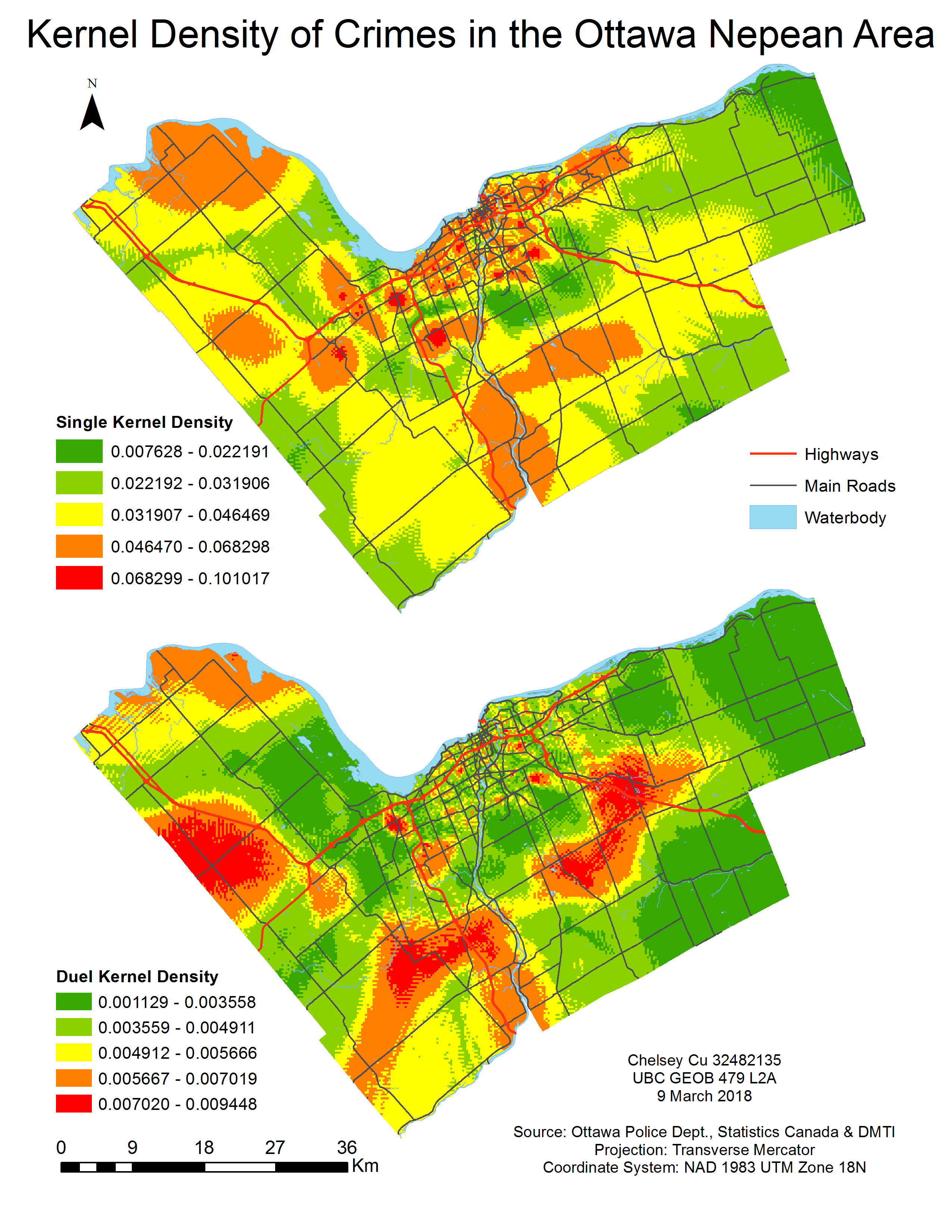
Figure 9. Results of the single and dual Kernel density estimation.
Through the different types of analysis done in this lab, spatial clustering of crimes were modeled in various ways to show hot spots. These different methods each have their pros and cons and their usefulness varies from situation to situation. Therefore, it becomes an added benefit to know how to employ all of them.
To view the full lab write up, click here.