The various functions in the Palladio application showed an interconnected web of data that can be visualized and interpreted. In doing so, this task required extensive analysis for my reflection and made me realize how time-consuming it can be to interpret graphs. One thing that stood out to me was how interconnected our song choices were yet my song choices seemed to overlap with each of my classmates’ at least once. I also noticed that there was one song that was only chosen by one classmate which made me wonder why. When I narrowed down my search to those in my assigned community, I noticed that there were many (four) song choices that were only chosen by one student. In addition, I also noticed that these songs that were chosen by just one member of the community, sounded vastly different from each other. 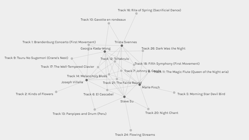
Our selection of song choices differed for many reasons. Ultimately, I believe that our experiences, interests, values, etc shaped the similarities that were presented in the Palladio application. Our musical choices are influenced by a variety of different factors and people use music for a variety of different reasons. Therefore, I do not believe the graphical visualizations are able to capture the reasons behind the choices. As a viewer, we can make our own connections and assumptions about the data but to understand the reasoning behind the why would require the viewer to have more information. In addition, there is no way for the viewer to validate their assumptions about the data collected.