GUI (https://userinyerface.com/) manipulated my attention and responses in many ways. According to Brignull, “deception is evident in various guises in user interfaces on the web today” (2011). This task definitely forced me to pay close attention to what each section of the game was asking and in order for me to complete my reflection, I worked my way through the game twice. The first time I was so focused on getting through the game that I forgot important details to include for my reflection. In addition, I believe this task would’ve been significantly easier to get through if I had a separate computer mouse as the keyboard mouse definitely slowed me down. Furthermore, I had my fiance and brother do this task as well and I had the best time, just saying :P. This could speak to my attention span, the amount of time I spend using technology, as well as my current experience in a text technologies course.
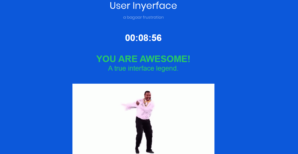
The functions within the GUI that especially stood out to me were the ones that inconvenienced me the most. The timer stood out to me first as I initially thought the time was decreasing instead of increasing. When inputting my personal information, having to backspace existing characters was time consuming and inefficient as well as inputting the street name and number separately. In addition, the GUI required manual clicking of the arrows to increase or decrease the address number. My address number is 80 which means I clicked the arrow 80 times, but what if my address number was in the hundreds or thousands? On this page, I also noticed it was difficult to input my exact age with the sliding scale and I kept sliding to the age that is one year before or after me. The flags were displayed in black and white which required me to spend extra time on finding the Canadian flag and I also noticed that the months of the year were in alphabetical order which you don’t normally see and which I found to be inconvenient. Furthermore, when selecting the images to authorize that I am not a robot, I noticed that it required me to read between the lines. For example, the word “checks” had a variety of different images associated with it including a check mark, engine check, etc.
Brignull, H., (2011). Dark Patterns: Deception vs. Honesty in UI Design. Retrieved from: https://alistapart.com/article/dark-patterns-deception-vs-honesty-in-ui-design/