Sensitivity Analysis
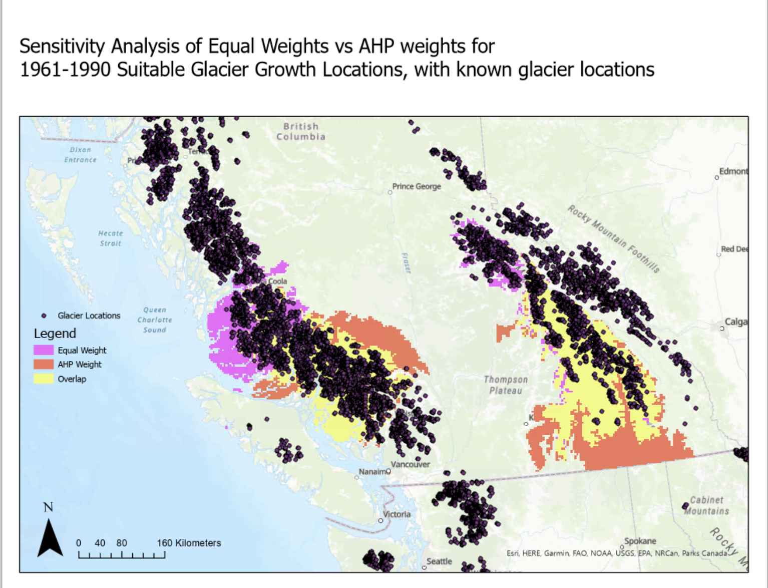
My sensitivity analysis demonstrated a significant overlap between the equal weights and the AHP weights, but there were also large swaths of land which both weight sets covered without overlapping. These results represent a significance between each individual factor and their affect on glacier growth, due to there being completely different sets of suitable growth areas.
Using known glacier locations as a reference point in Figure 9, we can see which transformation weights are actually more significant. It can be seen that there is a cluster of glaciers in the equal weights locations in the northern rockies, while there are no glaciers in the AHP weight location in the southern rockies, which may result in a greater significance with equal weights. For the coastal glacier region, the majority of glaciers are within the overlap between the two weights and therefore does not give us any more insight. The above information might help suggest to this model that the AHP weights are not very significant in contrast to the equal weights and the transformations themselves indicate the glacier growth areas.

Glacier Growth Locations Over the Years
Figure 8 gives a lot of information to digest for glacier growth locations over the years. The main trend is one of decreasing highly suitable locations, as we move forward in time the area on the maps in blue decrease significantly, from covering most of the western coastal mountain range of BC in 1961-1990 to just covering a small section in 2071-2100. This is most likely correlated with an average increase in temperature due to climate change, and an average decrease in large amounts of snowfall.
There is also an interesting change between map B and C, where there is not so much a change in the suitable glacier area, but instead an increase in the unsuitable glacier growth zones. In map B, the non suitable areas are a light red, but in map C the red gets significantly darker. Although not readily interpolated from this change, this can indicate an increase in glacier retreat for glaciers in these zones. This model only suggests suitable areas for glacier growth from 1961-2100, yet in years past the zones indicated in these maps as unsuitable might have been suitable, and the glaciers might still be there, just with a negative mass balance change instead of positive.
These maps also show the change in extremes throughout the years for glacier growth suitability. This is represented in the maximum and minimum of the blue/red scales in the top right corners of each individual map. In map A, the maximum suitability is 94.3 and the minimum suitability is 7.71, while in map E the maximum suitability is 97.03 and the minimum suitability is 3.61. So as the years progress, there are areas of higher suitability and lower suitability than in previous years. Contrary to this information, we know that areas of glacier growth significantly decrease in the future, as I have identified. This instead represents the future of extreme weather, and how there will be higher temperatures, colder temperatures, more snow-fall and less snowfall. These extremes don’t represent the average temperature but instead the maximum and minimum possible situations. This isn’t a linear trend from map A to E, as the max and mins fluctuate up and down, but end result is a greater maximum and smaller minimum.
Moving Forward
This model demonstrates the dire situation our glaciers are in, one of decreasing growth and increasing decay. This model can be utilized to inform the public and government further of how serious climate change is, and perhaps motivate glacier education and research funding so we can better understand the changes and their effects. In that light, this model can be also utilized by climate change scientists in various transformations or research that remotely relates to glaciers, and/or climate factors in British Columbia.